I am so excited to announce, this year-long blog series on Colour, specifically for quilters. I hope to make the series an interactive and practical study of color. Our goal is to provide you with resource tools, tips, ideas, processes, fabric selections choices, etc. Hopefully, making it easier for you to start playing and becoming more comfortable with color when creating your quilts.
What will the format be for the blog series?
We will have two posts per month.
The first post that will appear in the first week of the month, will be introducing the color, my view on using this color and a task/assignment for those interested in participating. It will include some color specific examples but also include more general content that we plan to build on each month.
The second post of the month, coming out the third week of the month will be and introduction from our guest + linking to a post from our guest (see schedule below), exposing you to a variety of processes from different people.
What is the schedule and who are the guests?
We have an amazing line up of guests that will be sharing their process, tips and/or resources.
| Month | Colour | Guest/s |
|---|---|---|
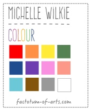
| January | Orange | Myself http://factotum-of-arts.com |
| February | Yellow | Melanie Tuazon http://melintheattic.com |
| March | Blue | Daisy Aschehoug http://antstosugar.com |
| April | Green | Anne Sullivan http://play-crafts.com Giuseppe Ribaudo https://www.instagram.com/Giucy_Giuce/ |
| May |
Coral/Peach | Heather Jones http://www.heatherjonesstudio.com/blog |
| June | Purple | Sandi Sawa Hazlewood http://craftyplanner.com |
| July |
Brown | Alison Glass http://alisonglass.com/ |
| August |
Pink | Alyce Blyth http://blossomheartquilts.com |
| September |
Black/White | Christa Watson http://christaquilts.com |
| October | Aqua/Teal | Katarina Roccella http://likeflowersandbutterflies.com |
| November |
Grey | Nicole Daksiewicz http://modernhandcraft.com Nydia Kehnle http://www.nydiakehnle.com/ |
| December | Red | Nancy Purvis http://owensolivia.blogspot.com/ |
How do you participate?
There will be two ways in which you can participate. Firstly, we will provide an activity at the being of the month that will help you on your color journey. There will be a link-up on the second post of the month, in which you can add your link and share with others. Secondly, there will be an opportunity to add comments anytime based on prompts (or in general).
Will there be prizes/giveaways, if I participate?
There will be prizes for each monthly link-up and then a single giveaway once a quarter for those who leave a comment. Please check out our Sponsors Page (which will be updated as sponsors come on board).
How do I catch up on the information if I miss anything?
A summarized view of the blog posts, resource tools, tips etc will be maintained here, so you can catch up anytime.
What does this series not cover?
This series is not going to go in-depth in the theory side of colour, as it aimed at more practical application. However, we will provide resources where you can read up on it and there will be reference to how selections work and why.
What’s Next?
Up next is the post on Orange. You will find content including:
- fabric pulls around the color Orange (with links to sellers)
- examples of a couple of projects I have made with Orange
- general tip of the month relating to using fabric for inspiration
- we will start building the resources for you to use with some reading resources.
Giveaway: Your task for this month
Let’s start with a simple task for this month. Just leave a single comment below that is either:
- a question that you would like answered during the series
- or you provide a link to a resource that you use that helps you with selecting colours for your quilt projects.
I will randomly choose a winner, 21st January, who will win a $20 gift card to the Fat Quarter Shop.
![]() A copy of “Simply Color: Orange: A Crayon Box for Quilters”
A copy of “Simply Color: Orange: A Crayon Box for Quilters”
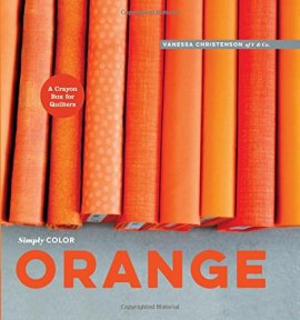 and a collection of 5″ Charm Pack of the Orange Fabrics, I feature in the next post.

I have a hard time deciding which color in a quilt to match my thread to. Do you match to the lighter color or the darker color? Thanks!
I have a had time picking a quilting design once the the top is all done. Any suggestions?
I would love to see some discussion of scales of prints for colors, if we are not just talking solids. For instance, mixing large scale prints of one color or tone with small scale prints of another color or tone. Hopefully that is within the scope of what you are talking about!
I love this proposed blog series. I have trouble with using cooler colours. My go to is a warm palette. I’d like advice on how to use a more focussed narrow palette.
Questions about what goes with orange and how to use it effectively in “other- colored” quilts. I have no desire to make an orange quilt, but for some reason my orange stash has grown, greatly, without intent.
This is great! Can you share and discuss examples of the same block or design in different colors and shades? It’s great to see the dramatic difference that the use of varying colors can give to the same design.
I’d love to know how to select fabrics for a bargello quilt
i agree other then halloween orange is a hard one to match up….as for links i use books the internet more or less other people’s quilts to help me match colors… happyness04431@yahoo.com
I always go to the same colors. I still love them but feel like I should branch out. How do I branch out?!
I took a short course on color at a local quilt store. They told us to arrive with a box off our pantry shelf and a photo from a magazine. Then we walked around the quilt store and picked something like 5 fabrics that used the colors in those items. Very thoughtful exercise. We then all discussed and critiqued our choices and how we would actually use those fabrics or what we would add or delete. Since I tend to use blues and my box was Brown’s and oranges it did stretch my color choosing.
Are there any bad colors for a quilt? Brown comes to mind.
When I buy fabric and look at what I already own, I really favor a few colors. Any tips/suggestions for introducing new colors to vary my collection without going way overboard, $$$$$ ?
My question: do you have any tips for online fabric purchasing since colours on screen can be very different than in person?
I LOVE color! I have a problem where the colors are similar in value and there is no rest for the eyes!
I like to use this 3-in-1 color tool and value finder when I am unsure about color.
http://joenwolfrom.com/color-design-tools/
I agree. Joan’s tool is excellent, inexpensive, and has helped me many times.
I would love help choosing different background colors besides my go to white.
I have a book called “Color Play” by Joen Wolfrom that has some good information. I also get lots of color inspiration from looking at pictures of quilts online and in books and magazines.
I’m excited about the aqua/teal month since I’m trying to combine that with red for home decor, and though I’ve seen quilts that I love using that combo, exploding it to a room is at times difficult.
Browsing the website design-seeds.com doesn’t provide a direct inspiration for quilts too often, but it is helpful to look at options if I’m in a color rut.
I am getting more adventurous in mixing colors, but am having a really hard time convincing the ‘ladies’ in my quilt guild. I introduced a color challenge block at the beginning of last year. This was met with a really lukewarm response. I am probably the youngest member and I am almost 60! Each month the winner of the blocks chooses the color combination for the next month. They are playing this pretty safe. Any suggestions on how to get others enthused in color? I love your color play and the design a day!
I’m totally scared of multi-colored prints and so my stash is nearly all blenders – I’d love to get advice for getting more comfortable including those kinds of prints into my work.
I’d like to get some ideas on choosing contrasting pops of colour in monochromatic palettes. I tend to always go for lime green for some reason!
I have a hard time trying to decide if I should quilt with a matching color or one that stands out a little or a lot. I never know if it will be too much if I don’t coordinate with the majority color or use a neutral. I hate unpicking so I usually go with a neutral. Any advice would be appreciated!
How I coordinate colors?
I’d like ideas for some hands on color activities my guild could do at meetings. We’ve never explored this area so I’m very excited about this series.
Orange is my favorite color so you have my attention. IN looking thru my stash I have a lot of it, many shades and large scale prints, little tone-on-tone though. How do you incorporate more than solids into this mix and should I lean toward tone-on-tone or add a contrasting or complimentary color?
I am wondering if most people use multiple thread colors when quilting the top or just one. Should I make it stand out or be neutral? (I’m guessing the answer to this depends on the fabrics and quilt design… just hoping I know when to pick the right ones!)
I’ve trouble using a low volume print as background fabric. Tips on how to deal with that based on other colors in the quilt would be great.
I love colors in nature! From sunrises to sunsets, landscapes, animals… it’s all beautiful. And I like the website http://design-seeds.com/home for inspiration.
I follow a blog called design seeds for my color inspiration. I dont have the link.
So I’ll ask a question: can you explain the difference between saturation and hues? I get confused about the basic terms. And is there a general rule on how much to include, for example light Vs dark? Thanks!
I look forward to whatever you throw at us! Congrats on putting this together with everyone.
I don’t know if I have a specific question to ask right now. I’m getting better about recognizing value, but saturation/hue need more work (just like the lady above me). I’m sure I’ll have questions as we go. Thanks also for starting with my favourite colour!
Great idea to focus on color. I find myself drawn to very saturated colors, and my stash is very low on tints and especially toned colors, because I feel those can look old fashioned. I need to balance my stash better. I like using a color wheel to refine my ideas for a quilt, but I realize many don’t.
I’m looking forward to this series as well. The use of colours in prints would be useful information to me. I’m looking forward to the challenges and hope I can find time for them.
I would like help with deciding, with a limited color palette, when “enough” colors are used and how to know if more colors or a pop of color is needed.
I do well with high-contrast, but have trouble when value differences are more subtle. I’m hoping some of the discussions/tips will help me with this. Thank you!
How to determine what to use as the quilt binding color/pattern.
I also follow design seeds for inspiration, but more I just follow my eye. I would love to get a little bolder in my color choices though and hope to learn how to accomplish that
I’ve seen a lot of complex quilts that are so beautiful – they look like a bunch of colors thrown together, but they really go together well. I would like to learn how to mix colors (particularly prints) that still provide a unified design.
I just found out about this blog series, and I am so excited about it! I didn’t read all the comments above me, but I’m curious about being able to more effectively mix colors for scrappy quilts so that they look modern and not like “scrappy vomit” as Molli Sparkles has mentioned before! Thanks, Mary.
Orange is my favourite colour!!! I always have a hard time deciding on the quilting pattern. Any help with that would be appreciated.
As others have already mentioned, I love Design Seeds for color combinations. http://design-seeds.com 🙂
I love color and at the same time I need help in using it effectively. I think I limit myself to too few colors in a single project. Great idea to start with orange. I love it, but rarely use it.
I always want to pick the same colors and need help in combining my favorite colors with some new ones, maybe a discussion with the post about what else would look good next to orange (navy comes to mind, but that’s it, any others?)
I agree with Mara. I tend to pick the same colors all the time and want to go outside of my favorites. I am afraid it will look stupid if I pick other colors.
Is there REALLY such a thing as BAD colors together? I’m really interested in this series as I often have wondered why all the efforts into color. Thanks for hosting this!
I use design seeds to help me pick a color palette.
I am drawn to bright true colors. I don’t like anything “dusky” or dark. Hope this expands my horizons.
I love this study! It’s great for people like me that sometimes struggles with color. Thank you for offering this. I’m having a problem finding Feb/ Yellow study however. What am I missing?
Thank you
I post within the first week and with me flying back from NZL (30 hr flight) I will probably post tomorrow
Ahh. Well that explains things 🙂 sorry, I just assumed I was or wasn’t getting it. Thanks for your response. Welcome back.
Pingback: Colour Blog Series: Blue | Ants to Sugar – Quilter. Fabric Collector. Paper Piecer.