Tips
January: Using Fabric as a Colour Palette Starter
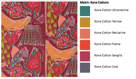
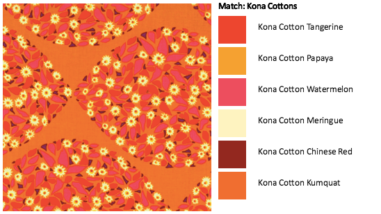
If you are unsure about building a color palette and you don’t want to stick with using a fabric line….What about choosing a print you like and build a bundle based on the colors available in that print (check out the dots on the selvedges). Here are a couple of examples using Anna Maria Horner fabrics and the palette builder tool for the Kona cotton palette.
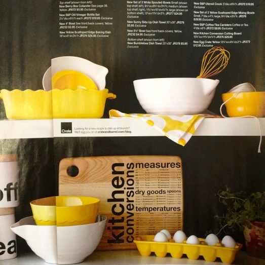
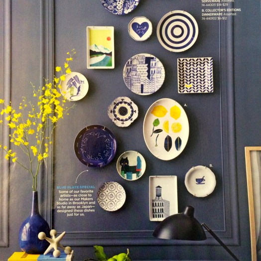
February: Use design or retail magazines as inspiration for your color palettes.
Here are some examples:
- Architecture/Design magazines feature great modern palettes. My favorite US based magazine is Dwell.

2. Retail Store Magazines, my favorites in the use are West Elm, Crate and Barrel (+ CB2).
Yellow + Neutral
Yellow + Blues
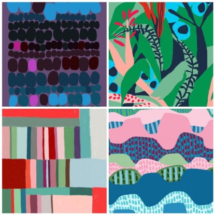
March: Colour Palettes in the world around you
The environment around you offers so much color inspiration, that usually we miss seeing on a daily basis. I find that holidays offer the best time for me to open my mind and see things differently. Go through some of your holiday photos, something caught your eye for you to take a photo….you may find some great color palette inspirations.
Here are a few of mine that are great blue based palettes.

[Photo of buildings along the High LIne, New York]

[Photo of 42nd Street Subway Station Wall Art, New York]

[Photo of Street Life in Ericeira, Portugal near Lisbon]
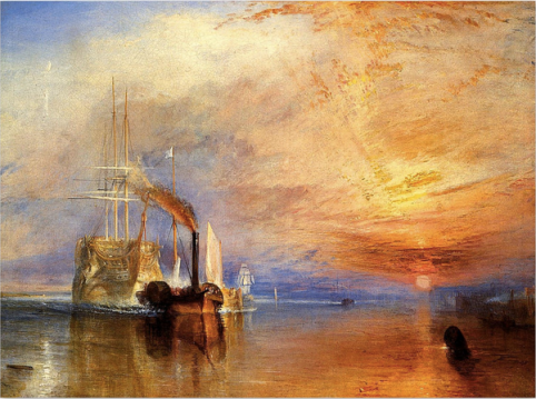
April: Other Artists Color Palettes
I love learning how other artists in other mediums use their color palettes. Here are a couple of examples.
Josef Albers: Interaction of Color

J.M.W Turner
May: Color Cards for Palette Play
Do you have an old solids Color Card (eg. the kona color card)?
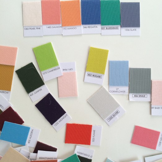
Cut it up into individual pieces and play with finding a palette that works. I find starting with 4 colors is easiest and then think about the balance these 4 bring. Do you need to add more variation or depth, add an additional 2 colors. Note: More than 6 will make it more difficult and you could lose cohesiveness.
July: Inspiration Board
Have you ever considered creating an inspiration board around the colors you are interested in? You see it a lot for weddings, graphic designers and fabric designers. I love the idea when you are exploring a color. Here are links for some examples:
Brown, Champagne, Nude, Purple
If you ever are working with brown’s in your projects and posting on IG (instagram), use #sewingwithbrowns
August: Paint Chips for Palette Play
Color Paint Chips from a hardware store are a great way to play around with value. You can use them as is or cut them up and rearrange them yourself. Also many of the paint chips will have example/design cards on how to use those colors with other colors around your house etc. Why not use those palettes as a starting point for your quilt?
September: Use Black and White Filters
When playing with saturation and/or gradients use black and white photographs (using digital filters) to play with placements and see of it reads the way you think it reads. I used this technique in this quilt and it helped a lot.

Resources
Books
Quilt Color Workshop – Creative Color Combinations for Quilters
Color Theory: A essential guide to Color by Patti Mollica
Interaction of Color by Josef Albers
The Secret Language of Color
Adult coloring books
Websites
Canva Color TheoryEmpower yourself with color
Tools
Play Crafts Palette Builder
Design Seeds
Rainbow Color Selector Wheel (or search on google, or visit an art store to find)
