I am super excited about this month’s color – Blue. I was actually surprised at how often I use it in my own quilts. When exploring my projects, I realized that it is the easiest color, for me, to mix with others….whether it is cooler or warmer palettes.

At the moment, it is trending too as a featured color with fabric lines/bundles. You have lines such as Cotton and Steel’s Bluebird Bundle, Alison Glass Handcrafted Indigo’s, or Indigo Collection by Michael Miller, just to name a few.
Here are a few of my own project examples, that I hope inspire you all.
Blue + White
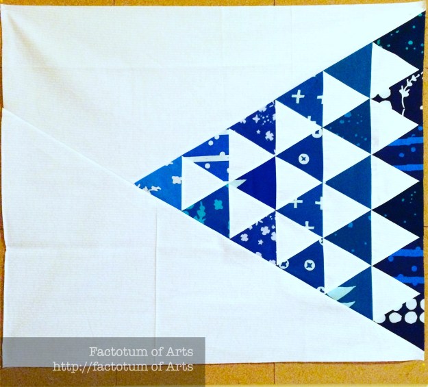
I love that porcelain and tiled freshness of blue and white. It reminds me of my visit to Portugal. In this first project, I used Alison Glass Handcrafted Indigos.
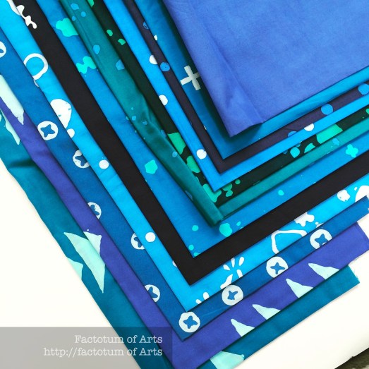
For this mini quilt (36 x 24″) they provide such a great richness that stands out even more when using just a white background (actually Alison Glass White on White Sunprint text).
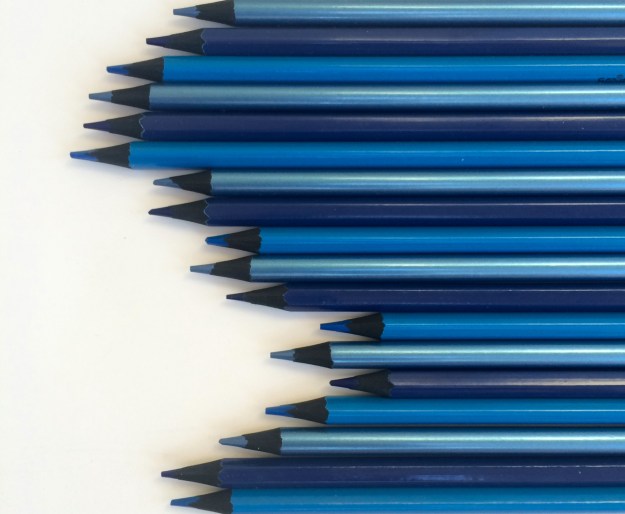
This bundle provides a great graduation of shades of blues (monotone) which you could also mimic with your blue prints from your stash. Here are a few, I pulled for you.
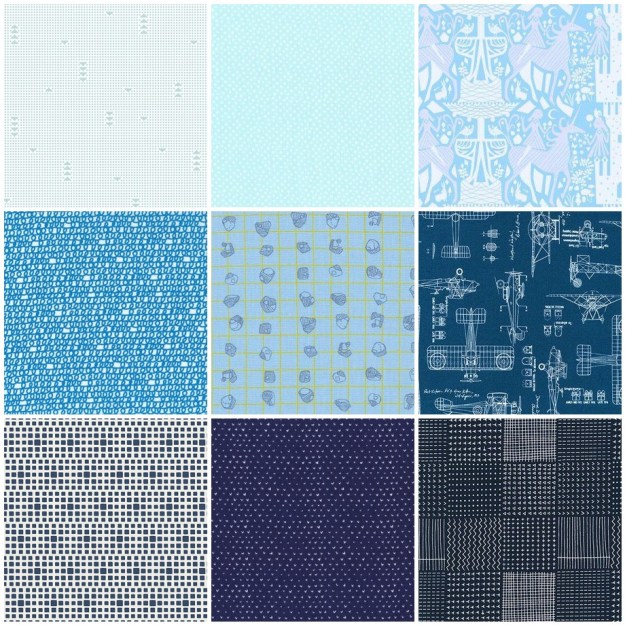
1. Hawthorne Threads; 2. Dear Stella; 3. Lizzie House; 4. Ed Emberly; 5. Carolyn Friedlander; 6. Savannah Lockie; 7. Art Gallery Designs; 8. Wee Gallery; 9. Karen Lewis
Blue + Low Volume

The new Denim’s that are coming out by Art Gallery Fabrics and Robert Kaufman are so soft, it’s like sewing with ordinary quilting cotton. I recently bought some of Art Gallery Fabrics Denim Studio and really wanted to pair it with some Maze and Vale Low Volumes prints. These low volume prints are white based (or neutral) with hints of red, yellow (triadic=blue, red, yellow), grey, and black in them. I love how the denim strips (of varying blues) pop with the low volumes.
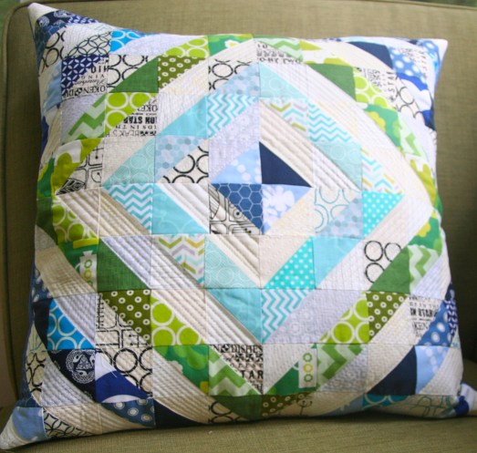
Blue + Cool
One of my first ever projects, mixed various shades of blue, with aqua’s, greens and low volumes (analogous palette). I did not want to mix the cooler colors in this project, as I think it gave a crisper design aesthetic. This pillow would also work, though, mixing up the cooler colors and separating using the low volumes.
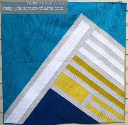
This next project was actually inspired by a photo of Crater Lake (by Anne Sullivan from Play Crafts). Nature can provide such great color palettes. These blues (Kona Oasis and Prussian) work well with the yellow-greens (Kona Wasabi, Pickle) and the neutrals (Kona White, Shadow).
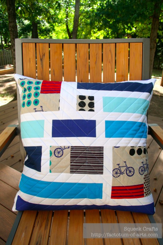
Blue + Red
Not quite opposites, the a triadic combination, yellow and/or red also work well with blues. We saw a yellow example last month, here is an example of pulling in red. There is not a lot of red in this pillow but the mix with blue makes the red pop in this project.
Monthly Tip
The environment around you offers so much color inspiration, that usually we miss seeing on a daily basis. I find that holidays offer the best time for me to open my mind and see things differently. Go through some of your holiday photos, something caught your eye for you to take a photo….you may find some great color palette inspirations.
Here are a few of mine that are great blue based palettes.
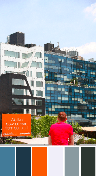
[Photo of buildings along the High LIne, New York]

[Photo of 42nd Street Subway Station Wall Art, New York]

[Photo of Street Life in Ericeira, Portugal near Lisbon]
Monthly Resources
Book: Interaction of Color by Josef Albers
Tool: Rainbow Color Selector Wheel (or search on google, or visit an art store to find)
Monthly Challenge
To make a project, whether a block, small project like a pillow or mini quilt with blue fabrics and adding 1-2 other colors. [UPDATED 07 March]
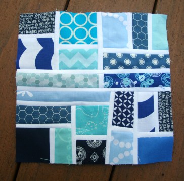
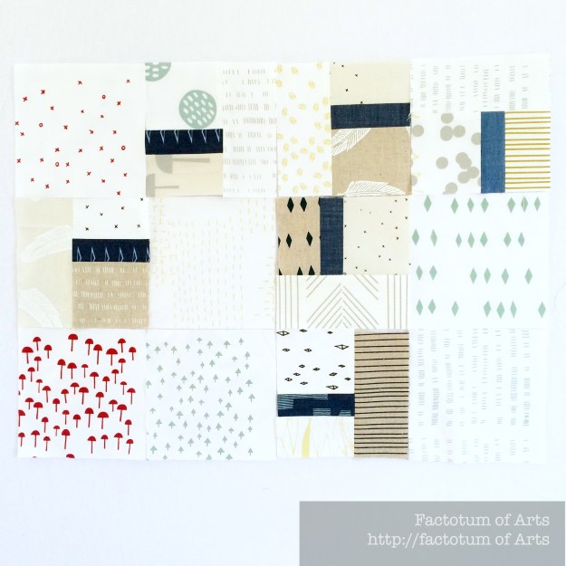
To help get you started if you are not sure, this block is a great way to use up scraps you may have. You can use this tutorial to make a block, a cushion or a mini quilt.
Come back here for the Guest Post Introduction and Link-up around the 2nd week of the Month (~15th). The prize this month is:
Winner (from our Yellow Challenge)
Is….Kate who blogs at Chromakate. Kate, I will be contacting you shortly to get your details.
———————————————————————————————————————————–
More details on how the series and posts work can be found in the Blog Series overveiw.


