
Orange is one of my favorite colours. I use it often in my quilts/ quilt blocks. It is so versatile and my favorite way of using it is as a pop to add visual interest.
Here are some examples on how I have used orange with a current fabric mosaic.
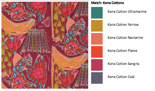
Orange
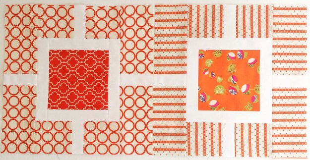
The trick with using all one color (ie. Monochromatic) is making sure you have variation, which can be achieved with different volumes (inside square high volume, outside low volume), or with various shades of the same color.
Tip for Monochromatic: Try using a camera and taking a black and white photo to see if you have enough variation in your fabric selections. You should see a gradation.
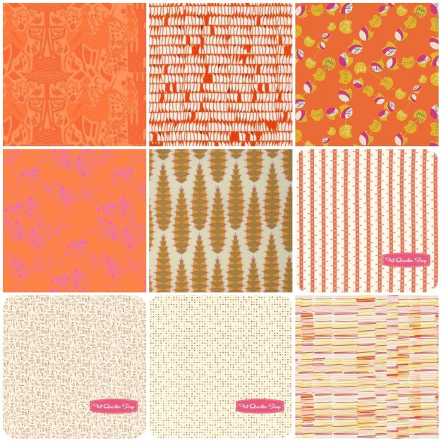
1. Lizzie House ; 2. Carolyn Friedlander; 3. Frances Newcombe; 4. Alison Glass; 5. Anna Maria Horner; 6. Denyse Schmidt; 7. Downton Abbey; 8. V & Co. ; 9. Leah Duncan
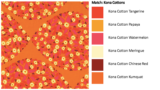
Orange + Warm
The other option to add depth and using orange, is to use other warmer colors (ie. An Analogous color palette). My current WiP was based on orange but I found I needed more depth so I added purples, magenta, yellow and coral/peach.
I find the Analogous color palette one of the easiest to do as the colors are in the same “family” or part of the color wheel so they always seem to work, no matter what print you use.

With this palette purple does stand out better than the orange due to its darkness, so you may choose to drop that. For my purposes it worked well.
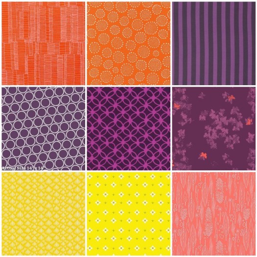
1. Carolyn Friedlander; 2. Karen Lewis; 3. Tula Pink; 4. Lizzie House; 5. Rashida Coleman Hale; 6. Katrina Roccella; 7. Leah Duncan; 8. Lizzie House; 9. Sarah Jane
When using a warm palette, but very vibrant versions of pink and orange, what about thinking of adding balance with neutrals like white and grey.
Orange + Neutrals
I use orange and neutrals a lot together, as this gives orange the role as a focus color. You don’t have to use a lot of color with neutrals for this to be true. Play around with solid greys, whites and blacks; featured here are all Kona cottons (First print: Titanium, Torch, Pepper, Shadow; Second Print: White, Torch, Oyster, Putty, Shadow).
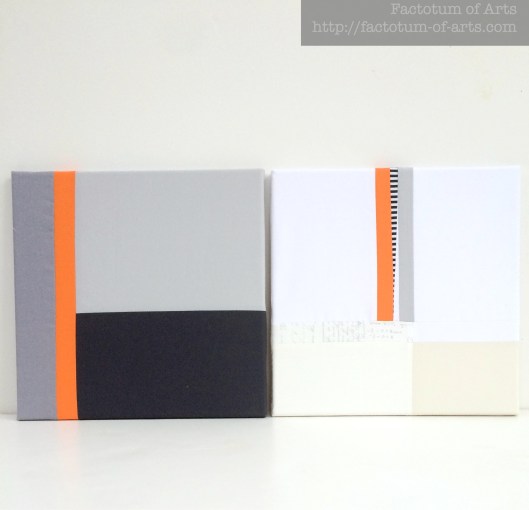
The main print in this next example is by Yoshiko Jinzenji for Yuwa Fabric. The grey, oyster and navy blue print (that appears black) are Karen Lewis hand printed fabrics. I love that pop of colour among the neutrals for visual interest and draws your eye into the quilt.
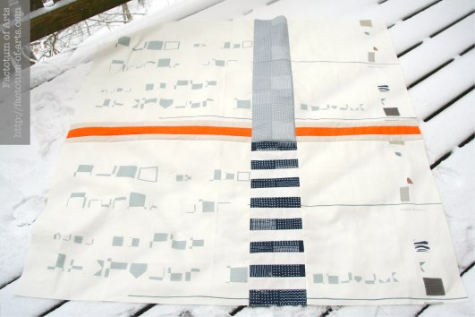
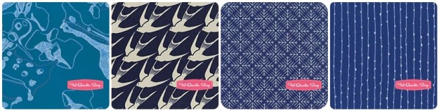
Orange + Blues
With this example, I used mostly blues but wanted to add a pop on the edges. I tried Teal, aqua and blue but landed up deciding that the orange was a perfect complement to the extreme blue palette.
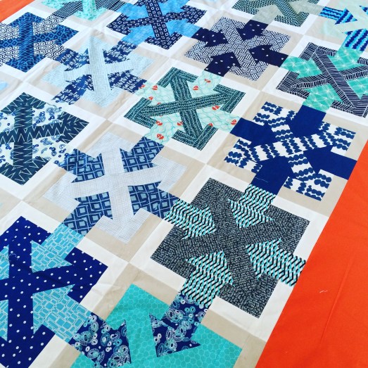
This works as it is loosely based on a triadic (complementary) color palette but I dropped the green that would be included.
1. Carolyn Friedlander; 2. Cotton + Steel; 3. Jeni Baker; 4. Karen Lewis
Monthly Tip
If you are unsure about building a color palette and you don’t want to stick with using a fabric line….What about choosing a print you like and build a bundle based on the colors available in that print (check out the dots on the selvedges). Here are a couple of examples using Anna Maria Horner fabrics and the palette builder tool for the Kona cotton palette.
Monthly Resources
Book: Quilt Color Workshop – Creative Color Combinations for Quilters
Website: Canva Color Theory
Tool: Play Crafts Palette Builder
Give-away Winner
Winner of the prize this month is Debbie from Sheltered Stitches. Debbie I will email you shortly with the details of your prize.
Next Month….Yellow
Note, that all the projects provided in this post are my own unless noted. If there is something you would like more information on or if you would like to provide feedback on what you want to see more of please leave a comment. This blog series is developing and I am happy to change it up to accommodate more information.

I sometimes get bored in colour posts, but all your examples were very interesting, so much better than just showing colour chips 🙂 Thanks!
Thank you Katy!! I am hoping that I have enough projects I can use throughout the year so that it is more of a practical view and not just colour chips. When I am low on a color then I am sure there are plenty of examples around in various art forms that can help 🙂
Hi! Very good post! I love orange and I’m happy to find new ways to use it. You have very good informatation here and I’m inspired by your orange + neutrals quilts. x Teje
Thank you Teje. I am so happy that you enjoyed the post and found inspiration. I am looking forward to the year and seeing how other people use color too, and learning from others
I love orange! Especially in combination with blues, but I would love to try it with some of those warmer colours too.
I love the blue too. Its one of my favorites.
This is the year I discipline myself not to use ‘everything but the kitchen sink’ in my quilts. Your color theory explanations make sense to me and the photographs illustrate the concepts perfectly. Looking forward to reading more – thanks!
Thank you Janet. I love what folks can do by adding a multitude of colors (“the kitchen sink”), it is something that makes me nervous as I don’t think I can visualize it beforehand like I do with a limited, selective palette. Maybe this is something I will try for the year 🙂
I am having fun and learning a lot from this site. I really like seeing the quilts/blocks that incorporate many prints as many of my modern quilting friends use mostly solids, which I find too boring for my own quilts. Thanks for doing this.
I love prints which is lucky as I have a whole room full of them ;-). I also love my solids though and think there is a place for them in my quilts too. I try to keep it interesting and play with a variety of ideas. Thank you for stopping by and leaving a comment – much appreciated !!
Orange is not one of my go to colors. However, I recently used orange, grey, brown and off white and I was so happy with it! I will never dismiss a color I am not in love with again!
That sounds like a great color palette. People shy away from brown but I love it in a quilt and with orange it would be a great complement. That palette may even look good with like a aqua or bright blue too.
I find experimenting and not throwing out a color has been very surprising and have produced some of my favorite quilts. Taking yourself out of your comfort zone is always good.
I stumbled upon your website by accident. boy am I glad I did. I have such a time trying to put two colors together never mind when I have to choose 5 or 6. loved your color palette download. it has now made my life much easier. I would dread when I had to choose colors for a particular quilt. now I have no problem at all. I spend a lot of time on your site just trying to absorb all of the information you provided. looking forward to more articles. thank you!
Yay!! I am excited that this was useful for you. I plan to use palettes with fabrics that are currently available all year so you should have plenty go to palettes, in case you need them.
Orange all the way!
Totally agree!!
I love orange as well and usually use it with blue. I love your use of orange as a pop of colour in neutrals along with the pink.
I am comfortable with using orange with blues, but hadn’t really considered the dramatic effect of the bold pink and orange with neutrals. Also, I appreciate the palettes you have shown us as examples of currently available examples. I’ve been using the color play tool for a while now to find solids that work well with prints – I found it on the Moda website. A great tool. Love this series so far, and I look forward to more excellent tips.
Michelle, I’m feeling a little dizzy at the moment. I seem to have moved from Nope to I Don’t Think So to Hmmm to Huh to Maybe to I Might! Thanks for the nudges 🙂
Pingback: Yellow – A Colour Blog Series | Factotum of Arts
Pingback: Colour Blog series – Yellow | Melanie Tuazon
Pingback: Colour Blog Series: Blue | Ants to Sugar – Quilter. Fabric Collector. Paper Piecer.
Pingback: A color blog series: GREY | Nydia Kehnle