
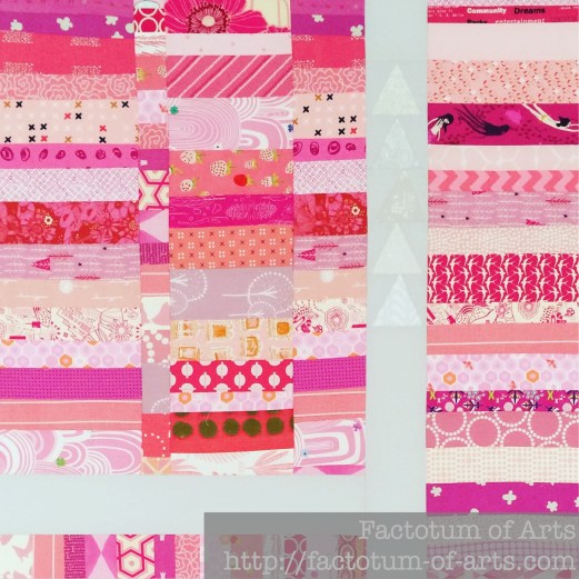
I think of pink and shudder. I know there are a lot of pink lover’s out there, I’m just not one of them. Lately though, I have found it’s really about the shade of pink or the saturation of the color that matters. There are so many variations. As an example, this quilt top is based on strip piecing pinks together. I found very early on that I needed to add a lot more paler pinks to balance out the more saturated/ higher value pinks.
So I think it matters a lot with pink, which pink you actually like. I have found combinations that I really like and will use frequently like Shocking Pink and Orange. Here’s how I have used it in my quilts and where I like it.
Shocking Pink + Orange
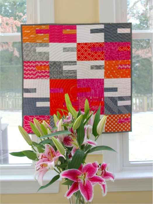
I find I love the Shocking/neon pink with an equally shocking/bright orange. These first two I use white and grey to balance those bright and saturated colors down.

[Photo Credit: Love Patchwork and Quilting]
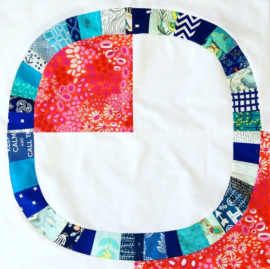
This last one in one of my latest WiPs which is using the pink as a secondary color with Orange being the main focus. Instead of Grey and white to add balance I have this pop of aqua which adds a focal point to the pink and orange circles.

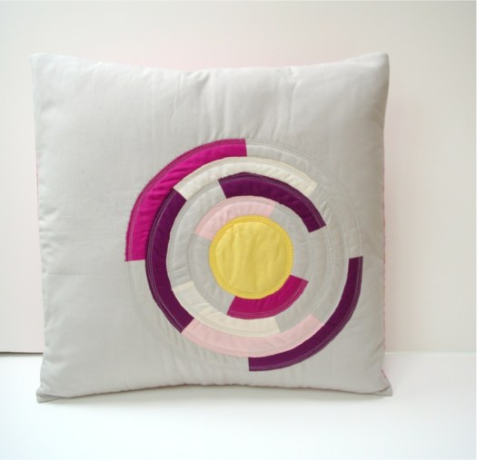
Pinks + Grey (Neutral)
This example is showing how the same color but in a variety of shades, adds depth. The grey acting just as a background neutral (which I prefer more than white with pink) and then the yellow to bring in a point of focus.
Pinks + Warm Colors
This is one of my favorite quilts, all warm colors and each represented well for balance. I love how the pinks bring in those lighter shades than and balances the darker purples. Without the pink and the yellow in the corner, I think it would be very flat (all the same level of saturation).

This handmade portable ironing board is made from a warm palette of selvedges, but again exhibits the balance pink brings to the warm palette.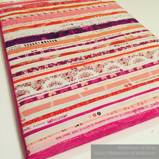
Pinks + Blues
I am all for adding that pop of color to add interest to a quilt or block. I love the addition of this orange/pink Lizzie House print to the predominantly blue palette. It adds a great contrast.
Monthly Tip
Color Paint Chips from a hardware store are a great way to play around with value. You can use them as is or cut them up and rearrange them yourself. Also many of the paint chips will have example/design cards on how to use those colors with other colors around your house etc. Why not use those palettes as a starting point for your quilt?
Monthly Resource
Playing with color and its variety are fun to play with. Try using quilty adult coloring books to explore a color or a palette.
Also look at the emotional / psychological response of a color. Here is a link for Pink specifically, does this ring true for you?
http://www.empower-yourself-with-color-psychology.com/color-pink.html
Monthly Challenge
To get back into the flow of things, the challenge this month is to provide two palettes;
- exploring fabrics with various shades of pink
- exploring fabric palettes with pink and at least two other colors.
Prize this month is a $20 gift card from the Fat Quarter Shop.
Link up will be next week, August 24th and will be open for a week.
(Note: I use Big Labs Mosaic Tool to create the mosaic. To get the image URL right-click on the image and “Copy Image Location” and paste it into the tool).
Save
Save
Save
Save
Save


