It has been a while since I spent time designing, so this month I decided to get back into it. Its been a little mixed to start which is normal – there are always designs I like and ones that I file away :-). Without giving it a go though, you never find the design you want to actually make.
January 15

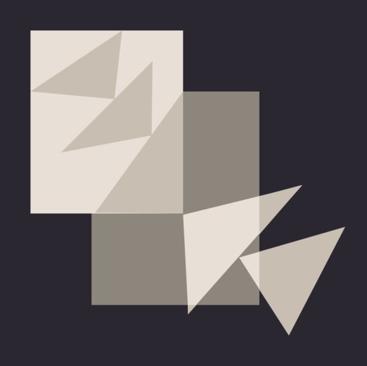
This design was influenced by the placement and direction I saw in the negative space of this photo. I used triangles as I find them best to represent movement.
January 17

I loved the idea of representing the shutters in my design with the little roofs. As I was developing the shutters I liked the dark line of the hinges which I also incorporated.
I decided that my final design need to be a more dense representation of the shutters. So this landed up being my final design.

January 18

I loved the colors in this palette and wanted to somehow represent the flowers without them being to definitive, slightly abstract. There are a couple of placement things I will change if I make this.

January 19
I took this photo on a trip to Florence a while back. Florence was not my favorite Italian city but this bridge was amazing.

The inspiration for this design is the roofs and the bridge form of Florence Ponte Vecchio.

January 21

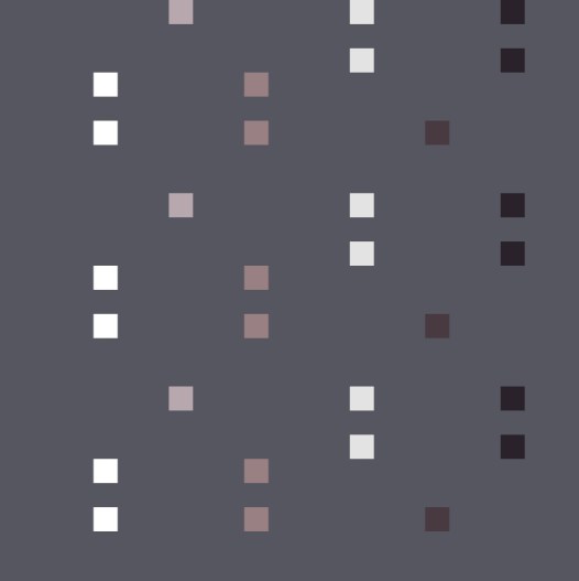
I loved the white concrete brick placement around the windows in the middle building. I used that placement to make this ombre dot design.
21 January
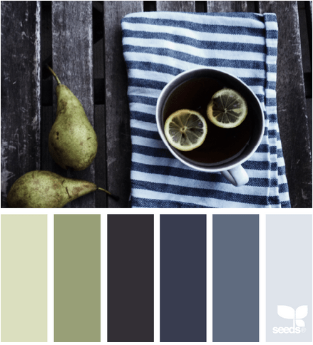
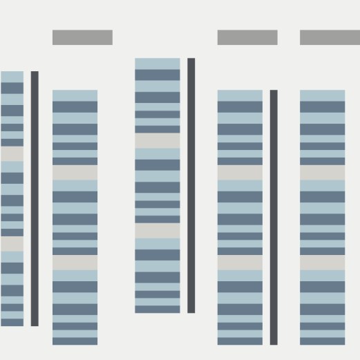
I loved the stripey towel and the vertical lines of the deck. I used these lines in my design.

January 22

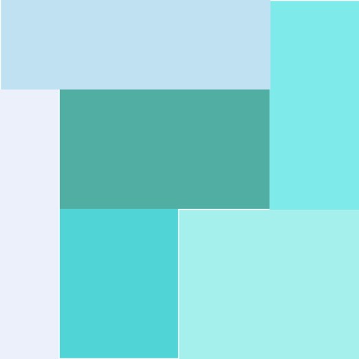
I wanted to play with prints using this palette. I have this idea for a design using the Speed bumps road markings. Lets see how this develops as I have another palette in mind as well.

January 23
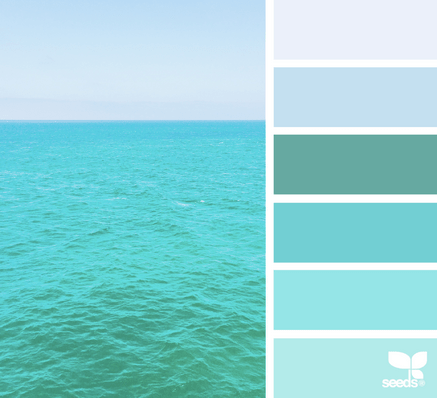
I love this palette, as it would be great for transparency design. I wanted though something very minimalist being inspired by a book I am reading on Ralph Hotere (NZ artist).
Thanks for stopping by. You can check out my other designs on my QDAD page. If you want to join in check out our closed group on facebook (click join).
Please Note: If you would like to make or use one of my designs, please email me (ml_wilkie(at)hotmail(dot)com) or leave a comment below. I am happy to talk with you on options and provide the relevant measurements etc. or have you test out a pattern. Also, if you use one of my designs, please use the following text to credit me the design: “Designed by Michelle Wilkie @ Factotum of Arts”.

Thank you so much for sharing these. It is so inspiring to see how you work with the photos and palettes.
Thank you for sharing on how you see places and subjects and how it can be transformed onto a beautiful pallette of colors. Is an inspiration ! I’m glad I found you.
It is so fun looking at the color palettes and then the design you create for them! My favorite from this set is the Jan 18th one–with the partial circles.
I’m so glad you’re back to sharing your QDADs!