Green is an interesting color for me. When I thought about it, I thought my projects would be similar to how I use blue. My fabric stash definitely has it as one of my main colors. However, I actually realized that I do not use it as frequently or in the same way.
I think I find green, while very appealing, a lot of the time very symbolic or representative of well-known brands, which to me is a little off-putting:
- Irish/St Patrick’s Day,
- Christmas
- trees/plants, four leaf clover
- Starbucks, Barnes and Nobles, BP
- Springboks (South African Ruby team), Wallabies (Australian Rugby team)….that’s why I might have an issue being a kiwi (All Black – NZ Rugby team) supporter 😉
When I do use green, in a very limited way. Here are examples.
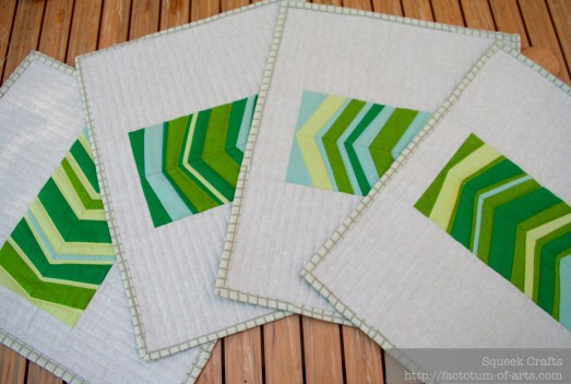
Green + Neutrals
As there are so many various greens represented in fabric, I really do like a monochromatic color palette with various neutrals. These place mats using shot cottons and linen are a great example.
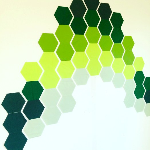
Another project I have underway, is a quilt design that is inspired on a tree-lined street. These hexagons use various greens to represent the light casts and the darkness of the leaves of the trees. The background fabric will be Kona White to make those greens pop.
Green + Multi-color
I think I like the balance green brings to a bright and multi-colored palette. I use it a lot in this manner and I know when selecting fabrics, I always add the green back in.
In my recent project, Treehouse Ladders (more to come on this project), green was definitely used to add balance to this very pop art inspired palette. It needed to be this very bright green, but not to yellow as both orange and yellow were used. It was also important it was not to blue since the palette also had blue and aqua.
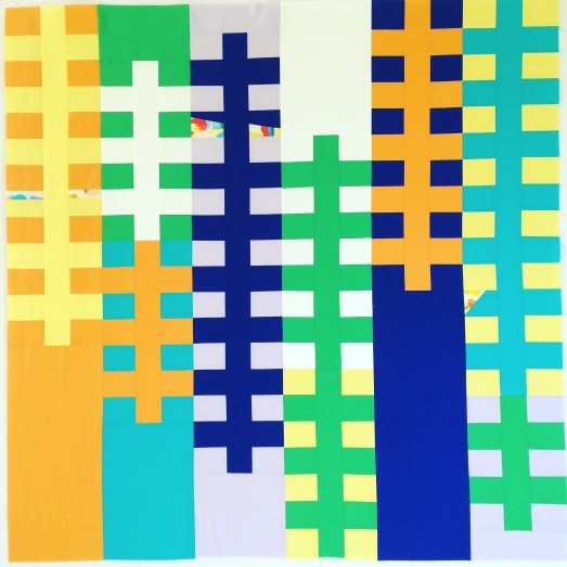
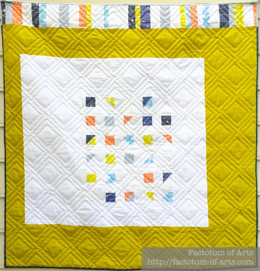
In this multicolored quilt, Natural Corridors, Kona Pickle (a yellow based green) was used as the focus fabric for the negative space. I decided to use this color as it pulled the citron print out a little but worked well with the blues and coral prints. The pickle area, is not too over bearing in this design and it highlights the offset centered block well.
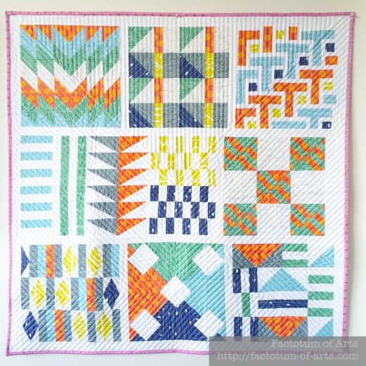
The Spoonflower Sampler Quilt, also required both the mid green print and the citron print to balance the colors.
Lastly, my Phased Circles quilts, using Carolyn Friedlander’s Botanics and Architexture lines, includes green. This was obviously driven from the 6 main color ways included in her fabric lines. This example of green though does show the color variations available in green prints, and the availability of high and low volume green based prints.

I was asked before starting this series about how I decide on the thread color for quilting. That is a great question especially when creating multi-colored quilts with such a difference in color. So above my thread choices are as follows:
- Treehouse Ladders: Invisible Thread (clear). I used Premium Silky Invisible thread.
- Natural Corridors: Light Grey
- Spoonflower Sampler Quilt: Off White
- Phased Circles: Color Matched the fabric. Blue block: 6738, 2725; Orange Block: 1133; Green Block: 2835, 5015; Pink Block: 1100, 2600; Jade: 2810, 5007; Gold: 5022, 2110
Monthly Tip
I love learning how other artists in other mediums use their color palettes. Here are a couple of examples.
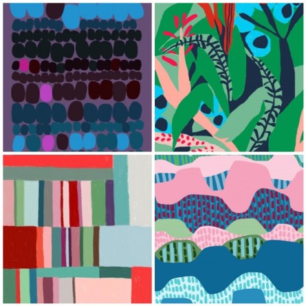
Josef Albers: Interaction of Color
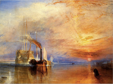
J.M.W Turner
Monthly Resource
Book: The Secret Language of Color
Give-away
There is no project this month, so this is open to everyone. Just leave one comment below on what you enjoy about these posts and what you would like to see more of or see different.
I will randomly choose a winner on May 1st, who I will announce in my May Colour Blog Series post. The winner will receive:
- 1/2 yard green bundle of 6 prints curated by me.
- An exclusive thread box from Fat Quarter Shop.
Last Month’s Winner….
is Katherine Gray who entered a fantastic hexie project she was working on in blue and greys. Katherine, I will direct message you shortly for your details.

Green– a wonderful topic for me to comment on. When I was in college a friend gave me a shirt that was green. The next day I was talking to my mother by phone — trying to describe the tint– and we together realized there was literally NOTHING green in the house I grew up in — for her to compare the color to.. . In fact, I realized later, as I looked around at my possessions, I had inherited the prejudice– and minus the new shirt owned NOTHING green. As a quilter I sort my scraps by color and regularly challenge myself to use new colors and combinations for patchwork runners– recently actually attacking green quite often. First off a lot of greens have Blue in them– and can be perfect for accents to blue patchwork. I also really enjoy a lot of the lighter, almost neon greens you see with new designers– often using green, yellow and orange together. Like any color– if you organize all of your scraps together you come to realize Green can actually describe about 100 different colors— only a sampling of which I don’t like. One thing for sure– thata lot of quilters seem to like is the combination of a lighter winter green with pink. Though NOT a combination I personal like– I get requests for this combination often– and really struggle to fulfill their requests while making somehting that I too find visually appealing.
I am enjoying your color series. It is fun to see how other quilters use colors, what appeals to them and how the different colors work together. Green has always been one of my favorite colors, but quilting has taught me to use even colors I thought I disliked because they make the colors I love sparkle!! The way the colors on the color wheel work together to make wonderful combinations in quilts.
I very seldom comment on the blogs that I read. Just so you know I really love your blog, enjoy what you are doing with color. Your designs are so clever and fresh. Congratulations, you’ve got my vote. Yay for green!
I really like seeing the art inspiration in these posts. It is an angle that is different and exciting for me.
I like that it helps me think of color in a new and fresh way. That is definitely a quilting skill I am lacking.
I love to learn how to use every colors, combination, inspiration, thanks for this serie XXX
I just realized that I don’t use much (if any) green in the quilts I make. Which is a shame because I do love it so. I wonder if living in Southern CA is to blame…everything is blue…the ocean, the sky. That seems to dominant my surroundings. Thank you for your thoughtful posts.
I’m really enjoying the colour blogs. They’re are especially helpful for inspiring me to use colours that don’t come naturallly to me…like green! Thanks
I love your color series. I learn so much from just looking at your pictures and your designs. Green is definitely not my favorite color but I realise that for a design, house, quilt, etc. to look balanced one needs a little of a multiple of colors and green can just give that extra ‘pop’ to a collection of blues or yellows or otherwise. I therefore became to appreciate it better. I love how your work contributes to that understanding of mine and I therefore think that these posts are good as they are, although I am with Yvonne that art inspiration could wonderfully complement your work. Thanks!
Green is my favorite color so this post was especially fun. However, I tend to throw everything in to my projects as if the fabrics will feel bad if I leave them out and then wonder why it doesn’t ‘work’. Your posts and designs are wonderful and I hope to learn something!
I love this! “The fabrics will feel bad.” So funny! Mostly because I share the same “problem.” I’ve had to work hard on my editing skills over the years when it comes to my fabric pulls, but I’ve still a long way to go. 🙂
There are so many different greens to choose from that I use green frequently. I also make a fair number of nature inspired quilts, so it seems logical that green would show up. I’m enjoying the color series, thanks for helping us to look at colors in a deliberate way.
I look forward to your post so much! I learn a lot and love seeing your quilts. Thanks again!
Your sense of color is amazing. It’s fun to follow your blog in an attempt to try to learn more about color and design myself.
I love seeing how colour is used and the great creativity in creating projects. Thanks for sharing.
I enjoy the visuals and your thoughts on how colors work.
I like the color quilt examples and the process. I liked the project last month even though things were too busy for me to follow through. I like the practical application of trying out the theory. I watch for this post every month and love it!
I just love the amazing quilts that you share with us. So beautiful. I have just started designing and making modern quilts so your posts are inspiring me to thing outside the box. Just by coincidence the quilt I finished this week was all shade/prints of green. Thank you.
I love seeing the real life projects/WIPs that use the same colors in different ways.
Love this blog–so inspiring with new ideas to try. So little time, so much to do 🙂
Green might be the hardest color for me to work with, though I love it so. I have had periods of pet green favorites – – pickle, bright green with a few steps of mint added, true bright green, and so on. I often realize it’s very hard to find “just that green” in the season I’m looking. I love the way you’ve been bringing in so many mediums into this color conversation. It’s very inspiring to read each month.
I use a lot of green. So much that I am pretty much out of it right now in my stash.
I like to read about how you THINK about color. It’s fascinating to me to learn the mental processes of other quilters. I live on my boat, so I have very few opportunities to talk to other quilters and this sort of in-depth discussion is great!
I’m really loving this color series because I am trying to be more intentional in my color choices. Green is a favorite color of mine. My husband really loves the color and he is drawn to my sewing projects that use a lot of green.
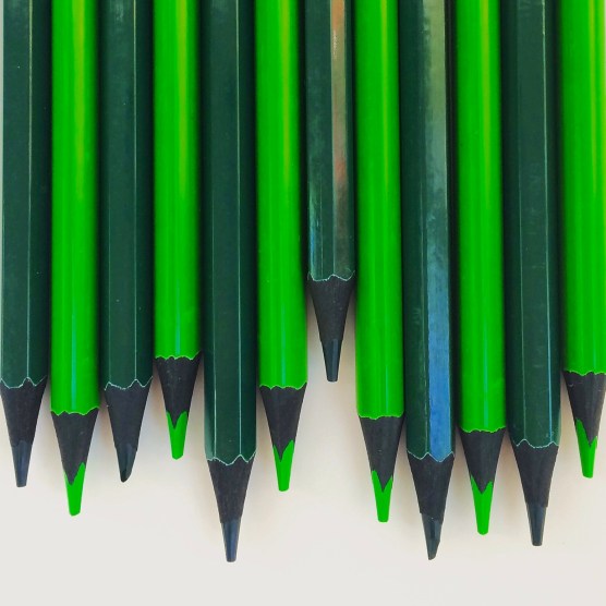
I am not only a quilter, but a watercolor painter as well and cannot get enough studies on color and use of same. First question, what is the brand of pencils you show – with the dark wood? One problem with the color green is finding batiks and prints with good green shades. I emerald or kelly greens – not so much the yellow greens.
I love looking at all the quilts. Green is a fantastic color, it can go with so many other colors.
What I like on your post, especially this one? I LOVE green, especially the bluish one, like emralde, smaragd, the green of mountain rivers in spring, the dark green of sarpin forrest . . .
And I am looking for those green for a next project. And now you are writing about my favorite colour! I like you artistic approach on quilts, a free minded approach. Inspiration is given by what somebody likes.
Thank you so much for bringing so much inspiration.
Greetings
I love the exploration of color!
I liked seeing the different ways green can be used in all different types of quilts. Just keep going, good job.
I’ll be honest – I really love having a nosy and looking at all the different projects you’ve made in a particular colour. Like you say it is always interesting how other people interpret or use colour. I feel like I tend to stick to the same thing a lot so it is good seeing what other people do.
Green is one of my favourites too, but I agree it can be surprisingly hard to use! I love seeing how you incorporate key elements into a design to make something completely new.
I guess I never thought of green as brand-popular. But I do love it! It’s one of my very favorites!
Green is my favourite colour (being born in May, the EMERALD is my birthstone so perhaps that is why green has always been my favourite?). I am drawn to all greens but especially lime green and grass green. It means growth and fresh and alive to me.
I had not thought much about ‘color’ before, until I started doing monthly blocks in specific colors. It is interesting to see what colors I have a bunch of and what colors I have to run out and buy because I don’t have any in my stash (yellow!)
These color studies are wonderful. Makes me think and stretch. Thanks so much!
Thanks for the fabulous blog series. I love seeing all the examples of the colour in the different projects – it’s very inspiring and much more interesting than colour wheel diagrams. Something that I’d love to see more of is examples of fabric pulls/ print palettes, as pulling fabric for a project using prints from different designers/collections is something I struggle with.
I like learning about how you think about colour. It’s also good to see the colours mixed in with various palettes, that was interesting today with the green. Green isn’t a colour i use much , though i like it, as i find it hard with all the different shades – green more so than any other colour. I’d like another post or two on green p,ease!
I am really enjoying being “made” to focus on just one color at a time. Green is one of my favorite colors, so I’m a tiny bit disappointed that there is no project this month, though the truth is I probably wouldn’t have found time to tackle any of the ideas I’ve had floating in my brain in anticipation of this month.
As with many of the others who’ve commented above, I also really enjoy learning how others approach color choices in their projects. The guest bloggers you have assembled really offer a great variety of perspective. Thank you!
I just found out about this series and am playing catch-up right now – and green happens to be one of my favourite colours! I’m enjoying how it’s encouraging me to consider the colours I use in a different way. Will be following avidly from now on! 🙂
This is a great way to get me thinking about colours! I usually just go by feel, but I do have a preference for acid or apple greens. Thanks!
I love seeing all the variations of the color being discussed and how it can be used in a wide range of ways. I especially appreciate when other colors are suggested as coordinates or contrasts! Thank you- this series is so helpful and interesting!
Love your inspiration about color choices and combining them! Thanks for a great giveaway too!
I enjoy seeing the color (green this time) in lots of projects shown as examples! I now need a green quilt 😄!!!
I love seeing how the featured color reacts with other colors or neautrals whether it be in a quilts or blocks, photographs (like your blue post) or in art work from others. I really like the fabric mosaics you have created with each also. Great series!
Green is my favorite color, but I find my stash is lacking in nice, saturated greens. I do have a lot of yellow greens, just not enough emerald. I love on these posts seeing the examples of the color used in quilts! Thanks for the fun series!
I love green but have a hard time adding it to quilting projects. I appreciate the fabric pulls along with the color posts. I also like going to the Design Seeds site and looking up palettes with certain colors. It’s interesting to see what to combine with green and not look too christmasy.
Green is both a fresh and calming color. It is also a great neutral, as most any color looks good with some shade of green. Love your quilt designs and color work. Very inspiring!
For me, green also symbolizes new growth, money, envy, illness (also yellow). I use a lot of green, but mainly more muted shades. Love your insights on color.
I like these posts just fine as is. I really appreciate the bit about thread choice as that one is just so tricky for lots of people (or at least me). Thanks!