Category Archives: Quilt Design a Day

Cheri d’Amour: A finish

It has been a busy but extremely fun week and now it’s time to catch-up a little. I want to share with you all this finished quilt, Cheri d’Amour. It is a gift for a close friend at work. So excited to be able to finally give it to her.
Cheri DAmour

An original design (QDAD), it turned out exactly how I imaged it.  I love this predominantly, black and white fabric line, Cherie by Frances Newcombe for Art Gallery Fabrics.

Cherie_Quilt_Design

I loved that pop of pink which I also added onto the binding to keep the cohesiveness of the design. Kathleen from Kathleen Quilts did an amazing job implementing my design asks. I really wanted each of the blocks in the center to be framed and have decorative borders (like picture frames).

Cheri dAmour Front

The back uses the brighter flowered print to bring in the color. You can also see more of the amazing quilting texture.

Cheri dAmour Back

I also had some scraps left over and decided that it would make a fantastic patchwork block that will bring an additional level of interest. I really like how the back turned out.

Cheri dAmour Closeup

Details

Name: Cheri d’Amour
Design:
Designed by me
Fabric: Cherie, Frances Newcombe, Art Gallery Fabrics and Kona White
Dimensions: 60″ x 60″
Quilted: by Kathleen Quilts

I hope you stop by again tomorrow, we will be discussing the color Green in the Color Blog Series.

QDAD: March

March was a little intermittent, as far as designing went, but I got a lot of quilting time in. Below are the color palettes and the design based on the color palette/inspiration.

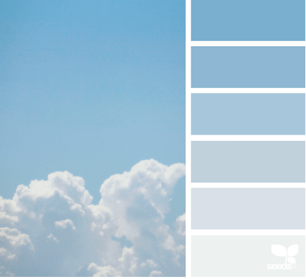
March 06: In the Clouds
Screen Shot 2016-03-05 at 3.19.48 PM

The palette was so low-key and spacious, that I wanted to use a minimal design to ensure that feeling was portrayed in the design as well. 6MAR_2016(1)

March 07

Screen Shot 2016-03-06 at 6.10.29 PM

I did not want to use all the colors with this design. I was inspired by Donald Judd’s wood print blocks. I played with the lines and in the end liked the irregular distances and directions. 07MAR_2016

March 08: Butter Knives

Screen Shot 2016-04-05 at 4.27.52 PM

The inspiration photo definitely drove the idea for this design. Look it’s missing a butter knife in the picture. I really was playing with improv. shapes and lines. This is my favorite design for the month.
08MAR_2016

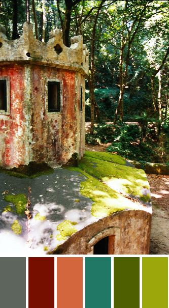
March 09: Sintra Gardens

imm023_22-21-palette

A little bored of the design-seed palettes, I decided to use one of my own photos. I pulled in the angular shapes of the castles garden architecture. I love the unusual palette but think its cool how well all the colors play with each other. 09MAR_2016

March 11: Improvisational Log Cabins

Screen Shot 2016-03-10 at 8.20.34 AM

I am always in love when I get a navy, cerise, coral palette. After playing with the butter knives design, I thought I would continue with some more improv. designs. This one is taking a log cabin and playing with the reverse colored borders in each log cabin block. I am thinking about going large-scale with this one. It’s on my possible make list.

11MAR_2016(3)

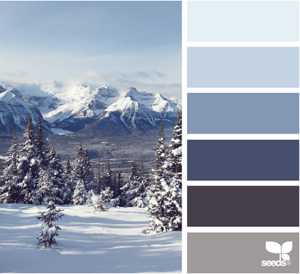
March 22: Mountain Range

Screen Shot 2016-03-21 at 3.08.07 PM

The mountains in this photo made me think of how rock formations are pushed up when tectonic plates crash into each other. I thought that was best represented by these lines stretching up in the air. The triangles represent the generalization of mountains and strength. 22Mar_2016

March 28: Barred Windows

Screen Shot 2016-03-28 at 5.07.00 PM

The barred window in the barn here, perfectly reflected how I was feeling being stuck in bed from a round of Bronchitis. I actually like this one a lot too. 28MAR_2016(2)

Thanks for stopping by. You can check out my other designs on my QDAD page. If you want to join in check out our closed group on facebook (click join).

Please Note: If you would like to make or use one of my designs, please email me (ml_wilkie(at)hotmail(dot)com) or leave a comment below. I am happy to talk with you on options and provide the relevant measurements etc. or have you test out a pattern. Also, if you use one of my designs, please use the following text to credit me the design: “Designed by Michelle Wilkie @ Factotum of Arts”.

Ideas = New Designs

With all the ideas this week, the one thing that did work, was the creation of new quilt designs. They have been following nicely with several this week I would like to make.

22 February

Screen Shot 2016-02-21 at 7.34.06 PM

I loved this color palette. I was watching TV and saw this sign with writing down the side which inspired this design.

22Feb2016

I think, if I make it, I am going to make it in flame and citrus/highlight.22Feb2016(1)

25 February

Screen Shot 2016-02-25 at 7.27.21 PM

I loved the palette but this is not a design I will like. It was inspired by the stamen of the flower. 25Feb2016(1)

26 February

Screen Shot 2016-02-29 at 1.32.49 AM

I decided to try to redo a couple of my favorite designs (originally posted 06 Dec 2014 and 28 July 2014 which I published the finished project on SMS 05 Dec 2014), that used circles but this time add more negative space between the circles.
Peach_Melba_Project_Finished

I like how this turned out, it will be on my possible make list. I am likely to change the palette though… not sure if I like this masculine palette.  26Feb_2016

28 February

Screen Shot 2016-02-29 at 1.30.52 AM

I am not overly keen on this palette, but I was inspired by the daily post by @designmilk (on Instagram), of this cool hanging like staircase. This is on my make list.

28Feb_2016

I think the palette will be something like this with pickle or highlight as the background.28Feb_2016(1)

2 March

Screen Shot 2016-03-02 at 10.25.04 PM

You probably know how much I like a neutral color palette. I just started playing around with the placement of lines. I like how this works and it reminds me of road markings. This is one of my favorites this month. 02MAR_2016

I may have to make at least two versions of this as I like the negative of the above design as well.
02MAR_2016(1)

3 March

Screen Shot 2016-03-03 at 8.46.46 PM

I was inspired by a book cover my friend was reading and posted on Facebook. The secondary design/ the look from a distance is interesting. It makes the lines look slightly bent, an optical illusion.
03MAR_2016

Here is the design with more repeated blocks. 03MAR_2016(1)

4 March

Screen Shot 2016-03-03 at 8.47.52 PM

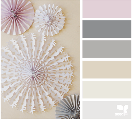
I loved the geometric shape of the fans. I was also watching TV, again, and saw a sonar-radar. This is an abstract view of the sonar-radar. This is one of my favorite designs this week (along with 2 March).
4MAR_2016

I tried using the pink as well in the design and it just did not work (in my opinion).
4MAR_2016(1)

Hope you found some inspiration this week. I will be back tomorrow, with Blue: Colour Blog Series post (and winner’s from last month).

Please Note: If you would like to make or use one of my designs, please email me (ml_wilkie(at)hotmail(dot)com) or leave a comment below. I am happy to talk with you on options and provide the relevant measurements etc. or have you test out a pattern. Also, if you use one of my designs, please use the following text to credit me the design: “Designed by Michelle Wilkie @ Factotum of Arts”.