Category Archives: Quilt Design a Day

QDAD: February Designs so far

I can’t tell you how much I have enjoyed design work this month. Even more exciting, I also got to present and share a program on quilt designing at our local guild meeting this past week.  I want to continue to share my process here, so this post includes couple iterations on the

10 February

Screen Shot 2016-02-22 at 10.20.37 PM

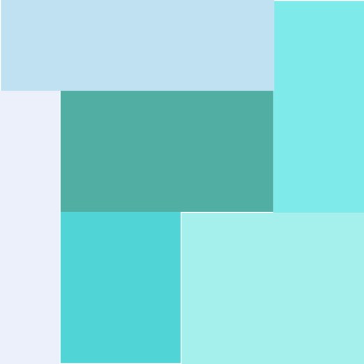
Not my favorite color palette, I did love the sparsity between the shapes in the image. I tried to include that by using a single line within a square and alternating the direction.

10Feb_2016

This design was still not sparse enough for me so I included some solid square blocks to add the space I think it needed.

10Feb_2016(2)

11 February

Screen Shot 2016-02-10 at 5.42.19 PM

This is a fabulous color palette, that surprised me. I was thinking not to include the dark green but in the end, it totally works. The design for this was inspired by homemade tree house ladders, the makeshift ones that are nailed to the trunk. I like the balance of the colors and negative space in this design.

11Feb_2016(1)

12 February

Screen Shot 2016-02-13 at 11.11.23 AM

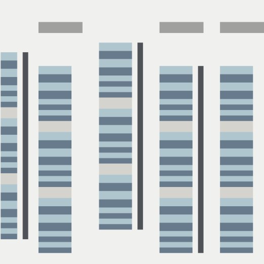
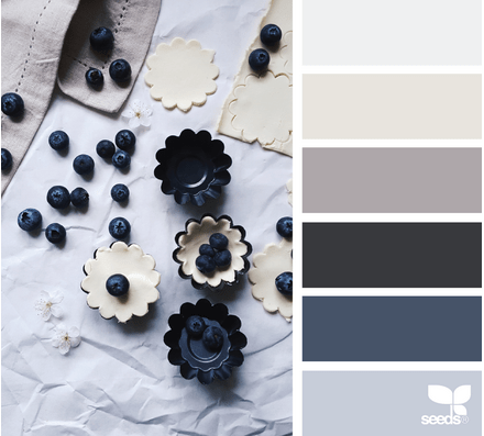
I wanted to redo an older design when I saw this palette, from December 2014. My design aesthetic, I think, has matured and become more unique style. While I like this design I find it very busy.

QDAD_Tudor_10Dec

So,  my goal, is to take elements from this design and use them in a more minimalist design. I decided to use the split alternating lines and using the 4 quadrants. This is my new design, love the lines, and the composition.

12FEB_2015(1)

15 February

Screen Shot 2016-02-15 at 1.01.25 PM

This design came about from a dress that was on a TV show for about 3 seconds. It had a block design on it, exactly what I wanted to play around with. I was not sure the direction I was taking with this design at the time. Now, I think the reds for me represent the heart chambers and the Aorta, perfect for this Valentine’s Day palette. This is on my make list for sure, and I am thinking of using the Ruby Red Oakshott Cottons for the vibrant colors.

15Feb_2016(1)

17 February

Screen Shot 2016-02-18 at 9.49.43 PM

I loved this color palette, but I found it very hard to work with in a design. Keeping with the limits though, this is my design after 20 minutes of playing around.

17FEB2016

19 February

Screen Shot 2016-02-18 at 9.55.36 PM

I am loving these red palettes, which to me is so strange, since red is not my go to color for quilts. Following up on working with blocked red color from my previous design, I came up with this one with hints of structure/shape with the neutral colors. I like this one as well but the Valentine’s Day one is still my favorite.

19Feb2016

20 February

Screen Shot 2016-02-19 at 10.52.58 PM

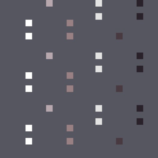
I was not rapped about the browns in this palette or the circle inspiration. Instead I wanted to play with squares and quadrant designs, inspired by Denyse Schmidt. I actually came up with two designs, this being my first:

20Feb2016

I was thinking for this second one that maybe the distinct quadrants needed to blend a little more. I go between both of these designs, trying to decide which one I prefer. Today its the top one but the other day I liked the one below :-).

20Feb2016(2)

More designs at the end of the month.

Please Note: If you would like to make or use one of my designs, please email me (ml_wilkie(at)hotmail(dot)com) or leave a comment below. I am happy to talk with you on options and provide the relevant measurements etc. or have you test out a pattern. Also, if you use one of my designs, please use the following text to credit me the design: “Designed by Michelle Wilkie @ Factotum of Arts”.

QDAD January

I have been enjoying the bit of spare time, I have had, designing new quilts using the inspiration sparks. I actually like most of these designs, this week.

If you want to join in, come over to join our Facebook group “Quilt Design a Day“, you don’t need to design every day, and when you do limit your time to 15-20 minutes. You will be so surprised what happens over a couple of weeks or months.

24 January

Screen Shot 2016-02-13 at 1.54.20 PM

I liked the circular shape of the glass, lemons and cucumbers. I wanted to try to represent that in this design here as well.
24JAN_2016(1)

25 January

Screen Shot 2016-02-13 at 2.09.18 PM

This color palette is my favorite of the week. I also liked the text and decided to take the “Royal” and use that as the design element in this one but represent it with Braille.

25Jan_2016

27 January

Screen Shot 2016-02-13 at 2.14.33 PM

I was thinking about an elevator in a building, when this design popped into my head. I love the simplicity of this design.

29Jan_2016

29 January

Screen Shot 2016-01-28 at 8.39.02 PM

The somewhat miscellaneous items made me go with a set of miscellaneous blocks in this design. I wanted to go with an alternative grid approach and a focus to the left.

29Jan_2016(2)

02 February

IMG_3925-palette

The inspiration photo was taken while my family was on vacation at the outer banks. I loved the lines in this photo, so I used these in this design and pull the focus on the red.2Feb_2016(1)

05 February

Screen Shot 2016-02-05 at 12.43.00 AM

With the graduated color palette, I had to get this (possible) bias tape design out of my head. It had been percolating for about a month. Once I started, I came up with three possibilities, this being the last.

05_Feb2016(3)

The other two I also love, maybe I need to make them as a series.05_Feb2016(1) 05_Feb2016(2)

Please Note: If you would like to make or use one of my designs, please email me (ml_wilkie(at)hotmail(dot)com) or leave a comment below. I am happy to talk with you on options and provide the relevant measurements etc. or have you test out a pattern. Also, if you use one of my designs, please use the following text to credit me the design: “Designed by Michelle Wilkie @ Factotum of Arts”.

QDAD: Getting back into practicing

It has been a while since I spent time designing, so this month I decided to get back into it. Its been a little mixed to start which is normal – there are always designs I like and ones that I file away :-). Without giving it a go though, you never find the design you want to actually make.

January 15
Screen Shot 2016-01-31 at 11.36.51 PM

This design was influenced by the placement and direction I saw in the negative space of this photo. I used triangles as I find them best to represent movement.

Jan15_2016

January 17

Screen Shot 2016-01-31 at 11.41.11 PM

I loved the idea of representing the shutters in my design with the little roofs. As I was developing the shutters I liked the dark line of the hinges which I also incorporated.

17JAN_2016

I decided that my final design need to be a more dense representation of the shutters. So this landed up being my final design.
17JAN_2016(1)

January 18

Screen Shot 2016-01-31 at 11.43.46 PM

I loved the colors in this palette and wanted to somehow represent the flowers without them being to definitive, slightly abstract. There are a couple of placement things I will change if I make this.

18JAN_2016

January 19

I took this photo on a trip to Florence a while back. Florence was not my favorite Italian city but this bridge was amazing.
020_19-palette

The inspiration for this design is the roofs and the bridge form of Florence Ponte Vecchio.

20JAN_2016(2)

January 21

Screen Shot 2016-01-31 at 11.50.59 PM

I loved the white concrete brick placement around the windows in the middle building. I used that placement to make this ombre dot design.

21JAN_2019_2(1)

21 January

Screen Shot 2016-02-01 at 12.00.35 AM

I loved the stripey towel and the vertical lines of the deck. I used these lines in my design.

21JAN_2019(1)

January 22

Screen Shot 2016-02-01 at 12.02.29 AM

I wanted to play with prints using this palette. I have this idea for a design using the Speed bumps road markings. Lets see how this develops as I have another palette in mind as well.

22JAN_2016

January 23

Screen Shot 2016-02-01 at 12.04.18 AM

I love this palette, as it would be great for transparency design. I wanted though something very minimalist being inspired by a book I am reading on Ralph Hotere (NZ artist).

23JAN_2016(1)

Thanks for stopping by. You can check out my other designs on my QDAD page. If you want to join in check out our closed group on facebook (click join).

Please Note: If you would like to make or use one of my designs, please email me (ml_wilkie(at)hotmail(dot)com) or leave a comment below. I am happy to talk with you on options and provide the relevant measurements etc. or have you test out a pattern. Also, if you use one of my designs, please use the following text to credit me the design: “Designed by Michelle Wilkie @ Factotum of Arts”.