Coral/Peach: Guest Post {Heather Jones}

IMG_9487

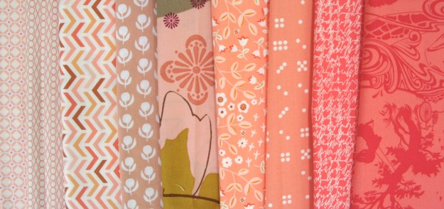
This month, our guest post is by Heather Jones. Heather is on the top of my list for most inspirational designers. She recently released her book, Quilt Local: Finding Inspiration in the Everyday, which is amazing, as it looks at the world around you and how you can transform that world into your quilt or piece of work. I also love her play with scale. I am looking forward to her new fabric line that was introduced at quilt market last week “Color Dash” (Robert Kaufman Designer).

Her blog post, this month, talks about how she introduced these colors into her quilts and learned to work with them. I think, those who are apprehensive of using coral and/or peaches will find this very useful.

Challenge Link-up

This challenge is a mini research project, and hopefully expanding your inspiration focus. Find an artist (fine arts – oil, printing, painting, drawing) who uses peaches and corals in their work. What other colors do they use with this color palette? Now try to recreate this color palette using your own prints and/or solids. Next week, I will provide you a link-up in the guest post introduction, to add your fabric pull with description of the artist (and link) to the pieces of work you were inspired by.

The prize this month is a 6 piece peach and coral bundle from Art Gallery Fabrics and a $20 Gift card from the Fat Quarter Shop. The link-up is open until 31st May (11:55pm). Winner will be announced in next month’s first post.

Peach + Coral: A Colour Blog Series

IMG_9487

This month is about one of my favorite colors, the peach/coral shades. When thinking about what to do this month, I realized I actually did not have that many projects, so this month you get to see some of my friends projects too.

Coral/Peach + Neutrals

Looking for soft looking projects, then the mix of peaches/corals with neutrals are a great choice.

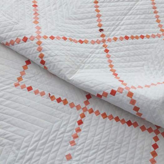
Melissa (IG: meliherboth) made this stunning version of Denyse Schmidt’s Irish Chain quilt using white + Peach/corals.
IMG_3649

Amy (IG: duringquiettime Blog: During Quiet Time)  mixed a neutral palette (white + grey) withe peaches and corals to make this crisp and clean-looking quilt “Melon Ice“. She even has a pattern available for this quilt.
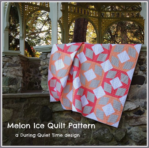
MelonIcePatternCoverbb

Coral/Peach + Warm

I love matching the coral/peach colors with other warm colors. This zipper pouch project was one of the first things I ever made with the Les Amis Fabric range.The peaches and brown’s that it came in that line, are some of my favorite brown prints today.
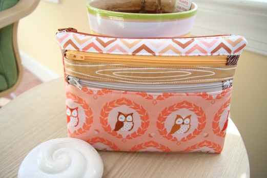
IMG_6997

Other great warm color combination’s that have worked with peach is this one. You will see more of this project soon, as it’s almost finished. The peachy colors used in this project adds depth, as they are lower volume than the oranges and purples.
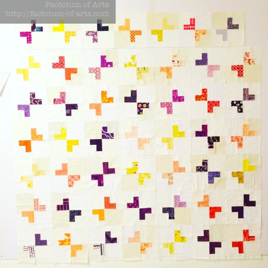
Mum_QuiltWiP

Coral/Peach + Cool

I also love a good mint or aqua match-up with coral/peach colors. These cooler colors make add a great balance to projects. This bag from Patchwork Please, was my first ever bag. I loved the play of patchwork of colors of coral, peach, yellow, purple, orange against the solid aqua pocket background.
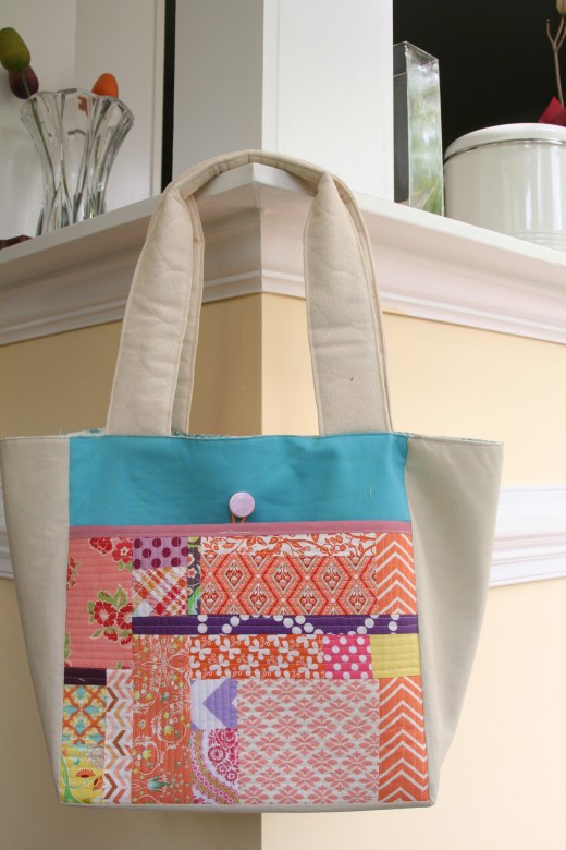
IMG_7164

Amy’s project “Pointed Statement” uses the deeper blues to give a great contrast to the peaches and corals. With the variations in shapes and the shades of the two colors, I love how your eye just can’t help but to wander over the quilt – provides great movement.2015-04-22-IMG_0489bb

Amanda (IG: amandadare31) used the peaches and cooler colors from the fabric line “Hello, Bear” to produce this amazing triangle quilt. This would make such a great neutral baby quilt. Screen Shot 2016-05-13 at 3.46.18 PM

Coral + Multi-colored

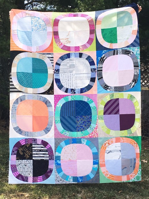
This last project, uses a great mix of warm and cool colors with peach + coral adding to the warmer palette. Sarah’s (IG: SarahSchrawDesigns, Blog: Sarah Quilts) has done a fabulous job interpreting Denyse Schmidt’s Single Girl Quilt vintage but modern feel to this quilt.
IMG_5153

I hope you have enjoyed seeing other projects from the quilting community this month.

Monthly Tip

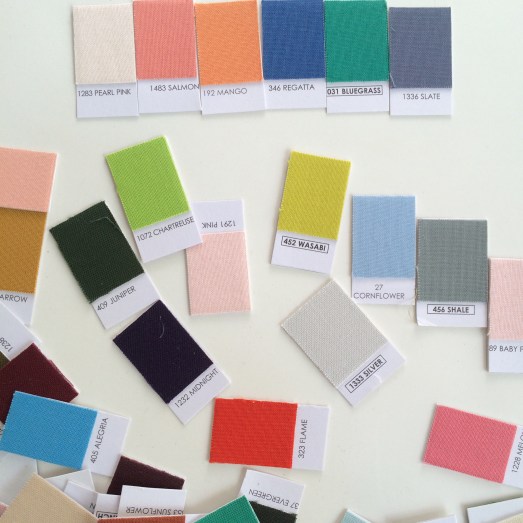
Do you have an old solids Color Card (eg. the kona color card)?
IMG_6244

Cut it up into individual pieces and play with finding a palette that works. I find starting with 4 colors is easiest and then think about the balance these 4 bring. Do you need to add more variation or depth, add an additional 2 colors. Note: More than 6 will make it more difficult and you could lose cohesiveness.

Monthly Resources

Books: Simply Color Series by Vanessa Christenson

Website: Color Matters

Monthly Challenge

This challenge is a mini research project, and hopefully expanding your inspiration focus. Find an artist (fine arts – oil, printing, painting, drawing) who uses peaches and corals in their work.  What other colors do they use with this color palette? Now try to recreate this color palette using your own prints and/or solids. Next week, I will provide you a link-up in the guest post introduction, to add your fabric pull with description of the artist (and link) to the pieces of work you were inspired by.

The prize this month is a 6 piece peach and coral bundle from Art Gallery Fabrics and a $20 Gift card from the Fat Quarter Shop. Winner will be announced in next month’s first post.

Winner for Last Month

I was so happy to hear how much you all are enjoying the posts. The winner of last month’s draw is Momi machts. I will be emailing you shortly to get your details.

 

Introspection {design process}

As some of you know, participating in Quilt Design a Day has been such a great activity for me. It has given me the ability to find myself as a quilter, find out what I like and don’t like, and given me the ability to focus. The thing I am most thankful for, is being more aware, opening my eyes to the world around me.  I would like to share with you all some of my experiences over a few blog posts, let’s try every two weeks to start and see where the journey takes us. There maybe even some link-ups, if you all are interested sharing, as we go on this journey. I would love to hear your thoughts and what you all see in your journey too.

mosaicae3f0a17578bb5268877ff674c597d75d6bf72e0

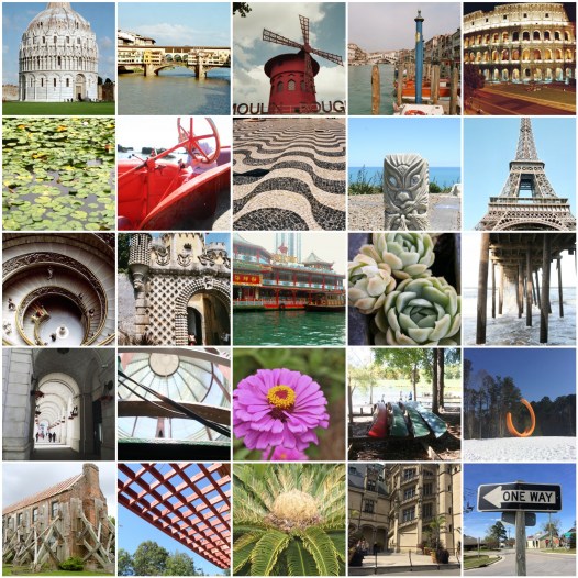
Have you noticed that we all have a natural ability to find things we like and that draw you in. Most of the time though, we don’t spent time in that moment, however I think that changes, at least for me, when you are on vacation or actually chosen to be in the moment. That’s why we take photo’s right.

Moment 1: OBX

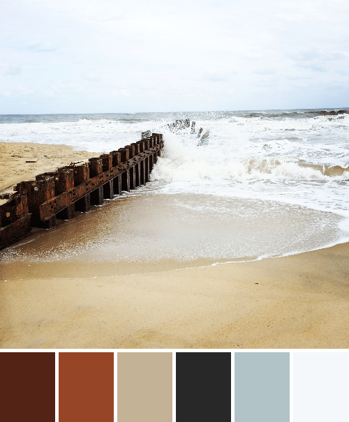
While on vacation at the Outer Banks, NC, we spent time at the beach by Hatteras Lighthouse. It has, what I think is an amazing remnant of a jetty or boat ramp. I find it so stark both within its environment (nature vs. man-made) and in color (dark vs. light).

IMG_3890-palette(1)

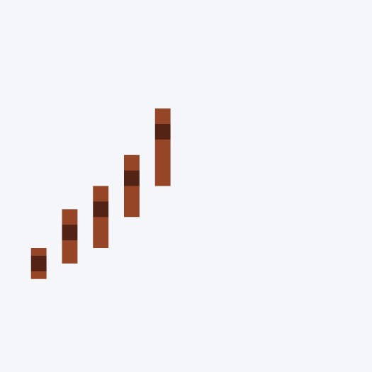
The color palette of this spark is very neutral and making this work as a quilt design was a bit of a struggle initially. I started with my usual minimal style with just using vertical lines to represent the jetty and it moving into the center of the picture.

temp

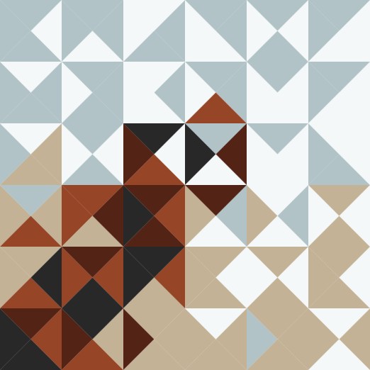
It was not enough for me and I felt it needed more in the background so I started playing with adding triangles. Once complete, the bars now were not as visible and I didn’t think they were required. I played around a little more with the balance for the representative jetty remnant, surf and sand. This was my final result:

02_May_2016

This turned out much better than I could image and I love the fact its more the idea it represents vs. the actual shapes that are in the spark.

Moment 2: Mosaic

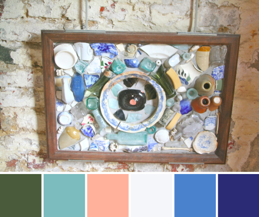
Walking through the slave quarters, at a Charleston plantation was very humbling. The history was felt and I loved the pieces that were in the quarters representing past lives. In one of the quarters was this mosaic of broken things that were unearthed.

IMG_8136-palette

This lead me a more traditional modern design for me, with the focal point of the circle and dark green bottle shard (with the coral dot) becoming a focal point also in my design. I liked the color palette for the blues/aqua and was automatically drawn to overlapping shapes. The hardest thing for me, in this design, was playing with the placement of the shape. Originally this shape was turned 45 degrees, which made it a more flat shape. After playing withe angles and placement, I like it much better on point.

01_MAY_2016(2)

Lastly, I played with the repeat. This is the final design, for now, but I am still thinking about thinning out the denser columns (removing maybe one shape from each column).
01_MAY_2016(3)

I hope you enjoyed my walk through and thoughts of my design process for these two.  I would love to hear your feedback or if you have questions or want to know more about something, please leave a comment below. Additional information on my quilt designs can also be found here:

  • QDAD page for a summary or instagram #qdad (for several other designs) #qdad2reality for finished quilts.
  • Quilt design class

Please Note: If you would like to make or use one of my designs, please email me (ml_wilkie(at)hotmail(dot)com) or leave a comment below. I am happy to talk with you on options and provide the relevant measurements etc. or have you test out a pattern. Also, if you use one of my designs, please use the following text to credit me the design: “Designed by Michelle Wilkie @ Factotum of Arts”.