I took a break over Christmas from designing, and it seemed to give me a new perspective of things. I have loved this first week of coming back. It is so hard to try to decide on a favorite this week!!
The palettes for the following designs are on the groups Facebook page.
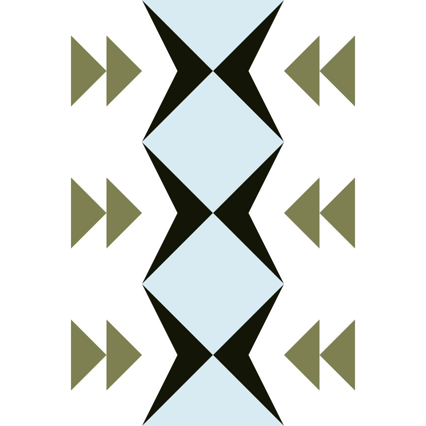
01 January: Defenses
This design was created based on the inspiration of the color palette photo, which was of the Great Wall of China. It represents the offense and defense of battle (with arrows as the symbol) meeting at the Great Wall. This was revision 2 and my favorite color way.

Revision 1 had the white and blue colors in opposite areas. Doesn’t it make such a difference to the design.

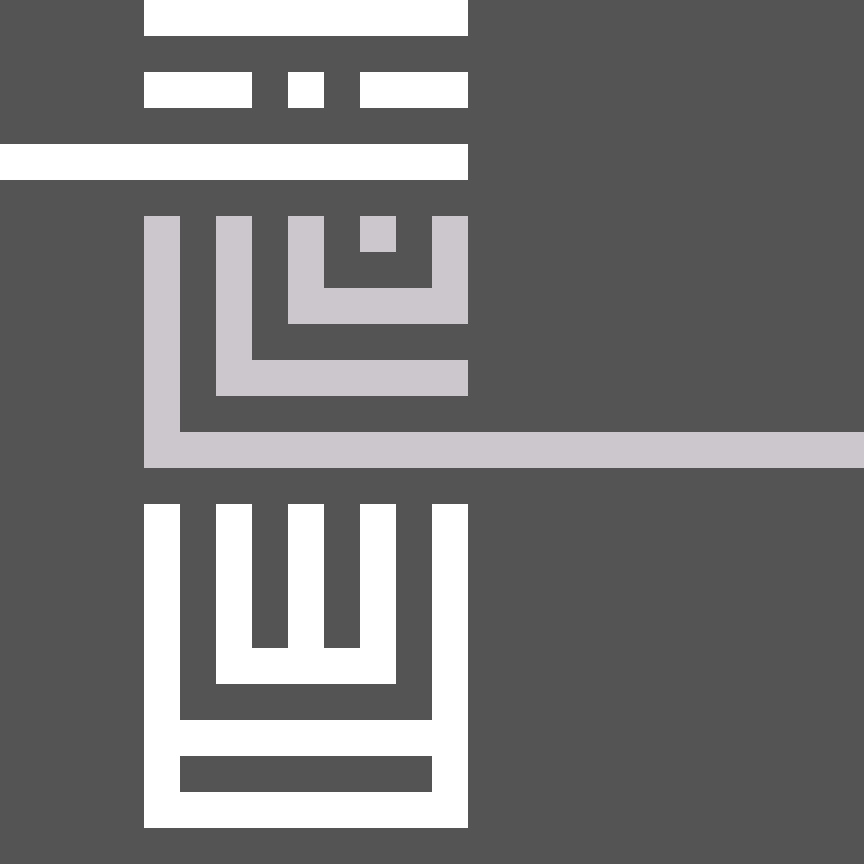
02 January: Temple Totems
Again, using the inspiration from the color palette photo of statues at an Indonesian temple, I created my own totem/statues. I loved the grey and white palette, adds simplicity and clarity to the design.

On a second revision I also really liked only using 2 of the 3 segments in the totem above, rotating the design and using a lighter shade of grey. I love both of these!!

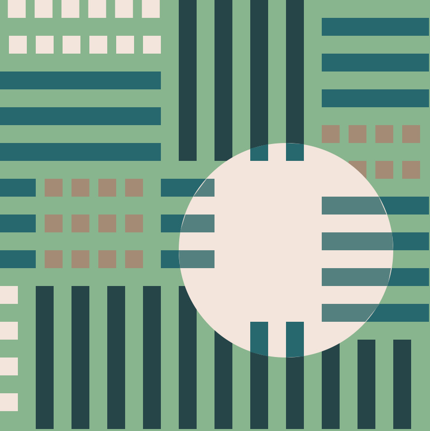
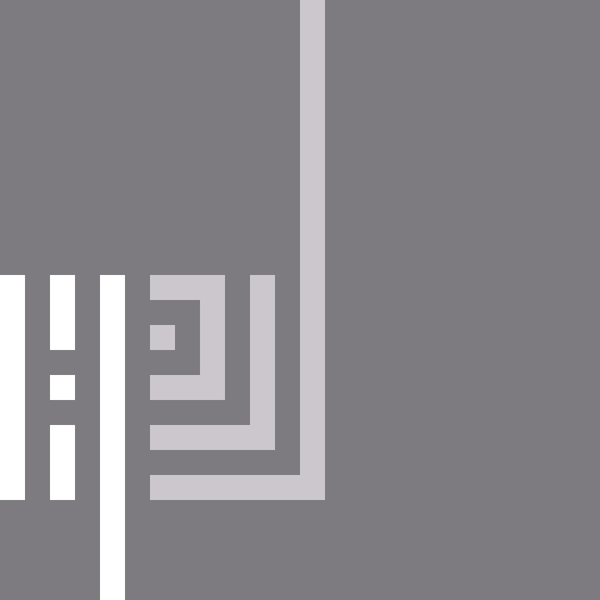
03 January: Architecture
This design was very interesting for me on how my thought process works. This is version 2, below is version 1. I found with version 1 that I liked it, but when I came back for a second view it was a little disjointed and more two halves. I decided to extend the black lines, and the white horizontal lines into the other halves to make it more cohesive….I love this version 2.


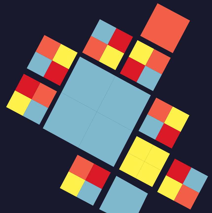
04 January: Utopia
This is a very different design to the other ones this week. The color palette perfectly matched with Utopia fabric line. I started this design with the crosses and stars but needed to some how have a filler space. The square-in-square block below the star works out really well.

05 January: Sewing Buttons
I started playing around with the circles that represented the buttons and button holes. I landed up making this more futuristic/spacey feeling design.
“Space: the final frontier. These are the voyages of the starship Enterprise. Its five-year mission: to explore strange new worlds, to seek out new life and new civilizations, to boldly go where no man has gone before.”

06 January: Wharf
The color palette photo was below a pier with the ocean – I loved this color palette. The symmetry of the pier and the ocean movement reminded me of fractals….hence this design.

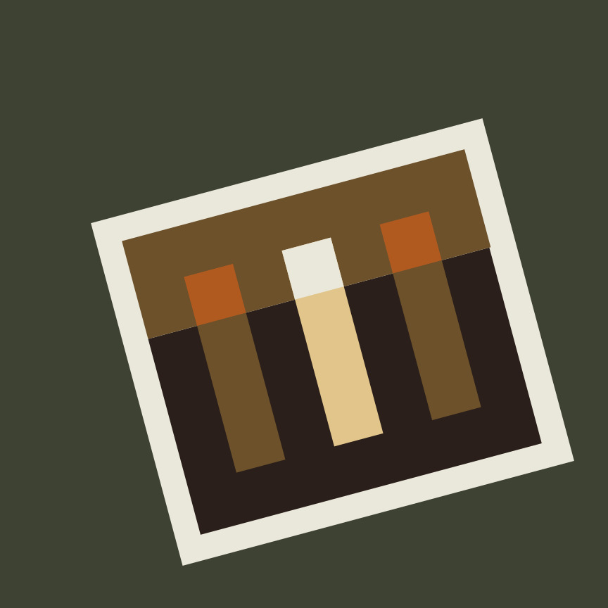
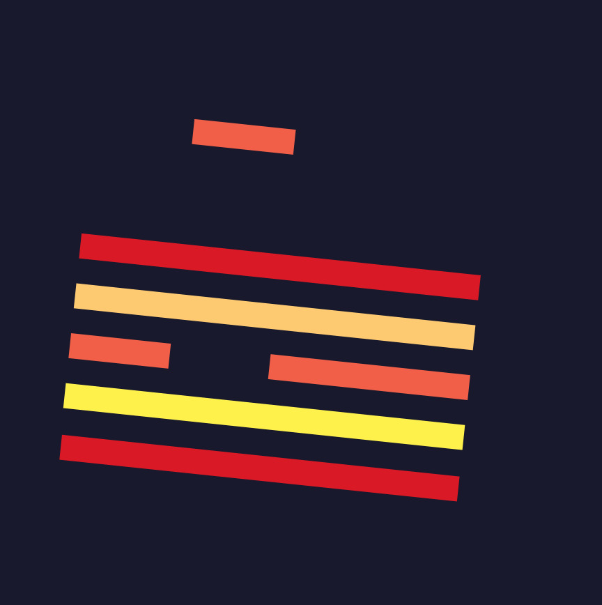
07 January: Ribbons in a jar
This design was a little more of a struggle. This was in fact my second design and the second version of the design. The previous designs and colors are below. I really liked the stripes and then the restriction of the lines to a given area (like the ribbons in a glass jar). In my house there is always some scrap that escaped my jar :-).


Please Note: If you would like to make or use one of my designs, please email me (ml_wilkie(at)hotmail(dot)com) or leave a comment below. I am happy to talk with you on options and provide the relevant measurements etc. or have you test out a pattern. Also, if you use one of my designs, please use the following text to credit me the design: “Designed by Michelle Wilkie @ Factotum of Arts”.