Tag Archives: QDAD

August QDAD

The set of designs, for this month, are all so different. I was inspired by folks like Clare Rojas, Lucienne Day, and Sherri Lynn Wood.  I really enjoyed the designs exploring improv. using various shapes (squares, triangles, stripes, and curves) from the 8th – 11th August. These designs were definitely my favorite of the month so far.

As the sparks (inspiration photo is not mine) don’t forget to check out the facebook page for the photos.

02 August: Coastal Village

The coastal village on the hillside spark had areas of color. I used these blobs of color in my design. I was also inspired by Clare Rojas work for this design.
QDAD_02August2015

06 August: Dragon Boats

A line of dragon boats inspired this simplified design. The lines end at various lengths based on the angle of the line of boats.

QDAD_06August2015(4)

07 August: Flowers
These colors reminded me of Lucienne Day and inspired me to play elements that were in one of her designs where she breaks areas into angles and using solid shapes and lines. Here is my individual block but the repeats are endless and make unique patterns.

QDAD_07August2015

The first one is a more regular pattern just using an inverse repeat but my favorite is the second design which randomly places the block at different rotations.QDAD_07August2015(1)        QDAD_07August2015(2)

08 August: Gridded Wire Frame

The gridded wire frame that was in the spark for this day, let me experiment with varying square designs that I had been collecting from various building facades.

QDAD_08August2015(2)

09 August: Car Show

Based on the squares the day before, and the inspiration I had experienced with Sherri Lynn Wood’s class, I decided I wanted to play with improv. only using triangles. I broke the areas into rows and sections and designed a piece at a time. This was the final design.

QDAD_09August2015

10 August: Casino Lights

The spark definitely had three distinct areas, the two sides and the foyer. Still in the mood, for improv, I used those sections to introduce improv design elements of triangles and lines. The foyer section in the design represented by the full columns. I was surprised with the color palette of this spark, I really enjoyed it and definitely would not put these colors together naturally.

QDAD_10August2015

11 August: San Diego Strip

In the spark, there were these unique curved lampposts in between the trees. These lamp posts and trees are represented by the left side of the design…playing with improv triangles and curves. Th right side with the more structural lines represent the building structures in the spark.

QDAD_11August2015(6)

12 August: Boardwalk Pier, San Diego

I was inspired by a blind and its reflection on the wall for this design. I do like the angles and the variations of the line widths in the design, though I would use a different color palette if I made this up.

QDAD_12August2015

Please Note: If you would like to make or use one of my designs, please email me (ml_wilkie(at)hotmail(dot)com) or leave a comment below. I am happy to talk with you on options and provide the relevant measurements etc. or have you test out a pattern. Also, if you use one of my designs, please use the following text to credit me the design: “Designed by Michelle Wilkie @ Factotum of Arts”.

QDAD: July

Lately, I have been so busy with other things that I have not spent a whole lot of time sewing/quilting or participating in Quilt Design a Day this month. I was lucky though ,to contribute the sparks (inspiration + color palette photos) in early July. Apparently, when I commit to doing the sparks, I can also commit to doing a design.

The sparks are all photos taken on various vacations, I have had. Have you ever taken a look through your photos and found quilting inspirations?? I have a different eye sometimes while on vacation….I think I am more open to see what is around me…so I see more design opportunities.

July 5: Moulin Rougue
imm017_18-palette

Love the dark moody colors this photo gave as a color palette….and how can you not use red while in Paris. The design is a minimalistic impression of the windmill blades.
QDAD_July5_MoulinRouge(2)

July 6: Ponte Sant’Angelo
imm014_15-palette

One of my favorite photos while in Rome. I love the view of Ponte Sant’Angelo from Castel Sant’Angelo key hole brick. It offered a stark neutral kind of palette. I choose to keep a simple brick layered design, color placement was important.QDAD_06JUL2015_CastelSantAngelo(1)

The original design had color placement a little different and I found it to noisy and made it look more like camouflage material.
QDAD_06JUL2015_CastelSantAngelo

July 7: Rossio Square
imm019_17-2-palette

I love this palette of dark greys, mustard, stone and red-brown. There was so much you can do with the design of the bricks in the photo but I had been flipping through a magazine and found the most amazing shelving units. I took what fascinated me in the furniture and turned it into this design.
QDAD_07JUL2015_RossioSquare(1)

July 8: Raglan
IMG_5020-palette

I love coastal color palettes. There is so much variety. I had an idea for a totem like design, inspired by the Maori sculpture in the picture and I had seen this great multimedia textile design which inspired the triangles and stripes.QDAD_08JUL2015_NZSculpture(1)

I also like this color way and couldn’t really decide between the brighter or darker versions.QDAD_08JUL2015_NZSculpture

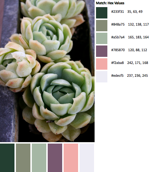
July 9: Raglan Succulents

IMG_4933-palette
For those of us who started out when we were using design-seeds as the photo inspiration, we have a few subject matters that we just cringe at. Succulents can sometimes be part of the list. So, I had a great chuckle to myself for posting this. I do love the color palette. Not my usual as it reads a little pastel.

I was inspired by a few Bauhaus prints for this one and chose several different elements from a few of those prints to put this triangle design together.

QDAD_09JUL2015_Succulent

I also love the darker palette with the plum as the background.QDAD_09JUL2015_Succulent(2)

July 10: Portugal Coast
imm002_2-42-palette(1)

I definitely have a thing at the moment for teals and coral colors. This color palette did remind me of a Lizzie House fabric line. I went with a simple design, again with lines of fractured color. This is not a bad design but with this color palette I would look at doing something different with it next time. QDAD_10JULY2016_LisbonCoast

Ah, that feels good to post some of the designs. I would love to hear what photo from your vacation inspires, or inspired any quilt design you may have made.

Please Note: If you would like to make or use one of my designs, please email me (ml_wilkie(at)hotmail(dot)com) or leave a comment below. I am happy to talk with you on options and provide the relevant measurements etc. or have you test out a pattern. Also, if you use one of my designs, please use the following text to credit me the design: “Designed by Michelle Wilkie @ Factotum of Arts”.


QDAD: Mid-March

I have been playing a bit of catch-up today. I was inspired by having some down time while traveling home today from Boston. Finally, I am posting some mid-March designs.

Please note the palettes for the following designs are on the groups Facebook page.

09 March: Tree-lined Street
I loved this palette, and this design is definitely on my make list and my favorite for this month. I am going to try out Nicole’s tutorial over @ Modern Handcraft.

QDAD_09March

10 March: Lines I
I started playing around with lines in this design. It was a hard color palette to work with.

QDAD_10March

12 March: Lines II – Creeping Ivy
Continued playing with lines. I think I want to make a quilt at some stage with the use of lines. I am just not sure if I have that design yet.

QDAD_12MARCH

13 March: Semi-Circles
I love this design, I just don’t like the colors. I think I will play with this a bit more and brave up to try my hand at curves.

QDAD_13MARCH

14 March: Diamonds
The text-y print in this design definietly balances out and makes the design. I like the mix of colors in the palette with the plums, mauves and pink + mustard, tan + black.

QDAD_14March

Please Note: If you would like to make or use one of my designs, please email me (ml_wilkie(at)hotmail(dot)com) or leave a comment below. I am happy to talk with you on options and provide the relevant measurements etc. or have you test out a pattern. Also, if you use one of my designs, please use the following text to credit me the design: “Designed by Michelle Wilkie @ Factotum of Arts”.