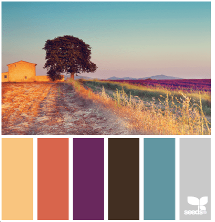
I have a little catching up to do today, with regards to my quilt designs a day. I will admit I took a week break in between but here are my last few designs (just over a week). Don’t forget if you want to join in the fun or just watch – go over to Facebook and check out Quilt Design a Day. Each of the color palettes below links back to the source @ Design seeds.
17 July:

Definitely not my favorite color palette, with all that pink and sweetness ;-). My first design was with a repeatable block which I like (obviously would make it in a different color though).
I decided it may look better with more of the blocks. It almost looks like a Granny Square in one large quilt…and I did like it better in the dense layout.
I didn’t mind this palette though I usually like coral with navy’s. I decided to go abstract with the design and play with triangles, straight lines and angles….like a flamingo’s legs.
19 July:

I love yellow. I think it is one of my many favorite colors. It always makes me smile. I really wanted to play with hexagons and triangle designs and wanted an aztec feel. Instead I came up with butterscotch toffee’s. I am not sure how I feel about this one, still….though I got great feedback from the group (thank you guys!!). I do like the secondary unaligned square that you get when you alternate the direction of the shape.
20 July:

I loved the green in this shot and decided to play with the broken rows from the rolling hills, and how the sun may play on those rows and make them lighter as it moves right.
I had a lot of fun with this color palette. I decided to make a start to a medallion quilt. The star which is made up of hexagonal shapes and the first border. 
Then two other possible color combinations, still using the same color palette inspiration:


Let me tell you, this color palette was totally out of my comfort zone, which is one of the reasons I decided to give it a go. I decided to see if there were things I could find around me, while on vacation. This is the first of a few that were designed with this theme in mind.
I was inspired by our beach umbrella shown here (photographed by me).

Here is the first attempt which is very geometric. Maybe too much like a pizza box.
So, I went to the abstract for the second attempt. Anne @ Play Crafts gave some great feedback with regards to the circles not being integrated…..which turned into the third and last attempt (and I might print this one off and hang on my wall as art).


Inspiration for my next designs (including some next week) will be from Savannah. The wrought iron work around historic downtown Savannah is fantastic. This gate lead to the inspiration for the design of the day.

I loved the simplicity of the gate design.

That’s it for this week. I hope you like the addition thought process and the photos of the inspiration. It is how I get from point A to point B.


Our group has grown to the point where I’m starting to miss designs which makes me so sad! I seem to have missed a lot of yours this week! That vineyard design I completely missed, and I really love it. It’s a simple concept but very evocative! And it would look wonderful as a quilt. 🙂 The flamingo legs one is also brilliant!! You are so good at improv design! Do you have any tips? 🙂 And I like your toffees, too. 🙂 Even if that’s not what you wanted. Okay, let’s just say they’re all brilliant designs, because they are.
You make me laugh with your talk of butterscotch toffees. I love the flamingo design. I don’t suppose it would hurt to change up the black to a navy if an actual quilt is to be made.
LOVE the flamingo and grey one. They’re all pretty great but that one is my favorite.
You are seriously rocking this challenge. I want to make the flamingo quilt and that yellow and brown palette has got me very excited. That’s for the inspirational kick in the a%#}.
Your July 18 Flamingo-colored design is amazing!