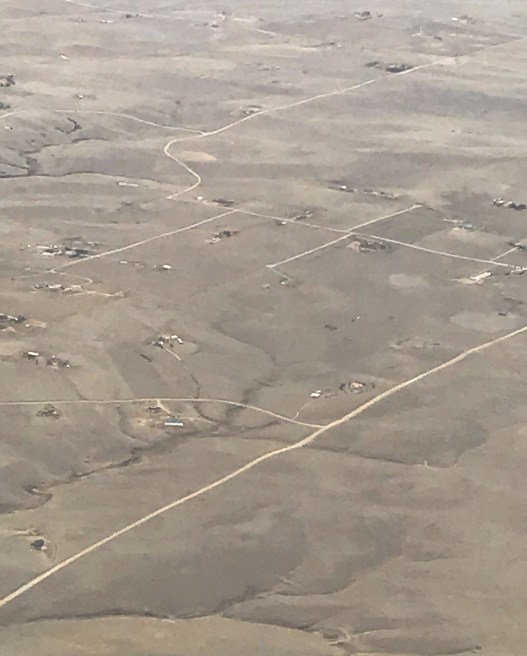
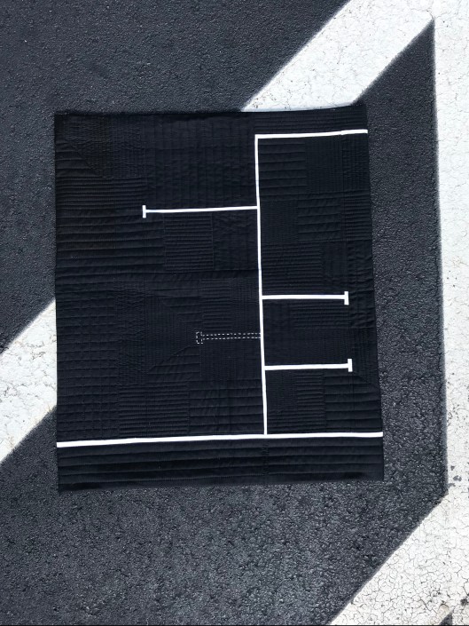
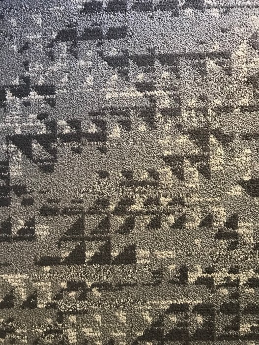
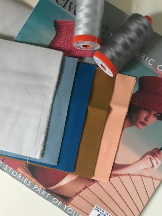
I am fascinated by what people miss seeing and experiencing on a daily basis. We all too often get stuck in a routine and distracted by our electronic, social media-based world. What details are we missing by not taking the time to really see and experience those things around us. I believe that with practice and intention, we can be inspired by patterns and design elements in objects we see or events we experience, every day. By seeing with intent, you could see the layered geometric designs of the concrete overpass structs, or the lines the bottom of a bamboo steamer or the unique pattern the moonlight casts through a window.
You can understand then, why my favorite part of making quilts is the design process of the quilt and then actually making that design into a quilt top. My typical process is finding elements in the world around me, photographing that image (the spark) and then creating a quilt design from that image. I love finding the geometry in things I see and looking at those individual elements and creating a design purely from one or two of the elements… breaking things down to the minimal components.
When I design and explore the elemental components, there are typically several editing and modification steps between the spark to final design. If I design on my computer instead of paper there are typically more iterations.
Let’s walk through a couple of spark to design processes that have been done using computer software. Note: I use Quilt Canvas which is a subscription based web tool.
Bridge
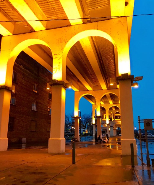
My friends and I were out for a drive at dusk in Nashville in February. I was in the passenger front side and as we went back to our apartment, we went under a bridge. I loved the arches and contrasting colors from the evening lights and the evening sky. As we drove this was the spark I captured through the car’s open window.
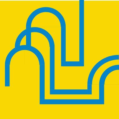
Fascinated by the arches and how they look stacked this was the first design which I really liked where this was going but the left bottom arch just kind of hung in nowhere.
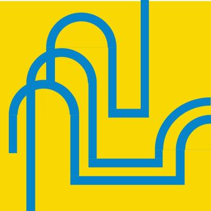
To continue the eye fully to the edge I extended the second arch through to the edge which I really liked but it still had the issue of the lower arch hanging in no mans land.
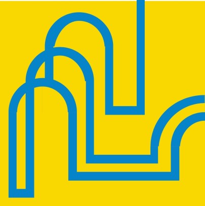
So what would happen if I joined the lines for the second and first arch in that bottom left corner. I loved the connecting lines and how they gave a little more flow and connectivity to the design.

Yes, I liked this but I think we needed to have less negative space in that corner, so I dragged those connecting lines down to fill the bottom left corner.
Now that the design was what I was looking for what if I played with the colors. I loved the color palette which was inspired by the palette of the photo. I think the additions of the orange and the red-brown adds interest and has a great 60s vibe.

This was the final design. Yet to be made but is on my to do list (which is rather long).
Carriage
This year I went to Marrakesh, Morocco with Amy Butler and Valori Wells. It was one of the most amazing and inspiring trips. The color and tile work everywhere was mind blowing. In one of our shopping adventures, Valori and I explored an alley behind some of the craftsman shops. At the back there was this old carriage. The geometry of the rectangles and curves captured my eye, those shapes just fascinated me.

First design was looking at the elements in the carriage, the rectangles of the stair like top, the curve of the undercarriage, then the rectangles of the body. I also had one that included the semi circle within the undercarriage curve but before I even saved the design I removed it as it just created additional noise.
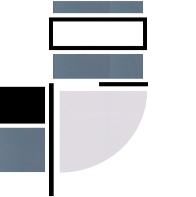
After the first design I questioned whether the curve was needed in the design, so I removed it. I really think that this was more due to the color I chose within that grey scale.
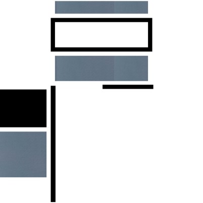
Deciding that the curve needed to be part of the design I added it back but played with other areas trying to get a better balance between the greys to make the curve more part of the design.

Finally, deciding that it was really the coloring was throwing the design off. I went to a pure two color design – red and white. I also made a couple of other simplifications:
- Removed the use of borders vs. filled rectangles on the top stair portion. I kept all the rectangles as solid shapes.
- Removed the second rectangle on the left side and representing this now by the lines and negative space
- I also moved the design over to the right, extending those rectangles and lines on the left column.

Again, wanting to make sure the curve was a good fit I removed it but decided to add it back, as I really like that curve. It was the core element that pulled me in originally.
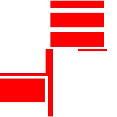
So, lastly after adding the curve, I shortened the line that was on the left that represents the edge of the missing rectangle. I liked the balance of this line and it stopping just over 1/2 way gave it interest, a hint that there is something in that space. It no longer creates a firm outline.

Let me know if you have any questions. Happy to answer anything around design/quilt design.