Author Archives: mlwilkie

Unknown's avatar

About mlwilkie

Software Developer, Mother, Wife with keen interest in art, design and crafts of all kinds.

Pink: A Colour Blog Series

IMG_6950

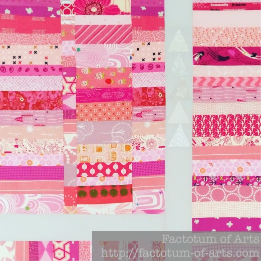
I think of pink and shudder. I know there are a lot of pink lover’s out there, I’m just not one of them. Lately though, I have found it’s really about the shade of pink or the saturation of the color that matters. There are so many variations. As an example, this quilt top is based on strip piecing pinks together. I found very early on that I needed to add a lot more paler pinks to balance out the more saturated/ higher value pinks.

Pink_Strip_Piecing

So I think it matters a lot with pink, which pink you actually like. I have found combinations that I really like and will use frequently like Shocking Pink and Orange. Here’s how I have used it in my quilts and where I like it.

Shocking Pink + Orange

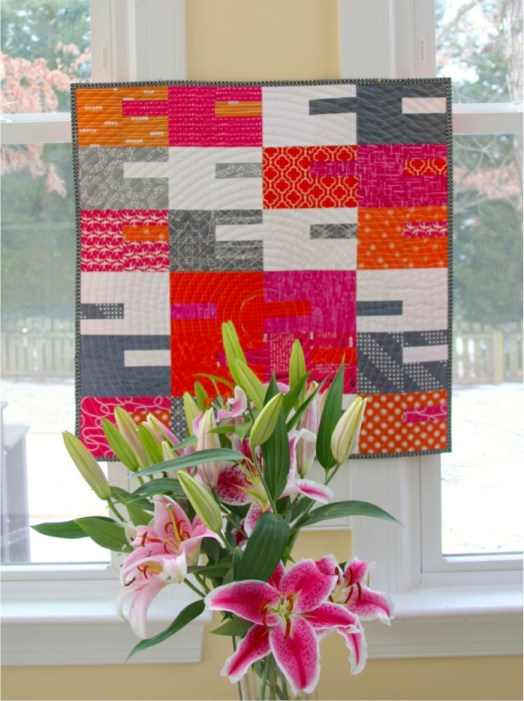
I find I love the Shocking/neon pink with an equally shocking/bright orange. These first two I use white and grey to balance those bright and saturated colors down.

Hot_proj2_pineapple
[Photo Credit: Love Patchwork and Quilting]

SoC_Mini_Hung

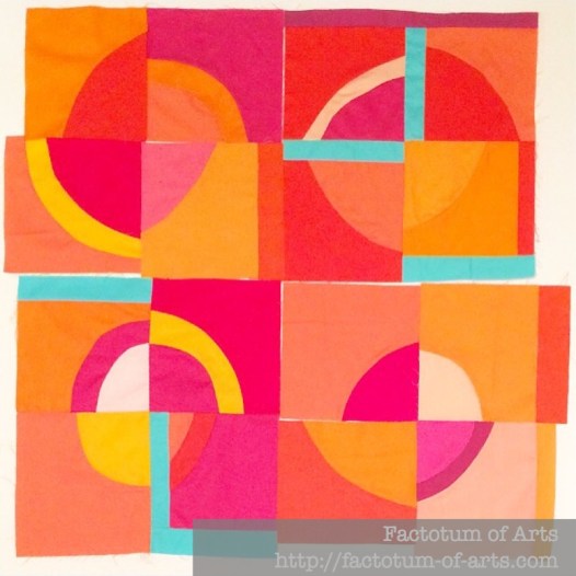
This last one in one of my latest WiPs which is using the pink as a secondary color with Orange being the main focus. Instead of Grey and white to add balance I have this pop of aqua which adds a focal point to the pink and orange circles.

Orange_Creamsicle_Blocks1-4

Pinks + Grey (Neutral)

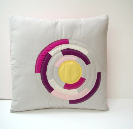
This example is showing how the same color but in a variety of shades, adds depth. The grey acting just as a background neutral (which I prefer more than white with pink) and then the yellow to bring in a point of focus.

Peach_Melba_Project_Finished

Pinks + Warm Colors

This is one of my favorite quilts, all warm colors and each represented well for balance. I love how the pinks bring in those lighter shades than and balances the darker purples. Without the pink and the yellow in the corner, I think it would be very flat (all the same level of saturation).

Neighbourhood_Finished_Front_Closeup

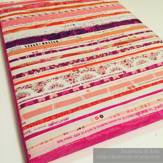
This handmade portable ironing board is made from a warm palette of selvedges, but again exhibits the balance pink brings to the warm palette.Selvedge_Ironing_Board

Pinks + Blues

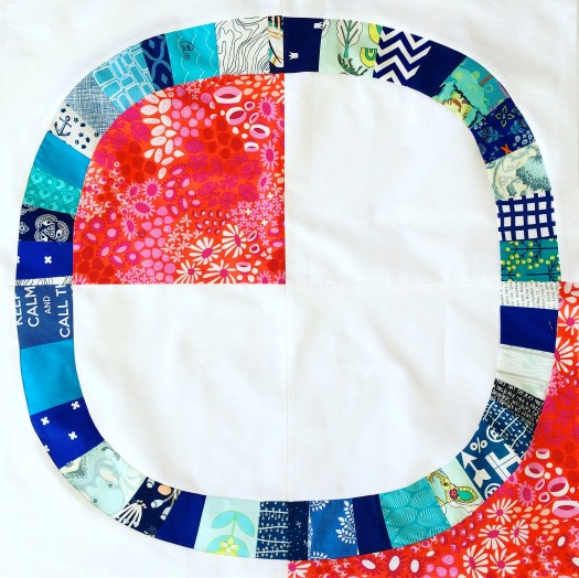
I am all for adding that pop of color to add interest to a quilt or block. I love the addition of this orange/pink Lizzie House print to the predominantly blue palette. It adds a great contrast.

IMG_6065

Monthly Tip

Color Paint Chips from a hardware store are a great way to play around with value. You can use them as is or cut them up and rearrange them yourself. Also many of the paint chips will have example/design cards on how to use those colors with other colors around your house etc. Why not use those palettes as a starting point for your quilt?

Monthly Resource

Playing with color and its variety are fun to play with. Try using quilty adult coloring books to explore a color or a palette.

Also look at the emotional / psychological response of a color.  Here is a link for Pink specifically, does this ring true for you?
http://www.empower-yourself-with-color-psychology.com/color-pink.html

Monthly Challenge

To get back into the flow of things, the challenge this month is to provide two palettes;

  1. exploring fabrics with various shades of pink
  2. exploring fabric palettes with pink and at least two other colors.

Prize this month is a $20 gift card from the Fat Quarter Shop.

Link up will be next week, August 24th and will be open for a week.

(Note: I use Big Labs Mosaic Tool to create the mosaic. To get the image URL right-click on the image and “Copy Image Location” and paste it into the tool).

Save

Save

Save

Save

Save

Fly Away Quilt {finish}

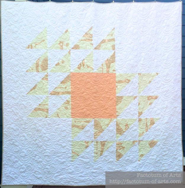
In June, for my birthday, Heather Jones came and taught a class for her Fly Away Quilt. We had so much fun, and it was one of the best birthday weekends I have had. I now have this great finish to remember my celebrations, as I have finished the Fly Away quilt.

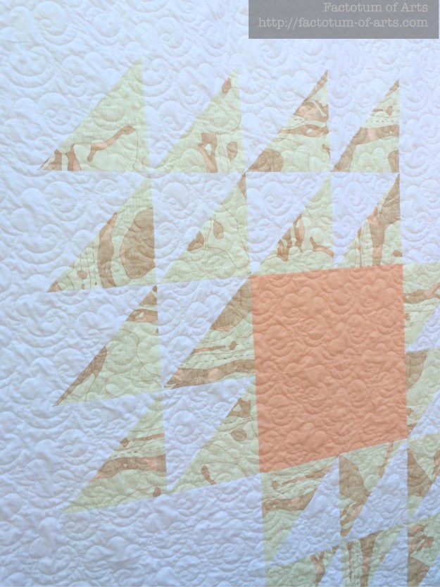
I wanted to make this quilt with a muted palette (in contrast to the Sunday Best quilt I was working on at the time). I choose to use a Kona Peach and White, and  a Carolyn Friedlander Carkai print.

Fly Away Quilt Front

I love how the top turned out with this muted color palette. I think, the Carkai print brings great texture with the print in each of the triangles, bringing lots of interest and things to investigate.

I decided to send the quilt of to Sarah at Crinkle Love for quilting. I wanted a curly design to balance the very geometric design. This is popcorn pattern, looking very cloud or wave-like. Fly Away Quilt Close_Up

The back is very simple in nature, both prints are from Carolyn Friedlander. Some of my friends, who attended the class gave me a signature block to add to the back as well.

Fly away quilt Back

Details

Name: Fly Away Quilt
Design:
Heather Jones (originating from a traditional block)
Fabric: Kona White;  Kona Peach; The Big One in Gold, Carkai, Carolyn Friedlander
Backing: Crosshatch, & Grid Diamond (Carkai), Carolyn Friedlander
Binding: Carolyn Friedlander, Carkai, Stitches in Parchment
Dimensions: 72″ x 72″
Quilted: Popcorn design by Sarah @ Crinkle Love

I will treasure it, and always remember this event :-). I highly recommend any of Heather’s classes. She is excellent.


Save

Daughter’s Love {a finish}

I have finally finished the quilt, I have been working on for my Mum. Making something for someone you love has been very humbling experience. Even more so, since my mum (as mentioned previously) has a brain tumor and currently undergoing Chemotherapy. This quilt “Daughter’s Love”, I hope will bring her comfort as I can not be with her.

The original design was inspired by the crosses/pluses that are in the stained glass window of a Scottish Castle.

imm023_24-palette

I thought the plus blocks in the original design looked a little heavy, so I removed two of the corners. Alternating the direction, also gave this great secondary square design.QDAD_29JUL2015

While I love the color palette in the original design, I decided to change it to suit my Mum more. Her favorite colors are orange and purple, hence the final colors of orange, purple, yellow, coral/peach, and magenta.  There are 98 different colored prints used, 20 white on neutral prints for the background with 4 neutral solids.

DaughtersLove_Finish

For the backing I used Tula Pink’s wide back print, Free Fall. It worked as such a great complementary print to the front of the quilt.

DaughtersLove_Back

I decided that, I didn’t want to continue the squares and lines with the quilting, so a spiral design it was. Little did I realize it would take a huge ~120 hours for the quilting but I love the end result. Thanks to everyone in the Instagram community that encouraged me through this 🙂 One of the other design decisions, was starting the spiral quilting in an off centered location, which just happened to be one of my favorite combinations of prints. The spiral quilting was 1/2″ lines using Aurifil #2021.

DaughtersLove_Quilting

In this close-up of the quilting center you can also see the use of some of the white on neutral prints.  The binding was not as easy a decision as I thought it would be. I was trying a dark orange but it did not work. I landed up using a coral based print with orange stripes (Carolyn Friedlander).

DaughtersLove_Binding

I will be releasing the pattern (pdf) for this quilt,  in various sizes, August 8th via my payhip shop. All sales, in the first month, will be donated to Cancer Society, New Zealand who help provide services to my Mum including accommodation while she was having treatment away from home.

Details

Name: Daughter’s Love
Design:
Designed by me
Fabric: 98 different colored prints, 20 white on neutral prints, 4 Kona solid neutrals
Backing: Tula Pink Free Fall wideback
Binding: Carolyn Friedlander, Carkai, Grid Diamond in Creamsicle Metallic
Dimensions: 70″ x 70″
Quilted: Spiral design, 1/2″ spacing, Aurifil #2021

Save