Author Archives: mlwilkie

Unknown's avatar

About mlwilkie

Software Developer, Mother, Wife with keen interest in art, design and crafts of all kinds.

Ideas != Attention || Focus

Sitting here thinking of work and programming so I had the urge to use it in my title. So, for my programmer friends out there Ideas != Attention || Focus (Ideas not equal to Attention or Focus). It is crazy, I literally have a stream of ideas at the moment, which is a good thing. The drawback is I have not been able to give enough attention or focus to one project to finish it.

The two projects I would like to finish in the next two weeks are my Spoonflower sampler quilt (only 68 weeks old) and my Mum’s quilt (8 weeks old). I am still quilting the sampler quilt but I probably only have 1-2 hours left on this quilt.

SpoonflowerSampler_Quilting

My Mum’s quilt, I need to baste and start the quilting.
MumQuiltTopComplete

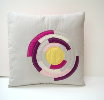
One of my new projects was based on a design I made in February. I think I am calling it “Beating heart” since it was my inspiration and it was Valentines Day.
Beating_Heart

Hopefully, I can finish at least two projects this weekend. Fingers crossed. Linking up with Lee over at Freshly Pieced for WiP Wednesday (button to the right).

QDAD: February Designs so far

I can’t tell you how much I have enjoyed design work this month. Even more exciting, I also got to present and share a program on quilt designing at our local guild meeting this past week.  I want to continue to share my process here, so this post includes couple iterations on the

10 February

Screen Shot 2016-02-22 at 10.20.37 PM

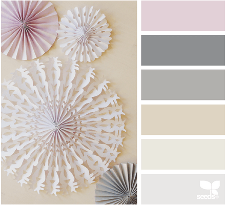
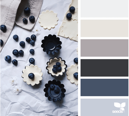
Not my favorite color palette, I did love the sparsity between the shapes in the image. I tried to include that by using a single line within a square and alternating the direction.

10Feb_2016

This design was still not sparse enough for me so I included some solid square blocks to add the space I think it needed.

10Feb_2016(2)

11 February

Screen Shot 2016-02-10 at 5.42.19 PM

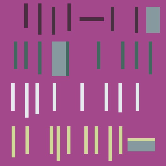
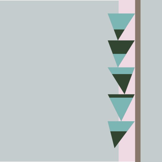
This is a fabulous color palette, that surprised me. I was thinking not to include the dark green but in the end, it totally works. The design for this was inspired by homemade tree house ladders, the makeshift ones that are nailed to the trunk. I like the balance of the colors and negative space in this design.

11Feb_2016(1)

12 February

Screen Shot 2016-02-13 at 11.11.23 AM

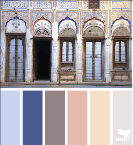
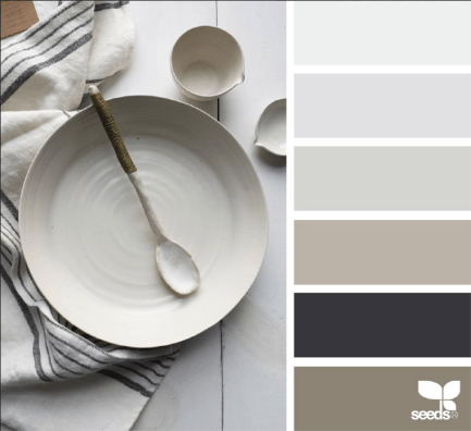
I wanted to redo an older design when I saw this palette, from December 2014. My design aesthetic, I think, has matured and become more unique style. While I like this design I find it very busy.

QDAD_Tudor_10Dec

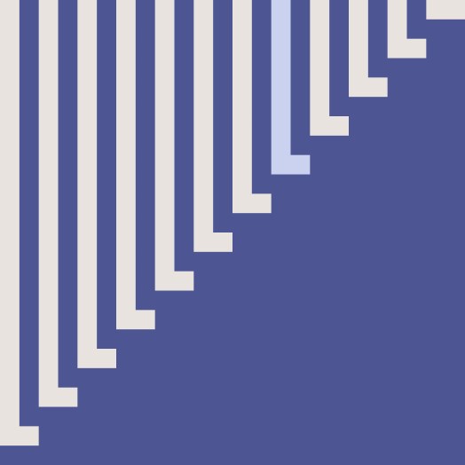
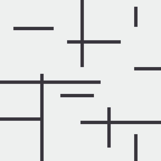
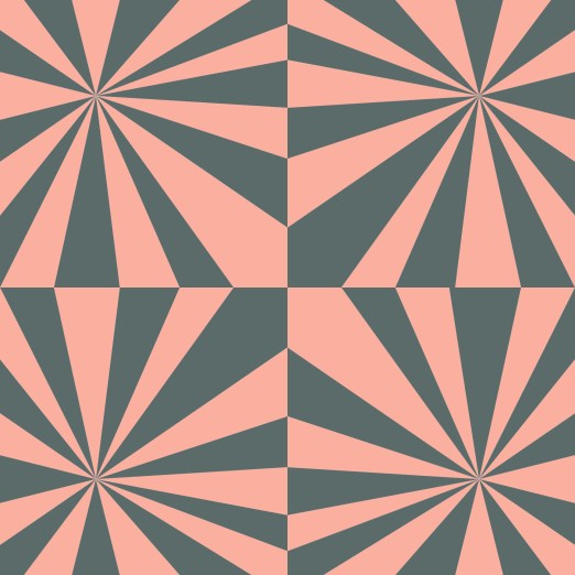
So,  my goal, is to take elements from this design and use them in a more minimalist design. I decided to use the split alternating lines and using the 4 quadrants. This is my new design, love the lines, and the composition.

12FEB_2015(1)

15 February

Screen Shot 2016-02-15 at 1.01.25 PM

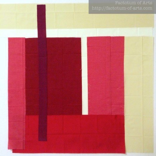
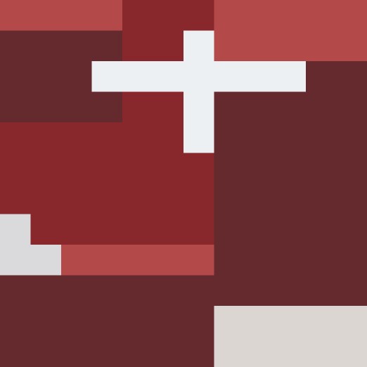
This design came about from a dress that was on a TV show for about 3 seconds. It had a block design on it, exactly what I wanted to play around with. I was not sure the direction I was taking with this design at the time. Now, I think the reds for me represent the heart chambers and the Aorta, perfect for this Valentine’s Day palette. This is on my make list for sure, and I am thinking of using the Ruby Red Oakshott Cottons for the vibrant colors.

15Feb_2016(1)

17 February

Screen Shot 2016-02-18 at 9.49.43 PM

I loved this color palette, but I found it very hard to work with in a design. Keeping with the limits though, this is my design after 20 minutes of playing around.

17FEB2016

19 February

Screen Shot 2016-02-18 at 9.55.36 PM

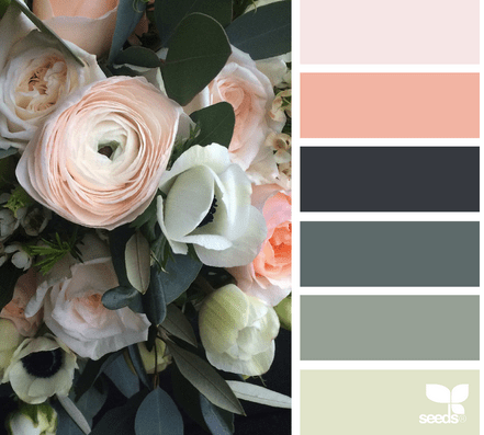
I am loving these red palettes, which to me is so strange, since red is not my go to color for quilts. Following up on working with blocked red color from my previous design, I came up with this one with hints of structure/shape with the neutral colors. I like this one as well but the Valentine’s Day one is still my favorite.

19Feb2016

20 February

Screen Shot 2016-02-19 at 10.52.58 PM

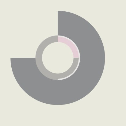
I was not rapped about the browns in this palette or the circle inspiration. Instead I wanted to play with squares and quadrant designs, inspired by Denyse Schmidt. I actually came up with two designs, this being my first:

20Feb2016

I was thinking for this second one that maybe the distinct quadrants needed to blend a little more. I go between both of these designs, trying to decide which one I prefer. Today its the top one but the other day I liked the one below :-).

20Feb2016(2)

More designs at the end of the month.

Please Note: If you would like to make or use one of my designs, please email me (ml_wilkie(at)hotmail(dot)com) or leave a comment below. I am happy to talk with you on options and provide the relevant measurements etc. or have you test out a pattern. Also, if you use one of my designs, please use the following text to credit me the design: “Designed by Michelle Wilkie @ Factotum of Arts”.
Yellow – Melanie Tuazon

IMG_5767

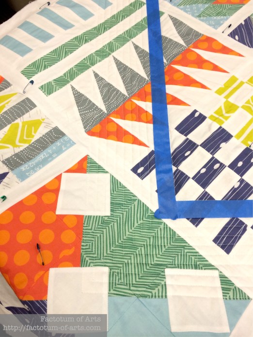
Our first guest on this colour blog series is Melanie Tuazon. Melanie is a quilter and designer who lives in New Jersey. She blogs at melintheattic.com and posts on Instagram as @melintheattic. She is a former president of the North Jersey MQG and has had quilts in the Quiltcon 2015 and 2016 shows. Her quilts can also be seen in the Winter 2015-2016 issue of Stitch and the Quiltcon 2016 issue of Modern Patchwork. Her quilt is this month’s MQG Quilt of Month, which is fantastic!! Check out her blog or the MQG site (if you are a member).

“I love playing with color in quilts because my feelings about the colors change throughout the process. It lets me develop a relationship with a certain shade or hue, and how it can shift depending on the colors that are adjacent to it. I never even liked yellow much before I started quilting, and using it in my quilts made me fall deeply in love.”

Her post on her process and yellow can be found here.

Challenge / Give-away

This month’s challenge is sponsored by two great companies.

The first is Robert Kaufman who is providing the winner 1 yard Highlight, the Kona Cotton Solids 2016 Color of the Year.
Screen Shot 2016-02-08 at 5.27.01 PM

Also, the Fat Quarter Shop is providing a $20 gift card.

FQS-logo
The Challenge this month,  is to make your own 3 x 3 mosaic palette of  (9) prints, that features yellow as the main color (I recommend at least 1/3 of the palette). Please post the mosaic, that is linked to either:

  • a blog post explaining your process/inspiration (feel free to grab the widget above to display on your blog),
  • or to an Instagram pic (using the url),
  • or a Flickr pic (using the url).

Add your mosaic by clicking onto the button below, and a winner will be announced after 9pm Tuesday 23nd February. I hope you all have fun.

(Note: I use Big Labs Mosaic Tool to create the mosaic. To get the image URL right click on the image and “Copy Image Location” and paste it into the tool).