Category Archives: Colour Blog Series

Yellow – A Colour Blog Series

IMG_5767

I find yellow one of the hardest prints to buy online, as it varies greatly. Is it bright yellow or mustard or ochre?? It’s also hard to find a good bright yellow print.

Yellow + Cool

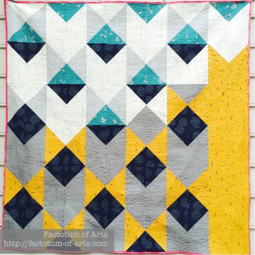
One of my recent finishes, inspired by a Moors Palace in Portugal, allowed me to use a great mustard color with these great cool colors of navy blue and aqua.

Moorish_Pyramids

Katarina Roccella’s Imprint line for Art Gallery Fabrics: mosaic66dd6f67f6c01b3e29004f5b173cc33cd9ebb1c2

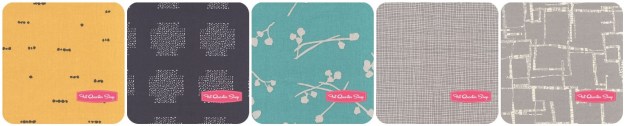
Or how about a mix of blues and a little purple, and yellow’s as a feature/focus. 

IMG_7245
mosaic4c2a7df43633024f24250a849b6ec366b7ed2b71
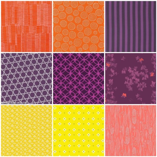
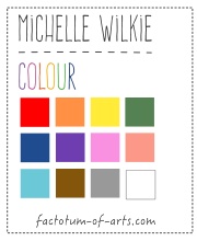
1. Cotton + Steel; 2. Alison Glass; 3. Art Gallery House Design; 4. Lizzy House; 5. Karen Lewis; 6. Skinny LaMinx; 7. Jeni Baker; 8. Lizzy House; 9. Leah Duncan

Yellow + Warm

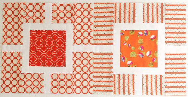
Last month, on the Orange post there was a great warm print palette that included yellow. So what about yellow in projects with solids??

This project, Peach Melba, is a tutorial I did for Sew Mama Sew, I loved the yellow with the mix of pinks and berries in this project. I used Kona Cotton Buttercup, Berry, Cerise, Baby Pink with Ash Grey and Bone.

IMG_0177

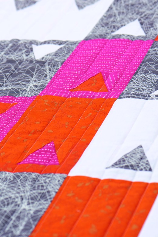
One of my WiP’s is this quilt top, Rangers Station, using the amazing bright Oakshott cottons The middle block is made from their autumn bundle, which have those brilliant yellows, and then the border is Lipari (08)).Rangers Station Quilt Top

Yellow + Neutrals

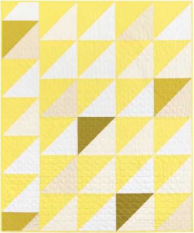
Bright yellow and white solids is one of my favorite combinations, though I have not made a quilt with just these colors. I just love the crispness and brightness of these two colors together.

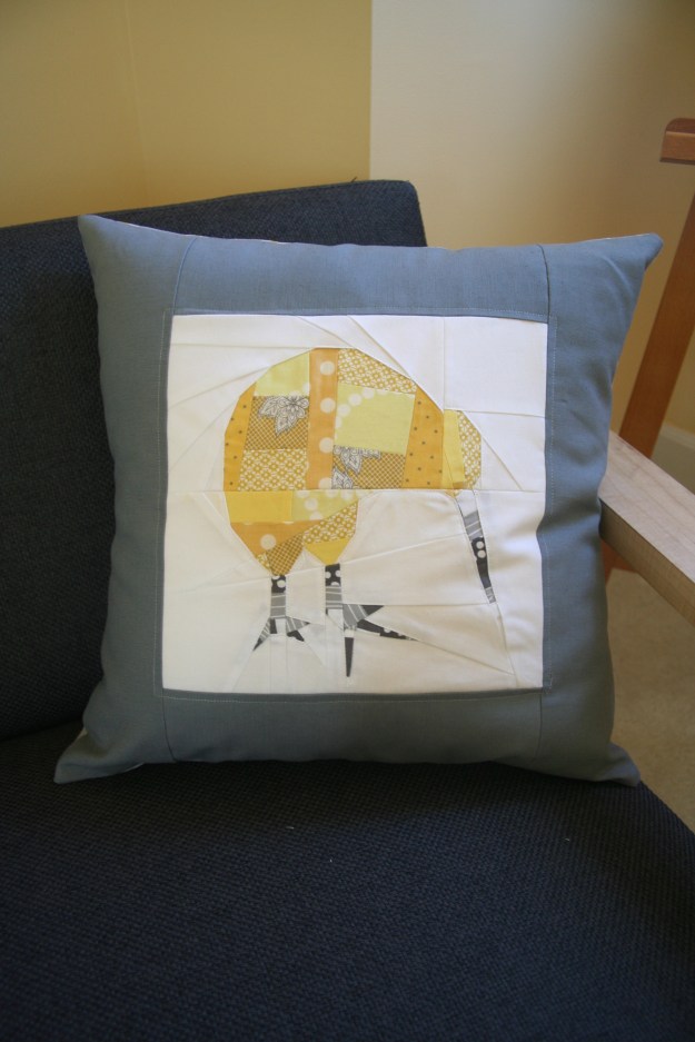
Yellow and Grey is a great combination. One of my first ever projects, when I started sewing, was a patchwork yellow, grey and white kiwi which I love.

IMG_7005

Monthly Tip

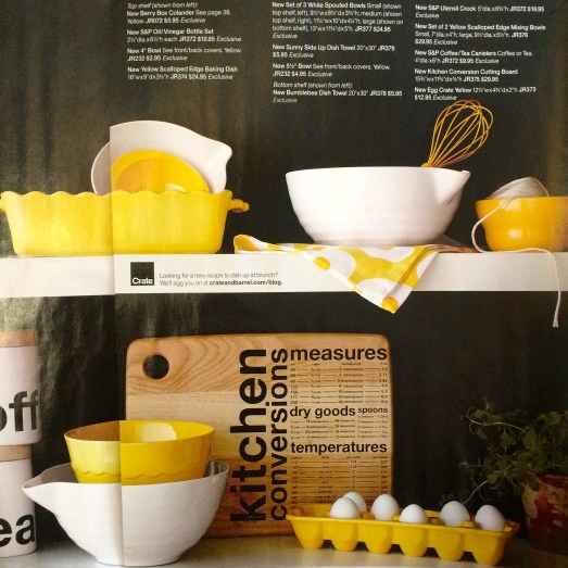
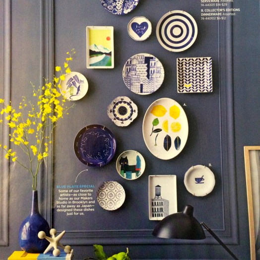
Use design or retail magazines as inspiration for your color palettes. Here are some examples:

  1. Architecture/Design magazines feature great modern palettes. My favorite US based magazine is Dwell.

yellow-sliding

2. Retail Store Magazines, my favorites in the use are West Elm, Crate and Barrel (+ CB2).

Yellow + Neutral
IMG_5754

Yellow + Blues
IMG_5755

Monthly Resources

Book: Color Theory: A essential guide to Color by Patti Mollica

Website and Tool: Design Seeds  – A site that offers two color palettes each day, great resource.

Monthly Challenge

This month’s challenge is sponsored by two great companies.

The first is Robert Kaufman who is providing the winner 1 yard Highlight, the Kona Cotton Solids 2016 Color of the Year.
Screen Shot 2016-02-08 at 5.27.01 PM

Talk about some great yellow inspiration, check out their Lookbook here. Two of my favorite quilts, that they will be providing as kits in March, are:

Heather Jones’ Trip the Light, I love the use of highlight, pickle, wasabi, white, snow and oyster.

Screen Shot 2016-02-08 at 5.15.07 PM

and Carolyn Friedlander’s Blake Quilt, that mixes in some of her neutral low-volume fabrics from Architexture and Doe with Kona solids highlight and pickle.Screen Shot 2016-02-08 at 5.14.46 PM

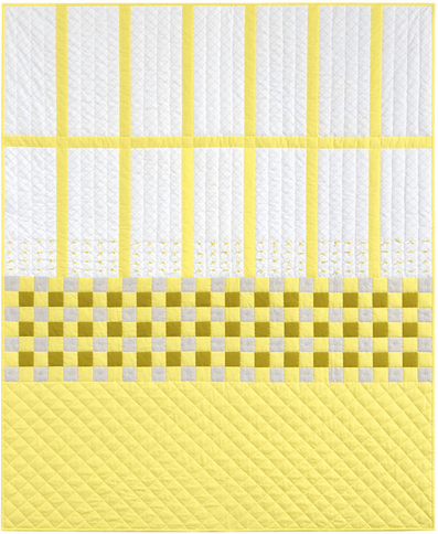
Also, the Fat Quarter Shop is providing a $20 gift card. ColorWidget
The Challenge this month,  is to make your own 3 x 3 mosaic palette of  (9) prints, that features yellow as the main color (I recommend at least 1/3 of the palette). Please post the mosaic, that is linked to either:

  • a blog post explaining your process/inspiration (feel free to grab the widget above to display on your blog),
  • or to an Instagram pic (using the url),
  • or a Flickr pic (using the url).

To give you time to explore your palette, the link-up will open around the 15th February (next color series blog post), and a winner will be announced by 8pm Monday 22nd February. I hope you all have fun.

(Note: I use Big Labs Mosaic Tool to create the mosaic. To get the image URL right click on the image and “Copy Image Location” and paste it into the tool).


Orange – A Colour Blog Series

IMG_5725

Orange is one of my favorite colours. I use it often in my quilts/ quilt blocks. It is so versatile and my favorite way of using it is as a pop to add visual interest.

Here are some examples on how I have used orange with a current fabric mosaic.

Orange
IMG_5484

The trick with using all one color (ie. Monochromatic) is making sure you have variation, which can be achieved with different volumes (inside square high volume, outside low volume), or with various shades of the same color.

Tip for Monochromatic: Try using a camera and taking a black and white photo to see if you have enough variation in your fabric selections. You should see a gradation.

mosaic10608d2471225cdc12bdc8c81651447620abf6b5
1. Lizzie House ; 2. Carolyn Friedlander; 3. Frances Newcombe; 4. Alison Glass; 5. Anna Maria Horner; 6. Denyse Schmidt; 7. Downton Abbey; 8. V & Co. ; 9. Leah Duncan

Orange + Warm

The other option to add depth and using orange, is to use other warmer colors (ie. An Analogous color palette). My current WiP was based on orange but I found I needed more depth so I added purples, magenta, yellow and coral/peach.

I find the Analogous color palette one of the easiest to do as the colors are in the same “family” or part of the color wheel so they always seem to work, no matter what print you use.

Mum_QuiltWiP

With this palette purple does stand out better than the orange due to its darkness, so you may choose to drop that. For my purposes it worked well.

mosaic792f2c1b24178952204fabbf046503790d5d4091
1. Carolyn Friedlander; 2. Karen Lewis; 3. Tula Pink; 4. Lizzie House; 5. Rashida Coleman Hale; 6. Katrina Roccella; 7. Leah Duncan; 8. Lizzie House; 9. Sarah Jane

When using a warm palette, but very vibrant versions of pink and orange, what about thinking of adding balance with neutrals like white and grey.

Project_hot_d9

Orange + Neutrals

I use orange and neutrals a lot together, as this gives orange the role as a focus color. You don’t have to use a lot of color with neutrals for this to be true. Play around with solid greys, whites and blacks; featured here are all Kona cottons (First print: Titanium, Torch, Pepper, Shadow; Second Print: White, Torch, Oyster, Putty, Shadow).

FabricArtBlocks

The main print in this next example is by Yoshiko Jinzenji for Yuwa Fabric. The grey, oyster and navy blue print (that appears black) are Karen Lewis hand printed fabrics. I love that pop of colour among the neutrals for visual interest and draws your eye into the quilt.

Unnamed_FinishQuiltTop

Orange + Blues

With this example,  I used mostly blues but wanted to add a pop on the edges. I tried Teal, aqua and blue but landed up deciding that the orange was a perfect complement  to the extreme blue palette.
IMG_5652

This works as it is loosely based on a triadic (complementary) color palette but I dropped the green that would be included.

mosaic45df1d3aa2fe29f989f6b10a62711fde196f4a3e
1. Carolyn Friedlander; 2. Cotton + Steel; 3. Jeni Baker; 4. Karen Lewis

Monthly Tip

If you are unsure about building a color palette and you don’t want to stick with using a fabric line….What about choosing a print you like and build a bundle based on the colors available in that print (check out the dots on the selvedges). Here are a couple of examples using Anna Maria Horner fabrics and the palette builder tool for the Kona cotton palette.

Screen Shot 2016-01-24 at 8.42.25 PM
Screen Shot 2016-01-24 at 8.43.41 PM

Monthly Resources

Book:  Quilt Color Workshop – Creative Color Combinations for Quilters

Website: Canva Color Theory

Tool: Play Crafts Palette Builder

Give-away Winner

 Winner of the prize this month is Debbie from Sheltered Stitches. Debbie I will email you shortly with the details of your prize.

Next Month….Yellow

ColorWidget

Note, that all the projects provided in this post are my own unless noted. If there is something you would like more information on or if you would like to provide feedback on what you want to see more of please leave a comment. This blog series is developing and I am happy to change it up to accommodate more information.

Introducing “Colour: A Blog Series” + Giveaway

ColorWidget

I am so excited to announce, this year-long blog series on Colour, specifically for quilters. I hope to make the series an interactive and practical study of color. Our goal is to provide you with resource tools, tips, ideas, processes, fabric selections choices, etc. Hopefully, making it easier for you to start playing and becoming more comfortable with color when creating your quilts.

What will the format be for the blog series?
We will have two posts per month.

The first post that will appear in the first week of the month, will be introducing the color, my view on using this color and a task/assignment for those interested in participating.  It will include some color specific examples but also include more general content that we plan to build on each month.

The second post of the month, coming out the third week of the month will be and introduction from our guest + linking to a post from our guest (see schedule below), exposing  you to a variety of processes from different people.

What is the schedule and who are the guests?
We have an amazing line up of guests that will be sharing their process, tips and/or resources.

Month Colour Guest/s
  January Orange  Myself http://factotum-of-arts.com
  February  Yellow  Melanie Tuazon http://melintheattic.com
  March  Blue  Daisy Aschehoug  http://antstosugar.com
  April  Green  Anne Sullivan http://play-crafts.com
Giuseppe Ribaudo https://www.instagram.com/Giucy_Giuce/
  May
 Coral/Peach  Heather Jones http://www.heatherjonesstudio.com/blog
  June  Purple  Sandi Sawa Hazlewood http://craftyplanner.com
  July
 Brown  Alison Glass http://alisonglass.com/
  August
 Pink  Alyce Blyth  http://blossomheartquilts.com
  September
 Black/White  Christa Watson http://christaquilts.com
  October  Aqua/Teal  Katarina Roccella http://likeflowersandbutterflies.com
  November
 Grey  Nicole Daksiewicz http://modernhandcraft.com
  Nydia Kehnle  http://www.nydiakehnle.com/
  December  Red  Nancy Purvis http://owensolivia.blogspot.com/

How do you participate?
There will be two ways in which you can participate. Firstly, we will provide an activity at the being of the month that will help you on your color journey. There will be a link-up on the second post of the month, in which you can add your link and share with others.  Secondly, there will be an opportunity to add comments anytime based on prompts (or in general).

Will there be prizes/giveaways, if I participate?
There will be prizes for each monthly link-up and then a single giveaway once a quarter for those who leave a comment. Please check out our Sponsors Page (which will be updated as sponsors come on board).

How do I catch up on the information if I miss anything?
A summarized view of the blog posts, resource tools, tips etc will be maintained here, so you can catch up anytime.

What does this series not cover?
This series is not going to go in-depth in the theory side of colour, as it aimed at more practical application. However, we will provide resources where you can read up on it and there will be reference to how selections work and why.

What’s Next?
Up next is the post on Orange. You will find content including:

  • fabric pulls around the color Orange (with links to sellers)
  • examples of a couple of projects I have made with Orange
  • general tip of the month relating to using fabric for inspiration
  • we will start building the resources for you to use with some reading resources.

Giveaway: Your task for this month

Let’s start with a simple task for this month. Just leave a single comment below that is either:

  • a question that you would like answered during the series
  • or you provide a link to a resource that you use that helps you with selecting colours for your quilt projects.

I will randomly choose a winner, 21st January, who will win a $20 gift card to the Fat Quarter Shop.
FQS-logo
A copy of “Simply Color: Orange: A Crayon Box for Quilters”
SimplyOrange
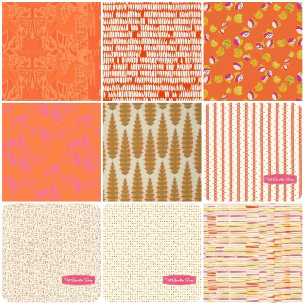
and a collection of 5″ Charm Pack of the Orange Fabrics, I feature in the next post.