I was really excited for this week, as it is a challenge week. The challenge: Find things around where you live and design a quilt from it. I was super excited to start, however so far I am struggling a little…it did not help that all I did all week was drive back and forward to work.
8 September: Challenge Day 1
My first source of inspiration was our scalloped fence in the back yard.

Now that I look at these and think about the inspiration…I may have made these way to much like headstones. I played around with the color palette which I like both, I prefer the mustard background. It is amazing how much color and fabric choices change a design.


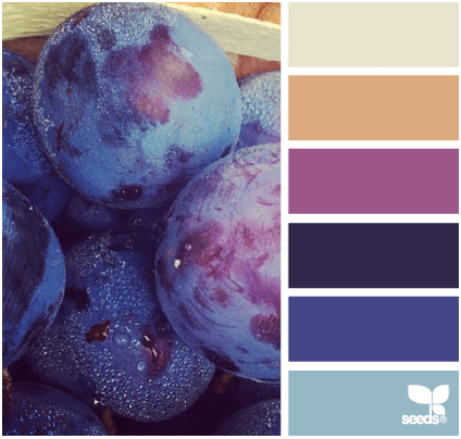
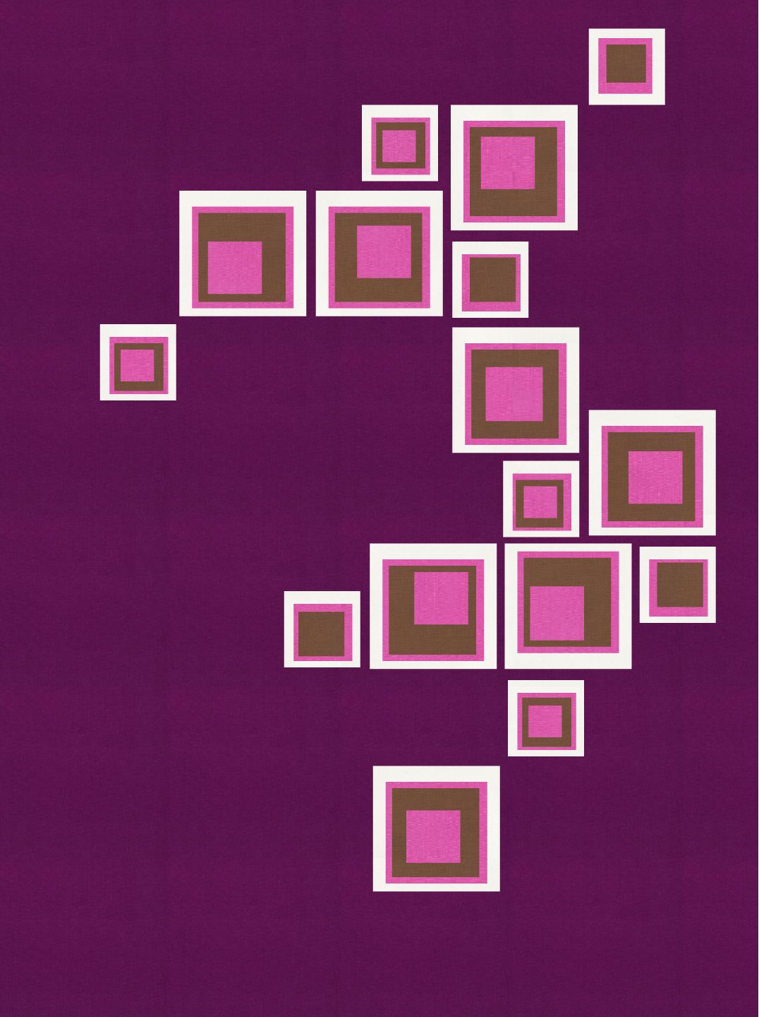
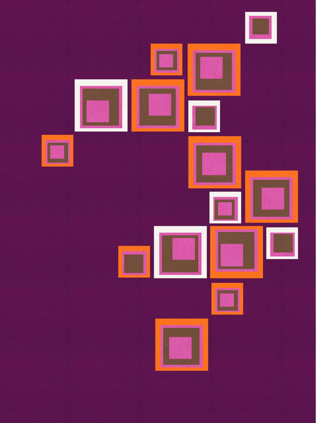
9 September: Challenge Day 2
One of the first things I purchased when we moved into our house were these cool wood squares. They have a self adhesive on the back. I bought two packets, which I then designed this layout in our guest bathroom.

That inspired this design. The first one using only the colors from the design palette of the day. I then started playing around by using orange. I still needed to make it brighter and have more contrast so teal was introduced in the last image.

10 September: Challenge Day 3
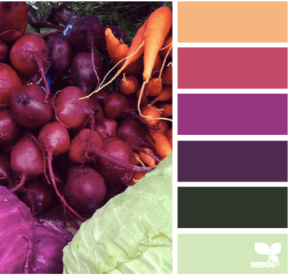
We see traffic lights everyday. I have always has this image of traffic lights making an interesting design as a quilt. That image was using improvisational piecing. Lucky for me, this palette came with the red, orange and green allowing me to stretch to this design of my traffic lights. I love the bright yellow solid background as it allows the other colors to pop against the improv black/grey piecing.
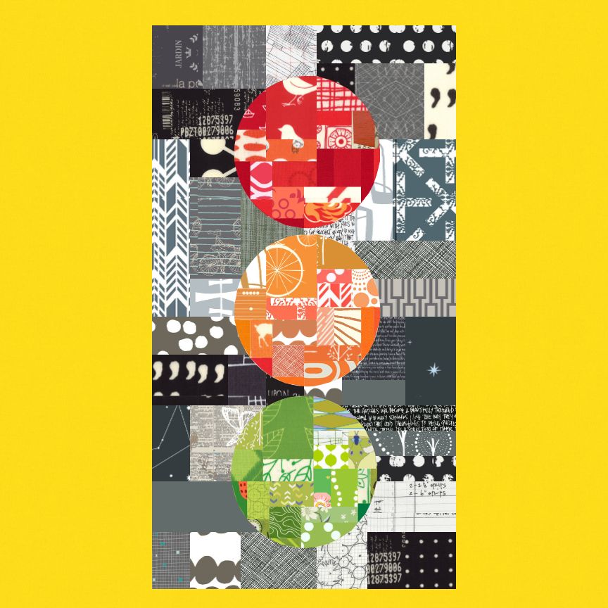
11 September: Challenge Day 4
This photo was actually taken while on vacation in New Zealand. I love the look of the rock formations and really wanted to try to capture it.
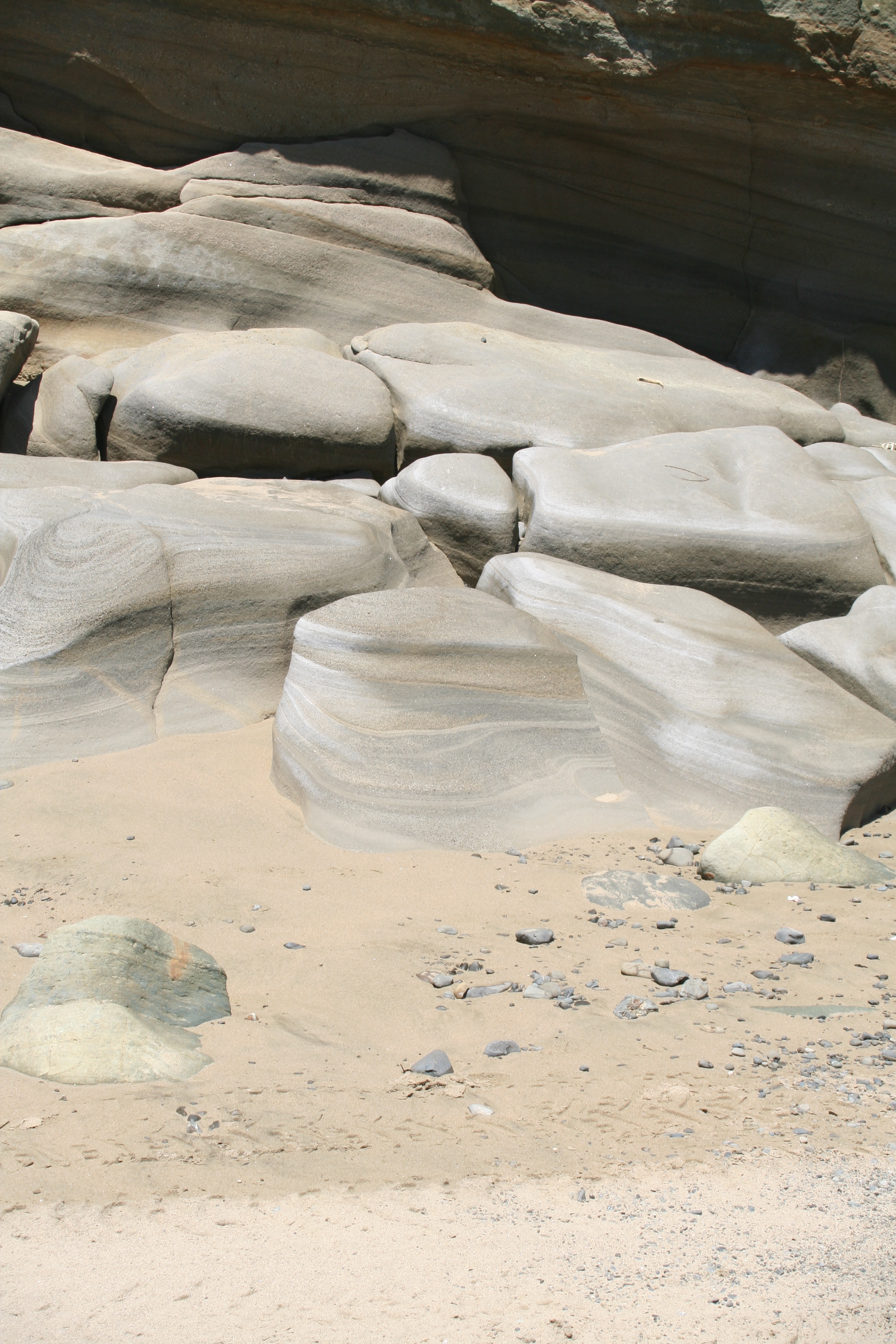
My vision for this design did not translate well. I don’t really like the design. I think I would have like to try to do this design in a different tool like illustrator. I struggled with a vector only design tool. I would do this design with multiple over laid raw edge improvisation pieces which will be appliqued on.

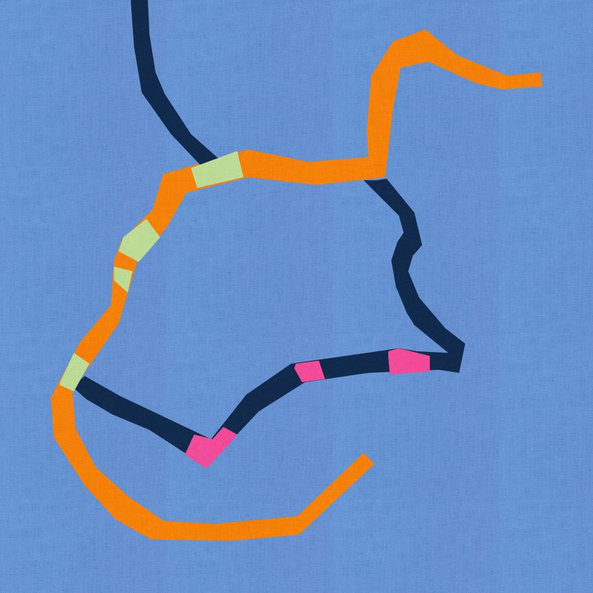
12 September: Challenge Day 5

I mentioned that all I did was drive to work and back most of the week. So what if you take the google map of your directions…

Well this is the design I got from my map, using vector based design tool. I think I would like to bring the map into illustrator and play even more and more accurately translate the map. I do think this would make a very fun bias applique project.
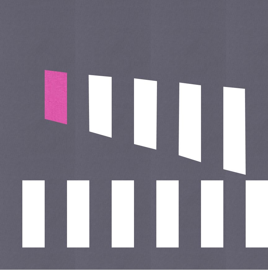
14 September: Challenge Day 7

I decided to use only two of the colors in this palette, the dark grey and cerise. I was inspired by a section of road I travel on at work which has these two crosswalks. One straight to one corner of the street and one diagonally to the other corner. I loved the simplicity of this.
That was the weeks challenge. I decided that over the next few weeks that I might choose a theme and try to use it in different ways to come up with my designs. Next week, I focus mostly on Plus designs.
