I was really excited for this week, as it is a challenge week. The challenge: Find things around where you live and design a quilt from it. I was super excited to start, however so far I am struggling a little…it did not help that all I did all week was drive back and forward to work.
8 September: Challenge Day 1
My first source of inspiration was our scalloped fence in the back yard.

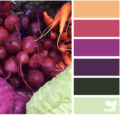
Now that I look at these and think about the inspiration…I may have made these way to much like headstones. I played around with the color palette which I like both, I prefer the mustard background. It is amazing how much color and fabric choices change a design.


9 September: Challenge Day 2
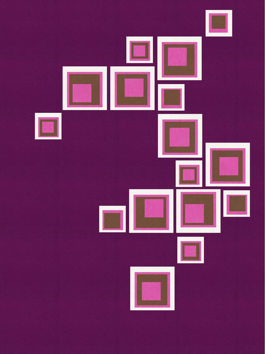
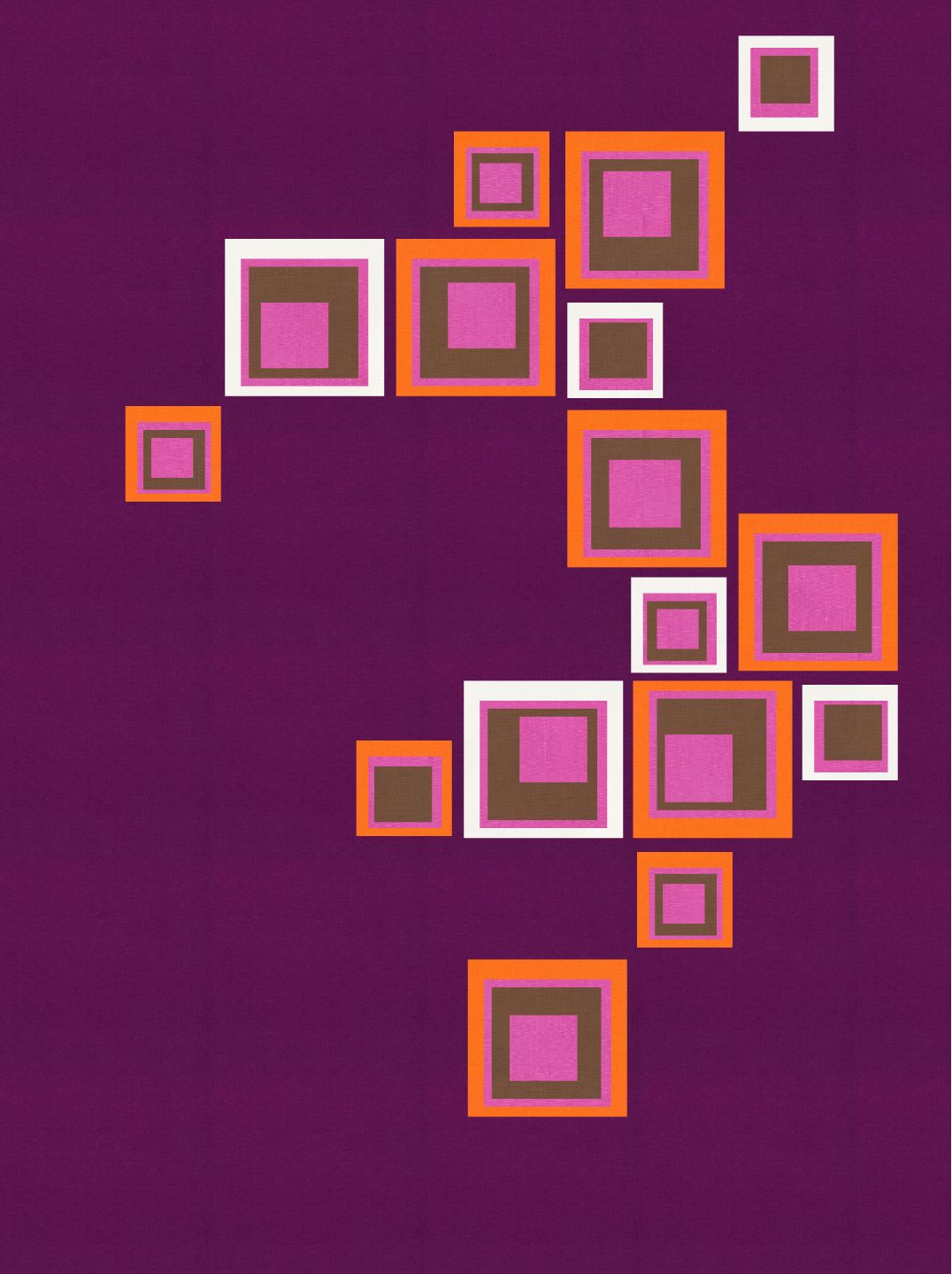
One of the first things I purchased when we moved into our house were these cool wood squares. They have a self adhesive on the back. I bought two packets, which I then designed this layout in our guest bathroom.

That inspired this design. The first one using only the colors from the design palette of the day. I then started playing around by using orange. I still needed to make it brighter and have more contrast so teal was introduced in the last image.

10 September: Challenge Day 3
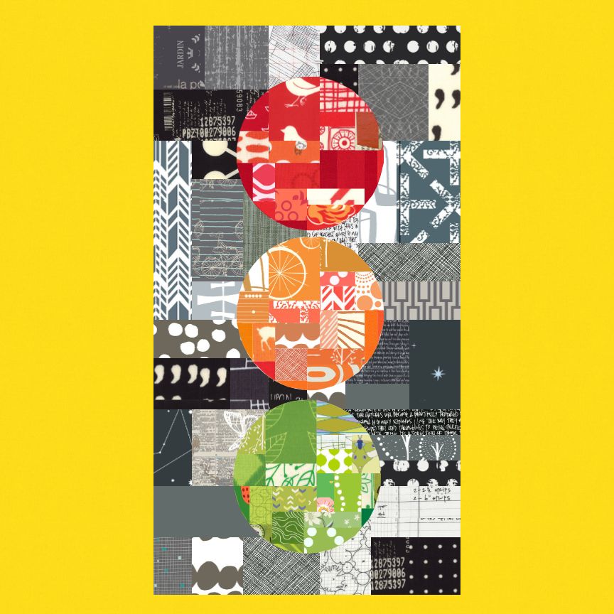
We see traffic lights everyday. I have always has this image of traffic lights making an interesting design as a quilt. That image was using improvisational piecing. Lucky for me, this palette came with the red, orange and green allowing me to stretch to this design of my traffic lights. I love the bright yellow solid background as it allows the other colors to pop against the improv black/grey piecing.
11 September: Challenge Day 4
This photo was actually taken while on vacation in New Zealand. I love the look of the rock formations and really wanted to try to capture it.
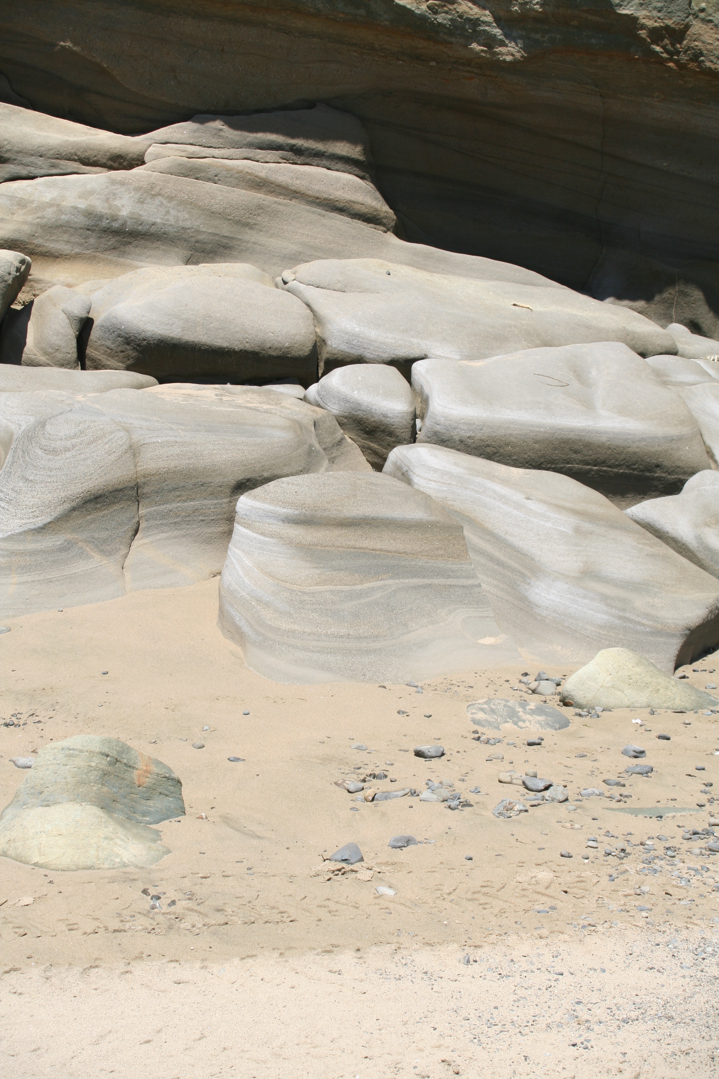
My vision for this design did not translate well. I don’t really like the design. I think I would have like to try to do this design in a different tool like illustrator. I struggled with a vector only design tool. I would do this design with multiple over laid raw edge improvisation pieces which will be appliqued on.

12 September: Challenge Day 5

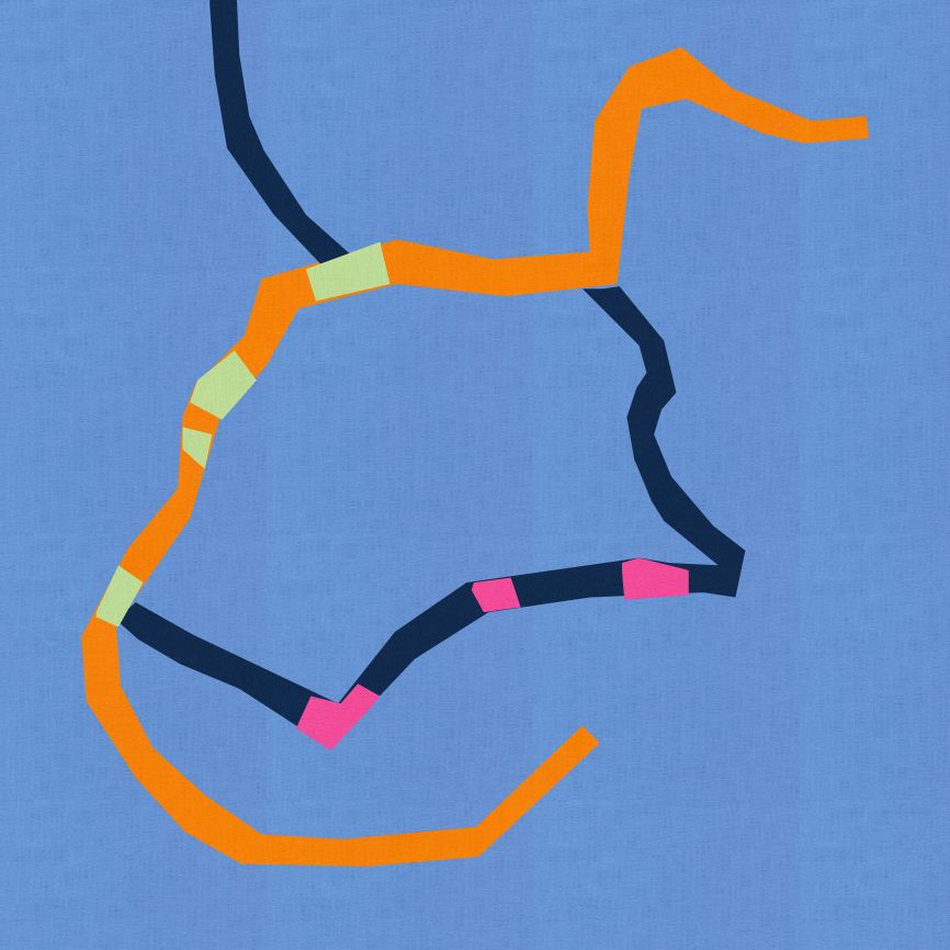
I mentioned that all I did was drive to work and back most of the week. So what if you take the google map of your directions…

Well this is the design I got from my map, using vector based design tool. I think I would like to bring the map into illustrator and play even more and more accurately translate the map. I do think this would make a very fun bias applique project.
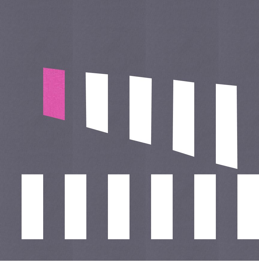
14 September: Challenge Day 7

I decided to use only two of the colors in this palette, the dark grey and cerise. I was inspired by a section of road I travel on at work which has these two crosswalks. One straight to one corner of the street and one diagonally to the other corner. I loved the simplicity of this.
That was the weeks challenge. I decided that over the next few weeks that I might choose a theme and try to use it in different ways to come up with my designs. Next week, I focus mostly on Plus designs.

I like the traffic lights one a lot, I think it would be worth working up and extending the colour palette.
The google route map looks like a thin sea horse holding onto a bit of seaweed!! Haha!! I like it! I like lots of the designs you share with us, it’s very interesting!
All designs are very inspirational. I like the one with the wooden squares, especially the one with the aqua/turquoise background. And I like all color palettes! Barbora
You could rework those headstones into something Halloween inspired if you’re into that… I’m not big on holiday decorating, but if that’s what comes to mind with that design… it’s a way to use it!
I love the rock layer one!
LOVE the rock formation one, and I also really liked your commute/map design. I’ve been searching for map quilts on Pinterest. CT Publishing just posted about a sale and one of the books was a book of map quilts that looked really interesting, too… Nice designing this week!