I recently purchased Josef Albers “Interaction of Color“. If you have not read this – it is amazing. I was so inspired that it influenced this week’s designs.
29 September
This design was a play with transparency and overlapping layers.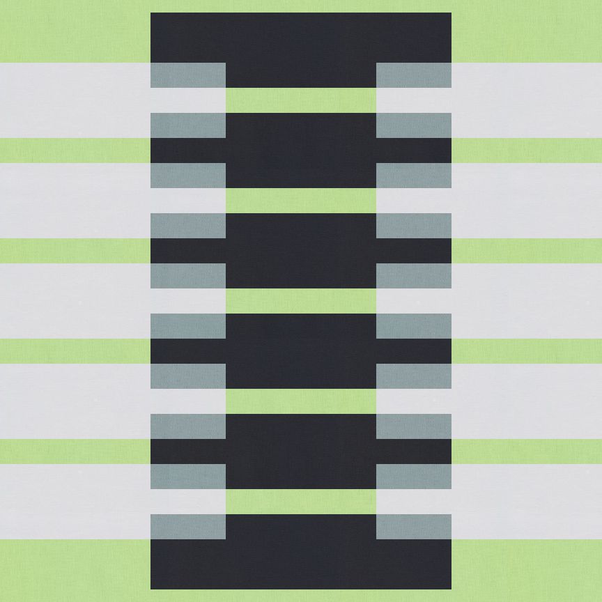
30 September
Color and designing for simplicity was my goal for this design.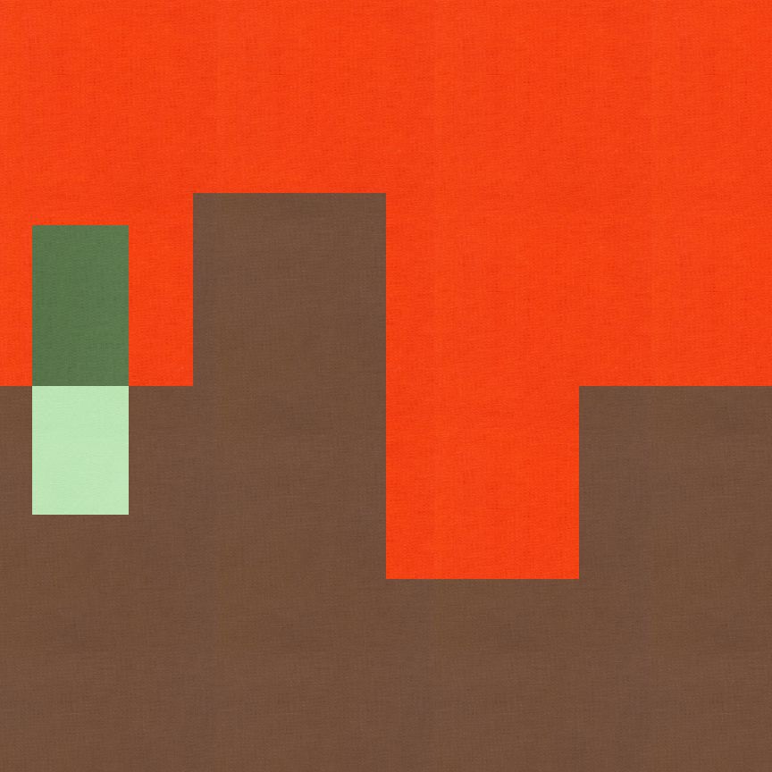
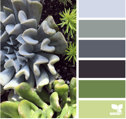
1 October

Further study of minimalism and an outward ombre look. 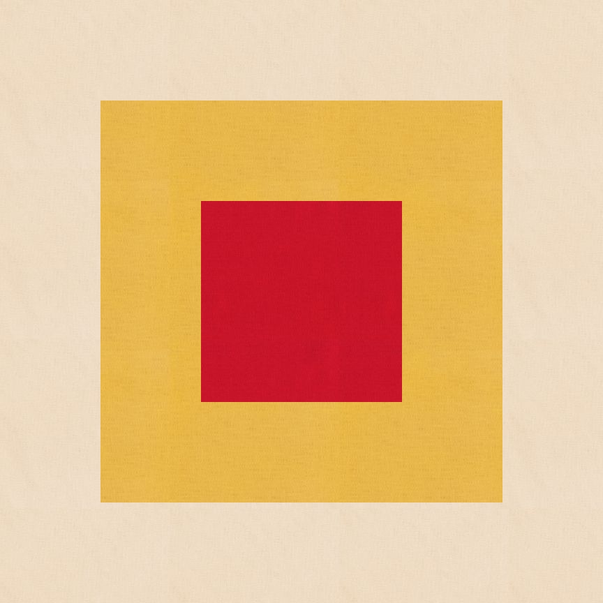
1 October
This second design for October 1st, started off with the same square and ombre design as above. I decided to play a little more and break up the square in quadrants and then moved the quadrant around within its place.
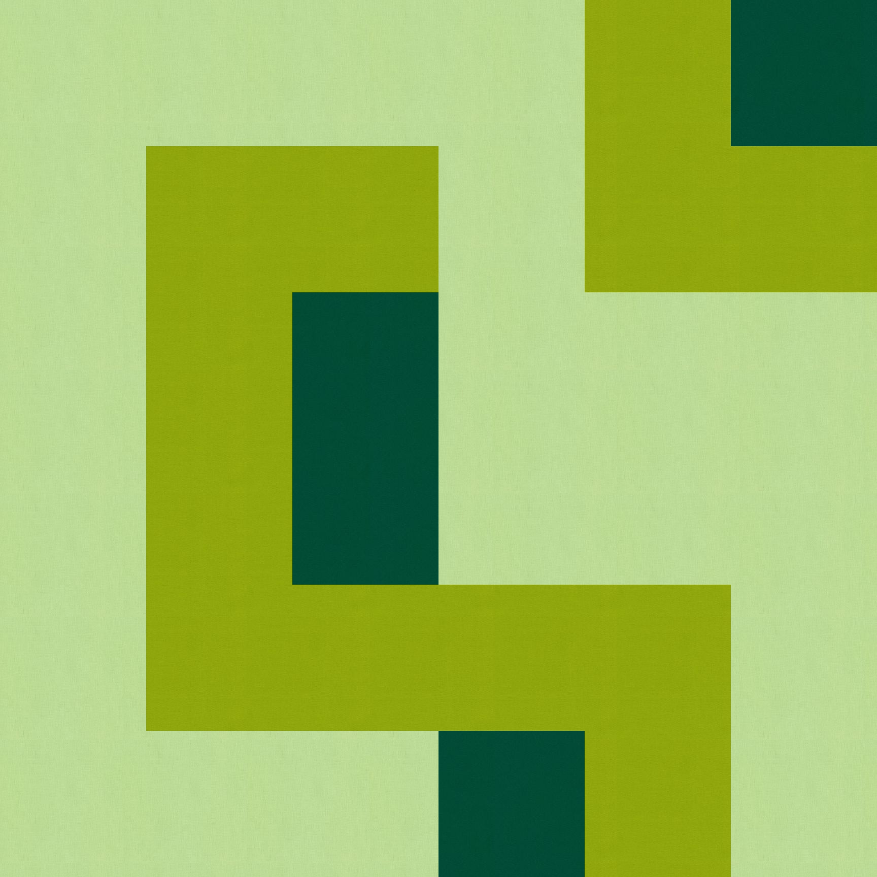
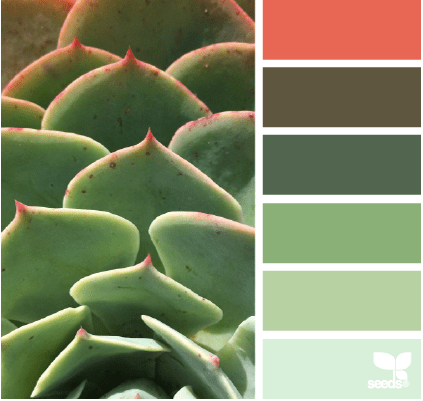
2 October
This was playing with the minimalism and transparency which Anne and the hubby saw a tree like design.
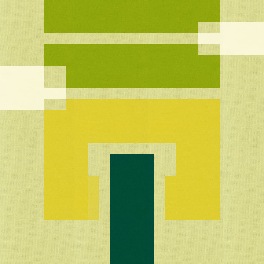
I played with it a little more and I really like it turned to the side. I also really like both the light and the dark backgrounds.
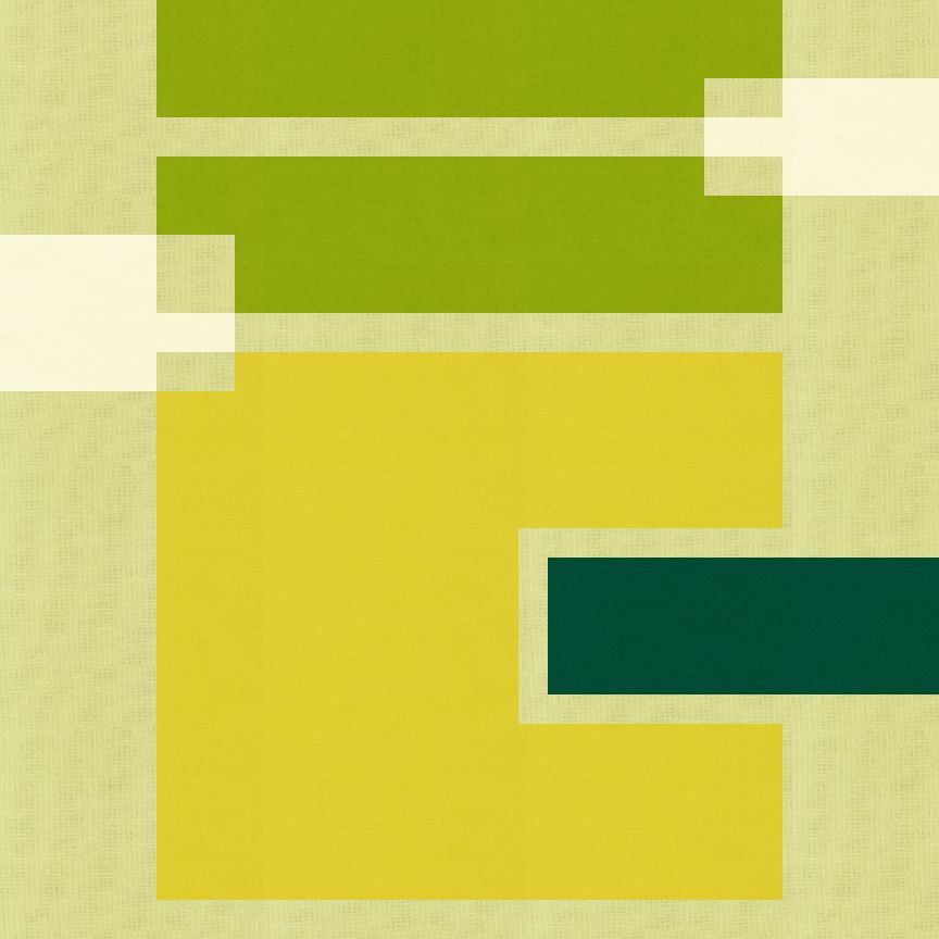
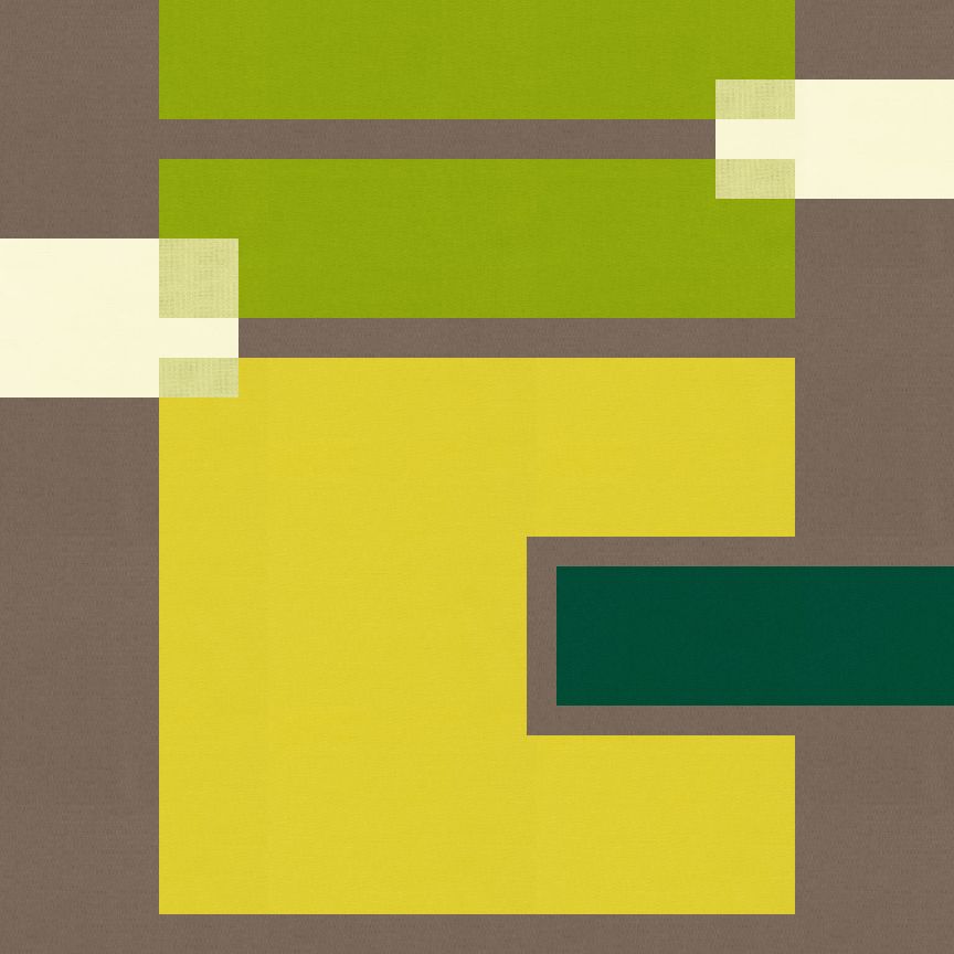
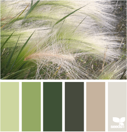
4 October
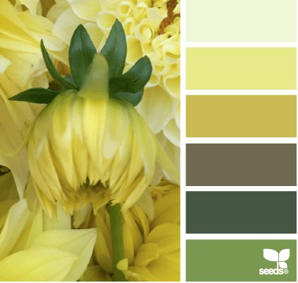
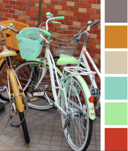
The color palettes this week are supplied by Amy @ Badskirt. She has the most wonderful palettes, more next week.
This stacked bar design was playing with layers and pops of color. I started of with predominantly neutrals and therefore a neutral background. 
However, my favorite landed up switching the background to the mustard-y color and all the neutrals placed in the stack.
So these are my Josef Albers inspired designs. On a final note:
If you would like to make or use one of my designs, please email me (ml_wilkie(at)hotmail(dot)com) or leave a comment below. I am happy to talk with you on options and provide the relevant measurements etc. or have you test out a pattern. Also, if you use one of my designs, please use the following text to credit me the design: “Designed by Michelle Wilkie @ Factotum of Arts”.
Linking up with Lorna @ Sew Fresh Quilts for Let’s bee social (see button on the right).
