I recently purchased Josef Albers “Interaction of Color“. If you have not read this – it is amazing. I was so inspired that it influenced this week’s designs.
29 September
This design was a play with transparency and overlapping layers.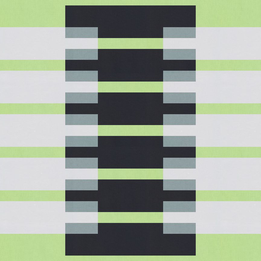
30 September
Color and designing for simplicity was my goal for this design.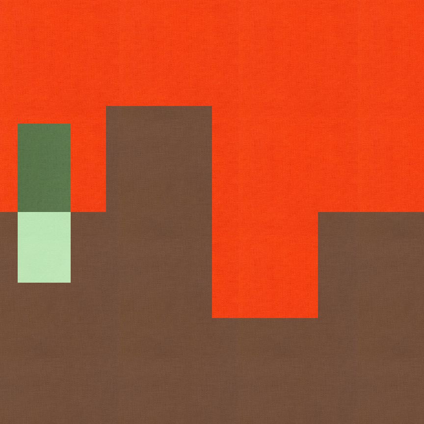
1 October

Further study of minimalism and an outward ombre look. 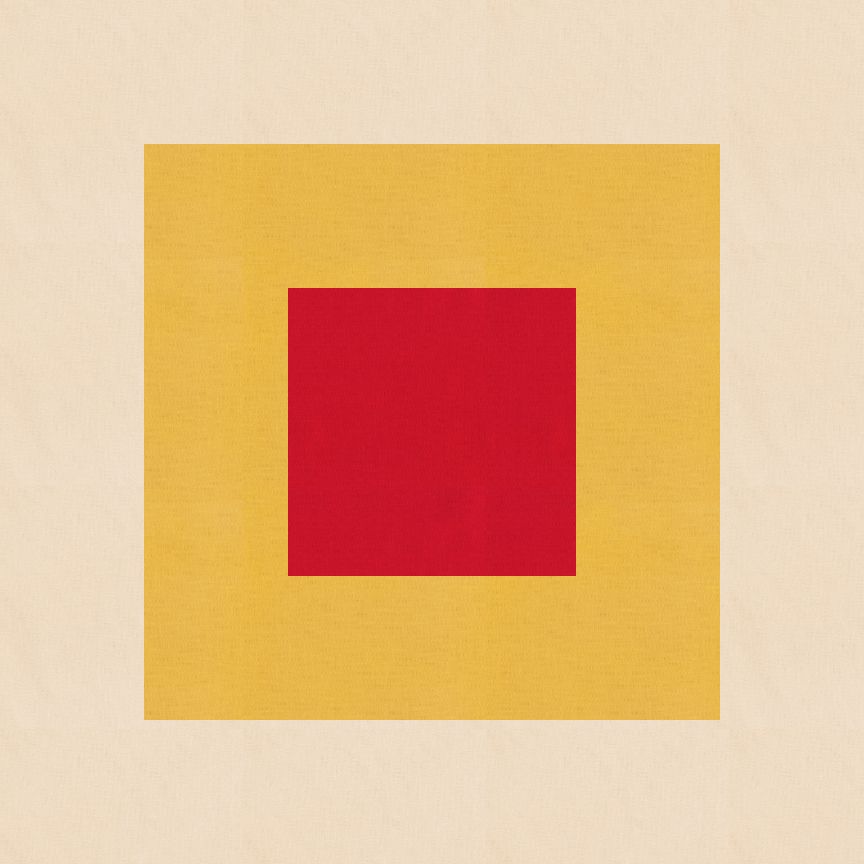
1 October
This second design for October 1st, started off with the same square and ombre design as above. I decided to play a little more and break up the square in quadrants and then moved the quadrant around within its place.
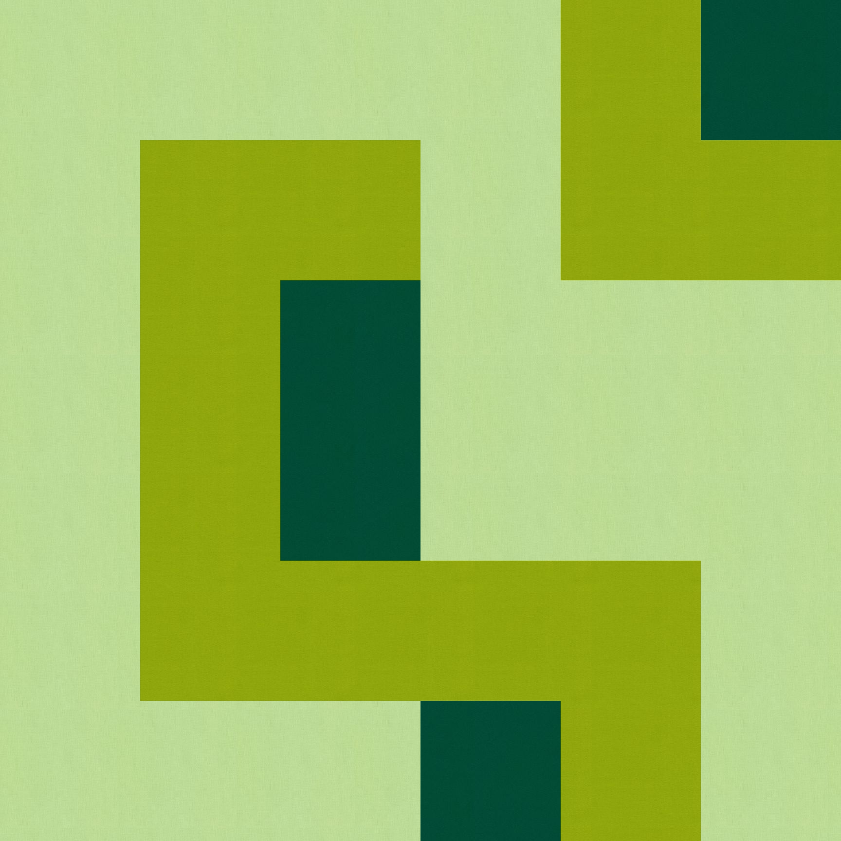
2 October
This was playing with the minimalism and transparency which Anne and the hubby saw a tree like design.
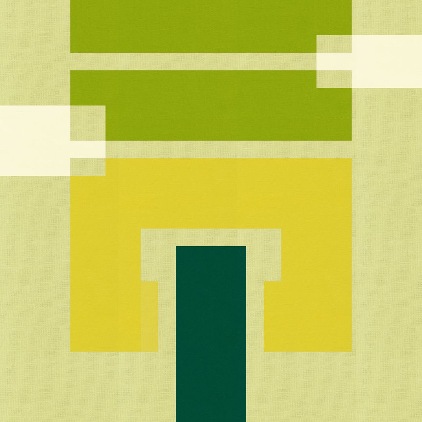
I played with it a little more and I really like it turned to the side. I also really like both the light and the dark backgrounds.
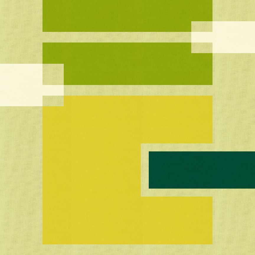
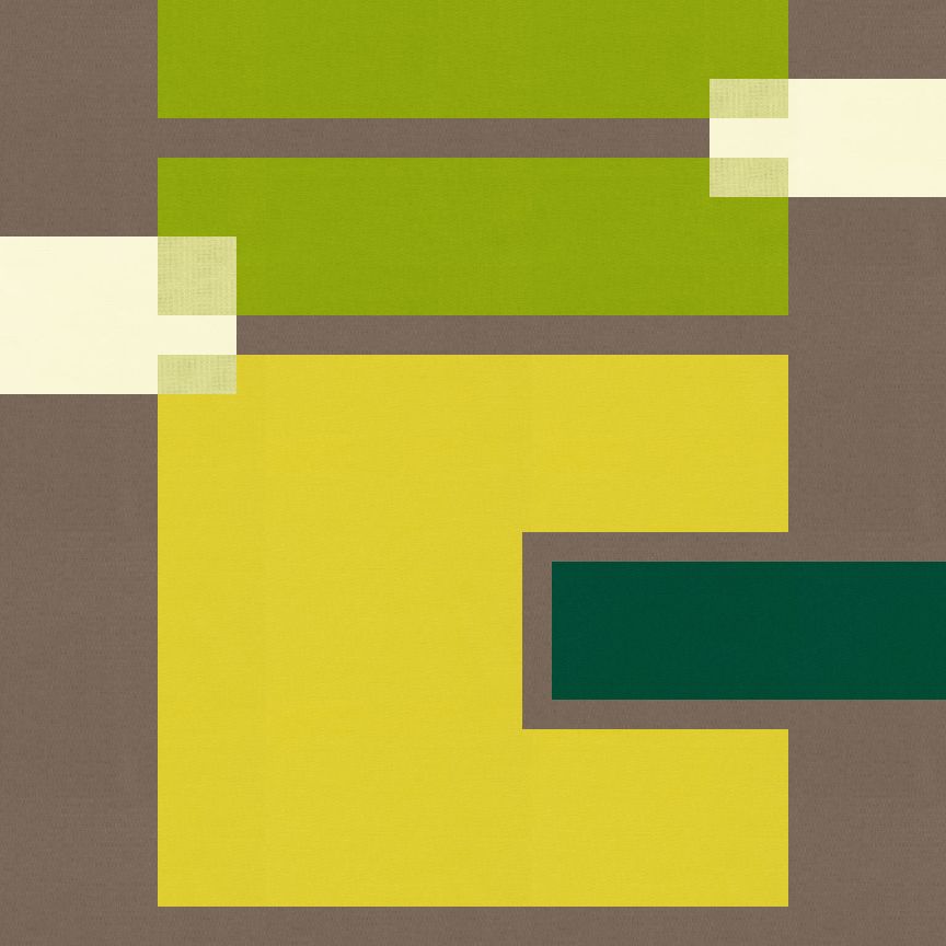
4 October
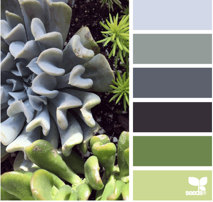
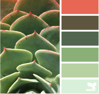
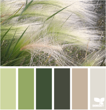
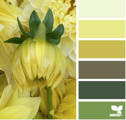
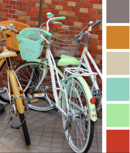
The color palettes this week are supplied by Amy @ Badskirt. She has the most wonderful palettes, more next week.
This stacked bar design was playing with layers and pops of color. I started of with predominantly neutrals and therefore a neutral background. 
However, my favorite landed up switching the background to the mustard-y color and all the neutrals placed in the stack.
So these are my Josef Albers inspired designs. On a final note:
If you would like to make or use one of my designs, please email me (ml_wilkie(at)hotmail(dot)com) or leave a comment below. I am happy to talk with you on options and provide the relevant measurements etc. or have you test out a pattern. Also, if you use one of my designs, please use the following text to credit me the design: “Designed by Michelle Wilkie @ Factotum of Arts”.
Linking up with Lorna @ Sew Fresh Quilts for Let’s bee social (see button on the right).

These are beautiful. Great way of selecting color
Nice work, Michelle. The palettes are scrumptious and your designs are all so creative. I especially like the stacked bar design with the mustard background, too!
Love that first one, I think probably for the symmetry and and colors. Also the stacked is great!
I like 2 October with it turned to the side as well. The first kind of reminds me of a zipper for some reason. 🙂
Michelle, I admire your diligence with the daily designs. These look fantastic!
Love the color inspiration and the quilt designs. I need to do more of that!
I love the combinations, especially the October one. xx
I most definitely see Albers influence. Love that book.
Pingback: Big Q4 Goals!! | Factotum of Arts