Tag Archives: sparks

QDAD: July

Lately, I have been so busy with other things that I have not spent a whole lot of time sewing/quilting or participating in Quilt Design a Day this month. I was lucky though ,to contribute the sparks (inspiration + color palette photos) in early July. Apparently, when I commit to doing the sparks, I can also commit to doing a design.

The sparks are all photos taken on various vacations, I have had. Have you ever taken a look through your photos and found quilting inspirations?? I have a different eye sometimes while on vacation….I think I am more open to see what is around me…so I see more design opportunities.

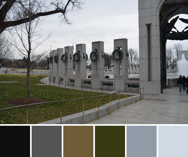
July 5: Moulin Rougue
imm017_18-palette

Love the dark moody colors this photo gave as a color palette….and how can you not use red while in Paris. The design is a minimalistic impression of the windmill blades.
QDAD_July5_MoulinRouge(2)

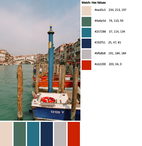
July 6: Ponte Sant’Angelo
imm014_15-palette

One of my favorite photos while in Rome. I love the view of Ponte Sant’Angelo from Castel Sant’Angelo key hole brick. It offered a stark neutral kind of palette. I choose to keep a simple brick layered design, color placement was important.QDAD_06JUL2015_CastelSantAngelo(1)

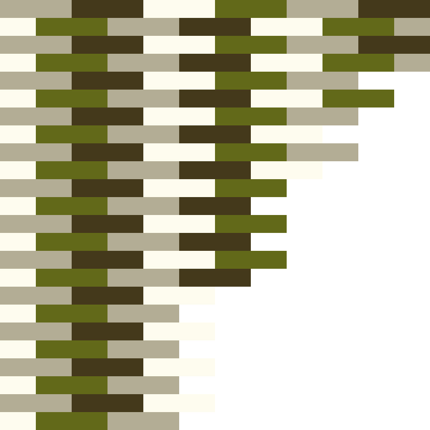
The original design had color placement a little different and I found it to noisy and made it look more like camouflage material.
QDAD_06JUL2015_CastelSantAngelo

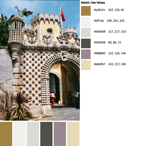
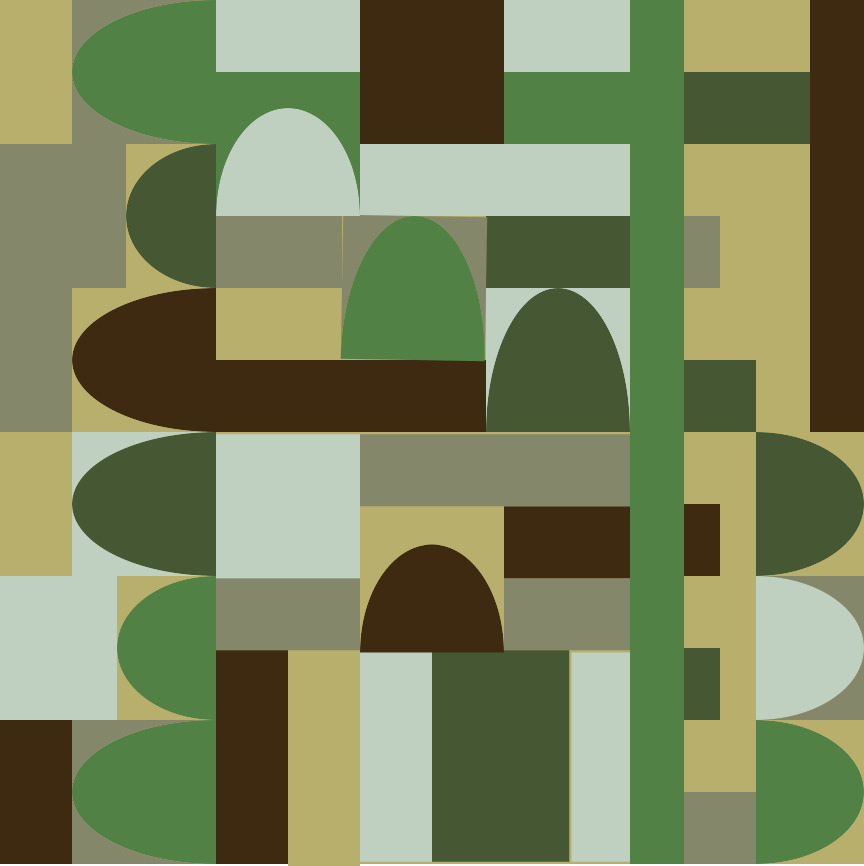
July 7: Rossio Square
imm019_17-2-palette

I love this palette of dark greys, mustard, stone and red-brown. There was so much you can do with the design of the bricks in the photo but I had been flipping through a magazine and found the most amazing shelving units. I took what fascinated me in the furniture and turned it into this design.
QDAD_07JUL2015_RossioSquare(1)

July 8: Raglan
IMG_5020-palette

I love coastal color palettes. There is so much variety. I had an idea for a totem like design, inspired by the Maori sculpture in the picture and I had seen this great multimedia textile design which inspired the triangles and stripes.QDAD_08JUL2015_NZSculpture(1)

I also like this color way and couldn’t really decide between the brighter or darker versions.QDAD_08JUL2015_NZSculpture

July 9: Raglan Succulents

IMG_4933-palette
For those of us who started out when we were using design-seeds as the photo inspiration, we have a few subject matters that we just cringe at. Succulents can sometimes be part of the list. So, I had a great chuckle to myself for posting this. I do love the color palette. Not my usual as it reads a little pastel.

I was inspired by a few Bauhaus prints for this one and chose several different elements from a few of those prints to put this triangle design together.

QDAD_09JUL2015_Succulent

I also love the darker palette with the plum as the background.QDAD_09JUL2015_Succulent(2)

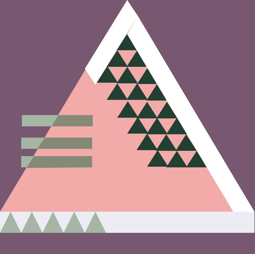
July 10: Portugal Coast
imm002_2-42-palette(1)

I definitely have a thing at the moment for teals and coral colors. This color palette did remind me of a Lizzie House fabric line. I went with a simple design, again with lines of fractured color. This is not a bad design but with this color palette I would look at doing something different with it next time. QDAD_10JULY2016_LisbonCoast

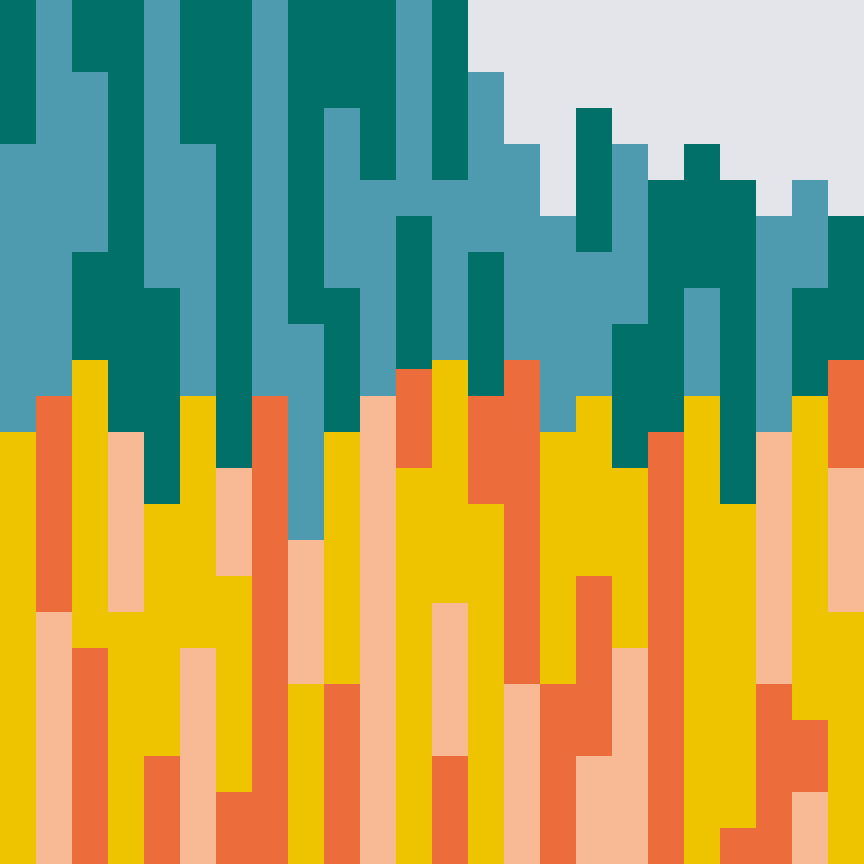
Ah, that feels good to post some of the designs. I would love to hear what photo from your vacation inspires, or inspired any quilt design you may have made.

Please Note: If you would like to make or use one of my designs, please email me (ml_wilkie(at)hotmail(dot)com) or leave a comment below. I am happy to talk with you on options and provide the relevant measurements etc. or have you test out a pattern. Also, if you use one of my designs, please use the following text to credit me the design: “Designed by Michelle Wilkie @ Factotum of Arts”.


My week of QDAD Sparks

This past week, I was so super excited to be hosting the sparks (palette choices/inspiration) for our Quilt Design a Day Facebook group. I decide early on that, I would show and inspire the group participants by using photos from my travels over the years. I had such a blast and was amazed at the designs (make sure you come over and take a look – or even add your own design).

26 April: San Francisco
First up, is Coppola’s Sentinel Building in San Francisco. I love the variations of the copper – those teals!!

IMG_0036-palette

I actually based this design on the top of the middle building but I rotated and tilted the design. This seemed to give it much better balance.

QDAD_26April2015

27 April: New York High Line
This is one of my favorite spots and photos that I took while visiting New York High Line. Of course, it has one of my favorite color palettes; blue, grey and orange.
IMG_7520-palette

I had so many ideas for this one and decide to play around with lines that could possibly be done with improv techniques.
QDAD_27APR2015

28 April: Washington DC
This was taken in Winter. I love the starkness of the color palette.
DSC_0504-palette

My design kind of happened by accident. I  accidentally moved pieces off the design worksheet and couldn’t delete them, these landed up being the best part of the design…the left hand side. I love the difference between the darker palette in the right with the starkness of the white panel on the left.
QDAD_28APR2015(1)

29 April: Venice, Italy (St. Marks Basilica)
I really love neutral palettes, so I decided to challenge the group with a couple of palettes.
imm020_22-palette

The diamonds and the crosses on the side of the building fascinated me. I really liked the repetition options.
QDAD_29APR2015

29 April: Venice, Italy (Grand Canal + Rialto Bridge)
To be fair to those who don’t like neutrals I also included a brighter palette, but I did not do a design for this one.
imm011_13-palette

30 April: Sintra, Lisbon (Castle of Moors)
Lisbon is one of my favorite cities in the world. This castle has amazing tiles and architectural features. The castle itself has amazing gardens. imm006_5-23-palette(1)

I loved the spikes and that gold in this palette, LOVE.
QDAD_30April2015_neutral

30 April: Lisbon (Coastal Village)
Like I mentioned, I love Lisbon. This photo speaks words about why I love it!!imm001_1-44-palette

01 May: Rome, Italy (Coliseum)
This photo was taken by my husband. The illumination of the Coliseum provides an amazing color palette.imm029_30-palette

I loved the architectural arches, and the top lines of the Coliseum. I really enjoyed this palette.QDAD_01May2015

02 May: Paris, France (Musee d’Orsay)
The glass roof of the old railroad station of Musee d’Orsay has amazing shades of greens.
imm020_21-palette

I did two designs, one more structured that was based on the floor space.
QDAD_02MAY2015(1)

and one that is more adhoc, improv based. I think this is my favorite of the two.
QDAD_02MAY2015

So several of these are on my make list: NY High Line, Sintra Lisbon (Castle of Moors) and Rome Italy (Coliseum) are among my favorites!!

Please Note: If you would like to make or use one of my designs, please email me (ml_wilkie(at)hotmail(dot)com) or leave a comment below. I am happy to talk with you on options and provide the relevant measurements etc. or have you test out a pattern. Also, if you use one of my designs, please use the following text to credit me the design: “Designed by Michelle Wilkie @ Factotum of Arts”.