I decided to create my own theme this week, Plus designs. I loved the focus on a single topic and will definitely try and do a few more of these.
16 September:

Using a repeatable block design, with solids that represent the above colors.
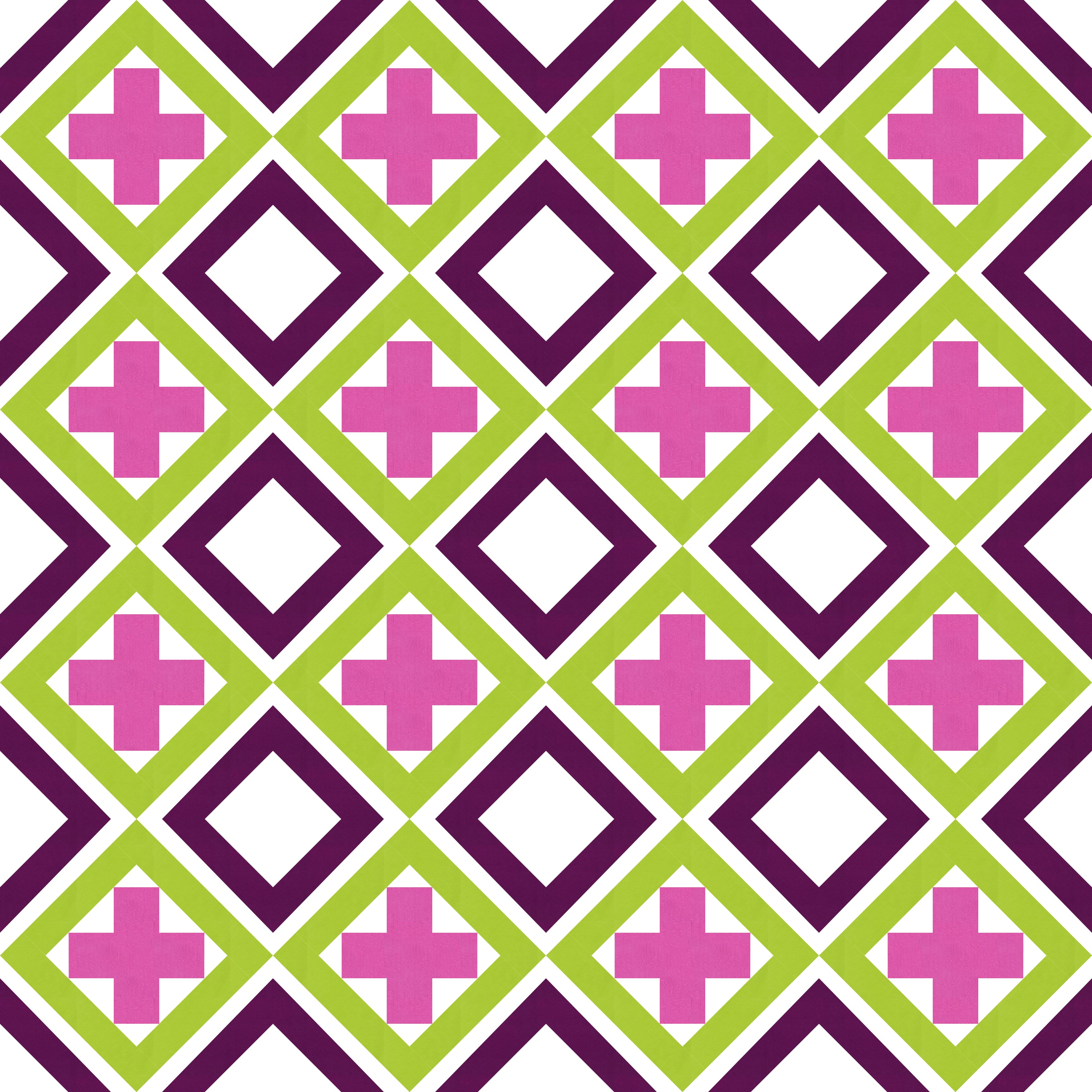
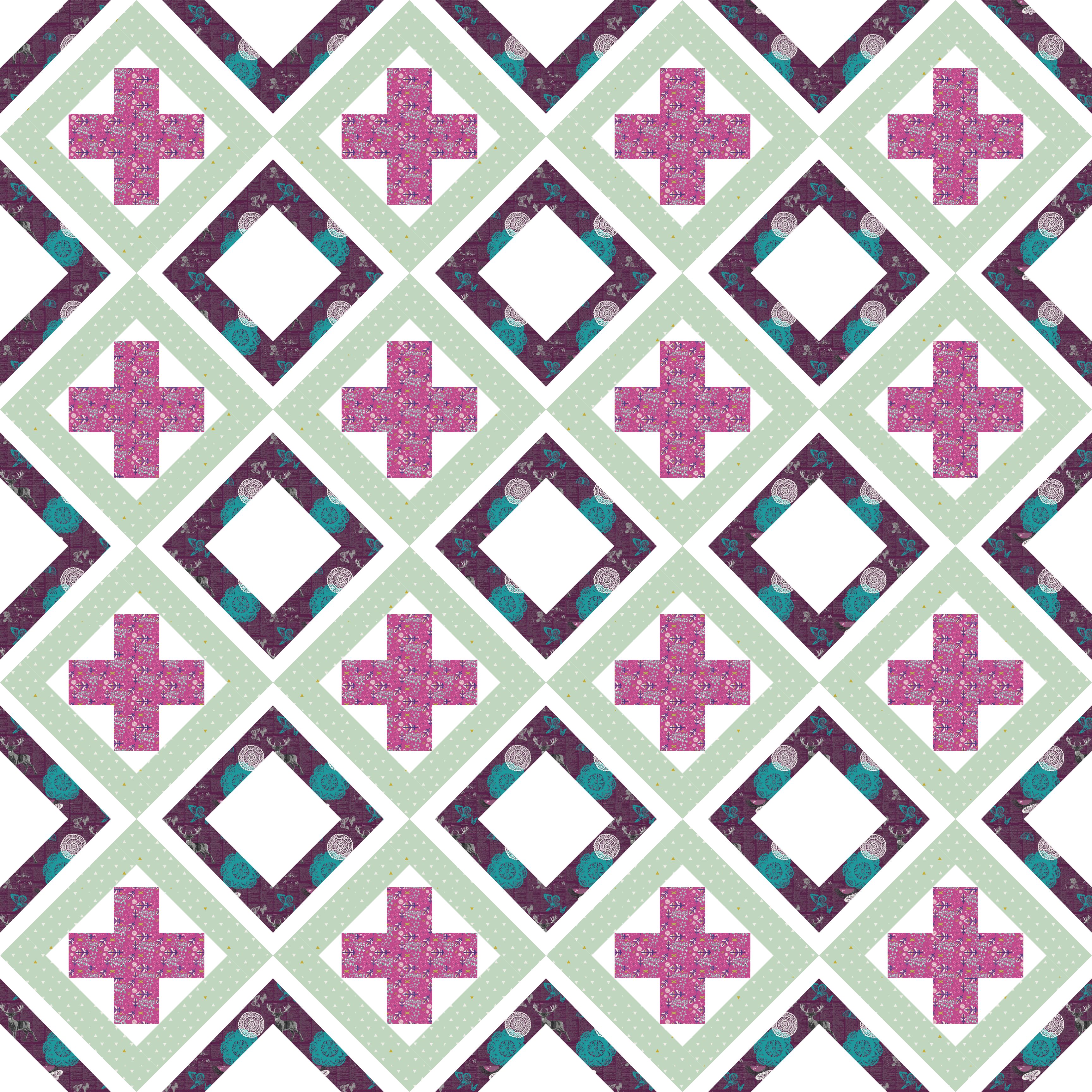
I also decided to try this one in prints. I like how the differences between the solid vs. print a lot with this design.
17 September:

This is one of my favorite designs this week. I love the color palette and the simplicity of the design.

18 September:

Playing around with a repeatable block made up of the plus and arrows within a cross/plus layout. My favorite landed up being the second option which looks like a wonky totem.
The first option, I had as a full nested plus/cross.
19 September:

Thi s is the second design that I love this week. It was inspired by a game of Tic Tac Toe (Naughts and Crosses). The line for the two colored background represents the winning line.
20 September:

“Raining Crosses”
There are two design competitions going on at the moment, so if you want to give designing a chance it is a great idea.
- Modern Quilts Unlimited – Fresh Ideas Competition Design a Block (closes 30 September).
- Cloud 9 Cirrus Solid BOM Challenge Design a Block and it might be chosen for the BOM (Block of the Month ) (runs all year)
If you want to check out more of my QDAD designs you can find them here. Stay tuned for next week where I focus on a minimalism study using only red, white and black.
Linking up with Lorna @ Sew Fresh Quilts for Let’s bee Social (see button on the right).

These color palettes are all so pretty! I think my favorite is the tick tack toe one.
I remember being so relieved when that pumpkin and gourds palette showed up. 🙂 Finally, a palette I liked! I love when you play with adding fabrics mostly because it IS so different. I’ve been designing with solids for so long, I have this QDAD-induced barrier to prints now a days. 🙂 So I love that you play with prints to remind me that oh yeah, those really work too! lol
Beautiful designs, as always. You really have such a wonderful style.
I particularly like the two palettes with greens and purples. I’ll never, ever, ever switch over to using just solids, I love my prints too much, but for me half the fun is finding the right print in the right colour.
Very nice designs, it was very interesting to see how different the first design looked in prints versus solids.
very cool, love them all
Pingback: Big Q4 Goals!! | Factotum of Arts
Pingback: Pattern testers wanted | Factotum of Arts