Ok, so really I do not have a name yet for this quilt. Lines Drawn just popped into my head as I was writing this…so let’s see. I will say, this is probably one of my favorite quilt tops.
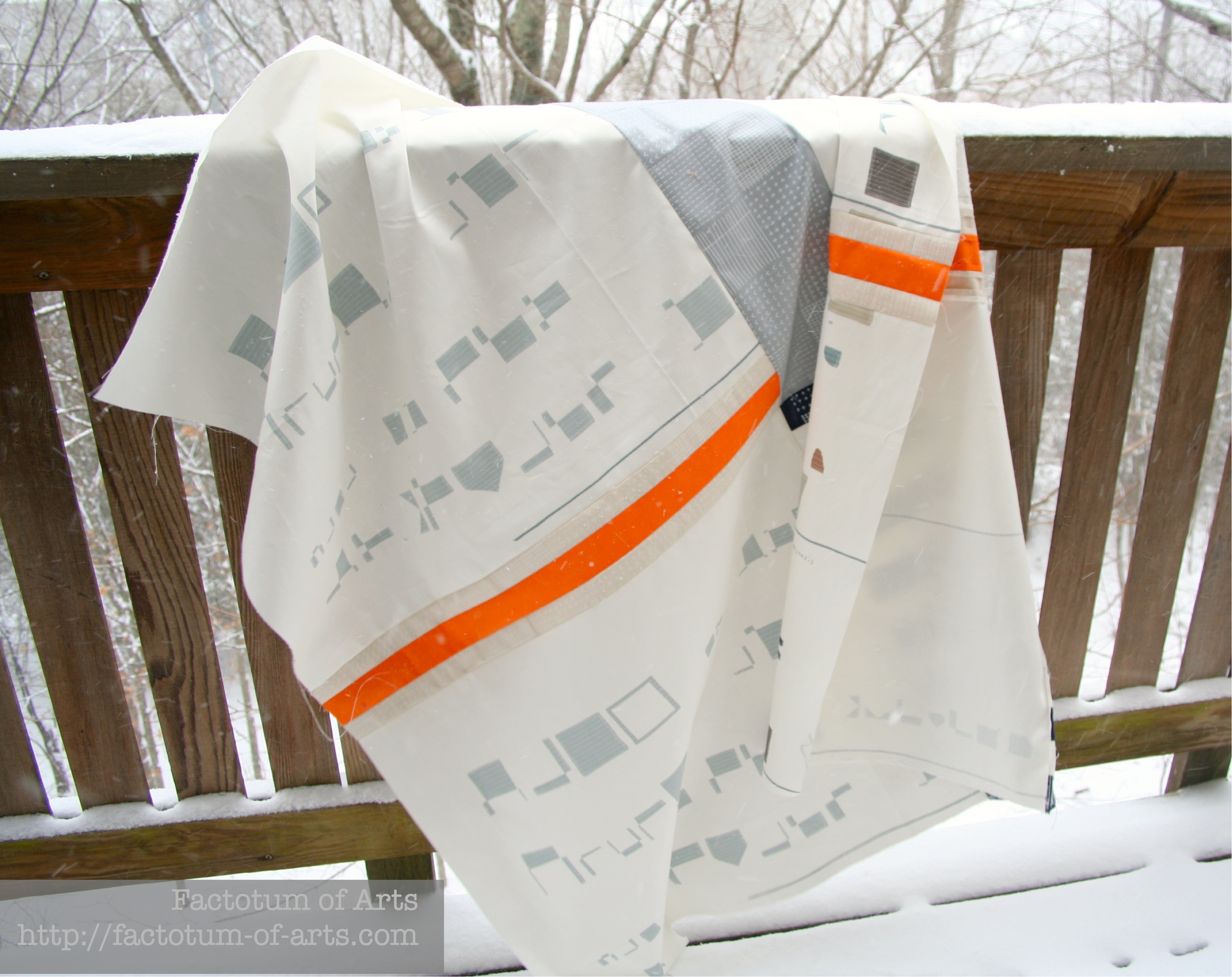
This quilt top came together fairly quickly while on our mountain vacation this week, a big woohoo for vacations. I love the lines, minimalism and complementary nature of the fabrics I choose (love the squares and colors in each).

Fabric Selection Process:
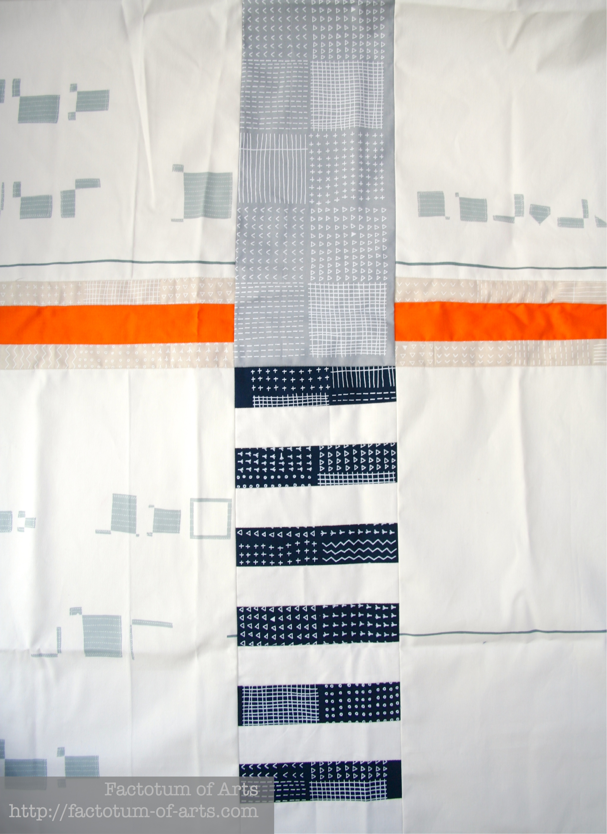
I have been stashing Karen Lewis Textiles fabric and trying to find the right project and decided I just need to do a design specifically for some of my pieces. This was it. I did play with the colored fabrics I had for a bit and decided on using Allotment in Silver, Oyster and Nautical and Kona Torch (orange stripe).
I also knew, once I finished this design that a plain white, or even a white on white fabric was not going to be enough for the background. I wanted something with some interest but not something that took away from the focus of the two lines. I immediately played around with my Yoshiko Jinzenji fabric and decided none of them worked…but there was one I had been looking at that would be perfect…I bought it and thankfully the vision was right on (that does not always happen when I buy fabric for a specific project).
Here’s a close-up of the fabrics in the quilt:
I think, I have already found a spot to hang the quilt in the house. It is in my son’s room, that is, if I can convince him to let me hang it…it doesn’t have pink it and does have one of his favorite colors orange…so there is a chance 😉

If you can think of a better name, I am open to suggestions. Linking up with Amanda Jean @ Crazy Mom Quilts for Finish it up Friday.

I really liked seeing this top come together as you worked on it via Instagram. The fabrics you used work so well together and really are stunning together. I personally like the name you have given it.
I like the balance of the design, the one orange stripe, and yes, the background fabric is perfect.
I love the simplicity of this quilt top. I’m curious to see what you make for the back. The pop of orange is striking!
Fabulous – I especially like the orange!
Love the minimalism
It kind of reminds me of a map, like an intersection. I really, really like it.
Wow! Such a beautiful quilt! Each fabric works so well as part of the overall design & the orange accent is perfect. I love that you need to convince your son that this hang in his room – surely that it matches the teepee/tent so well makes it more likely?
Love how modern and clean this is. The orange is a perfect addition.
This is awesome! I had the same thought as Carol. The first thing that came to mind when I saw this was the word – Intersection. I love the gray and orange. Perfect for a boys room!
Beautiful, I love simplicity and design of the quilt.
Oh wow – this is so simple but stunning. I love the navy with the orange – what a perfect colour combination!
It all works together so nicely! And that teepee posing with it sure fits right in, haha.
Your design is fabulous! I really like Yoshiko Jizenji prints, but I don’t buy them because I wouldn’t know what to do with them… 😀
The design and fabrics are such a great combination. I’m always excited (and impressed) when QDADs become reality but then I realized this was from my spark of the bridge and that makes it even more special. What do you think of “Suspension” as a title?
Pingback: Juggling | Factotum of Arts