Over the next two days, I thought would try to share my design process for Quit Design a Day. Remember, we try to spend no more than 15 minutes on a design. We use the color palette provided each day. You can use all or select colors from that palette, and you can add white or black. We can use the photo for the color palette as inspiration, or do your own thing.
As I step you through my process, remember I am very much about finding the geometric shapes and I like minimalistic design.
Today’s image and color palette is bought to you by Jennifer Em Lanak, published on the QDAD facebook group.

First step, what shapes do you see in this photo? Two keys areas drew my attention, from which I created two designs for this photo/color palette. Let’s step through each one.
Design 1
The first thing I saw, were the three stripes on the side of the bus and the windows on the side with the 3 sections.

So to get started I open up Quilt Canvas (tool by Threadbias, I use this for all my designs). I only use a 12 x 12″ design palette – typically I find this big enough to get my ideas down and then I can expand them to real size, if I make them.
Step 1: Based on these design elements this is my first step, laying down the components I see with initial colors. I know now that with a saturated color palette I typically use a neutral for the background for balance, in this case the gray from today’s palette.

Step 2: I was surprised at how much I liked the palette today and the balance of the colors. I realized to maintain the balance, my 3 stripes from the bus side, needed to be smaller (width) and closer together. This gives the black less prominence and balances those lines with the addition of the negative space at the bottom.
Step 3: While I like the 3 windows, I didn’t quite like all the color placement and I had that other red, I could use from the color palette. This landed up being the final design.
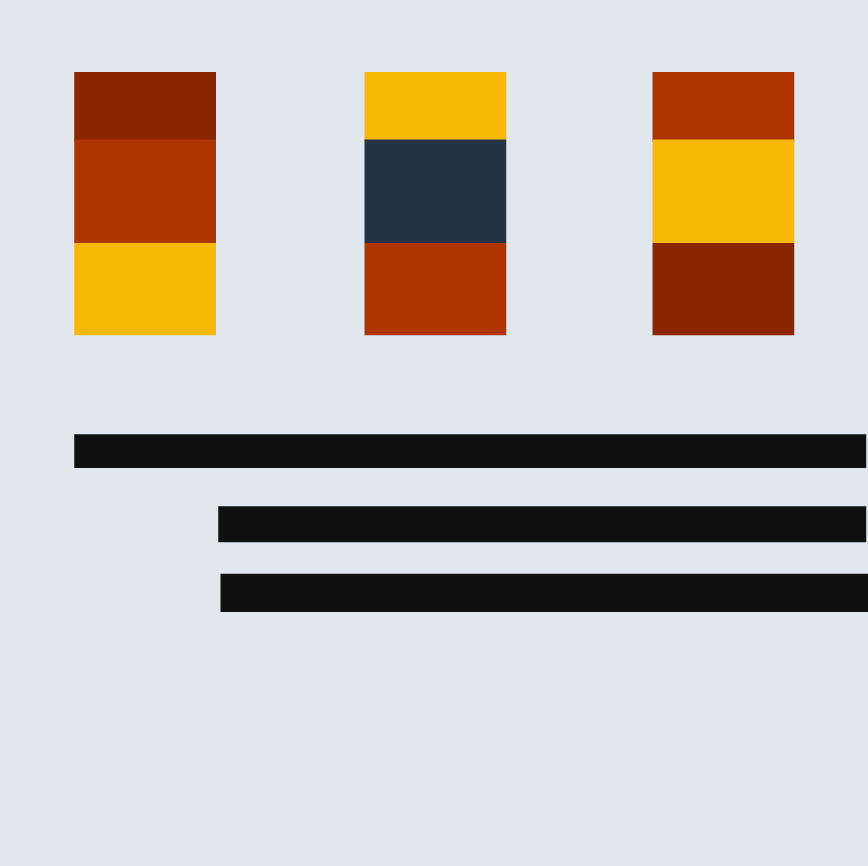
Step 4: Just to be sure sometimes I check a couple of other colorway options. I was seeing if I kept the yellow bus feel with the yellow background (switching with the grey)….but decided I liked it best as in Step 3.

Process Overview:

Design 2
For this design, I saw the geometric options with the grate (grill) of the bus.

Step 1: I liked the lines with the squares at the ends. So, I laid those down with an even spacing over the 12 x 12″ design area. I used the yellow and black as in the picture for the center, longer lines. You may notice that I started off with the lines and square rows being a little off-center. I try not to start centered.
Step 2: I did not like the all yellow and black center, so I thought maybe to break it up a little I could use a stripe of grey as well.
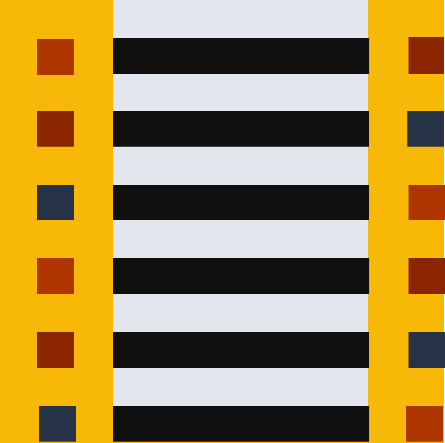
Step 3: Still not really happy with the balance I thought, what if I move the grey stripe off centered, having the yellow and grey more 50/50 in the background?

Step 4: I still was not happy with the balance, still thinking it was the background stripes, I decided to move and narrow the grey stripe. Now the stripe splits the left squares background in 1/2 and the black stripe background in 1/2. At the same time I realized I didn’t like the squares in the various colors in the left with this extra (grey stripe) detail. I made them all black except for the first, leaving the lighter red.

Step 5: I thought I was done at step 4, but I actually came back a little later (about 20 mins after posting) and decided I need less lines in the design. I made one more change to simplify it and give a little more space. I deleted the last line. This is the final design.

Process Overview:

So what about you, grab a pen/colored pencils, or your pick of computer program…what do you see in the bus inspiration and how do you use the color palette. If you do the exercise, come over and post it on the QDAD site or do your own blog post about your process.
I will do another post on my design process tomorrow, a different one. I hope this inspires at least one person to give it a go. I promise it gets easier the more you do it…and there are definitely days or designs I do not like but that’s part of the learning process. So go on, give it a go 🙂
Please Note: If you would like to make or use one of my designs, please email me (ml_wilkie(at)hotmail(dot)com) or leave a comment below. I am happy to talk with you on options and provide the relevant measurements etc. or have you test out a pattern. Also, if you use one of my designs, please use the following text to credit me the design: “Designed by Michelle Wilkie @ Factotum of Arts”.

What a cool way to share your design process! 😀 I really enjoyed seeing what part of the photo inspired you. You often notice smaller details that I do not.
Interesting to see the process, and the analysis that informs your designs. Also very interesting to see how very different our design processes are, when we have something specific in mind. The way you work also works well with computer based design. I have more of an instinctive approach, and most of the time the colour is talking to me rather than the shape. Sometimes I want to let the fabric talk loudest, if it’s a pretty palette, sometimes the quilt has a story to tell and it needs a lot of hand applied detail. Thank you for sharing how you do things.
Great description of your process, Michelle. I like that you save out so many versions or iterations of your designs. Seeing your progression here or even occasionally on IG is really awesome.
you have such a creative mind. i loved reading about your process! 4 days!!
I keep going back and forth on whether I want to try this. My dilemma is I have a long list of unfinished projects and more designs might make my head explode. But, I’d like to expand my design skills and practicing every day would be better than dwelling on those unfinished projects.
This is a really neat post! It’s really interesting to see the progression from the original photo/colour palette to the finished design. I love process posts, but so rarely see them around!
How neat to see your process! I love how you showed the different options you came up with.
Pingback: Design Process Part II | Factotum of Arts