I am a little late on this post, what can I say, I was caught up binge watch a TV series on Netflix (while being a little under the weather). It was totally worth it!!
Anyway, as mentioned in my earlier post on the Yellow Bus designs, I am going to share another design and show you how I got to my final design. This one is a little different, in that it was more playing around with the color palette choices than the overall design. Remember, I am very much about finding the geometric shapes and I like minimalistic design.
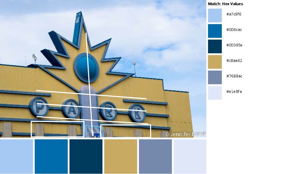
Today’s image and color palette is bought to you by Jennifer Em Lanak, published on the QDAD facebook group.

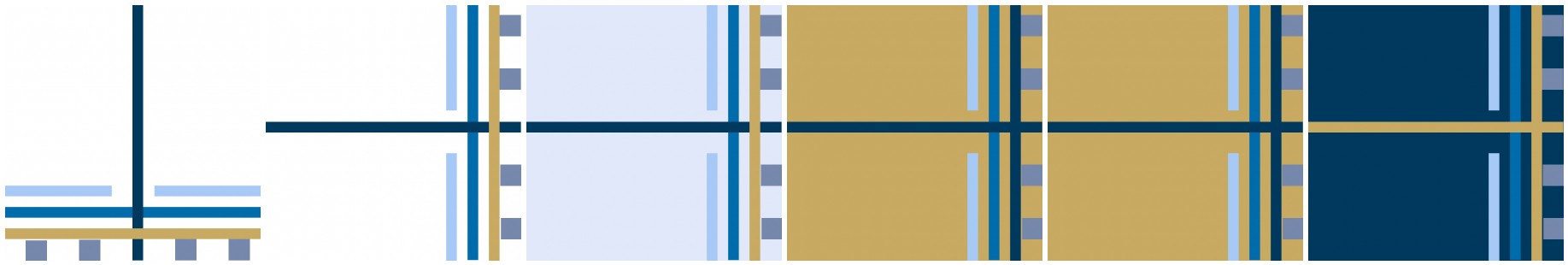
Step 1: My design was based on the horizontal lines, the bar in the middle and the concrete bars at the bottom.
Step 2: In Quilt Canvas, I quickly came up with this design. I knew this design would work. I initially went with a neutral background of white thinking the blues and the gold would pop.
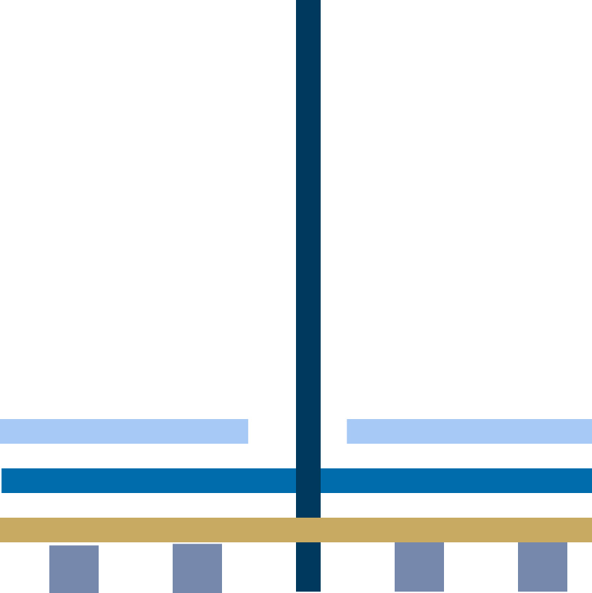
Step 3: The only thing, about the overall design, I did not like was the bottom to top feel. So, I rotated it 90 degrees.

Step 4: I really liked the rotation, but the white, now, was just too white. I needed to play with the color palette some more. What about using the lightest blue instead of white?
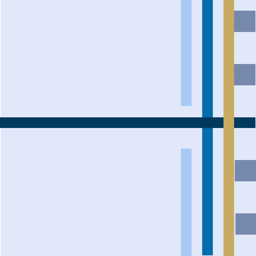
Step 5: I wasn’t happy with this either it was still the wrong balance for me. I decided to use the color that was the most different in the palette, the gold as background. 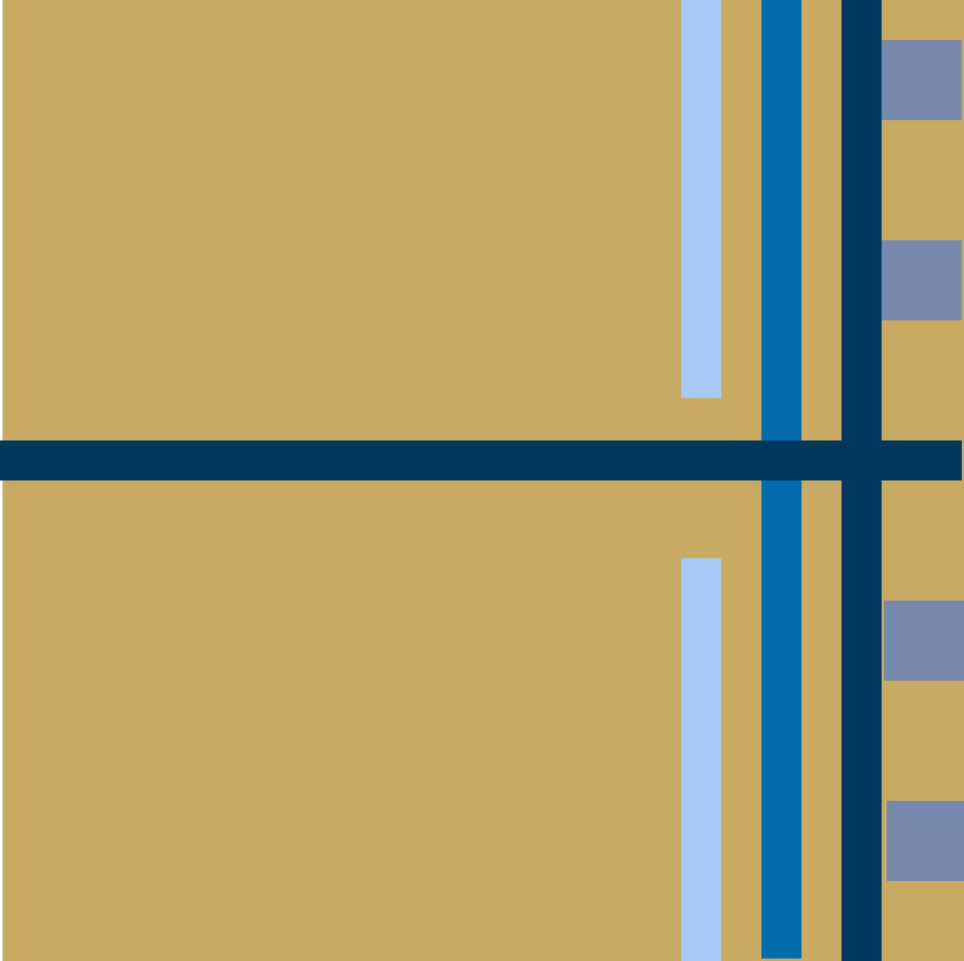
Step 6: While I liked this, I thought the background still needed to be a little darker, and I played a little with the lines adding the lighter blue back in, thinking about the light and dark balance.
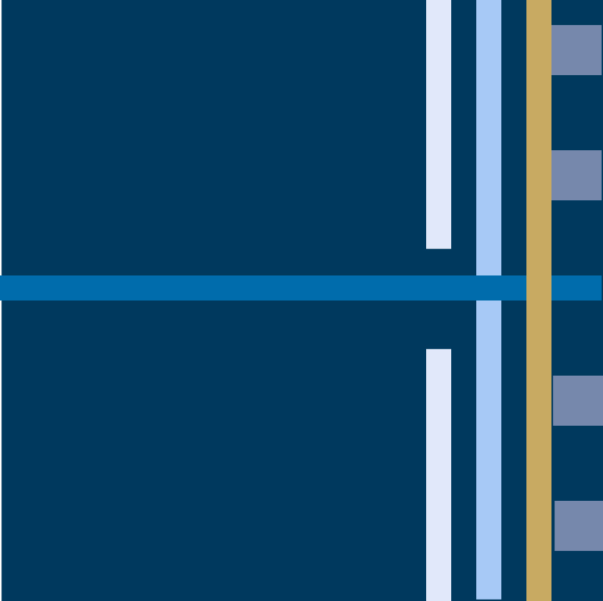
Step 7: I definitely liked the darker background, but I didn’t like the lightest blue color in the lines. In addition, the vertical bar and the intersection of the gold was wrong as the flow seemed broken. I changed the vertical bar to gold for a better flow and changed the blues to be just the two darker “light” blues. This was my final design.

Process Overview:
So, what do you think? Do you think you can give it a go? It doesn’t need to be on a computer program…paper and pencils are just as much fun and a great tool. Anyway, you know where to find us….QDAD Facebook page.
Please Note: If you would like to make or use one of my designs, please email me (ml_wilkie(at)hotmail(dot)com) or leave a comment below. I am happy to talk with you on options and provide the relevant measurements etc. or have you test out a pattern. Also, if you use one of my designs, please use the following text to credit me the design: “Designed by Michelle Wilkie @ Factotum of Arts”.

Thank you for sharing your design process. It’s fun to follow along with you!
I really like this series where you walk through your thoughts as you make subtle changes to the design. Rotating this one 90 degrees really was awesome.
I’m enjoying your QDAD series so much. The story board version of all the images lined up is kind of a great design in itself.
This is really interesting to me because I approach things so differently, but I like the way you do it and the the final one is definitely my favorite!
I love your QDAD designs and follow you in the group already. Taking us through the steps of your design process is very helpful indeed. Thank you for sharing.