My package is already to go for my first ever Traveling quilt. The blocks are done. The solid yardage has arrived (including the Kona Torch). You might say I am over excited about this….I am probably driving the “Sisterhood of the Traveling Quilts” crazy.

The last thing I have added to my package is a small traveling journal/design book for folks to fill in along the way. The first pages goes through my ideas (similar to this post)…
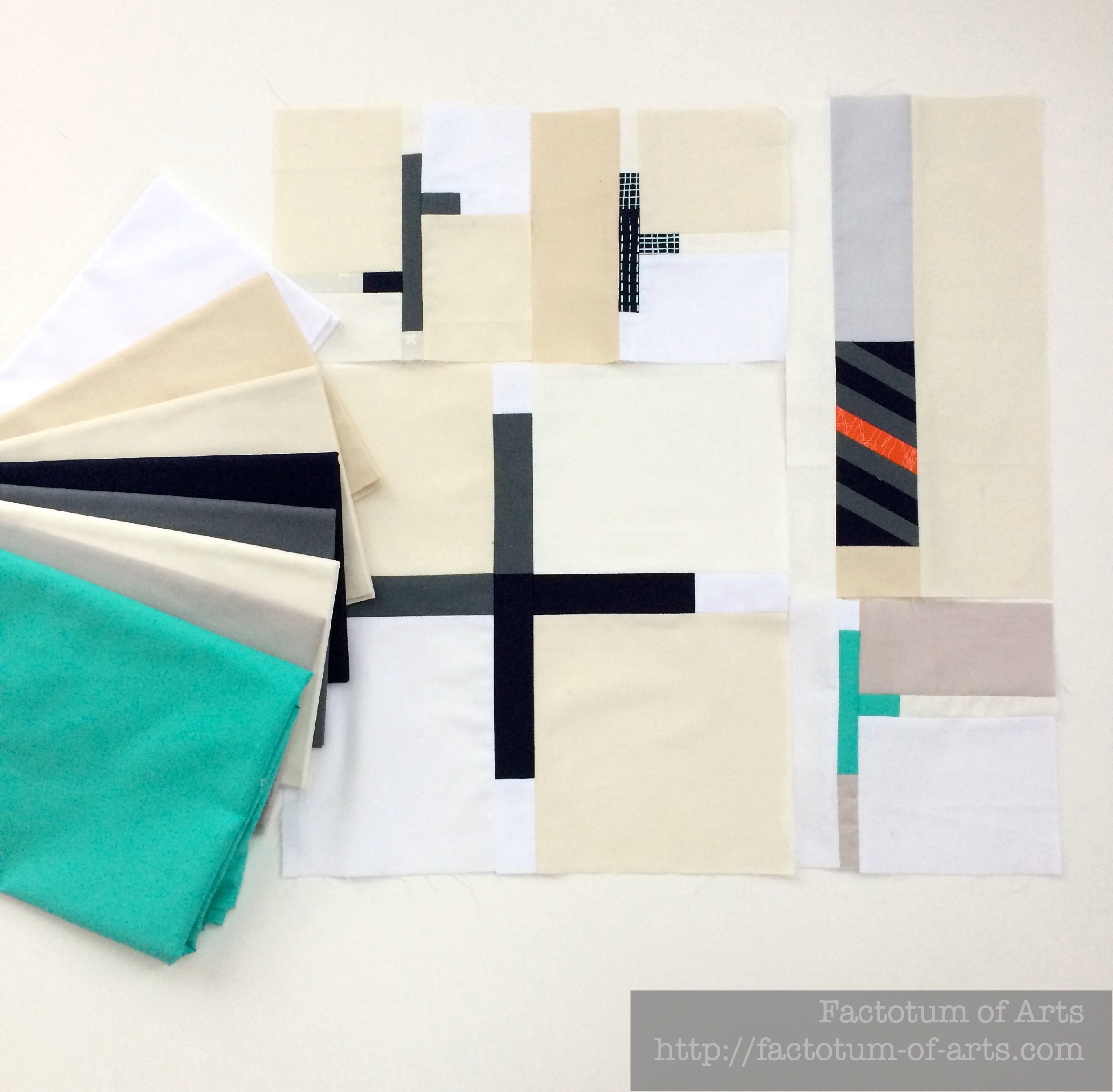
- Inspiration: The Road signs I all of a sudden found interesting on our way up to the North Carolina Mountains for vacation.
- Style: Very much a minimalistic, architectural feel, influenced by Erin Wilson’s quilts (which are featured in the pictures erinwilsonquilts.com).
- Color Palette: Navy (Kona Nautical), Orange (Kona Torch), Aqua (Kona Pool), Dark Grey (Kona Graphite) and then Neutrals for the background (White, Bone, Oyster, Putty, Ash, Silver etc). A minimal use of prints is ok.
I love the idea of the little design book/journal…I did feel the kid come out in me again and the creativity renewed with this little project. I hope the others have fun with it. Here are the others in our fab little group.
Liz – Beadqueene’s Bits and Baubles
Ashley – Wasn’t Quilt in a Day
Jessica – Quilty Habit
Laura – Little and Lots
Renee – Quilts of a Feather
I am off to ship my package!!

Reason to be over excited. Nothing is more fun than a bee mate with this level of enthusiasm, I’m sure they’re loving it too.
Please keep up the coverage! I love watching traveling quilts as they go through their different stages. It’s so much fun!
I can’t wait to see what the other ladies do with it! Glad I have lots of time to come up with something interesting to add.
It will be fun to see what the sisterhood adds to your quilt along the way. The traveling journal sounds and looks like a great idea. 🙂
I love those colors! I’m curious if you’ll ask the sisterhood to use more of the neutrals to keep it feeling “light” or “low volume,” or if you’ll have areas of saturated colors. I think your minimal approach is going to be really interesting!
The gial is to keep the color refined and minimal, also minimal use of print. There should not be any major saturated areas. The minimal LV were both a white on white. Part of all the fun thpugh is seekng what folks interpret and seeing the style of each incorporated!!
Pingback: Traveling quilts, progress and lessons learned | Factotum of Arts