I am so excited to announce, this year-long blog series on Colour, specifically for quilters. I hope to make the series an interactive and practical study of color. Our goal is to provide you with resource tools, tips, ideas, processes, fabric selections choices, etc. Hopefully, making it easier for you to start playing and becoming more comfortable with color when creating your quilts.
What will the format be for the blog series?
We will have two posts per month.
The first post that will appear in the first week of the month, will be introducing the color, my view on using this color and a task/assignment for those interested in participating. It will include some color specific examples but also include more general content that we plan to build on each month.
The second post of the month, coming out the third week of the month will be and introduction from our guest + linking to a post from our guest (see schedule below), exposing you to a variety of processes from different people.
What is the schedule and who are the guests?
We have an amazing line up of guests that will be sharing their process, tips and/or resources.
| Month | Colour | Guest/s |
|---|---|---|
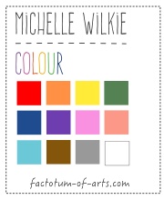
| January | Orange | Myself http://factotum-of-arts.com |
| February | Yellow | Melanie Tuazon http://melintheattic.com |
| March | Blue | Daisy Aschehoug http://antstosugar.com |
| April | Green | Anne Sullivan http://play-crafts.com Giuseppe Ribaudo https://www.instagram.com/Giucy_Giuce/ |
| May |
Coral/Peach | Heather Jones http://www.heatherjonesstudio.com/blog |
| June | Purple | Sandi Sawa Hazlewood http://craftyplanner.com |
| July |
Brown | Alison Glass http://alisonglass.com/ |
| August |
Pink | Alyce Blyth http://blossomheartquilts.com |
| September |
Black/White | Christa Watson http://christaquilts.com |
| October | Aqua/Teal | Katarina Roccella http://likeflowersandbutterflies.com |
| November |
Grey | Nicole Daksiewicz http://modernhandcraft.com Nydia Kehnle http://www.nydiakehnle.com/ |
| December | Red | Nancy Purvis http://owensolivia.blogspot.com/ |
How do you participate?
There will be two ways in which you can participate. Firstly, we will provide an activity at the being of the month that will help you on your color journey. There will be a link-up on the second post of the month, in which you can add your link and share with others. Secondly, there will be an opportunity to add comments anytime based on prompts (or in general).
Will there be prizes/giveaways, if I participate?
There will be prizes for each monthly link-up and then a single giveaway once a quarter for those who leave a comment. Please check out our Sponsors Page (which will be updated as sponsors come on board).
How do I catch up on the information if I miss anything?
A summarized view of the blog posts, resource tools, tips etc will be maintained here, so you can catch up anytime.
What does this series not cover?
This series is not going to go in-depth in the theory side of colour, as it aimed at more practical application. However, we will provide resources where you can read up on it and there will be reference to how selections work and why.
What’s Next?
Up next is the post on Orange. You will find content including:
- fabric pulls around the color Orange (with links to sellers)
- examples of a couple of projects I have made with Orange
- general tip of the month relating to using fabric for inspiration
- we will start building the resources for you to use with some reading resources.
Giveaway: Your task for this month
Let’s start with a simple task for this month. Just leave a single comment below that is either:
- a question that you would like answered during the series
- or you provide a link to a resource that you use that helps you with selecting colours for your quilt projects.
I will randomly choose a winner, 21st January, who will win a $20 gift card to the Fat Quarter Shop.
![]() A copy of “Simply Color: Orange: A Crayon Box for Quilters”
A copy of “Simply Color: Orange: A Crayon Box for Quilters”
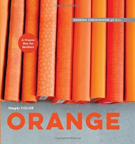 and a collection of 5″ Charm Pack of the Orange Fabrics, I feature in the next post.

How do you work with a color that does not speak to you? There are some colors that just are very difficult for me, and I am wondering if anyone has great tips or tricks I can use to help integrate them into my projects easier. Or maybe I should just embrace using what I love? 🙂
Is there a good way to audition fabrics, mainly in regards to prints, before purchase. Especially if you’re shopping online? Or do you hope for the best as you go? I see great ombré and rainbow quilts and just wonder if there’s a method to the madness or if everyone wings it.
Thanks for doing this, I can’t wait to see everyone’s posts!
I would love to learn to use a thicker thread in my quilting, like a pearl 8 maybe
I like using this site – http://www.myvirtualquilt.com/
Free and the design wall helps me!
I’m with Yvonne, how do I incorporate the colors that I am not drawn to into a quilt? Orange and yellow are on that list! I love the cool colors and I know that the warm colors complement my cool colors, but how to incorporate them without having them take over the quilt!! I would like them to be supporting actors, not the star! Maybe then I can get to the point of making them the star of the quilt! Thank you for doing this – I really need it!
I love seeing samples of fabric pulls- knowing how to narrow down your choices, color palette, etc. I often want to use every fabric I see 🙂 I also would love to see examples of pulls that don’t work and why as compared to a pull that works better. Thank you- so looking forward to this series!
What a fun idea! To expand on Yvonne’s question, I think it would be great to explore unexpected colour combos that can make colours you don’t like more palatable. For example brown might not be your thing (sorry brown) but if you pair it with x, y and z you might have a more modern take. Or you can just make everything a rainbow!
I think Jess@quiltyhabit sent this to me a couple of years ago: http://paletton.com/#uid=1000u0kllllaFw0g0qFqFg0w0aF it’s been a fun tool to play with, but to be honest I’ve never actually used it for picking quilt colors. I have used it to look at colors together that I’m considering for a quilt though!
http://blog.shopmartingale.com/quilting-sewing/color-lessons-for-the-terrified-quilter/
http://www.e-quilterscorner.com/blog/2014/10/20/10-tips-help-you-choose-fabrics-your-next-quilt/
These helped me.
Dmac5958ataoldotcom
Do I need a “stitch regulator” to do even FM Quilting ?
Thanks.
Jeni Baker, of In Color Order, has a series about color called “The Art of Choosing”. It’s well worth checking out. I am really looking forward to your series, Michelle!
My question: What have you found to be the best method for choosing fabrics (colors/designs) for a quilt?
My question is on fabric by Kaffee Fassett. I love his fabric but have a hard time trying to get it to blend with other fabric lines. How do I bridge color families from different designers?
I’d love to see a gender neutral quilt using a wide variety of colors, including scraps of punk and blue, without it looking overly feminine… My scrappy quilts usually look more girly! I suppose I just tend to have more “girly” scraps, but I’d still love some tips 🙂
Really glad you are doing this series. Thanks! My question has to do with my own difficulty in distinguishing the nuances in colors. For example, I’d love to be able to use solids to create a pattern that looks like a plaid — but I don’t think I could select the color “created” when two given solids appear to intersect. How can you train your eye?
Looking forward to this series. I always struggle with either having my fabric pulls too similar and therefore boring, or too incoherent when I try to bring in more diversity. Help!
Looking forward to this series. My question is how can you to decide on a balance of solids and prints.
Definitely ways to work with colours you don’t enjoy. They always get asked for in gift quilts!
I have been part of a block exchange for 2 years (friendship quilt). I love my block until I see what everyone else has done. I can’t wait for guidance on choosing colors for a quilt.
I have found the Color Tool http://www.amazon.com/gp/product/1607052350?keywords=Color%20tool&qid=1452141227&ref_=sr_1_1&sr=8-1 helpful. It can be used to match colours and then gives ideas of complementary, analogous and other types of colour schemes
I’m a big fan of Design Seeds and I’ve used it several times as I consider a project palette.
I’m trying to understand how to use the color wheel in selecting fabrics for quilts. Also, it would be helpful to have hints about meshing fabrics from different collections, and even different eras, so that they can look cohesive. I’m looking forward to reading more.
I see that my question has already been asked a few times, so I don’t feel quite so alone! I’m always at a loss as to how to to use colors I don’t feel drawn to, yet know that they would be useful in complementary or analogous color sets. Which is why even Joen Wolfrom’s Color Tool, wonderful as it is, hasn’t really helped me! How do I overcome my aversion?
How do you get out of a color rut? I always use blues and greens but I need to change my view.
I would like to know how to use prints that feature 2 or more colours
I love the Play Crafts Color Theory tutorials at http://www.play-crafts.com/blog/tutorials/ to help me use color well in my quilts.
I love all colours and will follow you with interest to learn more. I like to use Design Seeds for inspiration.
Question: How do you avoid putting in something that turns out glaring when you didn’t notice it was going to have that reaction?
Is there an easy way to know if the colors you see on the screen are true colors or not? Too many times I buy online and the colors look like they will match or are a close match and when it arrives it is nowhere near.
I am a new quilter trying to learn from all sites. My question is can I compete or will it be to difficult for a beginner?
How do you talk/educate about using color without going into color theory? I know this question will be answered as soon as you begin … but that’s the question your teaser article presented to me.
Do you use color wheel choices, sometimes the opposite color does not work for me?
There are some great questions up there. As a majority of my fabric shopping is done online my question is How do you determine color and coordinate it online? I know some shops have some great tools–like Hawthorne Threads, but that’s one of my greatest challenges.
My question is how to coordinate colors. I use the color wheel, but some times they just don’t do it for me.
How do you decide which patterns you could substitute block colours for patterned fabrics ?
I’ve just discovered Design Seeds http://design-seeds.com/search and have been playing with it a little.
my biggest struggle is using too much color…….I need to learn to include more neutral. Whichis a real struggle for me since they are normally boring to look at when they stand alone on the cutting mat.
How do you decide on prints to use within color schemes? How do you choose 5 fabrics within the same color scheme for variety? How can you blend :loud colors and patterns so not to over whelm a quilt?
I’m going to love this series!! Sometimes I have a really odd color that stumps me with what to pair it with. Is there a method to coordinating hard to match colors?
I need to think outside the box more and come up with my own designs. I never buy orange, this would be a great addition to my stash. thank you for your great idea
How does one effectively use colored thread on colorful quilts? I’ve seen a few that just sparkles; but, how do they do that?
this is an exciting way to play with color. Thanks for doing it.
loving that you’re starting with the color Orange – it is my favorite color. I tend to pair it with the usual browns and beiges…..can you teach me to go bold with this color which can be bold by itself?
I want to know how I can choose color combinations that aren’t too trendy and won’t leave me with a bunch of dated-looking projects. I know all things change with time, but don’t want to put a bunch of effort into projects I won’t love in the future.
I love all colours. I have a difficult time limiting the colours. Look forward to following this blog.
Orange is a favorite color of mine so I’m glad you started with it! I tend to use a focus fabric to help with color selection. I almost always start with a narrow group then look through my stash to increase the variety of fabric. I make very scrappy quilts most of the time. I would like to try more limited focused color groups.
For color inspiration I use Google images or Pinterest and type in the color combos I like to explore.
Ooh, orange is my favourite colour! I would like more information on how to effectively mix solids and prints of the same colour.
I like using lots of different fabrics in a quilt but sometimes get a blended look that doesn’t show the block pattern as well as I’d like. How do I select fabrics, especially prints, that give me the variety I want, but still show off a pieced design?
Oh and a second question. I love the shimmery effect I see in some scrap quilts. This usually seems to come from triangles in the piecing and slight differences in value or is it slight differences in hue?
I want to know how to mix colors without having it look like a gaudy mess. I see people who have quilts using all different colors, but when I try it always seems too brash.