Have you ever played with re-coloring your design or a pattern from another designer. I love playing with color and finding new color combinations. I recently had to do this for two designs.
This first one, was designed based on an image from Design Seeds via @thebungalow22 of a striped beach umbrella.

I loved how the original design came out. The color palette landed up being an unusual and unique palette.

When playing with color combinations for this design, I wanted to make sure that I kept this uniqueness and the combination of cold and warm color balance.
The first playing with oranges, blues and grey, which I think maintains the freshness.

The second, a more reserved palette with teal, green and peach.

A third version, using peach-pink, green and greys.
With these striped designs, I am thinking of making prints or fabric wall hangings, to see them side by side – it would make an interesting color study I think.
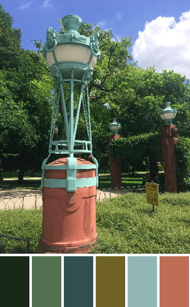
The second design was based on an old gas lamp at the Mannheim water tower (Wasserturm), a picture captured while visiting family. The color palette was created using the Palette Builder tool from Play Crafts.
The original design, definitely with this color palette, gives an air of Art Deco (1930s). I like it but knew if I made it I would need to re-color it.

I first tried a black, white and grey version, which I think I need as a floor (tiles).

I played with some bright colors, and had fun with mixing pink + orange with some aqua + greens.

Keeping with bold colors, used a warm palette here with pinks + oranges + purples, using the white to make the colors pop.

Wanted to play with more muted tones, so added some pastel based colors to this purple + yellow based palette. 
Liking the white but wanting to give it some freshness in this one. I went back to the warm + cold palette with this one. A mix of green + pink + peach and using the pastel versions of the green + peach, and again the white to add to the brightness and contrast.
Lastly, I wanted to play with some prints, my go to Carolyn Friedlander prints. I like the variations in her blue prints and love the lilac prints that are in her collections. (color: blue + lilac + mustard and cream).

Do you play around with color in your designs or patterns? What are your favorite combinations?
Please Note: If you would like to make or use one of my designs, please email me (ml_wilkie(at)hotmail(dot)com) or leave a comment below. I am happy to talk with you on options and provide the relevant measurements etc. or have you test out a pattern. Also, if you use one of my designs, please use the following text to credit me the design: “Designed by Michelle Wilkie @ Factotum of Arts”.

I really love working from the QDAD color and image prompts, but I often find that recoloring a design later will help its appeal in a pitch to a magazine. My favorite colors tend to shift over time. I was heavy on orange a few years ago and have slid into a fuchsia phase at the moment!
As always, I love your designs! This time both first versions are my favorites; these palettes are the strongest and most interesting ones for me.
Pingback: Umbrella Stripes {a finish} | Factotum of Arts
Pingback: Park Lamps {a finish} | Factotum of Arts