Instead of just posting about my finishes, I thought I would go into more detail on a few quilts. This first post I have touched on before but wanted to talk more about the steps, techniques and process of building these quilts from design to binding.
I am starting with a color play study I did, that was inspired by Stanley Whitney’s work. As Josef Albers explores color with his work Interaction of color, I love how Stanley Whitney does the same (at least for me) in the placement of the colors in the grid. Here are a couple of examples of Stanley Whitney’s work:


If you like these pieces, check out this book, Stanley Whitney: In the Color.
There are three pieces in which I explored color and placement. For all, I started with:
- A large design wall that provided space to organize layout and editing.
- A pile of larger scraps that were smaller than a fat quarter, and some sorted smaller scraps, sorted by color.
- I knew that these would be improvisation based quilts; exploring maximalism with color but minimalism in design.
The first quilt, Whitney, I started with a similar grid layout like Stanley Whitney’s pieces. I keep with bright colors but was limited based on the scraps I had in my stash. I did not want to purchase additional fabric.
As I ordered the larger scraps I found common color groupings – Reds/pinks, Greens, yellows and blues. I laid these scraps vertically in the color groups thinking I would add horizontal strips between the rows. Where I did not have enough large scraps I used smaller scraps to create the square (see red and green rows). This is what the initial layout looked like.
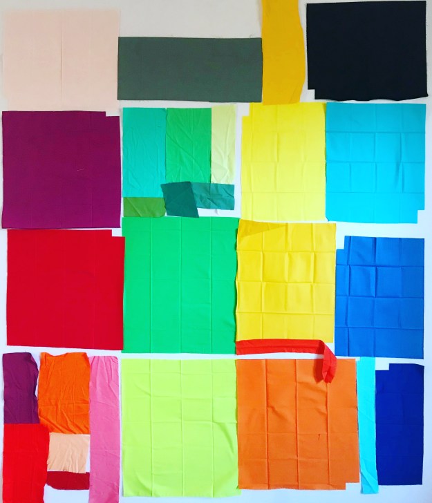
I edited the arrangement and made some decisions:
- I wanted to have yellow’s, vertically all the way down. Yellow had the smallest variation in color so I feel it draws the eye down between rows.
- As I sewed up each row, I added “filler” pieces to try and make sure each row was approximately the same size.
- The stripes between the rows, I wanted to keep within the color choices I made in the columns, so I chose blue, reds and yellow (the primary colors). The colors were ~2″ strips I had in stash.
- I added stripes to add interest and a place for visual rest.
- Many of the larger scraps had corners missing so additional pieces were added, or strips were trimmed off, and one I added a triangle which I thought would be great using a green from the adjacent color area.
- The lighter blue piece added in the blue row separator was not planned. The strip was too short and it was a slice and insert. It was a great coincidence that it lined up the way it did.

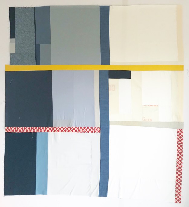
Stanley is the second study I did. I wanted to explore, this time the lack of bright colors with a mostly neutral color palette. Some design decisions for this quilt:
- I played with different fabric types in this quilt with quilting cotton, linen, denim and feed sacks.
- I wanted the quilt to move from dark (left) to light (right) – black, grey, whites/creams.
- Yellow was used as a row separator in this quilt.
- To draw the eye down the quilt, this time I used the thin blue denim vertical stripe. Its separated with the yellow but I decided not to separate it between second and third rows.
- The red was prompted from the red in the feed sack. I was hoping that it would make the feed sacks pop a little.
- The red print was added last as the row separator between black and grey. I decided I liked having the red print also down the side of the third row. I like the jump it forces you to make when looking at it.
The first two quilts were named after Stanley Whitney who inspired these two pieces; Whitney due to the bright colors (more girl-ie) and Stanley for the more neutral quilt.
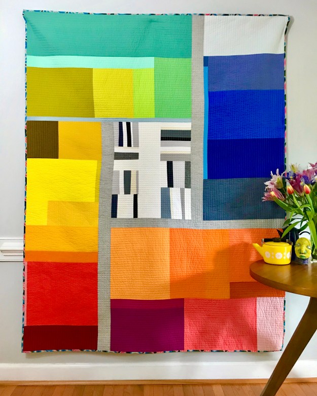
If you follow my blog you would have seen the 3rd one in this study – Scrap Dive Study no. 3. This one was not following the typical grid rows and columns layout the previous two explored. I still explored the separation of areas but in a more quadrant layout. The large scraps here I looked at oranges, reds, yellows, greens and a smaller area of blues. The separator is a linen weaved blend.
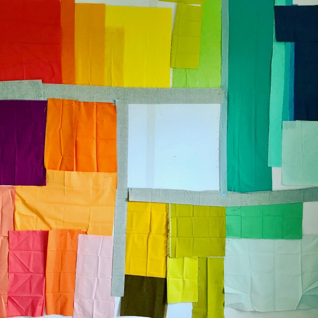
After this initial layout, I changed:
- The grouping of the colors. I moved all the greens into one area. I expanded the blues into its own areas and added some denim off-cuts. The two other segments were the warm colors which are positioned more in a gradation – corals to oranges in one segment, reds/pinks/oranges and yellows in the other.
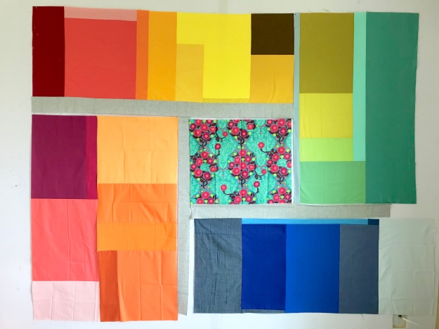
- The center, I struggled with and initially tried a variety of prints but finally decided on a black and white center
- Also, rotated the quilt so that the green was on top.
As I take you through the journey of these quilts, I plan to share:
- Technique: How I baste quilts (where I’ll share reference material)
- Deciding on Quilting designs
- Technique: Burying threads
- Technique: Binding tips
If you have other questions or topics you want more information, let me know and I’ll try to address them, either in these planned posts or in new posts.

Thanks for taking the time to explain your inspiration and process for these quilts. The colour groupings are very attractive. I’m doing the Rainbow Scrap Challenge and have been toying with the idea of placing neutral fabrics in the centre of the quilt… Your Scrap Dive quilt has shown me how that can work!
Pingback: The Quilting {Quilt Journey Part II} | Factotum of Arts
Nice blog thanks for postiing