Author Archives: mlwilkie

Unknown's avatar

About mlwilkie

Software Developer, Mother, Wife with keen interest in art, design and crafts of all kinds.

QDAD: Getting back into practicing

It has been a while since I spent time designing, so this month I decided to get back into it. Its been a little mixed to start which is normal – there are always designs I like and ones that I file away :-). Without giving it a go though, you never find the design you want to actually make.

January 15
Screen Shot 2016-01-31 at 11.36.51 PM

This design was influenced by the placement and direction I saw in the negative space of this photo. I used triangles as I find them best to represent movement.

Jan15_2016

January 17

Screen Shot 2016-01-31 at 11.41.11 PM

I loved the idea of representing the shutters in my design with the little roofs. As I was developing the shutters I liked the dark line of the hinges which I also incorporated.

17JAN_2016

I decided that my final design need to be a more dense representation of the shutters. So this landed up being my final design.
17JAN_2016(1)

January 18

Screen Shot 2016-01-31 at 11.43.46 PM

I loved the colors in this palette and wanted to somehow represent the flowers without them being to definitive, slightly abstract. There are a couple of placement things I will change if I make this.

18JAN_2016

January 19

I took this photo on a trip to Florence a while back. Florence was not my favorite Italian city but this bridge was amazing.
020_19-palette

The inspiration for this design is the roofs and the bridge form of Florence Ponte Vecchio.

20JAN_2016(2)

January 21

Screen Shot 2016-01-31 at 11.50.59 PM

I loved the white concrete brick placement around the windows in the middle building. I used that placement to make this ombre dot design.

21JAN_2019_2(1)

21 January

Screen Shot 2016-02-01 at 12.00.35 AM

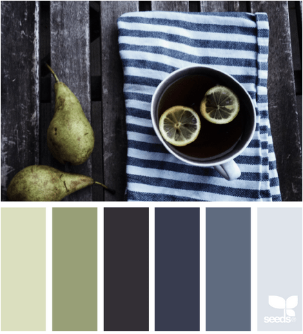
I loved the stripey towel and the vertical lines of the deck. I used these lines in my design.

21JAN_2019(1)

January 22

Screen Shot 2016-02-01 at 12.02.29 AM

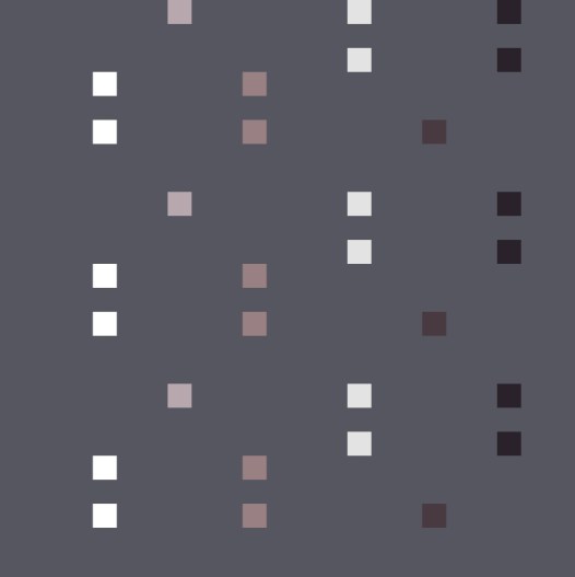
I wanted to play with prints using this palette. I have this idea for a design using the Speed bumps road markings. Lets see how this develops as I have another palette in mind as well.

22JAN_2016

January 23

Screen Shot 2016-02-01 at 12.04.18 AM

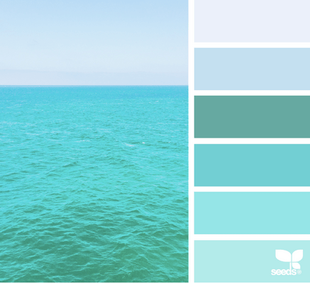
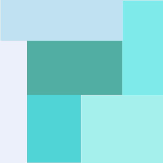
I love this palette, as it would be great for transparency design. I wanted though something very minimalist being inspired by a book I am reading on Ralph Hotere (NZ artist).

23JAN_2016(1)

Thanks for stopping by. You can check out my other designs on my QDAD page. If you want to join in check out our closed group on facebook (click join).

Please Note: If you would like to make or use one of my designs, please email me (ml_wilkie(at)hotmail(dot)com) or leave a comment below. I am happy to talk with you on options and provide the relevant measurements etc. or have you test out a pattern. Also, if you use one of my designs, please use the following text to credit me the design: “Designed by Michelle Wilkie @ Factotum of Arts”.

Bright Prints | a color study

Last year, I did a design that I thought would be perfect to play with prints. I like using solids and prints, but what I wanted to do is step outside my comfort zone and use a variety bright and loud prints. I was inspired by designers like Anna Maria Horner, Alison Glass, Tula Pink and Amy Butler, as their prints are so amazing.
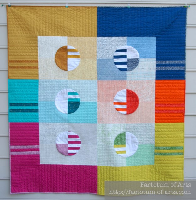
SquarewithinSquares_stripes_Solids

I chose Alison Glass prints from Field Day, Ex Libris, Clover Sunshine and Lucky Penny to play with.

LPQ 30 - Square in Square
[Photo Credit: Love Patchwork & Quilting]

I love how it turned out. I stressed the whole time while this was in the making. I had to change my inner background fabrics as the print I wanted to use was out of print (OOP) and I could not find it anywhere. The Ex Libris prints I did go with were much “noisier” than I was wanting. I was not sure until it was finished that it was what I wanted.

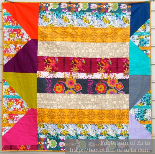
ColorStudyFront

The back was made from left over straps from the front of the quilt.ColorStudy_back

You too can make this pattern, if you like it. This project was ultimately done for Love Patchwork and Quilting. It is in this month’s magazine (Issue 30) and it actually made the cover. So, I am ecstatic that they loved it as much as I did.

LPQ 30 - Front Cover
[Photo Credit: Love Patchwork & Quilting]

Not to bad for my first finish of 2016. Looking forward to the rest of the year.

Orange – A Colour Blog Series

IMG_5725

Orange is one of my favorite colours. I use it often in my quilts/ quilt blocks. It is so versatile and my favorite way of using it is as a pop to add visual interest.

Here are some examples on how I have used orange with a current fabric mosaic.

Orange
IMG_5484

The trick with using all one color (ie. Monochromatic) is making sure you have variation, which can be achieved with different volumes (inside square high volume, outside low volume), or with various shades of the same color.

Tip for Monochromatic: Try using a camera and taking a black and white photo to see if you have enough variation in your fabric selections. You should see a gradation.

mosaic10608d2471225cdc12bdc8c81651447620abf6b5
1. Lizzie House ; 2. Carolyn Friedlander; 3. Frances Newcombe; 4. Alison Glass; 5. Anna Maria Horner; 6. Denyse Schmidt; 7. Downton Abbey; 8. V & Co. ; 9. Leah Duncan

Orange + Warm

The other option to add depth and using orange, is to use other warmer colors (ie. An Analogous color palette). My current WiP was based on orange but I found I needed more depth so I added purples, magenta, yellow and coral/peach.

I find the Analogous color palette one of the easiest to do as the colors are in the same “family” or part of the color wheel so they always seem to work, no matter what print you use.

Mum_QuiltWiP

With this palette purple does stand out better than the orange due to its darkness, so you may choose to drop that. For my purposes it worked well.

mosaic792f2c1b24178952204fabbf046503790d5d4091
1. Carolyn Friedlander; 2. Karen Lewis; 3. Tula Pink; 4. Lizzie House; 5. Rashida Coleman Hale; 6. Katrina Roccella; 7. Leah Duncan; 8. Lizzie House; 9. Sarah Jane

When using a warm palette, but very vibrant versions of pink and orange, what about thinking of adding balance with neutrals like white and grey.

Project_hot_d9

Orange + Neutrals

I use orange and neutrals a lot together, as this gives orange the role as a focus color. You don’t have to use a lot of color with neutrals for this to be true. Play around with solid greys, whites and blacks; featured here are all Kona cottons (First print: Titanium, Torch, Pepper, Shadow; Second Print: White, Torch, Oyster, Putty, Shadow).

FabricArtBlocks

The main print in this next example is by Yoshiko Jinzenji for Yuwa Fabric. The grey, oyster and navy blue print (that appears black) are Karen Lewis hand printed fabrics. I love that pop of colour among the neutrals for visual interest and draws your eye into the quilt.

Unnamed_FinishQuiltTop

Orange + Blues

With this example,  I used mostly blues but wanted to add a pop on the edges. I tried Teal, aqua and blue but landed up deciding that the orange was a perfect complement  to the extreme blue palette.
IMG_5652

This works as it is loosely based on a triadic (complementary) color palette but I dropped the green that would be included.

mosaic45df1d3aa2fe29f989f6b10a62711fde196f4a3e
1. Carolyn Friedlander; 2. Cotton + Steel; 3. Jeni Baker; 4. Karen Lewis

Monthly Tip

If you are unsure about building a color palette and you don’t want to stick with using a fabric line….What about choosing a print you like and build a bundle based on the colors available in that print (check out the dots on the selvedges). Here are a couple of examples using Anna Maria Horner fabrics and the palette builder tool for the Kona cotton palette.

Screen Shot 2016-01-24 at 8.42.25 PM
Screen Shot 2016-01-24 at 8.43.41 PM

Monthly Resources

Book:  Quilt Color Workshop – Creative Color Combinations for Quilters

Website: Canva Color Theory

Tool: Play Crafts Palette Builder

Give-away Winner

 Winner of the prize this month is Debbie from Sheltered Stitches. Debbie I will email you shortly with the details of your prize.

Next Month….Yellow

ColorWidget

Note, that all the projects provided in this post are my own unless noted. If there is something you would like more information on or if you would like to provide feedback on what you want to see more of please leave a comment. This blog series is developing and I am happy to change it up to accommodate more information.