Category Archives: Colour Blog Series

Peach + Coral: A Colour Blog Series

IMG_9487

This month is about one of my favorite colors, the peach/coral shades. When thinking about what to do this month, I realized I actually did not have that many projects, so this month you get to see some of my friends projects too.

Coral/Peach + Neutrals

Looking for soft looking projects, then the mix of peaches/corals with neutrals are a great choice.

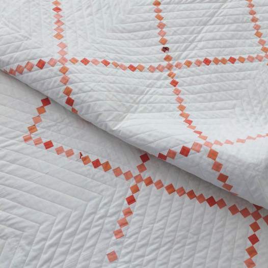
Melissa (IG: meliherboth) made this stunning version of Denyse Schmidt’s Irish Chain quilt using white + Peach/corals.

IMG_3649

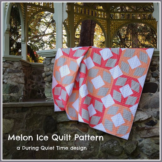
Amy (IG: duringquiettime Blog: During Quiet Time)  mixed a neutral palette (white + grey) withe peaches and corals to make this crisp and clean-looking quilt “Melon Ice“. She even has a pattern available for this quilt.
MelonIcePatternCoverbb

Coral/Peach + Warm

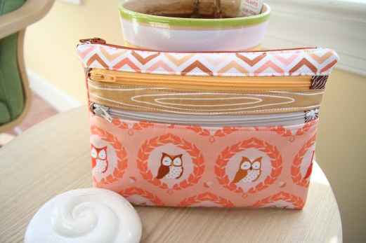
I love matching the coral/peach colors with other warm colors. This zipper pouch project was one of the first things I ever made with the Les Amis Fabric range.The peaches and brown’s that it came in that line, are some of my favorite brown prints today.

IMG_6997

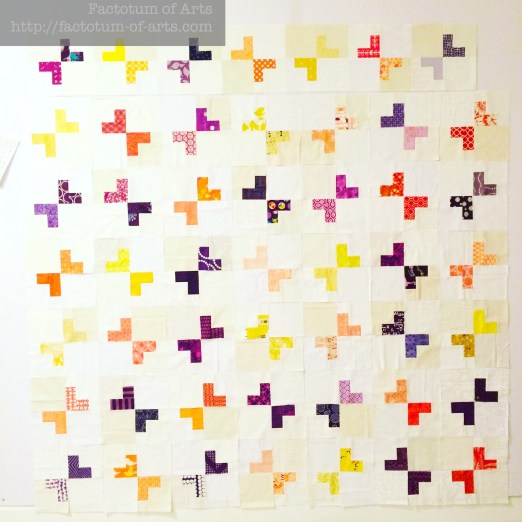
Other great warm color combination’s that have worked with peach is this one. You will see more of this project soon, as it’s almost finished. The peachy colors used in this project adds depth, as they are lower volume than the oranges and purples.

Mum_QuiltWiP

Coral/Peach + Cool

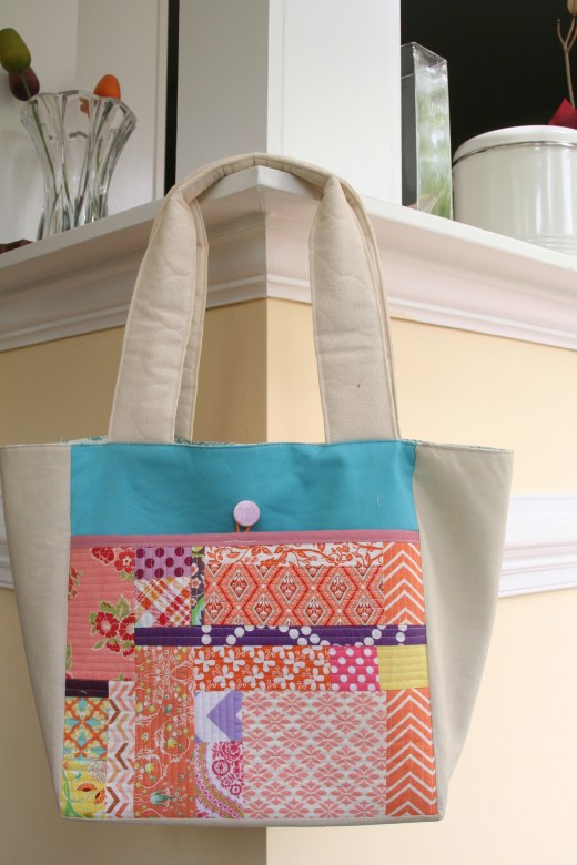
I also love a good mint or aqua match-up with coral/peach colors. These cooler colors make add a great balance to projects. This bag from Patchwork Please, was my first ever bag. I loved the play of patchwork of colors of coral, peach, yellow, purple, orange against the solid aqua pocket background.

IMG_7164

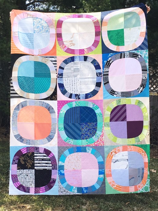
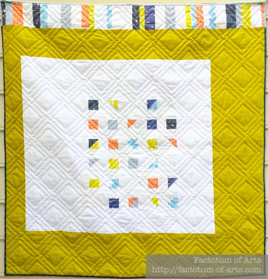
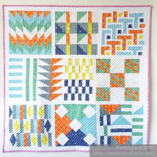
Amy’s project “Pointed Statement” uses the deeper blues to give a great contrast to the peaches and corals. With the variations in shapes and the shades of the two colors, I love how your eye just can’t help but to wander over the quilt – provides great movement.2015-04-22-IMG_0489bb

Amanda (IG: amandadare31) used the peaches and cooler colors from the fabric line “Hello, Bear” to produce this amazing triangle quilt. This would make such a great neutral baby quilt. Screen Shot 2016-05-13 at 3.46.18 PM

Coral + Multi-colored

This last project, uses a great mix of warm and cool colors with peach + coral adding to the warmer palette. Sarah’s (IG: SarahSchrawDesigns, Blog: Sarah Quilts) has done a fabulous job interpreting Denyse Schmidt’s Single Girl Quilt vintage but modern feel to this quilt.

IMG_5153

I hope you have enjoyed seeing other projects from the quilting community this month.

Monthly Tip

Do you have an old solids Color Card (eg. the kona color card)?
IMG_6244

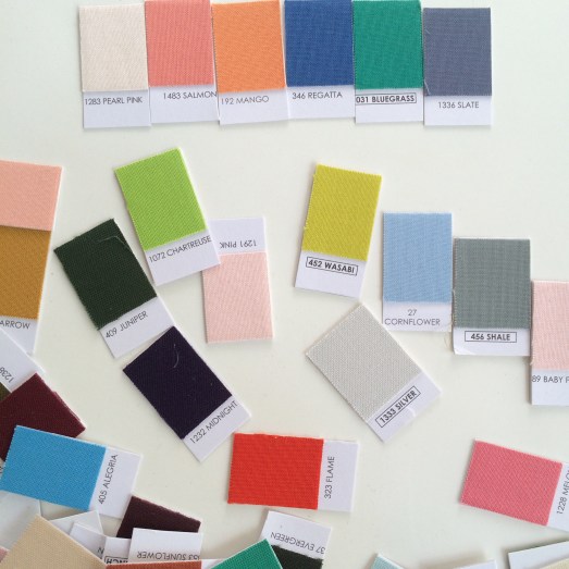
Cut it up into individual pieces and play with finding a palette that works. I find starting with 4 colors is easiest and then think about the balance these 4 bring. Do you need to add more variation or depth, add an additional 2 colors. Note: More than 6 will make it more difficult and you could lose cohesiveness.

Monthly Resources

Books: Simply Color Series by Vanessa Christenson

Website: Color Matters

Monthly Challenge

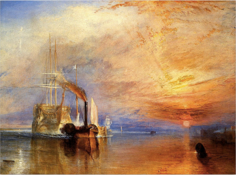
This challenge is a mini research project, and hopefully expanding your inspiration focus. Find an artist (fine arts – oil, printing, painting, drawing) who uses peaches and corals in their work.  What other colors do they use with this color palette? Now try to recreate this color palette using your own prints and/or solids. Next week, I will provide you a link-up in the guest post introduction, to add your fabric pull with description of the artist (and link) to the pieces of work you were inspired by.

The prize this month is a 6 piece peach and coral bundle from Art Gallery Fabrics and a $20 Gift card from the Fat Quarter Shop. Winner will be announced in next month’s first post.

Winner for Last Month

I was so happy to hear how much you all are enjoying the posts. The winner of last month’s draw is Momi machts. I will be emailing you shortly to get your details.


Green: Guest Post {Anne Sullivan}

IMG_6079

Last week, the monthly post for Green: A Colour Blog Series went live, check it out as there is a great give-away open to everyone.

Introducing Anne Sullivan

I am so delighted to have Anne Sullivan from Play Crafts as a guest this month. Anne has been an inspiration to me and really helped me, find who I am as a quilter, by starting Quilt Design a Day. She is super talented, and if you are part of The Modern Quilt Guild you would recognize her Quilt of the Month entries: City Lights (Mar 2016), Phoenix Quilt (Sep 2015).  Her post is an interesting one, as she talks about her journey of discovery with green and how she now finds it a great supportive color.

Fabric Pulls for Green

Also in this post, I want to provide some fabric pulls of current choices people could have with the various greens, which I did not do in the last post. Let’s start by highlighting my two favorite fabric lines/collections that are my go to for green.

  1. Carolyn Friedlander: Not only does her lines usually include green but you can use her lines as a great color palette choice when trying to find other colors to go with green.

    Green Palette (all currently available)

    mosaic9a9e0f6e6f2051d7d9ccf3e3de0df466d7faf85e
    [All available at Hawthorne Threads, except 7: Botanics Leaf print and 8: Botanics Lines print]

    Co-ordinated Palette from Carkai (all available at Hawthorne threads)

    mosaicb52cb0ecac8214ab688d60ebbebc22790b2a30b0

  2. Cotton and Steel: Produce great basics for so many colors. They have varying depth and range (forest green, bright green, mint, citron etc.), so I definitely like adding them to my green stash. (Prints available at Hawthorne Threads)
    mosaic4be02721c60ee8a8bcd62de7605dc72eca34f26d

Other Green Color palette choices

Mint:
mosaicc30d7f3253caf8103920bd365aee4da45b97ba6b
1. Bonnie Christine; 2. Katarina Roccella; 3. Cotton + Steel; 4. Leah Duncan; 5. Amy Sinibaldi; 6. Sarah Jane; 7. AGF Studios; 8. AGF Studios; 9. Alison Glass

Greens:
mosaicc00e17f34484f542376ab2678ca8600e55c13bdb
1. Tamara Kate; 2. Cori Dantini; 3. Heather Ross; 4. Tula Pink; 5. Jessica Jones; 6. Lizzie House; 7. Ann Kelle; 8. Ink and Spindle; 9. Frances Newcombe

If you are looking for previous posts, check out the home page here. Otherwise, I’ll see you the same place here next month!! Enjoy!


Green: A Colour Blog Series

IMG_6079

Green is an interesting color for me. When I thought about it, I thought my projects would be similar to how I use blue. My fabric stash definitely has it as one of my main colors. However, I actually realized that I do not use it as frequently or in the same way.

I think I find green, while very appealing, a lot of the time very symbolic  or representative of well-known brands, which to me is a little off-putting:

  • Irish/St Patrick’s Day,
  • Christmas
  • trees/plants, four leaf clover
  • Starbucks, Barnes and Nobles, BP
  • Springboks (South African Ruby team), Wallabies (Australian Rugby team)….that’s why I might have an issue being a kiwi (All Black – NZ Rugby team) supporter 😉

When I do use green, in a very limited way. Here are examples.

Green + Neutrals

As there are so many various greens represented in fabric, I really do like a monochromatic color palette with various neutrals.  These place mats using shot cottons and linen are a great example.

PlaceMats_WH_complete

Another project I have underway, is a quilt design that is inspired on a tree-lined street. These hexagons use various greens to represent the light casts and the darkness of the leaves of the trees. The background fabric will be Kona White to make those greens pop.

IMG_6049

Green + Multi-color

I think I like the balance green brings to a bright and multi-colored palette. I use it a lot in this manner and I know when selecting fabrics, I always add the green back in.

In my recent project, Treehouse Ladders (more to come on this project), green was definitely used to add balance to this very pop art inspired palette. It needed to be this very bright green, but not to yellow as both orange and yellow were used. It was also important it was not to blue since the palette also had blue and aqua.

IMG_6040

In this multicolored quilt, Natural Corridors,  Kona Pickle (a yellow based green) was used as the focus fabric for the negative space. I decided to use this color as it pulled the citron print out a little but worked well with the blues and coral prints. The pickle area, is not too over bearing in this design and it highlights the offset centered block well.

Natural_Corridors_Quilt_Top

The Spoonflower Sampler Quilt, also required both the mid green print and the citron print to balance the colors.

Spoonflower Sampler Quilt

Lastly, my Phased Circles quilts, using Carolyn Friedlander’s Botanics and Architexture lines, includes green. This was obviously driven from the 6 main color ways included in her fabric lines. This example of green though does show the color variations available in green prints, and the availability of high and low volume green based prints.

PhasedCirclesComplete

I was asked before starting this series about how I decide on the thread color for quilting. That is a great question especially when creating multi-colored quilts with such a difference in color. So above my thread choices are as follows:

  • Treehouse Ladders: Invisible Thread (clear). I used Premium Silky Invisible thread.
  • Natural Corridors: Light Grey
  • Spoonflower Sampler Quilt: Off White
  • Phased Circles: Color Matched the fabric. Blue block: 6738, 2725; Orange Block: 1133; Green Block: 2835, 5015; Pink Block: 1100, 2600; Jade: 2810, 5007; Gold: 5022, 2110

Monthly Tip

I love learning how other artists in other mediums use their color palettes. Here are a couple of examples.

Ophelia Pang:
mosaicb75cd2cbe7ffb463188be2345c119483e4869be4

Josef Albers: Interaction of Color
Screen Shot 2016-04-13 at 9.57.32 PM

J.M.W Turner
Screen Shot 2016-04-13 at 10.01.51 PM

Monthly Resource

Book: The Secret Language of Color

Give-away

There is no project this month, so this is open to everyone. Just leave one comment below on what you enjoy about these posts and what you would like to see more of or see different.

I will randomly choose a winner on May 1st, who I will announce in my May Colour Blog Series post. The winner will receive:

  • 1/2 yard green bundle of 6 prints curated by me.
  • An exclusive thread box from Fat Quarter Shop.

Last Month’s Winner….

is Katherine Gray who entered a fantastic hexie project she was working on in blue and greys. Katherine, I will direct message you shortly for your details.