Category Archives: Uncategorized

WiP Wednesday: Sisterhood of the Traveling Quilts

The first round for the Sisterhood of the Traveling Quilts is almost finished. I have been working on Renee’s quilt. She made this amazing center using a paper piecing pattern from Angela Walters.

IMG_3916

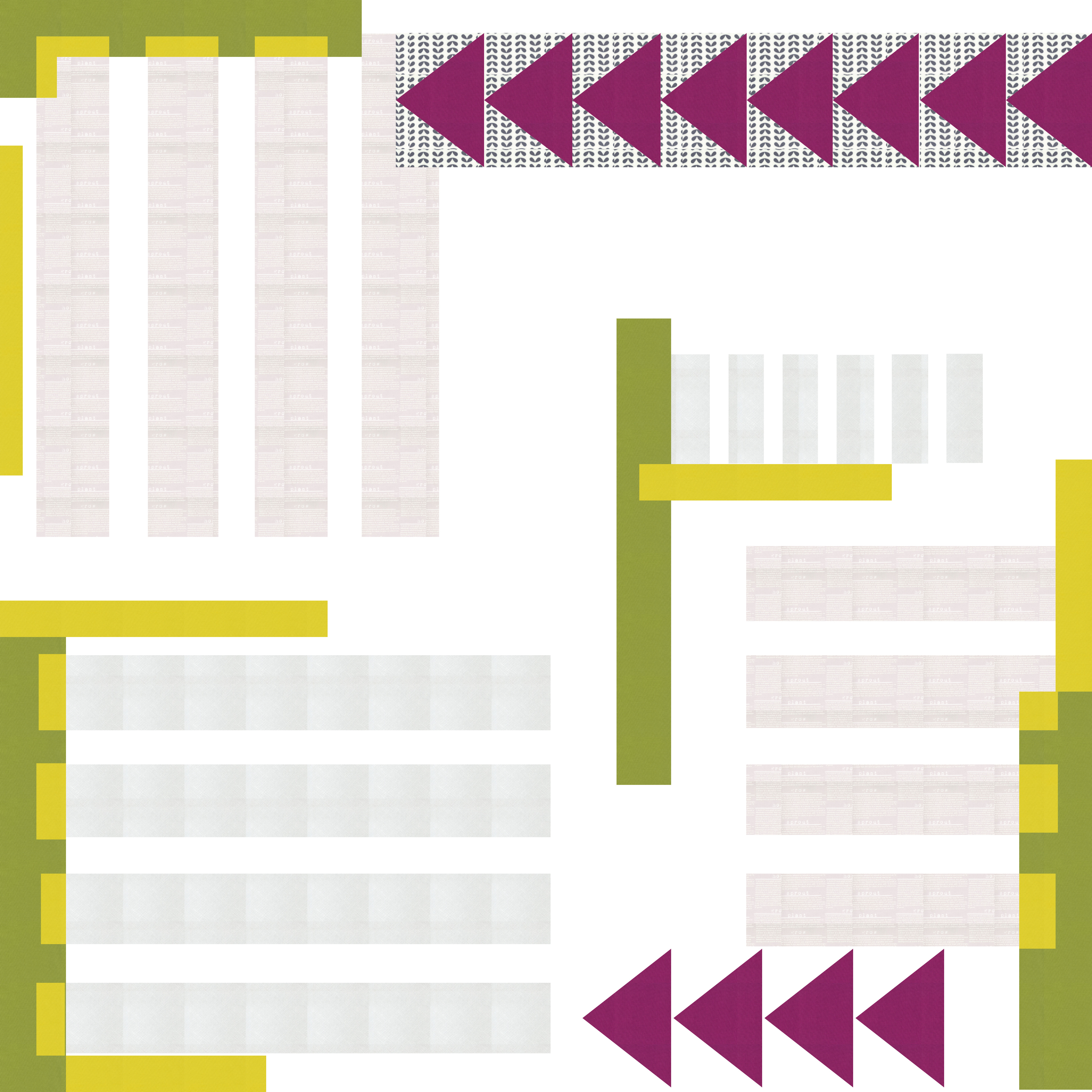
This quilt when I received it made me nervous. I had no idea what I was going to do. The color palette was definitely not my usual palette and Renee’s center was so fantastic. What to do, which direction to take?? I had an idea with one of my previous designs, and decided to play around with it in Quilt Canvas (design tool).

Untitled(10)

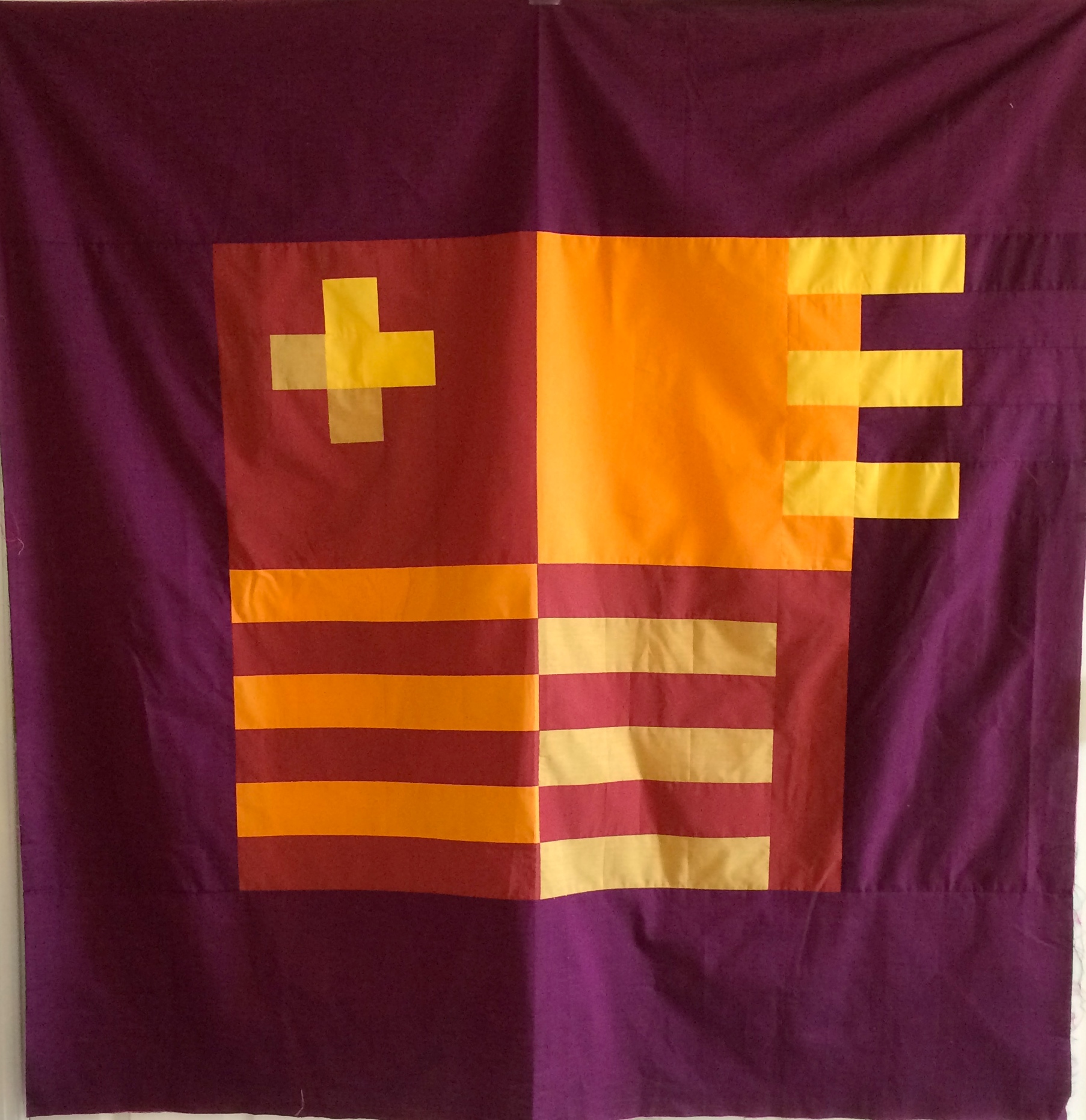
I felt so much better once I worked out this plan, even though the color palette was still a little scary. I went to work and spent a whole day (while on vacation) starting to piece together my border (6″ across). 5 or so hours later (I need to find a quicker way to do those 1.5″ geese) I am so happy with this quilt addition so far.

IMG_3920

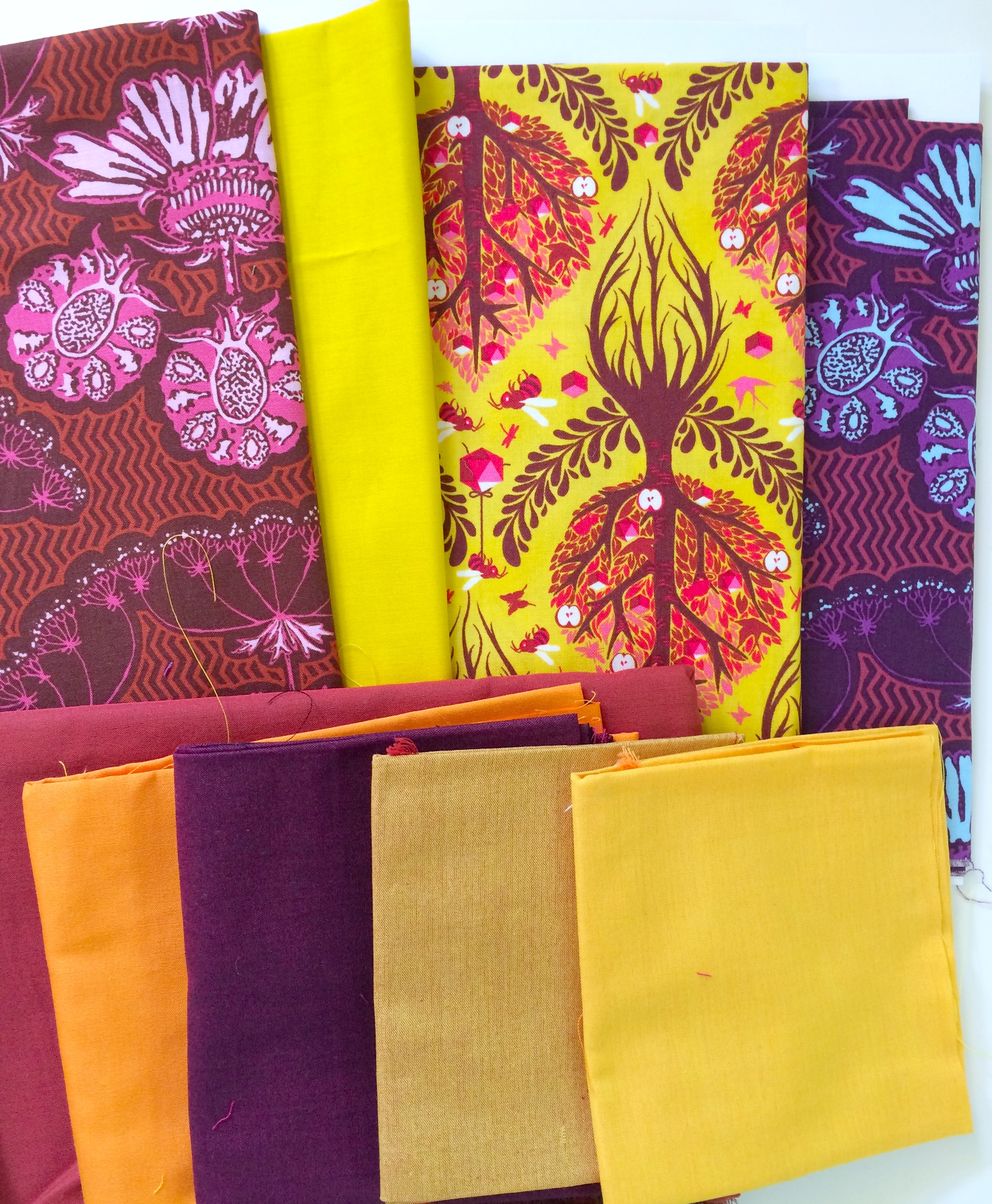
I am hoping to finish the border this weekend, along with my do.good.stitches blocks. I am just so happy to be feeling well again and sewing. FYI…don’t forget if you sew with browns (this is Kona Bison) that there is a hashtag #sewingwithbrowns. Yes, Brown can be in a modern quilt!!

Linking up with Lee over @ Freshly Pieced for WiP Wednesday (see button on the right).

QDAD: End of March Madness

Wow, did April not fly by!! It is almost 1/2 way through the year. All of a sudden, I realized I still needed to post the last of my March designs.

Please note the palettes for the following designs are on the groups Facebook page.

24 March: Blocks
I loved this color palette. It was taken from an advertisement from an airplane magazine. I might change this design as the original hand drawn quilt design has the second and the third outer rows completely nested within each other…like nested boxes.

Blocks

24 March: House blueprints
This is actually the second of my designs. I was playing with some transparency with a mix of solids and low volume prints. This is in fact the layout of the first floor of our house. The flying geese represent stairs while the bars represent floor space. The green solids represent walls. I am definitely plan on making this one up – I love this one.

HousePlan(3)

First design:
HouseLayout(1)

25 March: Radio Cover
The inspiration for this design was based on the inspiration photo in our facebook group. It was a photo of old radios. I used the grill of one of the radios.
QDAD_25MAR2015(1)

26 March: Church
The crosses and the steeples representing the church aspects of the image in the windows of the palette image.

QDAD_26MAR2015(5)

27 March: Shut the front door
I am not so keen on this one. The inspiration was based on the palette photo which was of a front door. I was playing around with extending some of the linesQDAD_26MAR2015

28 March: Blossoms
I loved this design as well. The palette was in the hopes of spring and finally seeing the blossoms start to appear….as not really a pink person I was very surprised how much I love this color palette. I also love the combination of squares within squares and the triangles within squares… each of the larger square divided equally to make 4 pieces.

QDAD_28March

Please Note: If you would like to make or use one of my designs, please email me (ml_wilkie(at)hotmail(dot)com) or leave a comment below. I am happy to talk with you on options and provide the relevant measurements etc. or have you test out a pattern. Also, if you use one of my designs, please use the following text to credit me the design: “Designed by Michelle Wilkie @ Factotum of Arts”.

High hopes dashed

I had high hopes for this week coming off a great vacation. Those were soon dashed, as I came back with a head cold… which unfortunately has not improved 4 days later. So, instead I am posting this to share with you all, what my intentions were (thumbs up)…and the fact I love this project.

IMG_4072

Rangers Station is the one project I did not make progress on during my vacation. This quilt I had hoped to finish for the 2015 Pantone Quilt Challenge (let’s be honest, I won’t make tomorrow’s deadline, no matter what my voices in my head are telling me).

My design was based on the signs on a rangers station, in the mountains of North Carolina. I used Oakshott Cottons for this quilt. The middle blocks use colors, out of the autumn bundle; and then the border is Lipari (08).

IMG_4073The wind picked up during my photo shoot, I loved how it landed. I think the color additions of  yellows, oranges and the purple/raisin worked well with the “Marsala-like” solid.

For the back I did have a plan of adding prints to solids but pulling the line and cross elements to the back. Here is what I plan to work with.

IMG_4066

Finally, one more shot of the front.
IMG_4068

Good luck to those that enter, I will be coming over to vote!! I encourage you all though, that if you have a chance, enter….they have great prizes!!
2014 Pantone Quilt Challenge