June project tracking

This is a little late, but I have finally got over my sewing mojo funk. Happy dance happening here!! I have come to realize that January through May are difficult months for me in terms of producing final products. I tend to get stuck on one project.  Great news, I rock the last 7 months though, and usually achieve my goal of 1 quilt a month by the end of the year (12 quilts).

The progress has been great so far this month!! I am super excited about moving forward. I finished a contract project a week early  (pictured, folded above), which was my second finished quilt of the year. I have another old WiP at the long-armer this month, it just needed a back. Lastly, the project that should have been finished in February will be done tonight – more on that one in another post.

Project Dates Current Status
 NY High Line  May June  TOP, BACK, BASTE, QUILT, BIND
 Project 1 (Secret)  June  TOP, BACK, BASTE, QUILT, BIND COMPLETED!!
Medallion July TOP (Underway), BACK, BASTE, QUILT, BIND
 Project 2 (Secret)  July  TOP, BACK, BASTE, QUILT, BIND
 Project 3 (Secret)  August TOP, BACK, BASTE, QUILT, BIND
Graveyard  August TOP, BACK, BASTE, QUILT, BIND
 Trellis  September  TOP, BACK, BASTE, QUILT, BIND
 Manicured Garden  September TOP (Underway), BACK, BASTE, QUILT, BIND
 Triangle Quilt September Pattern Release
 Square Dance September  Pattern Release
Abstract Triangles II & III October Pattern Release
Phased Circles & Lunar Lines  October Pattern Release

What I have learned about myself, is I am much more productive with a fuller plate and deadlines that are not my own. Don’t get me wrong but I will still procrastinate until the last-minute.  So, how do you all get over quilters block?

Improving my Instagram feed

I have been working bit by bit to improve my photo’s for my Instagram feed, to grow interest in my feed. I see such alluring images from others that I wanted to step up my game. I am by no means an expert, here are some of my experiments so far.

Staging photos, adding interest

The first thing was actually work on the staging of my photos. Everyone tells you how important staging is, and it is amazing how it drives a different interest in the photo. For example, I have two photos  of the same quilt that are similar, both taken and posted around the same time of day, same day of the week. Both, showing stages in my quilting process of one particular quilt.  The response of the photos were completely different.

The first uses no props. it just shows the quilt and the stage it is in. The topic of this photo was that it was time to start burying threads.

IMG_8694

The second, I added the Auriful thread options and the painters tape I was using for the straight line quilting, to the picture as the prop. The topic of this photo was I continue to do 1/2″ straight line quilting.
IMG_8280

The response was doubled in the second shot over the first shot.

Photo Quality

I have to admit, I had switched to using my iPhone full-time for taking pictures. This is mainly for convenience, I always have my phone. Also, my phone had higher pixels than my older digital SLR.

I was lucky enough, that my fabulous husband bought me a new Nikon digital SLR camera at Christmas. Oh, what a difference!!! The pictures are clearer, the colors more vibrant. I love it.

I am using these Campbell’s soup can’s as color palette inspiration. I wanted a quick shot and started off with my iPhone (5s). Note, these are photos before any editing. Not bad, but I wasn’t getting those vibrant colors as my eye was seeing. Also, I knew I will need higher resolution photo’s if I wanted to put these in my upcoming book.
IMG_8308

So, I switched to my SLR and was able to control the zoom, the color and crispness was improved. Note, I just point and click and use the camera’s defaults for this image, and again no editing yet.
IMG_2188

What has made using my SLR with Instagram so much easier, is my new SLR has a bluetooth feature and downloads from my camera to my phone. There is no need to move the photos from my camera to my laptop to my cloud and then to my phone.

Framing the Photo

I have loved my friend, Nicole @mamalovequilts, Instagram feed for the longest time. I have realized it has a lot to do with her staging and photo quality of her images. It also has to do with how she uses white negative space to frame her photos. I mentioned this to her the other day, and asked how she did this, whether it was with IG or another program. She uses an app PicTapGo ($1.99). I downloaded it yesterday and I love it already!!

I use it mostly for the framing of the picture, but have been playing around with their set of filters too. Let’s just focus on framing a picture, though. I find that framing the picture with more white negative space actually focuses my eye to the image more.

Here is the photo I posted yesterday, a closeup of a pineapple, which I love (border added around the screenshot so you can see the visual space in IG). This one has no negative space around the image.

IMG_8726

The second image is what I posted from PicTapGo with a IG Square Floating effect added. This adds negative space around all four sides of the image so its floating.
IMG_8720

Another image, of my new media stand. This is the image of what I posted in Instagram. IMG_8721

However, I like it much better with the floating negative space. To me it gives it a crisper and cleaner look.
IMG_8728

Today’s photo out on Instagram, is using a slightly different border effect. It is the IG Square Full, which adds borders to the long sides of the image but the short sides reach the full length of the space within Instagram.

img_87194.png

I am definitely no expert, as I mentioned. I still have steps to go to increase interest on my Instagram page. If you are with the MQG, here is a recent article by Christopher @the_tattooed_quilter on social media and photography. 

Some of the other Instagram feeds that I find inspiring (not all are quilting related):
Nicole @modernhandcraft
Hillary @entropyalwayswins
Kate @teaandkate
Giuseppe @Giucy_Giuce
Helen @helen_dardik
Nicole  @mamalovequilts
Christopher @the_tattooed_quilter

I’ll keep you posted how things go, I am looking into videos next. I would love to hear how or what has worked for you.

Save

Save

Save

Playing with Color

Have you ever played with re-coloring your design or a pattern from another designer. I love playing with color and finding new color combinations. I recently had to do this for two designs.

This first one, was designed based on an image from Design Seeds via @thebungalow22 of a striped beach umbrella.

I loved how the original design came out. The color palette landed up being an unusual and unique palette.

When playing with color combinations for this design, I wanted to make sure that I kept this uniqueness and the combination of cold and warm color balance.

The first playing with oranges, blues and grey, which I think maintains the freshness.

The second, a more reserved palette with teal, green and peach.

A third version, using peach-pink, green and greys.

With these striped designs, I am thinking of making prints or fabric wall hangings, to see them side by side – it would make an interesting color study I think.

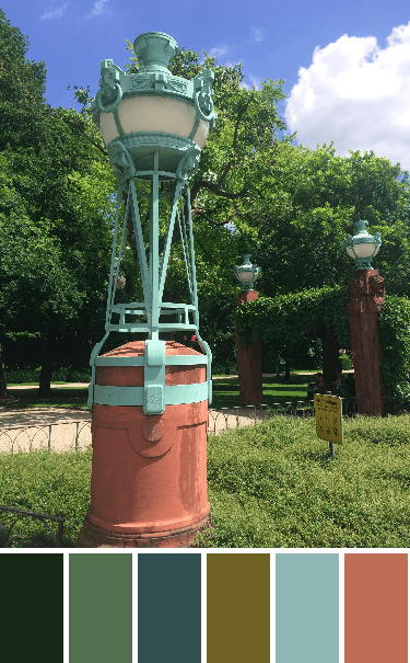
The second design was based on an old gas lamp at the Mannheim water tower (Wasserturm), a picture captured while visiting family. The color palette was created using the Palette Builder tool from Play Crafts.

The original design, definitely with this color palette, gives an air of Art Deco (1930s). I like it but knew if I made it I would need to re-color it.

I first tried a black, white and grey version, which I think I need as a floor (tiles).

I played with some bright colors, and had fun with mixing pink + orange with some aqua + greens.

Keeping with bold colors, used a warm palette here with pinks + oranges + purples, using the white to make the colors pop.

Wanted to play with more muted tones, so added some pastel based colors to this purple + yellow based palette.

Liking the white but wanting to give it some freshness in this one. I went back to the warm + cold palette with this one. A mix of green + pink + peach and using the pastel versions of the green + peach, and again the white to add to the brightness and contrast.

Lastly, I wanted to  play with some prints, my go to Carolyn Friedlander prints. I like the variations in her blue prints and love the lilac prints that are in her collections. (color: blue + lilac + mustard and cream).

Do you play around with color in your designs or patterns? What are your favorite combinations?

Please Note: If you would like to make or use one of my designs, please email me (ml_wilkie(at)hotmail(dot)com) or leave a comment below. I am happy to talk with you on options and provide the relevant measurements etc. or have you test out a pattern. Also, if you use one of my designs, please use the following text to credit me the design: “Designed by Michelle Wilkie @ Factotum of Arts”.