Yellow – A Colour Blog Series

IMG_5767

I find yellow one of the hardest prints to buy online, as it varies greatly. Is it bright yellow or mustard or ochre?? It’s also hard to find a good bright yellow print.

Yellow + Cool

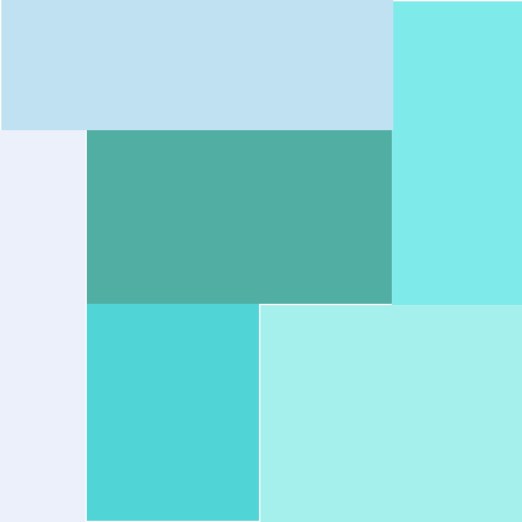
One of my recent finishes, inspired by a Moors Palace in Portugal, allowed me to use a great mustard color with these great cool colors of navy blue and aqua.
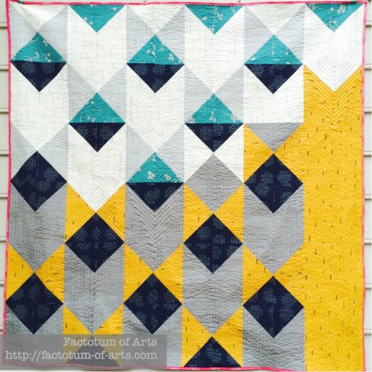
Moorish_Pyramids

Katarina Roccella’s Imprint line for Art Gallery Fabrics: mosaic66dd6f67f6c01b3e29004f5b173cc33cd9ebb1c2

Or how about a mix of blues and a little purple, and yellow’s as a feature/focus. 
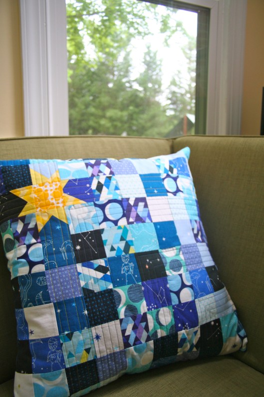
IMG_7245
mosaic4c2a7df43633024f24250a849b6ec366b7ed2b71
1. Cotton + Steel; 2. Alison Glass; 3. Art Gallery House Design; 4. Lizzy House; 5. Karen Lewis; 6. Skinny LaMinx; 7. Jeni Baker; 8. Lizzy House; 9. Leah Duncan

Yellow + Warm

Last month, on the Orange post there was a great warm print palette that included yellow. So what about yellow in projects with solids??

This project, Peach Melba, is a tutorial I did for Sew Mama Sew, I loved the yellow with the mix of pinks and berries in this project. I used Kona Cotton Buttercup, Berry, Cerise, Baby Pink with Ash Grey and Bone.

IMG_0177

One of my WiP’s is this quilt top, Rangers Station, using the amazing bright Oakshott cottons The middle block is made from their autumn bundle, which have those brilliant yellows, and then the border is Lipari (08)).Rangers Station Quilt Top

Yellow + Neutrals

Bright yellow and white solids is one of my favorite combinations, though I have not made a quilt with just these colors. I just love the crispness and brightness of these two colors together.

Yellow and Grey is a great combination. One of my first ever projects, when I started sewing, was a patchwork yellow, grey and white kiwi which I love.
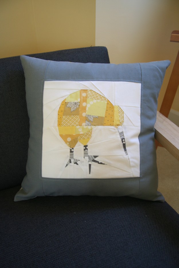
IMG_7005

Monthly Tip

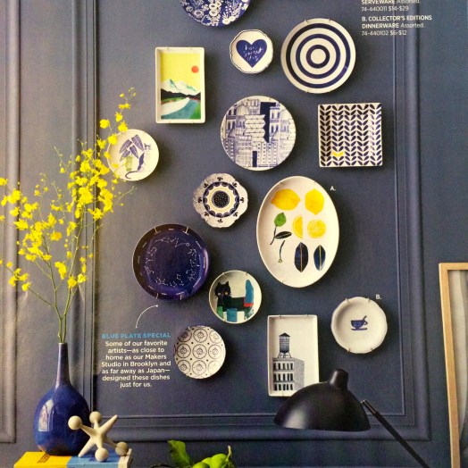
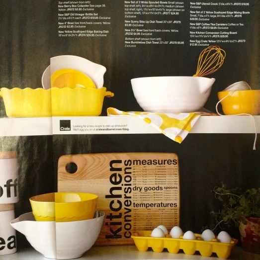
Use design or retail magazines as inspiration for your color palettes. Here are some examples:

  1. Architecture/Design magazines feature great modern palettes. My favorite US based magazine is Dwell.
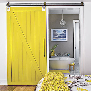
yellow-sliding

2. Retail Store Magazines, my favorites in the use are West Elm, Crate and Barrel (+ CB2).

Yellow + Neutral
IMG_5754

Yellow + Blues
IMG_5755

Monthly Resources

Book: Color Theory: A essential guide to Color by Patti Mollica

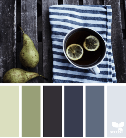
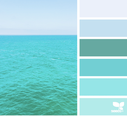
Website and Tool: Design Seeds  – A site that offers two color palettes each day, great resource.

Monthly Challenge

This month’s challenge is sponsored by two great companies.

The first is Robert Kaufman who is providing the winner 1 yard Highlight, the Kona Cotton Solids 2016 Color of the Year.
Screen Shot 2016-02-08 at 5.27.01 PM

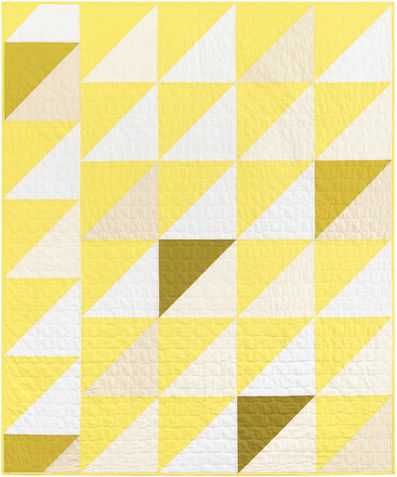
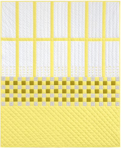
Talk about some great yellow inspiration, check out their Lookbook here. Two of my favorite quilts, that they will be providing as kits in March, are:

Heather Jones’ Trip the Light, I love the use of highlight, pickle, wasabi, white, snow and oyster.
Screen Shot 2016-02-08 at 5.15.07 PM

and Carolyn Friedlander’s Blake Quilt, that mixes in some of her neutral low-volume fabrics from Architexture and Doe with Kona solids highlight and pickle.Screen Shot 2016-02-08 at 5.14.46 PM
Also, the Fat Quarter Shop is providing a $20 gift card. ColorWidget
The Challenge this month,  is to make your own 3 x 3 mosaic palette of  (9) prints, that features yellow as the main color (I recommend at least 1/3 of the palette). Please post the mosaic, that is linked to either:

  • a blog post explaining your process/inspiration (feel free to grab the widget above to display on your blog),
  • or to an Instagram pic (using the url),
  • or a Flickr pic (using the url).

To give you time to explore your palette, the link-up will open around the 15th February (next color series blog post), and a winner will be announced by 8pm Monday 22nd February. I hope you all have fun.

(Note: I use Big Labs Mosaic Tool to create the mosaic. To get the image URL right click on the image and “Copy Image Location” and paste it into the tool).



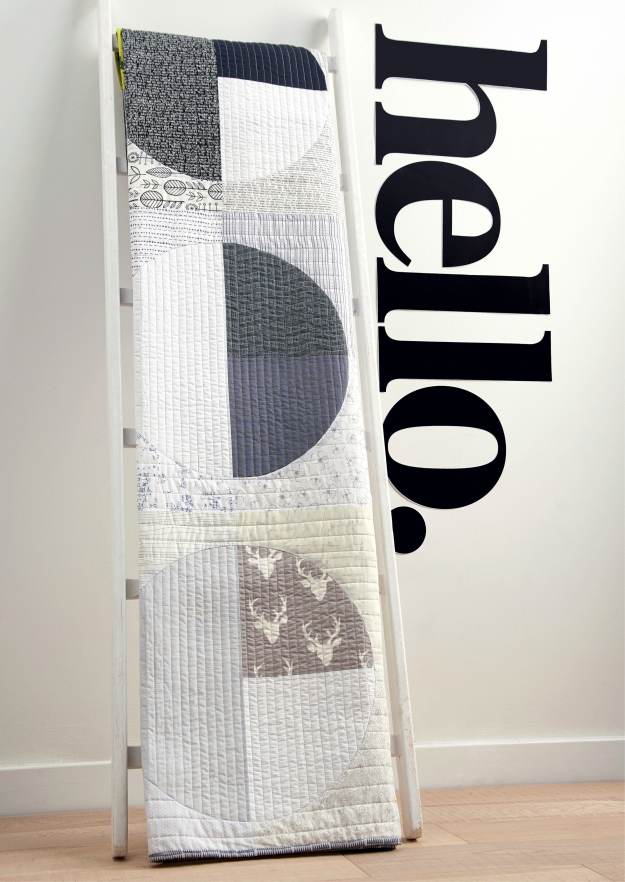
Dark Circles – a quilt finish


PhasedCirclesComplete

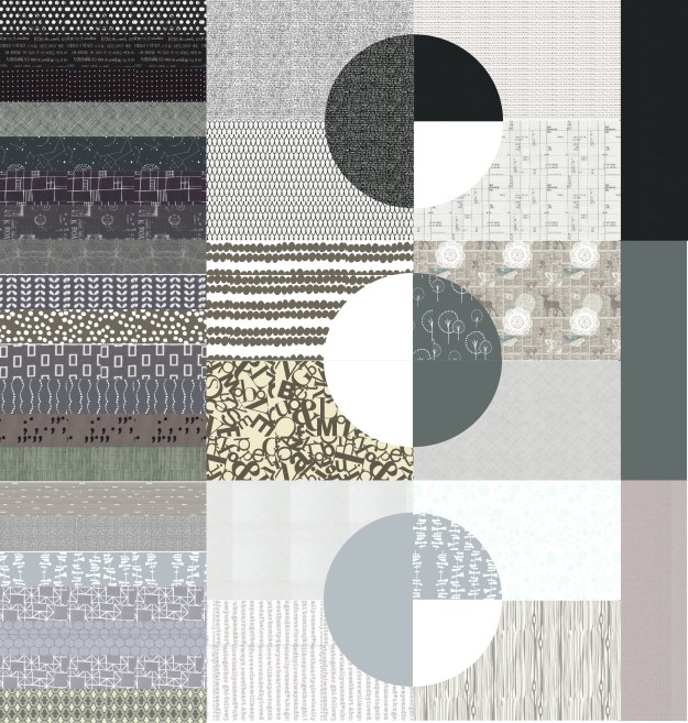
I loved my “Phased Circles” quilt that I finished in 2014. I wanted to see if I can use the underlying blocks in another design. Could I make another design but make it different enough??

I came up with this monochromatic design which is one of my favorites. I love the the graduation of black to dark grey to light grey, the use of prints and solids and finally the mix of low volumes. The circles are much larger than the phased circles design, and a little simpler but a little more complexity and non-symmetrical with the outer blocks/areas.

DarkCircles_03March

I was lucky in two ways with this quilt.  One, the US post office didn’t loose my quilt (it was sent twice, returned once) and two, lucky enough that Love Patchwork and Quilting loved it too. It is one of the projects featured in this month’s issue (issue 31) . Can you believe this? ….. all of the fabrics in this quilt came from my existing stash.

patchwork projects shot in the studio

Photo Credit: Love Patchwork & Quilting

The binding is one of my favorite things about the quilt. I kept it solid “blocked” on the right side and then used Carolyn Friedlander’s Doe Sharp and a splash of Alison Glass’ Grove in Neon (Handcrafted).

The quilting for the circles were 1/2″ vertical lines while the rest of the quilt is quilted using 1″ horizontal lines.

Michelle Wilkie

Photo Credit: Love Patchwork & Quilting

I hope you check it out in the new issue.This makes my second finish for the year.

Details

Name: Lunar Lines (aka Dark Circles)
Design:
Designed by me, Pattern in Issue 31 – Love Patchwork Quilting.
Fabric: Kona Cottons + Various black, dark and light grey prints
Dimensions: 60″ x 62″
Quilted: Straight Line quilting, Aurifil 50wt.

Linking up with Amanda Jean over @ Crazy Mom Quilts for Finish it up Friday.

QDAD: Getting back into practicing

It has been a while since I spent time designing, so this month I decided to get back into it. Its been a little mixed to start which is normal – there are always designs I like and ones that I file away :-). Without giving it a go though, you never find the design you want to actually make.

January 15
Screen Shot 2016-01-31 at 11.36.51 PM

This design was influenced by the placement and direction I saw in the negative space of this photo. I used triangles as I find them best to represent movement.

Jan15_2016

January 17

Screen Shot 2016-01-31 at 11.41.11 PM

I loved the idea of representing the shutters in my design with the little roofs. As I was developing the shutters I liked the dark line of the hinges which I also incorporated.

17JAN_2016

I decided that my final design need to be a more dense representation of the shutters. So this landed up being my final design.
17JAN_2016(1)

January 18

Screen Shot 2016-01-31 at 11.43.46 PM

I loved the colors in this palette and wanted to somehow represent the flowers without them being to definitive, slightly abstract. There are a couple of placement things I will change if I make this.

18JAN_2016

January 19

I took this photo on a trip to Florence a while back. Florence was not my favorite Italian city but this bridge was amazing.
020_19-palette

The inspiration for this design is the roofs and the bridge form of Florence Ponte Vecchio.

20JAN_2016(2)

January 21

Screen Shot 2016-01-31 at 11.50.59 PM

I loved the white concrete brick placement around the windows in the middle building. I used that placement to make this ombre dot design.

21JAN_2019_2(1)

21 January

Screen Shot 2016-02-01 at 12.00.35 AM

I loved the stripey towel and the vertical lines of the deck. I used these lines in my design.

21JAN_2019(1)

January 22

Screen Shot 2016-02-01 at 12.02.29 AM

I wanted to play with prints using this palette. I have this idea for a design using the Speed bumps road markings. Lets see how this develops as I have another palette in mind as well.

22JAN_2016

January 23

Screen Shot 2016-02-01 at 12.04.18 AM

I love this palette, as it would be great for transparency design. I wanted though something very minimalist being inspired by a book I am reading on Ralph Hotere (NZ artist).

23JAN_2016(1)

Thanks for stopping by. You can check out my other designs on my QDAD page. If you want to join in check out our closed group on facebook (click join).

Please Note: If you would like to make or use one of my designs, please email me (ml_wilkie(at)hotmail(dot)com) or leave a comment below. I am happy to talk with you on options and provide the relevant measurements etc. or have you test out a pattern. Also, if you use one of my designs, please use the following text to credit me the design: “Designed by Michelle Wilkie @ Factotum of Arts”.