Orange – A Colour Blog Series

IMG_5725

Orange is one of my favorite colours. I use it often in my quilts/ quilt blocks. It is so versatile and my favorite way of using it is as a pop to add visual interest.

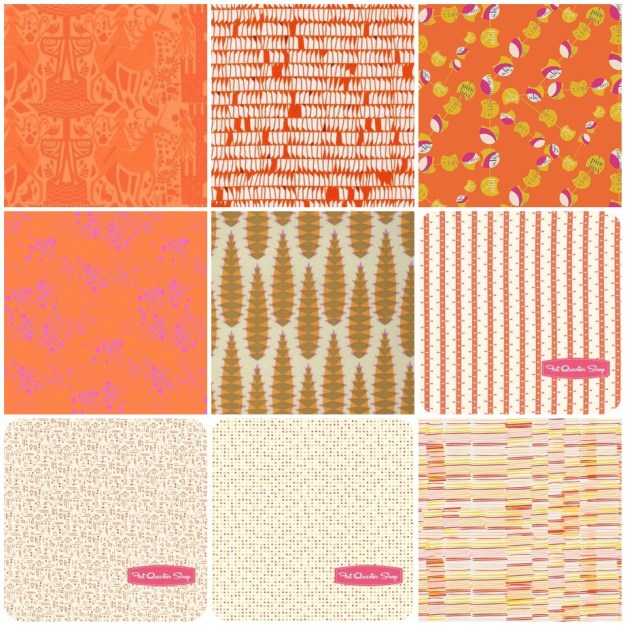
Here are some examples on how I have used orange with a current fabric mosaic.

Orange

IMG_5484

The trick with using all one color (ie. Monochromatic) is making sure you have variation, which can be achieved with different volumes (inside square high volume, outside low volume), or with various shades of the same color.

Tip for Monochromatic: Try using a camera and taking a black and white photo to see if you have enough variation in your fabric selections. You should see a gradation.
mosaic10608d2471225cdc12bdc8c81651447620abf6b5
1. Lizzie House ; 2. Carolyn Friedlander; 3. Frances Newcombe; 4. Alison Glass; 5. Anna Maria Horner; 6. Denyse Schmidt; 7. Downton Abbey; 8. V & Co. ; 9. Leah Duncan

Orange + Warm

The other option to add depth and using orange, is to use other warmer colors (ie. An Analogous color palette). My current WiP was based on orange but I found I needed more depth so I added purples, magenta, yellow and coral/peach.

I find the Analogous color palette one of the easiest to do as the colors are in the same “family” or part of the color wheel so they always seem to work, no matter what print you use.

Mum_QuiltWiP

With this palette purple does stand out better than the orange due to its darkness, so you may choose to drop that. For my purposes it worked well.
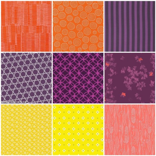
mosaic792f2c1b24178952204fabbf046503790d5d4091
1. Carolyn Friedlander; 2. Karen Lewis; 3. Tula Pink; 4. Lizzie House; 5. Rashida Coleman Hale; 6. Katrina Roccella; 7. Leah Duncan; 8. Lizzie House; 9. Sarah Jane

When using a warm palette, but very vibrant versions of pink and orange, what about thinking of adding balance with neutrals like white and grey.
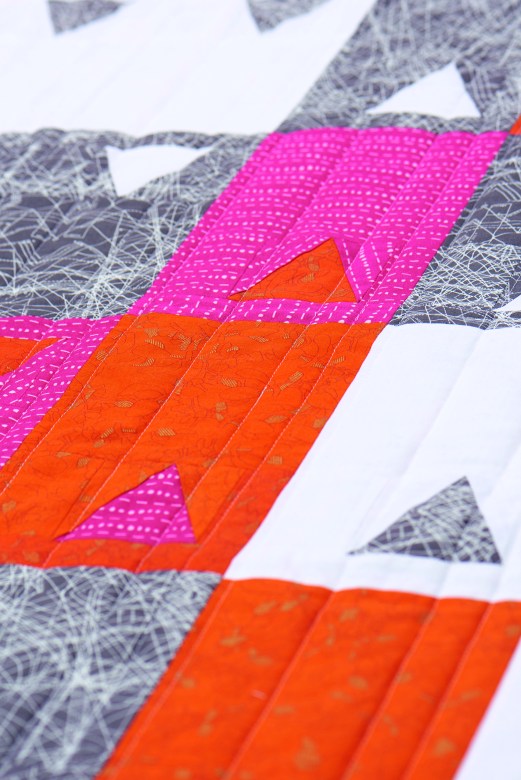
Project_hot_d9

Orange + Neutrals

I use orange and neutrals a lot together, as this gives orange the role as a focus color. You don’t have to use a lot of color with neutrals for this to be true. Play around with solid greys, whites and blacks; featured here are all Kona cottons (First print: Titanium, Torch, Pepper, Shadow; Second Print: White, Torch, Oyster, Putty, Shadow).
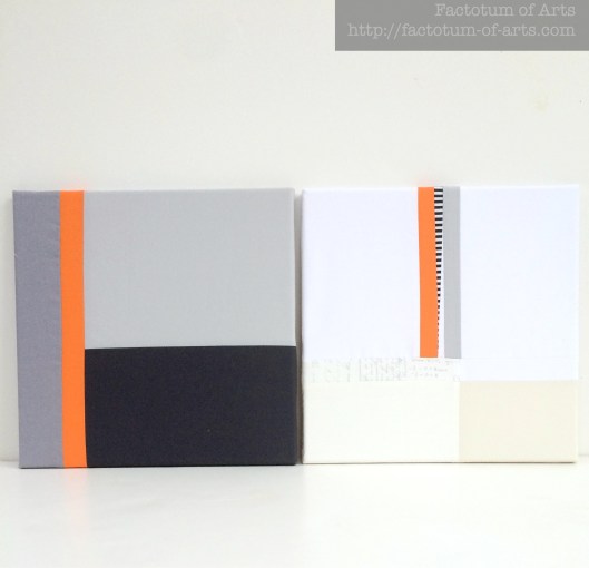
FabricArtBlocks

The main print in this next example is by Yoshiko Jinzenji for Yuwa Fabric. The grey, oyster and navy blue print (that appears black) are Karen Lewis hand printed fabrics. I love that pop of colour among the neutrals for visual interest and draws your eye into the quilt.
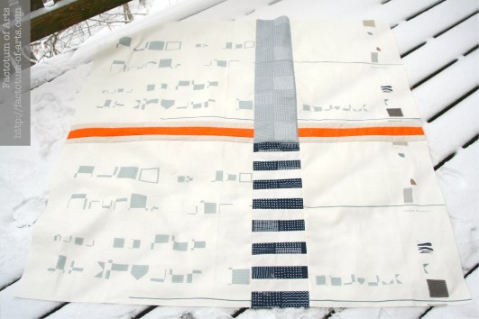
Unnamed_FinishQuiltTop

Orange + Blues

With this example,  I used mostly blues but wanted to add a pop on the edges. I tried Teal, aqua and blue but landed up deciding that the orange was a perfect complement  to the extreme blue palette.
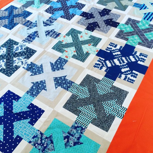
IMG_5652

This works as it is loosely based on a triadic (complementary) color palette but I dropped the green that would be included.
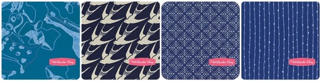
mosaic45df1d3aa2fe29f989f6b10a62711fde196f4a3e
1. Carolyn Friedlander; 2. Cotton + Steel; 3. Jeni Baker; 4. Karen Lewis

Monthly Tip

If you are unsure about building a color palette and you don’t want to stick with using a fabric line….What about choosing a print you like and build a bundle based on the colors available in that print (check out the dots on the selvedges). Here are a couple of examples using Anna Maria Horner fabrics and the palette builder tool for the Kona cotton palette.
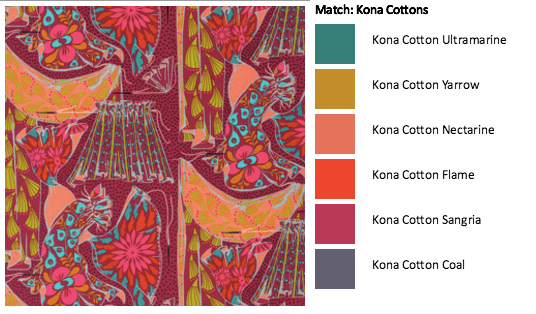
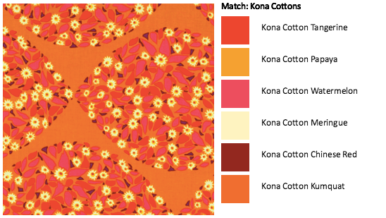
Screen Shot 2016-01-24 at 8.42.25 PM
Screen Shot 2016-01-24 at 8.43.41 PM

Monthly Resources

Book:  Quilt Color Workshop – Creative Color Combinations for Quilters

Website: Canva Color Theory

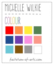
Tool: Play Crafts Palette Builder

Give-away Winner

 Winner of the prize this month is Debbie from Sheltered Stitches. Debbie I will email you shortly with the details of your prize.

Next Month….Yellow
ColorWidget

Note, that all the projects provided in this post are my own unless noted. If there is something you would like more information on or if you would like to provide feedback on what you want to see more of please leave a comment. This blog series is developing and I am happy to change it up to accommodate more information.

New Projects for 2016 – In Progress

Isn’t it amazing how traveling makes you so tired?? I have traveled for about 30 hours this past weekend to come from North Carolina (USA) to Napier (New Zealand).

I wish, I could say I was traveling back home to have fun visiting family, friends and vacation, but unfortunately that is not the full story. My mum (who is in her early 60’s) has been put through some rigorous and long periods of testing over the last year. She has finally been diagnosed with a large benign, inoperable brain tumor. She is in her last 3 weeks of radiation, in attempts to try to shrink it.

ColorPlacement
Playing with color placement of the expanded design

As she travels and stays in a different city for her treatment each week, I decided that I wanted to be there to support her. I also want to leave her with something that brings her comfort when I am not around.

QDAD_29JUL2015
Original design

A quilt would be perfect. I have been playing around with her favorite colors, purple and orange and one of my Quilt Design a Day patterns. I have added a few other colors to add depth….coral/peach, yellow and magenta. The background fabrics are a mix of 20 white on neutrals prints.

Mum_QuiltCloseupWiP
Close-up of the blocks in-progress

I had to expand the design and play with the color placement but I am really pleased with how it is looking all up on my design wall. I bought all the rows with me to try to finish it before I leave.

Mum_QuiltWiP
All the pieces up on my design wall

The other project I am working on is a “secret”. It took a lot of procrastination trying to work out how to make this design into reality. The color palette is also way outside of my comfort zone but I am loving how it is coming together.
SecretSewing_Palette

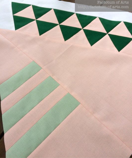
And you can’t complain, when you get joins like these on your first go.
SecretSewingJoin

Anyway, that is what I am up to this week. I am getting plenty of design and sewing time which I am very happy about.

Linking up with Lee over @ Freshly Pieced for WiP Wednesday.


Sewing Studio: Final make-over

Every so often, I have posted here about my sewing room and how it has been transitioning over time into more of a studio. Except for the wood floors (that may never come), I think finally have the ultimate space for me.

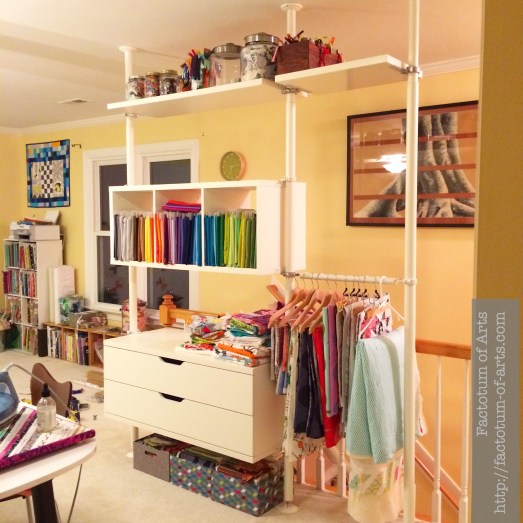
Over the holiday, my husband moved his office out, to the third floor….woohoo. This opened up my room. I realized that I could use the same storage we have in our walk in closet (Ikea), along the stair case railings. A space that was not really usable, became usable.
SewingStudioStorage
I love having my Kona’s in one spot and have a hanging area for my backs. This space is also used for all my scraps and my WiPs.

I have also added a new chair from Ikea, which is the new home for a great cushion/pillow that I got for Christmas (from wonderful Nicole @ mamalovequilts).  I now have this amazing 8×7 foot design wall which has already been put to good use.

NewChair_Footstool

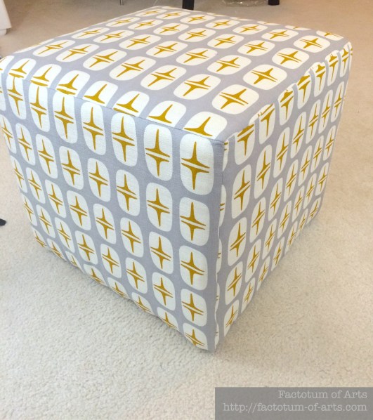
Of course, you can’t have a comfy chair without a footstool. I managed to finally finish one of my WiPs using Cloud9’s barkcloth. It was a total fluke that the columns lined up in the panels.
Footstool

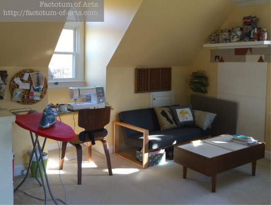
These are additions to my sitting area, where I can sit and blog or have coffee with friends.
SittingArea

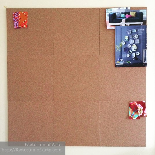
This is an older picture of my sitting area, as I replaced that little design wall with an inspiration design board. Its made of cork tiles.
InspirationDesignBoard

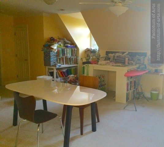
One final photo of my new-ish table, that I teach, host friends and quilt large projects on. It seats 4 people with machines ok. At the back is my project table and fabric storage which has been uncluttered of late with the new storage.
SewingTable

If I can work out periscope sometime, I will actually give you all a walk through. Anyway, I love this space and I hope you enjoyed my photo journal of my space :-).