My week of QDAD Sparks

This past week, I was so super excited to be hosting the sparks (palette choices/inspiration) for our Quilt Design a Day Facebook group. I decide early on that, I would show and inspire the group participants by using photos from my travels over the years. I had such a blast and was amazed at the designs (make sure you come over and take a look – or even add your own design).

26 April: San Francisco
First up, is Coppola’s Sentinel Building in San Francisco. I love the variations of the copper – those teals!!

IMG_0036-palette

I actually based this design on the top of the middle building but I rotated and tilted the design. This seemed to give it much better balance.

QDAD_26April2015

27 April: New York High Line
This is one of my favorite spots and photos that I took while visiting New York High Line. Of course, it has one of my favorite color palettes; blue, grey and orange.
IMG_7520-palette

I had so many ideas for this one and decide to play around with lines that could possibly be done with improv techniques.
QDAD_27APR2015

28 April: Washington DC
This was taken in Winter. I love the starkness of the color palette.
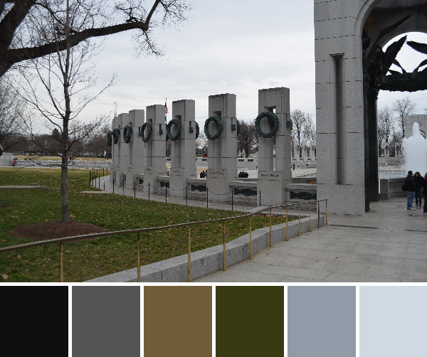
DSC_0504-palette

My design kind of happened by accident. I  accidentally moved pieces off the design worksheet and couldn’t delete them, these landed up being the best part of the design…the left hand side. I love the difference between the darker palette in the right with the starkness of the white panel on the left.

QDAD_28APR2015(1)

29 April: Venice, Italy (St. Marks Basilica)
I really love neutral palettes, so I decided to challenge the group with a couple of palettes.
imm020_22-palette

The diamonds and the crosses on the side of the building fascinated me. I really liked the repetition options.
QDAD_29APR2015

29 April: Venice, Italy (Grand Canal + Rialto Bridge)
To be fair to those who don’t like neutrals I also included a brighter palette, but I did not do a design for this one.
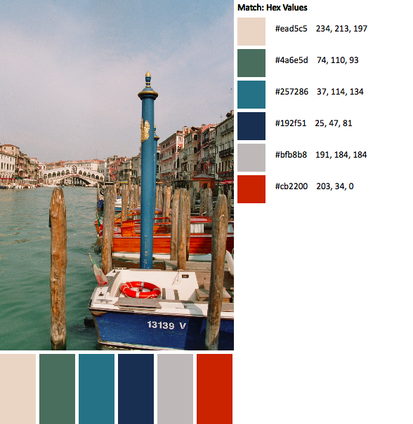
imm011_13-palette

30 April: Sintra, Lisbon (Castle of Moors)
Lisbon is one of my favorite cities in the world. This castle has amazing tiles and architectural features. The castle itself has amazing gardens. imm006_5-23-palette(1)
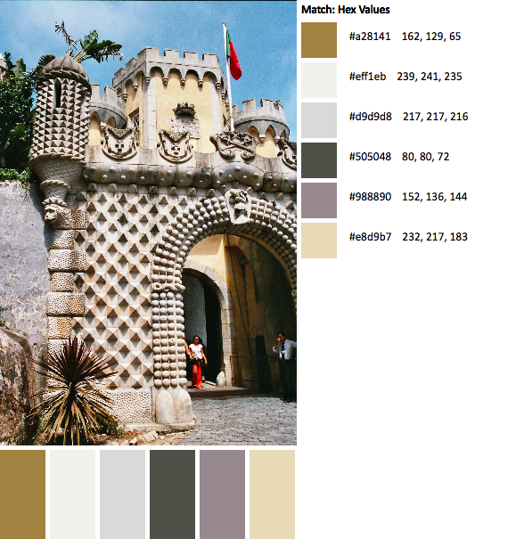
I loved the spikes and that gold in this palette, LOVE.
QDAD_30April2015_neutral

30 April: Lisbon (Coastal Village)
Like I mentioned, I love Lisbon. This photo speaks words about why I love it!!imm001_1-44-palette

01 May: Rome, Italy (Coliseum)
This photo was taken by my husband. The illumination of the Coliseum provides an amazing color palette.imm029_30-palette

I loved the architectural arches, and the top lines of the Coliseum. I really enjoyed this palette.QDAD_01May2015

02 May: Paris, France (Musee d’Orsay)
The glass roof of the old railroad station of Musee d’Orsay has amazing shades of greens.
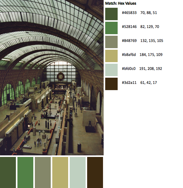
imm020_21-palette

I did two designs, one more structured that was based on the floor space.
QDAD_02MAY2015(1)

and one that is more adhoc, improv based. I think this is my favorite of the two.
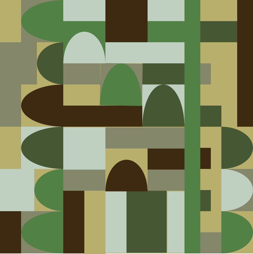
QDAD_02MAY2015

So several of these are on my make list: NY High Line, Sintra Lisbon (Castle of Moors) and Rome Italy (Coliseum) are among my favorites!!

Please Note: If you would like to make or use one of my designs, please email me (ml_wilkie(at)hotmail(dot)com) or leave a comment below. I am happy to talk with you on options and provide the relevant measurements etc. or have you test out a pattern. Also, if you use one of my designs, please use the following text to credit me the design: “Designed by Michelle Wilkie @ Factotum of Arts”.


WiP Wednesday: Sisterhood of the Traveling Quilts

The first round for the Sisterhood of the Traveling Quilts is almost finished. I have been working on Renee’s quilt. She made this amazing center using a paper piecing pattern from Angela Walters.

IMG_3916

This quilt when I received it made me nervous. I had no idea what I was going to do. The color palette was definitely not my usual palette and Renee’s center was so fantastic. What to do, which direction to take?? I had an idea with one of my previous designs, and decided to play around with it in Quilt Canvas (design tool).

Untitled(10)

I felt so much better once I worked out this plan, even though the color palette was still a little scary. I went to work and spent a whole day (while on vacation) starting to piece together my border (6″ across). 5 or so hours later (I need to find a quicker way to do those 1.5″ geese) I am so happy with this quilt addition so far.

IMG_3920

I am hoping to finish the border this weekend, along with my do.good.stitches blocks. I am just so happy to be feeling well again and sewing. FYI…don’t forget if you sew with browns (this is Kona Bison) that there is a hashtag #sewingwithbrowns. Yes, Brown can be in a modern quilt!!

Linking up with Lee over @ Freshly Pieced for WiP Wednesday (see button on the right).

QDAD: End of March Madness

Wow, did April not fly by!! It is almost 1/2 way through the year. All of a sudden, I realized I still needed to post the last of my March designs.

Please note the palettes for the following designs are on the groups Facebook page.

24 March: Blocks
I loved this color palette. It was taken from an advertisement from an airplane magazine. I might change this design as the original hand drawn quilt design has the second and the third outer rows completely nested within each other…like nested boxes.

Blocks

24 March: House blueprints
This is actually the second of my designs. I was playing with some transparency with a mix of solids and low volume prints. This is in fact the layout of the first floor of our house. The flying geese represent stairs while the bars represent floor space. The green solids represent walls. I am definitely plan on making this one up – I love this one.

HousePlan(3)

First design:
HouseLayout(1)

25 March: Radio Cover
The inspiration for this design was based on the inspiration photo in our facebook group. It was a photo of old radios. I used the grill of one of the radios.
QDAD_25MAR2015(1)

26 March: Church
The crosses and the steeples representing the church aspects of the image in the windows of the palette image.

QDAD_26MAR2015(5)

27 March: Shut the front door
I am not so keen on this one. The inspiration was based on the palette photo which was of a front door. I was playing around with extending some of the linesQDAD_26MAR2015

28 March: Blossoms
I loved this design as well. The palette was in the hopes of spring and finally seeing the blossoms start to appear….as not really a pink person I was very surprised how much I love this color palette. I also love the combination of squares within squares and the triangles within squares… each of the larger square divided equally to make 4 pieces.

QDAD_28March

Please Note: If you would like to make or use one of my designs, please email me (ml_wilkie(at)hotmail(dot)com) or leave a comment below. I am happy to talk with you on options and provide the relevant measurements etc. or have you test out a pattern. Also, if you use one of my designs, please use the following text to credit me the design: “Designed by Michelle Wilkie @ Factotum of Arts”.