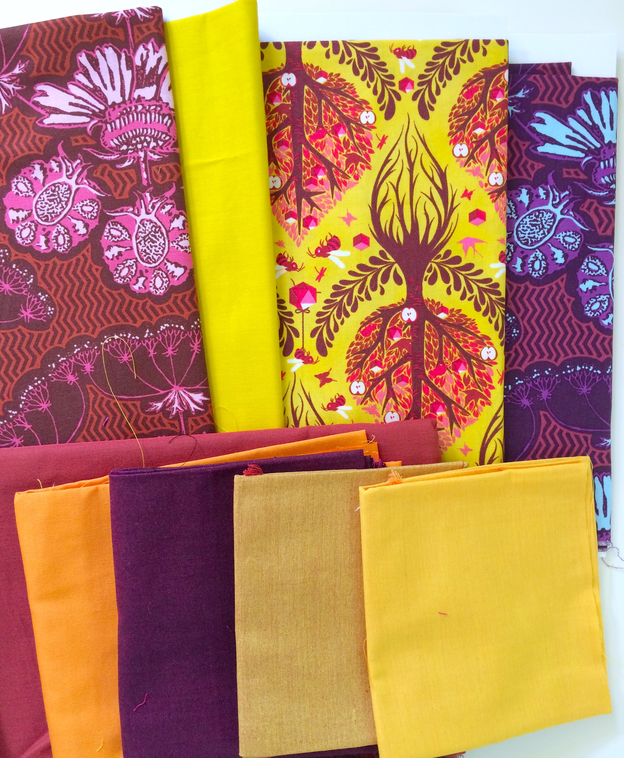
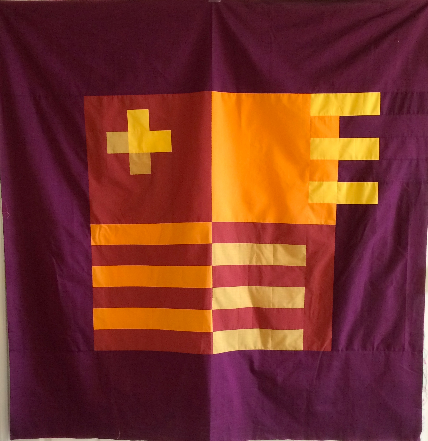
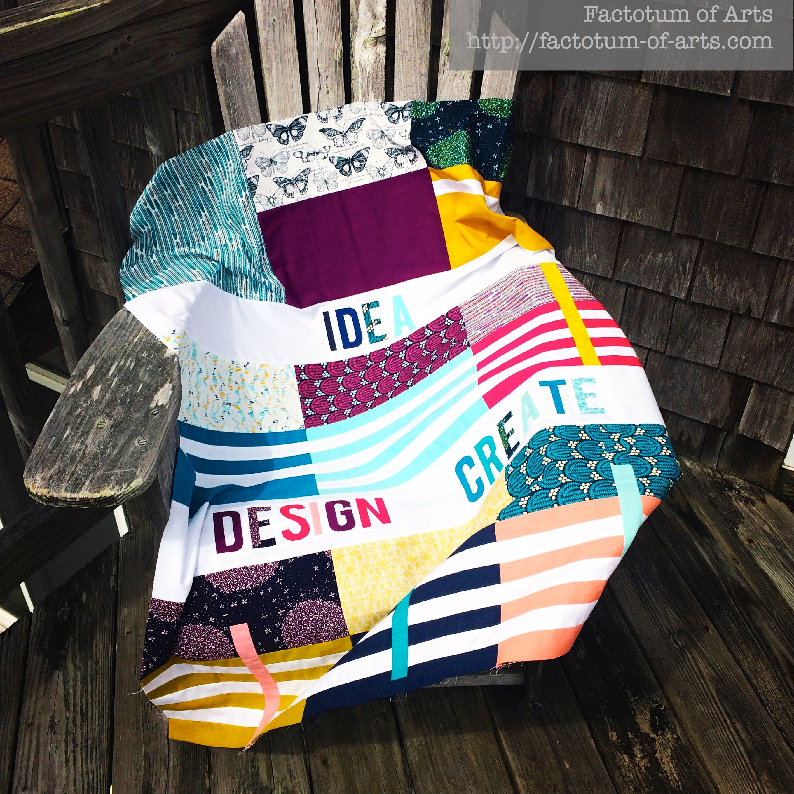
After I won February’s Cloud 9 BOM design, which the prize included a FQ bundle of Cirrus Solids, I have been playing around with a quilt design idea. I wanted to show my design process for this block, in a quilt. The quilt top shows with each block, how I played with it to get to the last block, which is actually the final design.
Reflecting back on some of my design decisions for this quilt, was actually interesting for me. A lot of my past, what my current goals are, and my current processes are represented in this quilt. Here are some of the design decisions:
- Using prints with the solids: I chose to stay with cloud 9 and use Sarah Watson’s Biology prints. The Biology prints have special meaning to me, as this was one of my two majors in my BSc.
- Color choices: Matching the prints to the solids was probably my favorite part. There were some colors and prints that immediately I knew they would work together, then there were others, I had to play a little more around. I have to say, I get asked a lot about my choices and how I came by them. I really just have an eye for it, rather than using any true color theory method. I have grown up in an artistic family and always participated in some kind of creative means. In this case I mix the solids and prints up, stood back and looked; and if it was right, I knew pretty quickly. Sometimes, I might be on the fence, so I will test and try to see it in the bigger scheme of things before making a decision.
- Block Layout: I had originally designed this quilt with rows consisting of 4 blocks. After getting started, I realized a 3 x 3 model would work best. This meant playing around with the color placements for each block and switching out the first block.
- Statement: I also wanted to add a statement/words. I was thinking about “evolution” on the bottom of the quilt, but I was not sure that would translate for everyone. I was thinking you know evolution of man…which lead my thoughts on how the design evolved… and then throw in the biology themed fabric…maybe too far field???. So, in the end, I decided to go with my blog goal/mantra “Idea, Design, Create” (at the top of the page). It described my process perfectly.

I must say at first, seeing the blocks start to go up on my design wall, I was skeptical, even telling the husband “I don’t know, I may not like this”. By changing my layout and adding the letters and the sashing between the blocks, I have to say that I love it now. I love this picture of the final quilt top, one the hubby did a great job holding it, but the beach Fauna gave the best contrast to the vibrant colors.

The letters are a paper piecing pattern by Diane Bohn @ From Blank Pages – “My first alphabet” (Craftsy link). They worked perfectly with my quilt, though the S and the G were time-consuming for obvious reasons.
The quilt top is ~36″ x 48″. I am going to find some special place in my sewing room to hang it when complete!! (When it comes back from quilting that is)
Linking up with Amanda Jean @ Crazy Mom Quilts for Finish it up Friday.

 The wind picked up during my photo shoot, I loved how it landed. I think the color additions of yellows, oranges and the purple/raisin worked well with the “Marsala-like” solid.