Author Archives: mlwilkie

Unknown's avatar

About mlwilkie

Software Developer, Mother, Wife with keen interest in art, design and crafts of all kinds.

What Shade Are You: Rails {a finish}

REPOSTING from RJR Fabrics “What Shade are You” Blog post today.
—————————————————————————————————-

Today, on “What Shade are You” I would like to share with you on my design journey and inspiration for my quilt “Rails”.

img_7386

I am Michelle Wilkie. I can be found on Instagram @ml_wilkie, or on my blog Factotum of Arts.

I was so excited to be participating in What Shade are you, and when I received my bundle in the mail a multitude of ideas came to mind. The colors are so vibrant.
img_6774

My original bundle, had a couple additional colors but the final fabrics I chose were:

Cotton Supreme Solids:
Optical White
Black
Turks & Caicos
Night
Electric Blue
Anemone
Citron
Sunny Delight
Tangerine Dream
Chilli Pepper
Grape
Shell pink
Raging Ruby

Additionally, I used some C+S fabrics to add some interest within the solids:
Sprinkle in Corduroy
Dottie in Fedora
Dottie Cousins in Natural

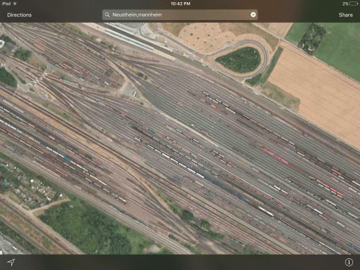
I get inspired all the time from the world around us. For this quilt, it was no different. My husband is from Mannheim Germany, where we both lived for a few years before moving to the US. My inspiration for this quilt came from the Neustheim Train Junction.
img_0215

The lines fascinated me. I loved the idea of using improvisation strip piecing to try and mimic these strong direction lines. It was an interesting experience bending the fabric to make the gentle curves. Some tips:

  1. I started this quilt at one end and added in one direction, using strips to mark out where I was adding curves that would intersect with other lines.
  2. Use a lot of starch to get the pieces to lay flat and press often.
  3. Make sure you trim your threads and additional fabric as you go, especially when using white.
  4. Lastly, I glue basted this quilt while it was on my design wall. I pressed each layer to fix it to the one beneath. This technique was important as it helped the top to adhere flat to the bottom layers and hold in place as it stretched out some of the puffy areas.

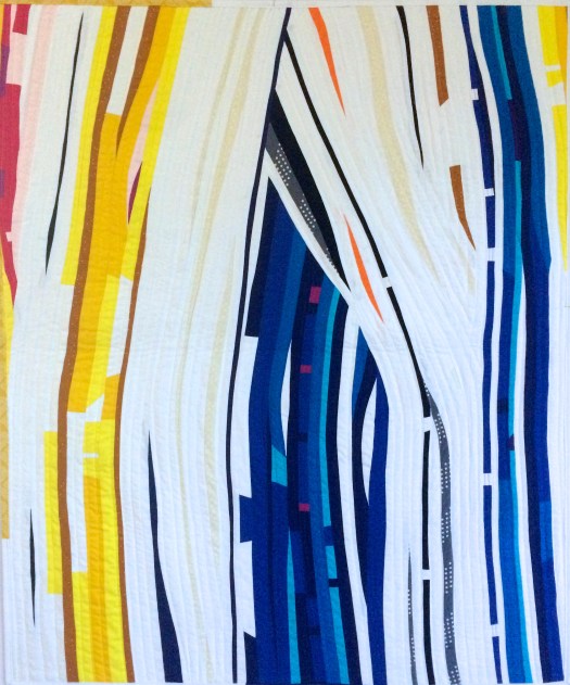
Here’s a close-up of the quilt top. The predominant colors are blues, yellows and white, however as I stepped back with each addition, I decided to add pops of colors. This adds balance and richness to this quilt that helped also break up the stark bands of color. You can see the use of red, purple, pinks, and orange.
img_7389

For the quilting, I used Aurifil 2410, 2021, 2120, and 2783. I used irregular-spaced wavy lines that flowed with the fabric strips, to complement the colors and design of the quilt. In the binding, I also added some interest and continued the flow of color by inserting a piece of C+S print and a small blue strip to my white binding.

img_7385

This was so much fun to play with such vibrant colors. I loved the overall finish that the Cotton Supreme Solids provided. Thanks to RJR fabrics for the opportunity and to you for stopping by.
——————————————————————————————————————————————

Stop by my RJRFabrics and ml_wilkie (on Instagram) for a giveaway later today.

Mad Dash {Pattern Release}

Today I am releasing my Mad Dash Quilt Pattern. It is now available in my payhip and craftsy shops.

mad-dash-quilt

Over some time, I had started to collect a significant amount of scrap and panels of Maze and Vale low volume, hand printed fabrics. Saving them for the perfect quilt. After playing around with dashes, inspired by the lines in a text document, I came up with this design.

10feb_20162

In my head, I could envision the recently released Art Gallery Fabrics soft Denim for the dashes, and the Maze and Vale prints for the backgrounds.

mad-dash-quilt_boy

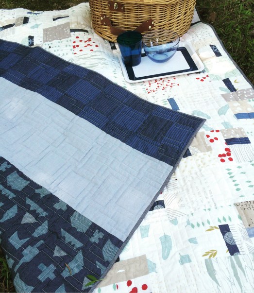
I love how this quilt turned out. I have two layers of batting and denim on the back as this is now our picnic blanket.mad-dash-back
The pattern includes 3 alternative sizes. The pattern testers did an amazing job. I love their choices.

mosaic7e0aa0057d08a83dbdd373b59f0172ed67d8950a
Photo Credits to each of the testers:
1. Debbie's Pillow (IG: @aquilterstable); 
2. Katherine's Lizzie House quilt (IG: @katgraycraft);
3. Jacqueline's quilt using solids (IG: @jskarritt); 
4. Molly's in a great woodsy palette (IG: @lane33andhalf)

Details

Name: Mad Dash
Design:
Original Design (Payhip or Craftsy)
Fabric: AGF Denim Studio, Maze and Vale Low Volumes
Backing: AGF Denim Studio
Binding: AGF Textured Denim
Dimensions: 60 x 60″
Quilted: Sarah @ Crinkle Love

I would love to see any makes with the pattern. Tag me on Instagram (@ml_wilkie) or use the hashtag #maddashquilt

Black + White: A Colour Blog Series

This month past month (September), Christa (@christaquilts) showed some amazing examples of her use of black and white. To close out September, here are some of the projects I have used black and white.

Making a Statement with Stark Contrasts

I love the use of black and white as a statement. These first two examples are using the whole quilt as a statement. Both the back and front of a quilt,  used to show contrast/differences.

Phased Circles

This quilt was designed using all Carolyn Friedlander prints (Botanics and Architexture). The front of this quilt plays with color and saturation.

PhasedCirclesComplete

The back though, I wanted to show take out the play of color completely from the quilt. I used black, grey and white on the back for a stark comparison.
Phased Circles Block1 Quilted Back

Sunday Best

Sunday Best quilt is an experiment of using scrap solids, almost blindly, in this improv project.

The introduction of the black and white into the front of this quilt, had a lot of meaning. I added the pieced B&W pieces the week I was feeling down and processing some very sad feelings. I did not feel like color.

Once I added these sections I liked the look of them, and decided to also add some stripey B&W fabric as filler and to help balance the small B&W inserts.

Week10_SundayBest

For the back of this quilt, I made the decision again to add that stark difference between color and non-color by adding very graphical B&W prints with the various B&W stripes. I used some of the left over string/strip pieces blocks from the front to add those pop of colors and tie the two sides together.

SundayBest_Back

Making a Statement with Pops of Color

The other way I use B&W, is with quilts that are predominantly neutral but then a pop of color adds interest and somewhere for the eye to settle on.

Cheri D’Amour

One of my favorite quilts is Cheri D’Amour. This is made with Frances Newcombe’s Cherie fabric line. The play with the B&W fabrics highlights dark vs light, also brings the industrial feel / structured feel to the quilt.This industrial look is important as it was inspired by a building/warehouse. The pops of pink and blue, I feel, brings so much to this quilt to bring a focal point into the quilt.

Cheri DAmour

Scrappy Pin Cushion

This pin cushion is another example of adding interest with a pop of color. Using the B&W scrap pack from Umbrella Prints with the lime green print of Alison Glass Handmade adds interest to this simple pin cushion and provides that place for the eye to focus on.B&WPinCushionPleatedPocket

Making a Statement with Monotone Quilts

Lastly, the use of graduating non-colors – Black, White and Grey, are one of my favorite things to experiment with. It is very easy to show how color gradients show movement or to play with saturation levels (high vs. low).

Lunar Lines

Lunar Lines is playing with both of these, gradients and saturation’s. I loved playing with various prints from my stash for this quilt. I believe that prints can be used in a modern quilt, and this limited palette helps keep that modern aesthetic.

Tip: When playing with saturation and/or gradients use black and white photographs (using digital filters) to play with placements and see of it reads the way you think it reads. I used this technique in this quilt and it helped a lot.

patchwork projects shot in the studio

Photo Credit: Love Patchwork and Quilting

Negative Crosswalks

The last project I have to share, is one that highlights minimalism. I loved the idea of a crosswalk in which I inverted like a photo negative (the old photographs, before digital). I keep the palette simple, Black, White and Greys in line with the minimal design. Again, I played with the gradient possibilities in this solids only quilt. I do not think that if this was in other colors it would look as simple, minimal as it does in B&W.

NegativeCrosswalks_Front

Getting started with Black and White: Fabric Lines

First off, it’s not hard to find black and white prints but it is important to note that there are underlying tonal colors that impact how black and grey’s play with each other. The blacks/greys tend to be in a blue or a brown family. It is not easy to recognize when purchasing fabric, you will need to place them side by side, and assess, and remove them if they don’t fit.

Where to start from fabric selections….

Solids: My favorite  solid line for B&W (and Grey) is based on the variety of selections at the moment: Robert Kaufman Kona Solids. Take a look at Pepper, a blue black….amazing!! I bought a bolt.

B&W Fabric Lines, some of my favorites include:


Anyway, that catches us up on the Colour Blog Series. Next week, I will post the October Color and a giveaway for all. Stay tuned.

Save

Save

Save

Save