Author Archives: mlwilkie

Unknown's avatar

About mlwilkie

Software Developer, Mother, Wife with keen interest in art, design and crafts of all kinds.

News + Finish {Sunday Best}

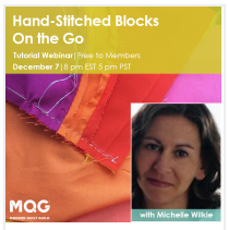
It has been a busy 30 days or so but for super exciting reasons. First off, I did my first quilting webinar last night. It was about the skill I learned this year – hand piecing (hand stitching blocks). If  you are an MQG member you can check it out here. I had a lot of fun doing it.
screen-shot-2016-12-08-at-5-14-28-pm

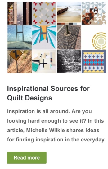
Also, I published my first Article for the MQG “Inspirational Sources for Quilt Designs”. If you are an MQG member you can read it here.
img_7963

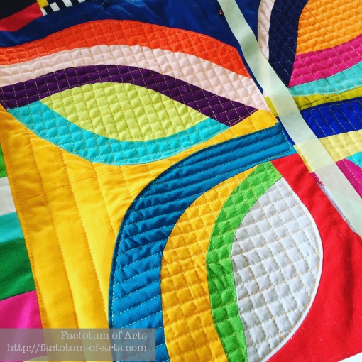
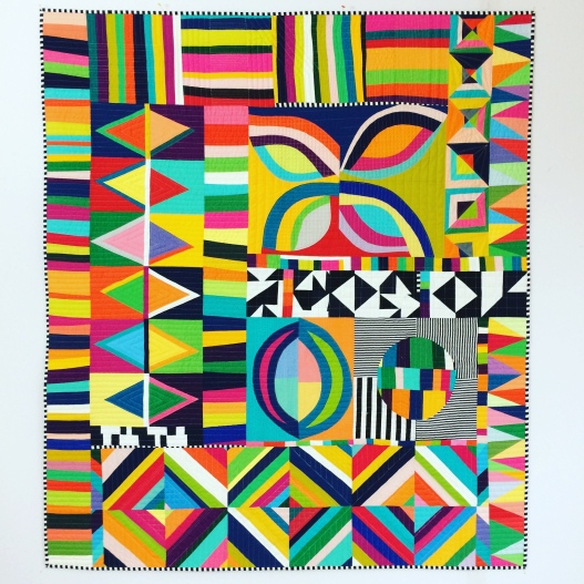
Best of all, I also have a finish in time for Quiltcon submissions – Sunday Best.   It took me forever to start quilting this one, as I just was not inspired by anything. Finally, I had an idea on how to quilt the orange peel block….and the long quilting journal began. I used a domestic sewing machine and walking foot for all the quilting.
sundaybest_quiltingblock1

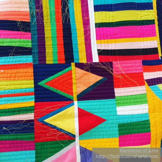
My goal for quilting, was to add interest, while ensuring it complemented the top and did not distract the viewer. For the stripes up the top of the quilt I used straight lines with varying widths from matchstick quilting to 1/2″.
sunday-best-quilting2

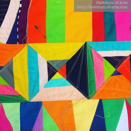
I decided to choose two different designs for each of the main triangle patterns. The design above on the left (with nested triangles) I used for all of these triangles in this section. For the next set of triangles, featured below, I used a sectional design like slices of an orange. It makes this cool pyramid effect.
sunday-best-quilting-2a

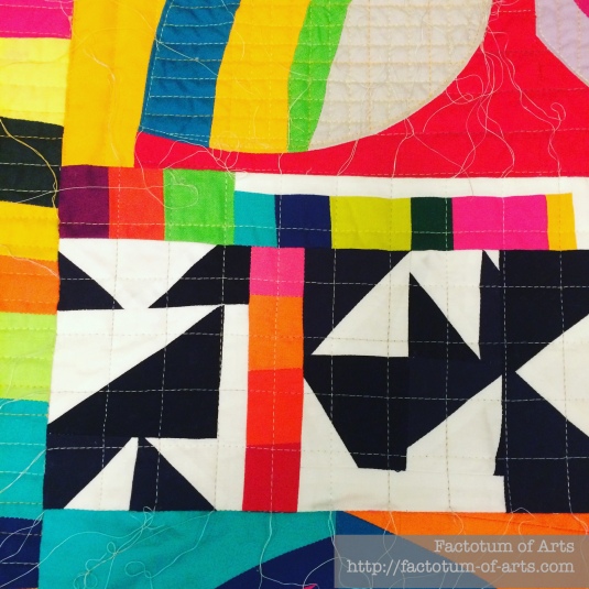
For the black and white sections of the quilt, it reminded me of a checker’s board so I used a 1″ grid design.
sunday-best-quilting4

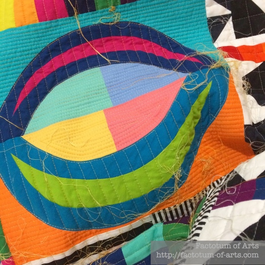
With using the matchstick quilting at the top, I felt that I needed to balance the dense quilting somewhere else. I decided to use it in this block, the background fabrics, that reminded me of a seed pod.
sunday-best-quilting3

And yes, all those thread ends, did need burying. It took around 9 hours for this task but I did it over 3 sessions. For those that are interested in how to bury threads, I learned from this tutorial from @ crazy mom quilts.

I finished off the quilting with 1/2″ black and white binding. I can’t tell you how in love I am with this quilt.
sunday-best

Details

Name: Sunday Best
Design:
Original Design – Improvisation
Fabric: Various Solid from my scrap bins, Black and white stripes
Backing: Lecien Fabrics (Black and white), scraps from the front
Binding: B+W Striped Binding (1/2″ white stripe)
Dimensions: 46 x 53″
Quilted: Various designs, domestic sewing machine with a walking foot. Used Aurifil #4658 and #4060 wt. 50

Just in case, you can find the design decisions and the information about the top, in this post.
Grey: Guest Posts {Nydia Kehnle + Nicole Daksiewicz}

This month’s color is Grey. We have two amazing guests this month. I am so excited for you to read their posts.

First up, is Nydia Kehnle. I met Nydia during Quiltcon 2015 and have always loved her work. Her improvisation quilt that included both machine quilting and hand quilting, won an award that year.  She is an amazing designer, and photographer. I have been so excited to see her quilt pattern/design collaboration with Alison Glass, her releases of embroidery designs and experimentation with improvisation. Recently, she has been teaching some of her techniques at Glamp Stitchalot and next year at Quiltcon. Check out her thoughts on photography and how it influences her use of Grey.

Blog: http://www.nydiakehnle.com/
Instagram: @nydiak
Shop: http://nydiakehnle.bigcartel.com/

Nicole, from Modern Handcraft, was one of the first people I met in this virtual crafting world. If you don’t know her, she has a great sense for modern design and craft beers/ciders. You might know her from her Hexie projects but she has recently been releasing some amazing new quilt patterns. Grey is one of her favorite neutrals. Find out how she uses grey in her projects and in naming her son ;-).

Blog: http://modernhandcraft.com/blog/IG: @modernhandcraft
Shop: https://shop.modernhandcraft.com/


Aqua + Teal: A Colour Blog Series

I love using aqua and teal in quilts, though aqua tends to be more common. There is so much variation in fabrics on the market today with these particular colors. I use them  often to add a pop of color, as a great intermediate color or to add more depth to a blue color palette.

Aqua + Teal with Blue

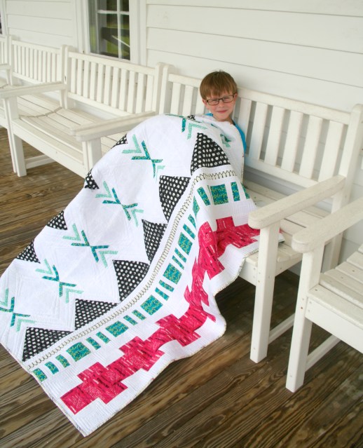
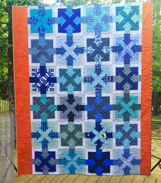
This quilt, that I recently finished for my son, is an example of adding a little more depth and variation to this very blue color palette. The use of teal and aqua helps the eye to continue to move over the quilt.

Pushme_Pullme_Finish

Aqua + Teal as a focal point

I used aqua with these improv. blocks originally just as a filler. As the blocks came together the aqua provided a focal point and pulls the viewer in.

orangecreamsicle_top

Likewise, with this warm color palette the aqua stripes provide a focal point for the eye to rest within strong and busy prints.

ColorStudyFront

Aqua + Teal balancing color

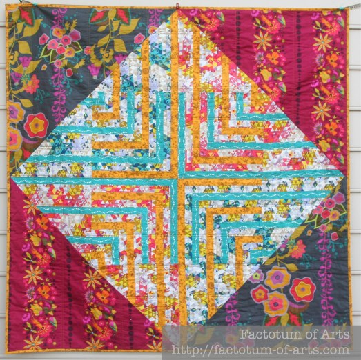
I use aqua and teal as a balancing color a lot. This first quilt, Moorish Pyramids, is made using Imprint line from Katarina Roccella. I love this line and for this quilt I was using the greys, whites and navy as neutrals.  The aqua and mustard provide the focus and balance for this quilt.

Moorish_Pyramids

Another line from Katarina, Wonderland, is such a great girls line. As I was playing with the pinks and browns, I realized I needed something to balance this warm palette. The aqua print was perfect for adding the balance. And who would not like those great girl characters in this print.

Wonderland_Quilt_Finish

The aqua and teal within Jungle Ave Tapa, provides a balance to the hot pink and the starkness of the white, without taking over the other colors. IMG_0406

Lastly, the aqua and teal in Phased Circles quilt, is a great intermediate color that worked alongside of the 3 warm colors; mustard, orange and hot pink. I do not think the blue or green would work as well with these. PhasedCirclesComplete

Aqua and Teal for Christmas

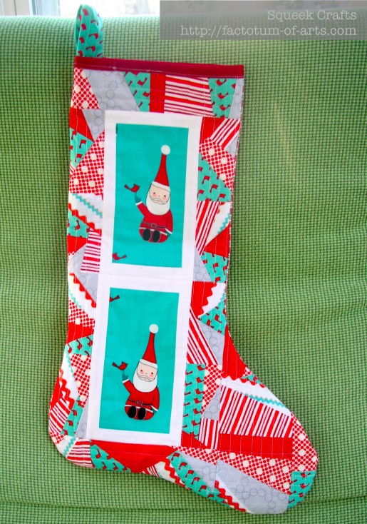
I like to use aqua, red and grey as an alternative to the traditional green and red palette for Christmas.  It’s one of my favorite combinations and used here for my Christmas Stocking.
Christmas_Stocking

Winner – Giveaway

The winner for this month, the $50 Fat Quarter Shop Gift Card and Fabric Bundle of Katarina Roccella’s Art Gallery Prints is Cathy W. Congratulations!! I will email you shortly for your details.