Last week, was Sewtopia Atlanta and I attended. What can I say, it was so awesome. My best retreat ever!! Will I attend again? Absolutely, if my commitments allow I would like to attend everyone from now on!!
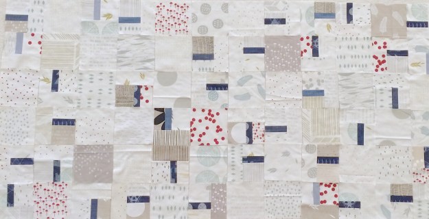
[Personal Project: WiP: Maze & Vale + AGF Denim]
For those that don’t know, Sewtopia is a sewing retreat which happens twice a year. The first event of the year tends to be structured as partly class, partly open sew. The second event tends to be only open sew.
It was the first time I have every roomed with a stranger. Corrinna was the best room-mate ever, and totally alleviated my concerns of maybe not knowing anyone. She was not the only new friend I made, it was such a great event for making new or building on existing connections.

The weekend kicked-off with me scrambling to finish hand sewing my binding on my Michael Miller Challenge item, before the 3pm Cotton + Studio Tour. I did finish it just in time. The studio tour was amazing. All the ladies from C+S were there and answered our questions, we saw their new line and their studio/work space is just amazing!!
 [Denyse Schmidt: My Single Girl Block: Blue Scraps+Lizzie House Print]
The classes were Denyse Schmidt’s Free Wheeling Single Girl and Elizabeth Hartman’s Frances Firefly. Both instructors were amazing and so friendly. I managed to contain my fan-girl moments :-), as they spend a lot of time with each student. The classes were well structured, and since both were block based you could decide what kind of project you would make. Look, I got to practice curves which I just recently learned in Melanie Tuazon’s curve class.
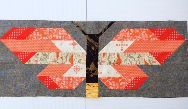 [Elizabeth Hartman: Frances Firefly: Cotton and Steel + Carolyn Friedlander Carkai + Katarina Roccella Avant Garde + Essex Linen]
Other than the special events, the other things that made this the best retreat I have ever gone to:
- The wonderful and friendly staff
- The great balance between activities and open sew
- The stress-free, friendly environment
- The optional challenge and swap activities is greatly appreciated
- I enjoyed the catered lunches
I can’t wait to my next Sewtopia retreat (here’s hoping for a spot at Austin, if not I will see you all at Denver)!!
Have a great weekend, all. I am hoping to get some quilting time in.