Category Archives: color

Orange Creamsicle {a finish}

As QuiltCon Together approaches (02/18/2021) I thought I would share this quilt that made it into the virtual show but had not made it onto my blog so far. 

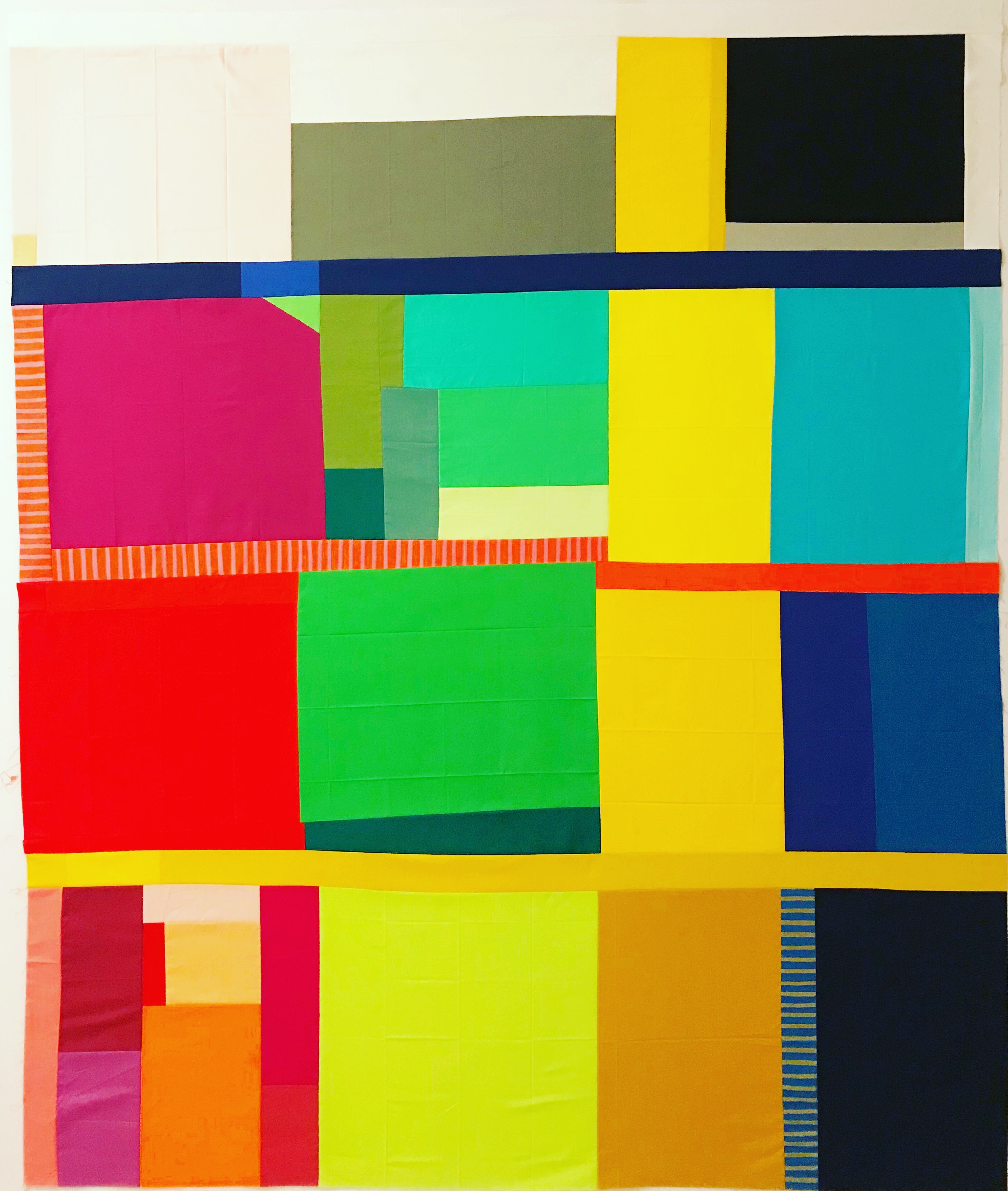
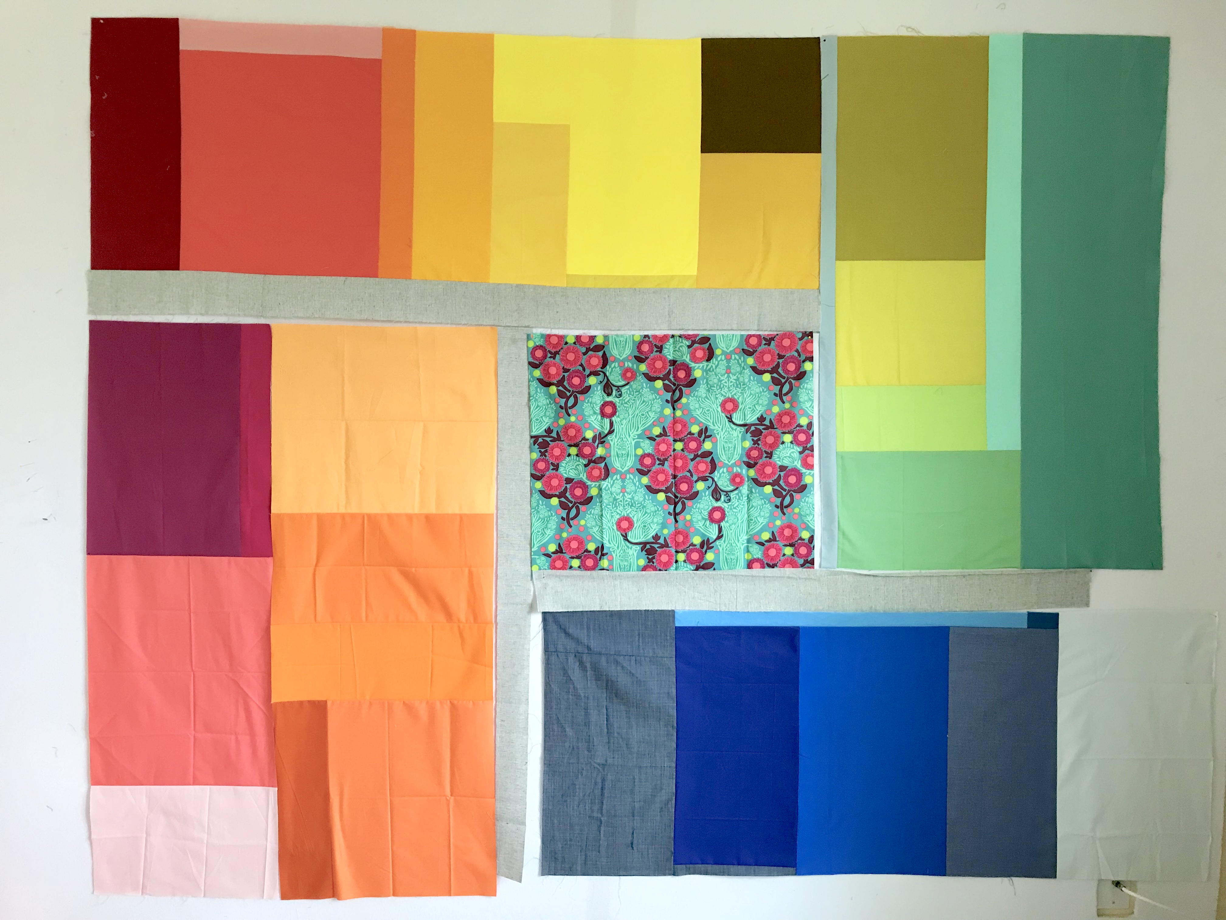
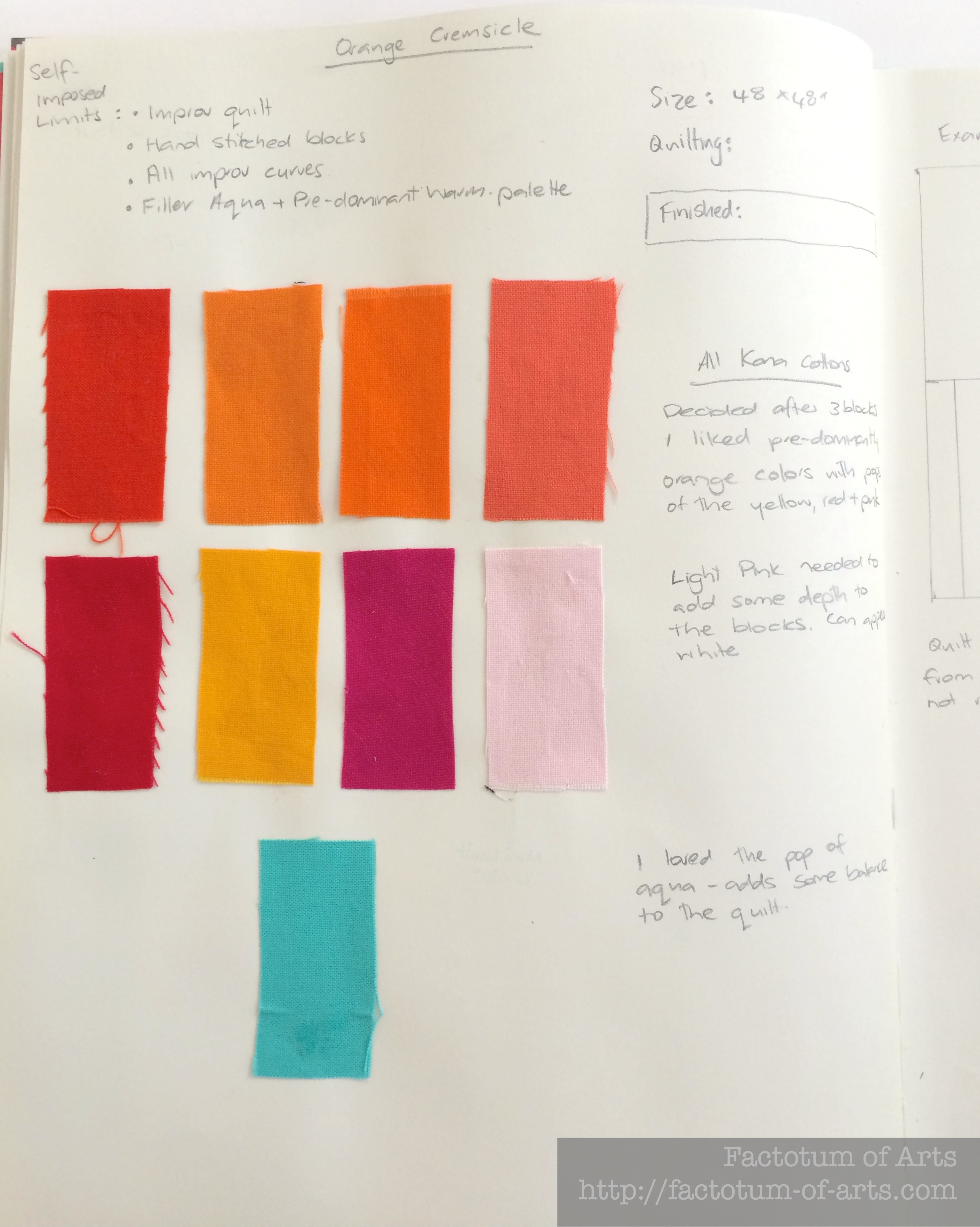
Say hello to Orange Creamsicle. Orange Creamsicle started with a single block that I had hoped would be a great compliment to the rest of the Sunday Best blocks.

IMG_6340

To be honest the block just didn’t really work with the rest of quilt. Yes, that became the start to Orange Creamsicle.

IMG_6332

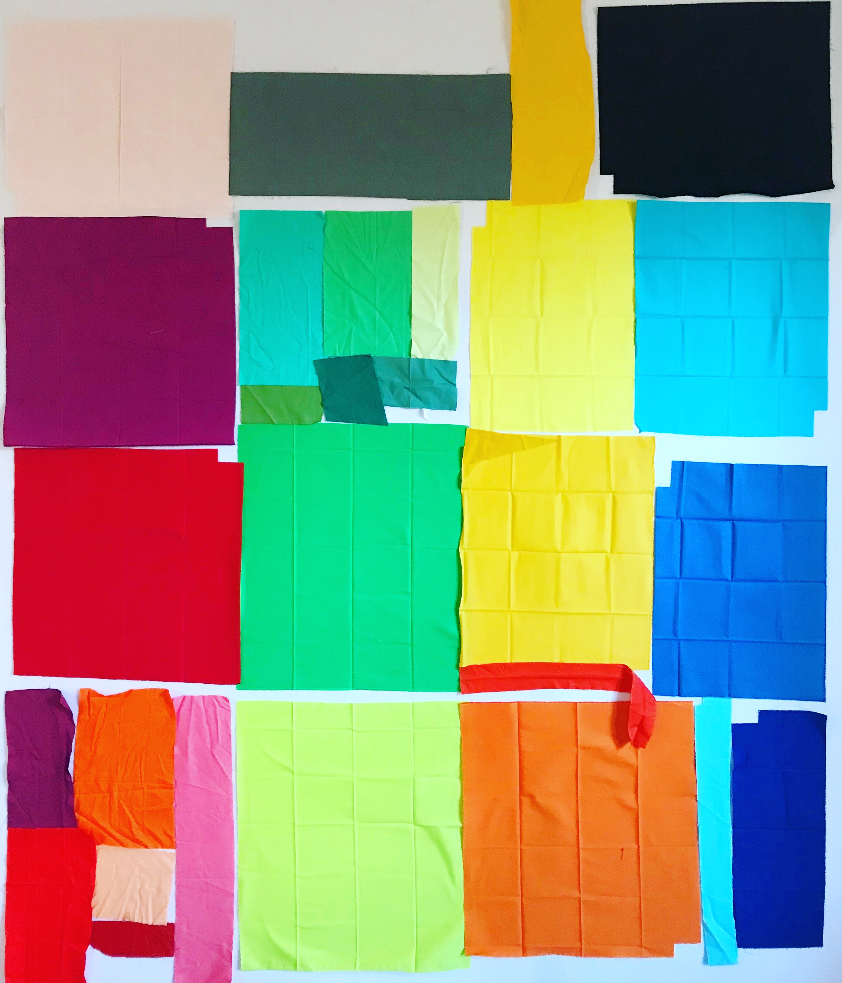
I introduced some limits to this quilt after the first block, as I really wanted to try making a quilt top without modern equipment. I wanted to see what it was like for women of the past who made quilts.  Those limits included:

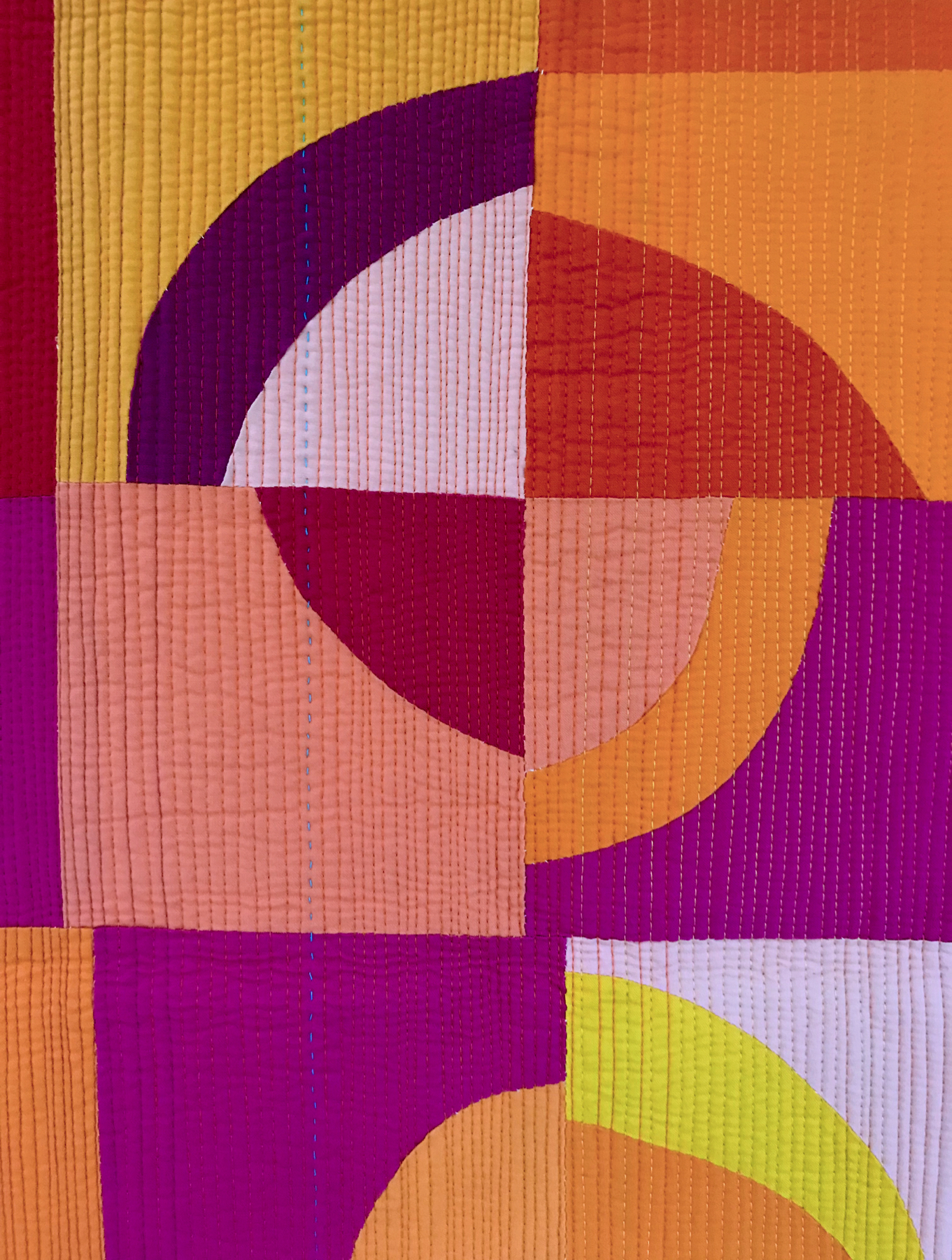
  • Limited color palette (pinks, oranges, yellows, red, purple – a warm color palette)
  • All fabric was cut with scissors (typically scissors less that 4″ so they could travel on the plane)
  • All blocks with hand pieced. Stitched up by hand.
  • The drunkard path blocks were roughly 6″ finished. They again were squared up using scissors.

If any block did not measure 6″ finished I used filler strips. A design decision was made to introduce aqua into these strips to give the eye somewhere to rest. 

Journal_OrangeCreamsicle1

I really enjoyed this project. Much of it was done on work trips or on vacation. I remember stitching blocks in Germany while visiting my husband’s family and in Olympic National Park as we drove from sight to sight.  The best thing is I learned a lot about hand piecing that I had not known before.

  • Back stitch, 2-3 stitches at the beginning and end of your lines instead of using notes.
  • Stay stitch across each seam for stabilization and then also every 1-1 1/2 inches.
  • Mark a 1/4 ” line so your stitch lines are relatively straight.
  • Stitch multiple stitches at a time with your needle. You will get straighter and more consistent stitching.
  • I used a 10 needle and 50wt aurifil thread which worked well for just piecing.
  • Next time I will match my thread to the fabric palette and use a warm color (like orange). I used white as that is what I had on hand. You will see your stitches as they are larger than what you get with a sewing machine.

While visiting my family in New Zealand I laid out the blocks for determining final layout. Once I thought the balance of colors were right the rows of the tip were hand stitched together.  The limits of mostly handwork made this perfect for a traveling quilt project.

IMG_8095

I decided to give this quilt a little something else and pieced the back from scraps. The scraps were in the same color palette as the front but were all prints. They were mostly pieced in a column like fashion, again using improvisation. I was really pleased with how many of my favorite prints were in my scrap bin that made it into the back and shocked to see how much of my scraps were still in the storage jars, after I had finished.

Early on I had made a decision to use match stick quilting with a variety of warm colors. I also wanted to add a few hand quilted lines with a 28 wt thread. It was my first time hand quilting since taking a class with Season at QuiltCon (S.d.evans). I started in the middle and laid down the first few lines….and then this quilt stopped progressing.

Thankfully, I had a fire lit to try and finish some of my WiPs in the middle of 2020 (while in quarantine. Orange Creamsicle made the list.   I have no idea why it took so long to get back to it, as it did not take long to finish. The quilting added an amazing amount of texture. There is also a guarantee, with this many quilting lines, these blocks will never fall apart.

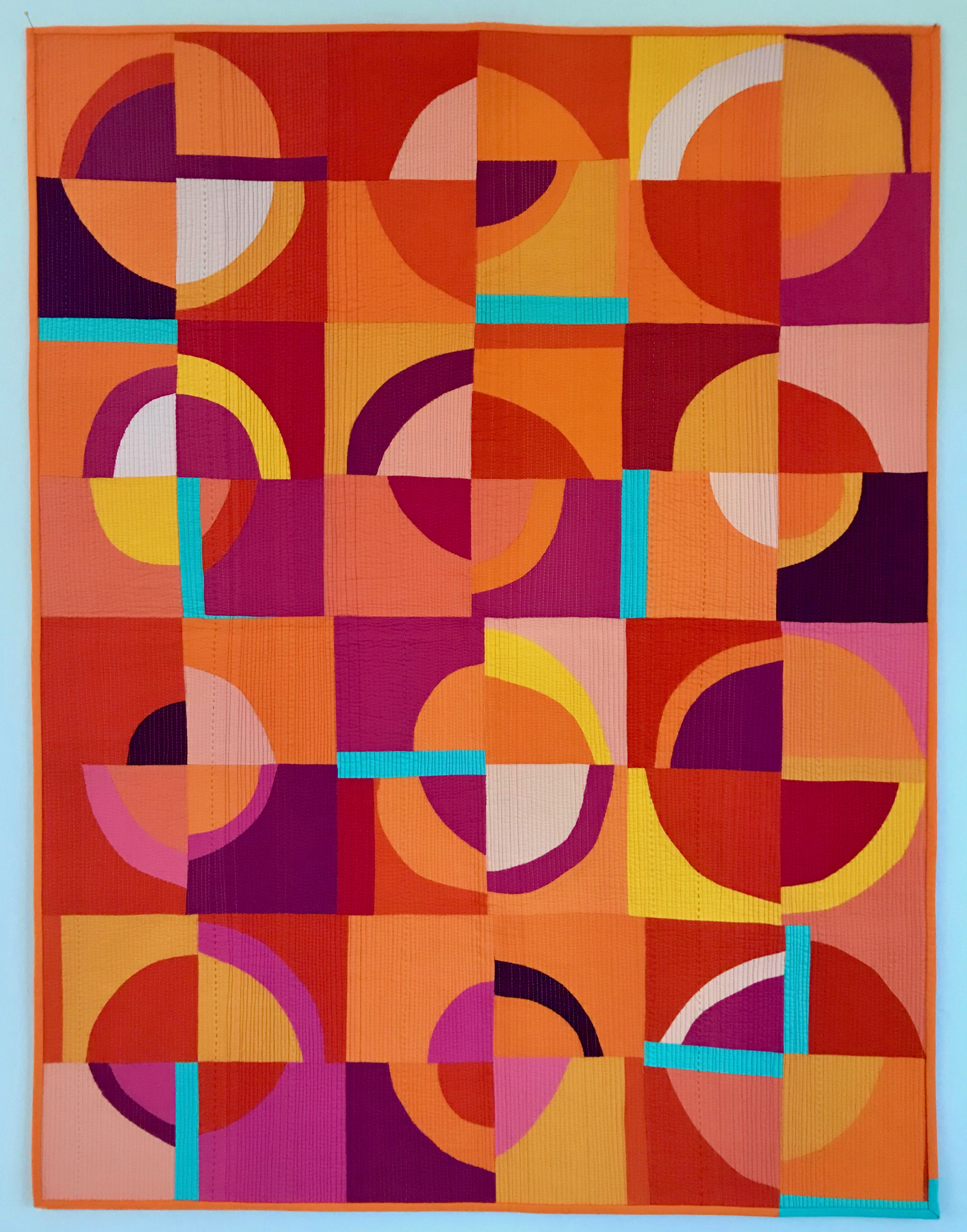
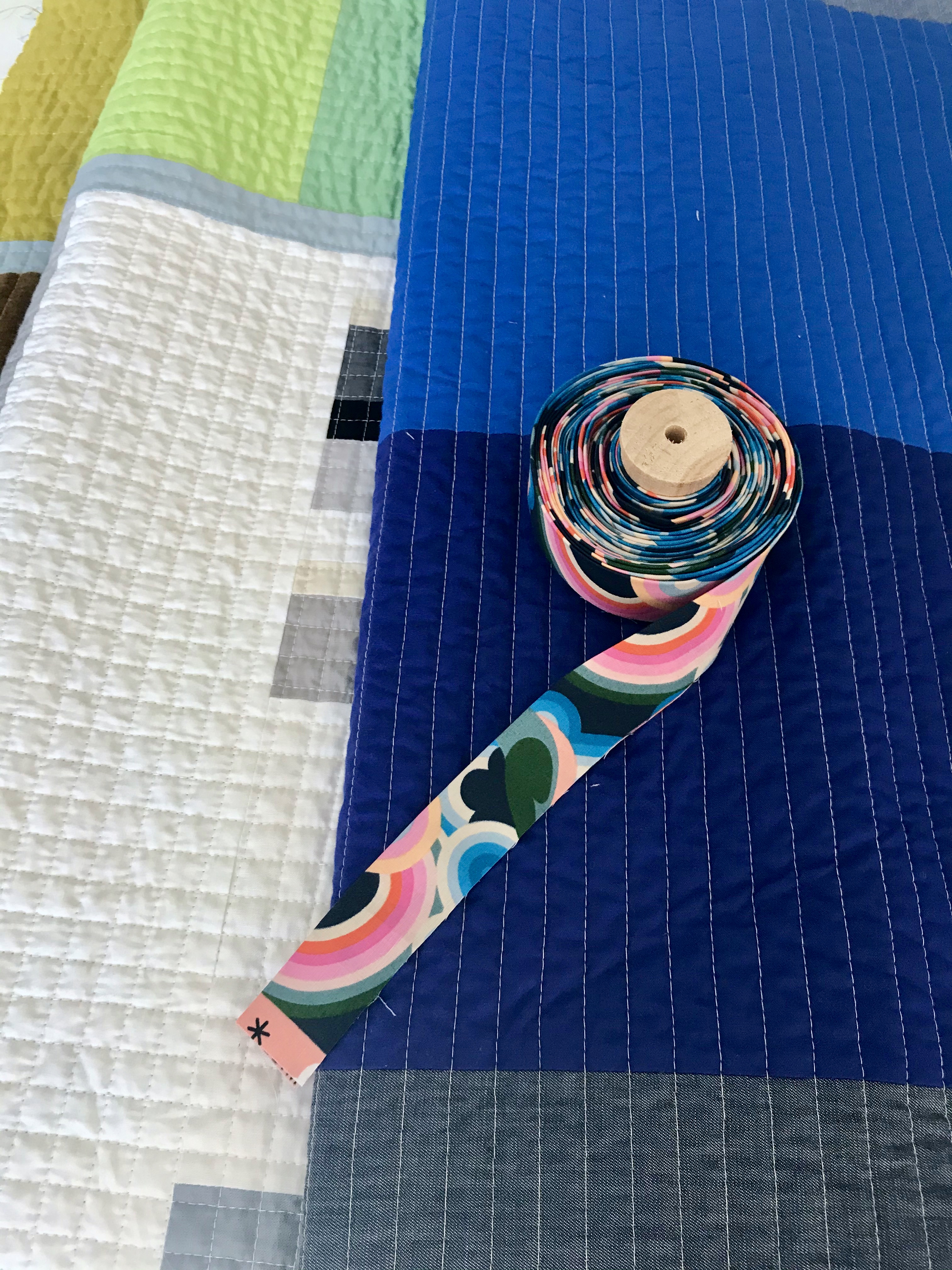
Binding was an easy decision, it was which ever orange solid color that I had a 1/2 yard of. I also used the aqua for the bottom right corner as I love that line at the bottom there and it would almost have disappeared if orange was used.

I am really pleased with how this turned out. I did do a little happy dance as this one came off the machine.

Details

Name : Orange Creamsicle 
Design:
 Original Design
Fabric: Kona Cotton (Variety of warm colors + ? )
Binding: Kona Cotton
Backing:
 Various Print Fabric scraps
Dimensions: 36 x 48 in.
Quilted: With 50wt Aurifil , using domestic machine walking foot, straight lines matchstitck + 28wt Aurifil hand quilted.

Color Play Study {Quilt Journey Part I}

Instead of just posting about my finishes, I thought I would go into more detail on a few quilts. This first post I have touched on before but wanted to talk more about the steps, techniques and process of building these quilts from design to binding.

I am starting with a color play study I did, that was inspired by Stanley Whitney’s work.  As Josef Albers explores color with his work Interaction of color, I love how Stanley Whitney does the same (at least for me) in the placement of the colors in the grid.  Here are a couple of examples of Stanley Whitney’s work:

If you like these pieces, check out this book, Stanley Whitney: In the Color.

There are three pieces in which I explored color and placement. For all, I started with:

  • A large design wall that provided space to organize layout and editing.
  • A pile of larger scraps that were smaller than a fat quarter, and some sorted smaller scraps, sorted by color.
  • I knew that these would be improvisation based quilts; exploring maximalism with color but minimalism in design.

The first quilt, Whitney, I started with a similar grid layout like Stanley Whitney’s pieces. I keep with bright colors but was limited based on the scraps I had in my stash. I did not want to purchase additional fabric.

As I ordered the larger scraps I found common color groupings – Reds/pinks, Greens, yellows and blues. I laid these scraps vertically in the color groups thinking I would add horizontal strips between the rows. Where I did not have enough large scraps I used smaller scraps to create the square (see red and green rows). This is what the initial layout looked like.

IMG_5136

I edited the arrangement and made some decisions:

  • I wanted to have yellow’s, vertically all the way down. Yellow had the smallest variation in color so I feel it draws the eye down between rows.
  • As I sewed up each row, I added “filler” pieces to try and make sure each row was approximately the same size.
  • The stripes between the rows, I wanted to keep within the color choices I made in the columns, so I chose blue, reds and yellow (the primary colors). The colors were ~2″ strips I had in stash.
  • I added stripes to add interest and a place for visual rest.
  • Many of the larger scraps had corners missing so additional pieces were added, or strips were trimmed off, and one I added a triangle which I thought would be great using a green from the adjacent color area.
  • The lighter blue piece added in the blue row separator was not planned. The strip was too short and it was a slice and insert. It was a great coincidence that it lined up the way it did.

IMG_5139

Stanley is the second study I did. I wanted to explore, this time the lack of bright colors with a mostly neutral color palette. Some design decisions for this quilt:

  • I played with different fabric types in this quilt with quilting cotton, linen, denim and feed sacks.
  • I wanted the quilt to move from dark (left) to light (right) – black, grey, whites/creams.
  • Yellow was used as a row separator in this quilt.
  • To draw the eye down the quilt, this time I used the thin blue denim vertical stripe. Its separated with the yellow but I decided not to separate it between second and third rows.
  • The red was prompted from the red in the feed sack. I was hoping that it would make the feed sacks pop a little.
  • The red print was added last as the row separator between black and grey. I decided I liked having the red print also down the side of the third row. I like the jump it forces you to make when looking at it.

IMG_5204

The first two quilts were named after Stanley Whitney who inspired these two pieces; Whitney due to the bright colors (more girl-ie) and Stanley for the more neutral quilt.

If you follow my blog you would have seen the 3rd one in this study – Scrap Dive Study no. 3. This one was not following the typical grid rows and columns layout the previous two explored. I still explored the separation of areas but in a more quadrant layout. The large scraps here I looked at oranges, reds, yellows, greens and a smaller area of blues. The separator is a linen weaved blend.

fullsizeoutput_15a6

After this initial layout, I changed:

  • The grouping of the colors. I moved all the greens into one area. I expanded the blues into its own areas and added some denim off-cuts. The two other segments were the warm colors which are positioned more in a gradation – corals to oranges in one segment, reds/pinks/oranges and yellows in the other.

fullsizeoutput_15af

  • The center, I struggled with and initially tried a variety of prints but finally decided on a black and white center
  • Also, rotated the quilt so that the green was on top.

fullsizeoutput_1597

As I take you through the journey of these quilts, I plan to share:

  • Technique: How I baste quilts (where I’ll share reference material)
  • Deciding on Quilting designs
  • Technique: Burying threads
  • Technique: Binding tips

If you have other questions or topics you want more information,  let me know and I’ll try to address them, either in these planned posts or in new posts.

Scrap Dive – Study no. 3 {a finish}

fullsizeoutput_1597

Idea

A couple of years ago I discovered the Lisson Gallery in New York as I went to see a Carmen Herrera exhibit there. The next show, was Stanley Whitney. I had never heard of him. He is African American artist, and I was fascinated how he played with blocks of color in a very vertical/horizontal grid like fashion. They are such amazing compositions, maximalist with color but minimalist in shapes.

fullsizeoutput_15a3

Design | Create

His pieces are just amazing!! My mind, after seeing this work, could not let go of how to do the same color play in textiles. Around the same time, friends and I were talking about how to use larger scraps of fabric up.

What is a scrap you might ask?
I store most of my fabric, that is a fat quarter or larger, wrapped around comic book boards. Smaller scraps are stored in the white bins you see below. So to me, I consider a large scrap a fat eighth, a scrap that I can still fold nicely but won’t fit around a board.

IMG_4077

Pulling out these larger scraps, I realized they would be perfect to explore color play in a similar way that Stanley Whitney’s pieces speak to me.

I have done three studies exploring color with my scraps. Whitney was the first and I explored this using a similar composition to Stanley Whitney pieces. Stanley, the second exploring more the lack of color with neutral colored scraps and using other fabrics like denim, linens and feed sacks. The third is Scrap Dive – Study no.3.

I always start making each piece by putting the scraps I have on the design wall.  I edit placement and what stays or goes directly on the design wall. The initial pull and layout of Study no. 3 still had the bands of vertical color. It evolved as I wanted to play more with my own layout and explored a quadrant-like composition using a linen scrap to put up the boundaries.

fullsizeoutput_15a6

While this layout you could see the movement from warms to colds, I wanted to really show the movement more around the quilt, almost like a color wheel. I moved things around so each quadrant took on different colors – Reds/Oranges, Reds and Yellows, Greens, and Blues (ROYGBIV). The other thing I found difficult was what to put in the center. I tried adding a variety of prints until I decided on my strip piecing from a class sample I was using.
fullsizeoutput_15af

The last design decision was the binding. I tried 20-30 different solids and prints to see what would work. Nothing. Then I was looking at recently purchased backing fabric and realized that this crazy colorful Melody Miller print from Ruby Star Society would be perfect.

fullsizeoutput_1599

Quilt

I put the quilt top away for a while as I had no clue how I was going to quilt it.  Finally deciding on straight lines, I decided to start with a grid of 1/2″ line for the center.
fullsizeoutput_159e

Each quadrant was then quilted with alternating vertical and horizontal straight lines. The other detail that might be hard to see is within the boundary lines, around the gridded center the lines in the boundaries are just vertical or horizontal. The boundary lines are then gridded where the two color sections are against each other.

fullsizeoutput_15a2

Details

Name : Scrap Dive – Study No. 3
Design:
 Original Design
Fabric: Variety of solid scraps
Backing: Frolic Wide-back, Tula Pink (green)
Binding: Social Bird on a wire, Melody Miller, Ruby Star Society (navy)
Dimensions:
58 x 82 in.
Quilted: 1/2″ Straight line and gridded quilting using Aurifil white #2021(center), cream #2310 (quadrants)