Reflecting on QuiltCon 2015

OMG!! Where do I start?? This was my first QuiltCon and I ignored all the advice from those who attended last time, and organized myself a jam-packed schedule.

Thursday: All-day Class, Triangles with Vanessa Christensen
Friday: Volunteer from 7:15am – 6 pm (Lectures/White Glove);Midday lecture
Saturday: Volunteer from 7:15am – 6 pm (Lectures/White Glove); Midday lecture; Alison Glass Embroidery Class 6-9pm
Sunday: All-day Class Monoprinting with Lizzie House
Monday: Leadership Conference

Oh, yes, I did. My experience was one of the best times I have ever had, however I totally now understand the advice I was given!! The best thing about trying everything….now I know what I will do and not do next time.

Lectures
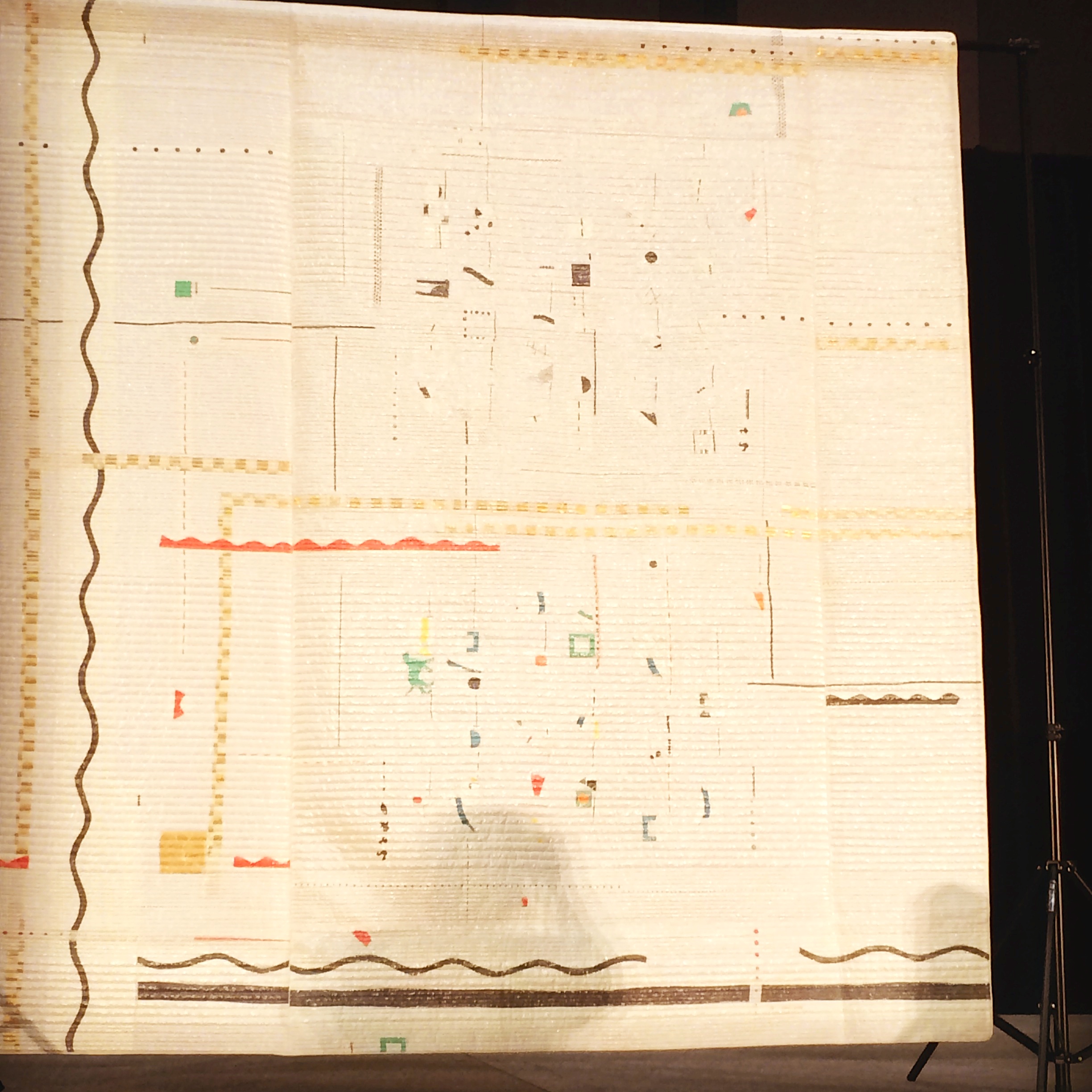
I will definitely do more lectures next time. I liked the burst of information and the coverage of topics that were provided. Yoshiko Jinzenji’s lecture about her process and her quilts was inspiring and one of my highlights of the conference. I loved her gold shimmering quilt that accompanied her in her lecture and shhh…one of the few fabric purchases I made, was more of her fabrics (more on that at Sunday Stash).
IMG_3493

Classes
The classes I took were great. I learned so much and the instructors I had were so amazing to meet in person.  I enjoyed each class for different reasons.

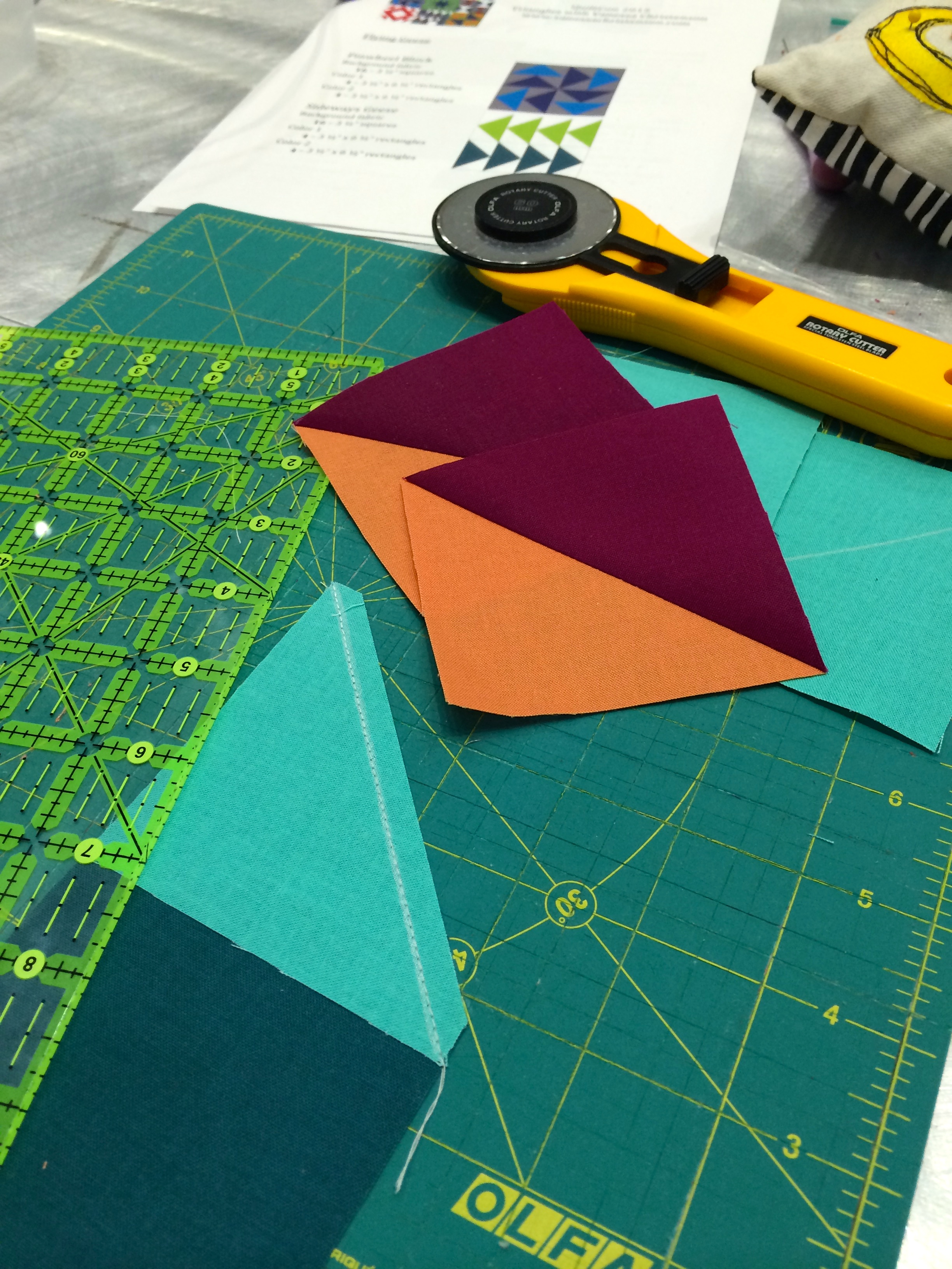
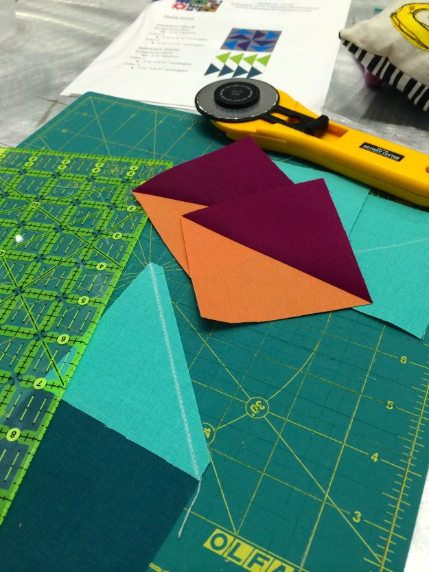
  • Triangles with Vanessa Christensen was very educational about the techniques of sewing triangles and I  now know why I am supposed to use starch. It really does stabilize the fabrics. I will admit I only spent 1/2 the day in the class; as I knew the only time I would have to look at the vendors was that afternoon.
    IMG_3467
  • Embroidery with Alison Glass was perfect for me at that time of day. I so needed something relaxing, and go with the flow at the end of that long day. It delivered completely. I now have another great hand project to do while traveling (or without my machine).
    IMG_3510
  • Monoprinting with Lizzie House was my favorite by a smidge. What a great technique that she offered. One that is transferable to my 7-year-old and I am hoping its something we can do together. I loved this class which is the only reason I could push through the whole day…exhaustion was kicking in. There was so much talent in the class. I loved working with the layers and the two techniques of drawing and then pressing. My final printed panel turned out better than I imagined. I highly recommend this class!!
    IMG_3504

Next time I would limit myself, I think to maybe one class.

Volunteering
I highly recommend volunteering. Everyone is fantastic. My favorite activity, hands down ;-), was white glove duty. The hours were long but my favorite thing was talking to others, who were so interested in what they were seeing. Some wanting to ask your opinion on how it was made or what technique was used etc. The added bonus of this task is you got to walk around and see all the quilts in the quilts show. The inspiration was amazing and as a white glove person you could look at the back of the quilts (of course while showing others).

Volunteering is definitely something I would consider doing again but not as a whole day….spread it out a little for sure!!

Best QuiltCon Activity
The best thing about QuiltCon is meeting all the people you know on social media and actually knowing them by their first name not just their IG handle. Some of the highlights include:

Meeting my peeps from the sisterhood of the traveling quilts; some of the Aussie’s, where we got our photo taken over by my quilt (below)!!; meeting Anne, Stacey and Gillian from QDAD at the Moda Party; meeting Nicole (modern handcraft) and the NZ contingent at Moda party; meeting Denyse Schmidt and Katy Jones there too; talking with the C+S girls at their amazing booth; meeting the fabulous Nydia, Christa and many others on the quilt show room floor; BBQ with Kelsey, Amanda and Ashley; having donuts with the New Jersey MQG gals!!

IMG_3491
A shout-out needs to go out to my roomie, Ashley from @wasntquiltinaday. Best Roomie Ever!! Loved every minute including my bed every evening. So many people – missing you all already!!

Design Process Part II

I am a little late on this post, what can I say, I was caught up binge watch a TV series on Netflix (while being a little under the weather). It was totally worth it!!

Anyway, as mentioned in my earlier post on the Yellow Bus designs, I am going to share another design and show you how I got to my final design. This one is a little different, in that it was more playing around with the color palette choices than the overall design. Remember, I am very much about finding the geometric shapes and I like minimalistic design.

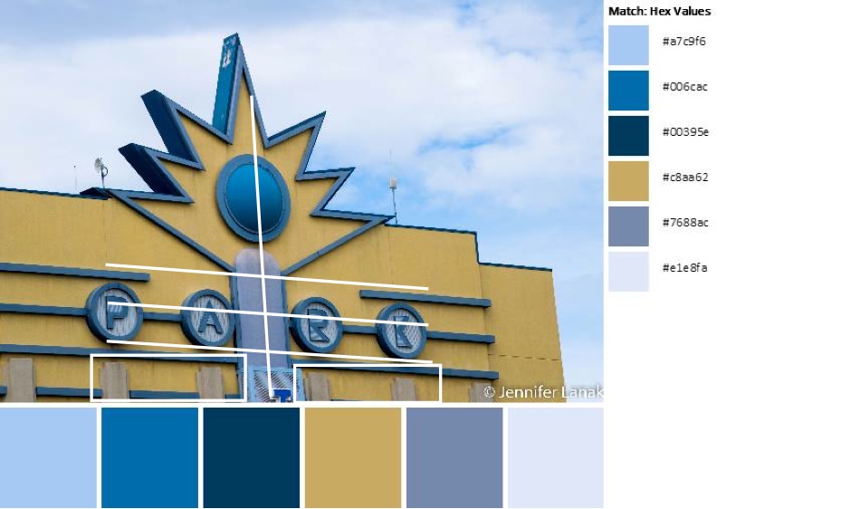
Today’s image and color palette is bought to you by Jennifer Em Lanak, published on the QDAD facebook group.

ArtDeco_08Feb

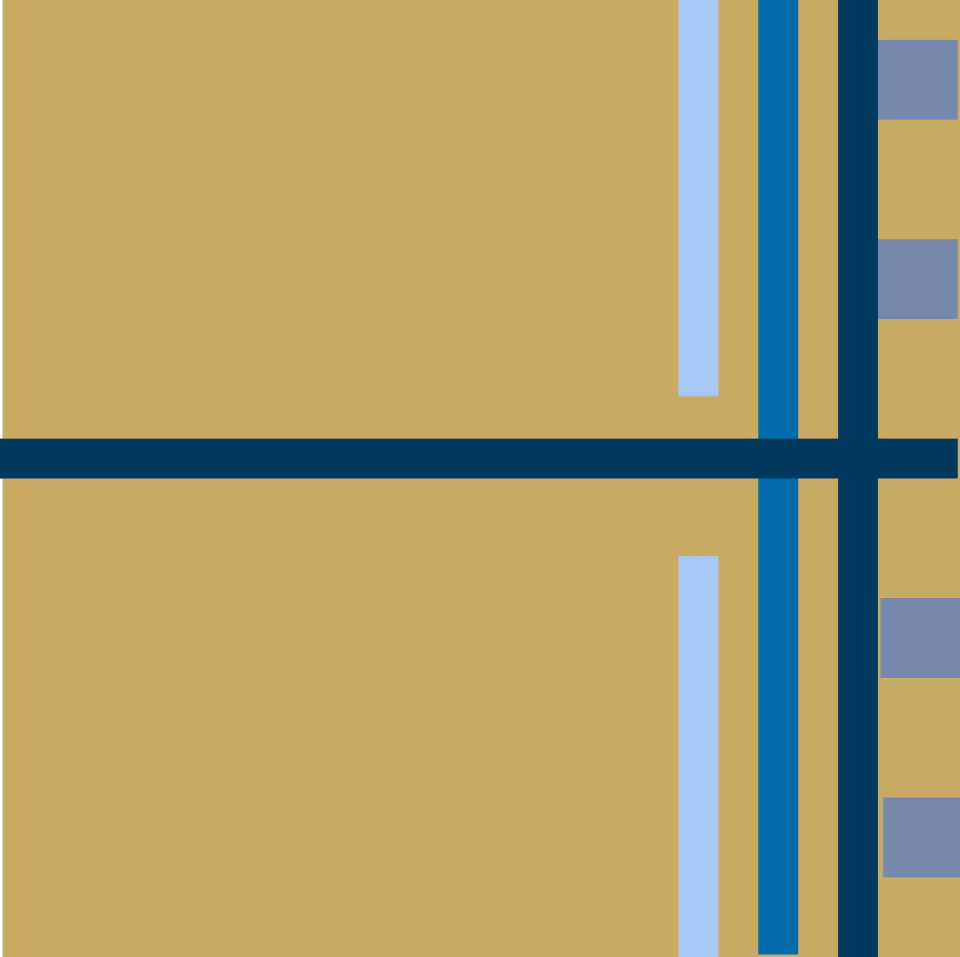
Step 1: My design was based on the horizontal lines, the bar in the middle and the concrete bars at the bottom.

ArtDeco_08Feb_Inspiration

Step 2: In Quilt Canvas, I quickly came up with this design. I knew this design would work. I initially went with a neutral background of white thinking the blues and the gold would pop.
QDAD_9FEB2015(6)

Step 3: The only thing, about the overall design, I did not like was the bottom to top feel. So, I rotated it 90 degrees.
QDAD_9FEB2015(1)

Step 4: I really liked the rotation, but the white, now, was just too white. I needed to play with the color palette some more. What about using the lightest blue instead of white?
QDAD_9FEB2015(3)

Step 5: I wasn’t happy with this either it was still the wrong balance for me. I decided to use the color that was the most different in the palette, the gold as background. QDAD_9FEB2015(4)

Step 6: While I liked this, I thought the background still needed to be a little darker, and I played a little with the lines adding the lighter blue back in, thinking about the light and dark balance.
QDAD_9FEB2015(5)

Step 7: I definitely liked the darker background, but I didn’t like the lightest blue color in the lines. In addition, the vertical bar and the intersection of the gold was wrong as the flow seemed broken. I changed the vertical bar to gold for a better flow and changed the blues to be just the two darker “light” blues. This was my final design.
QDAD_9FEB2015

Process Overview:
mosaicc66d42aaffb691513693518b42ecb4f55d50c162

So, what do you think? Do you think you can give it a go? It doesn’t need to be on a computer program…paper and pencils are just as much fun and a great tool. Anyway, you know where to find us….QDAD Facebook page.

Please Note: If you would like to make or use one of my designs, please email me (ml_wilkie(at)hotmail(dot)com) or leave a comment below. I am happy to talk with you on options and provide the relevant measurements etc. or have you test out a pattern. Also, if you use one of my designs, please use the following text to credit me the design: “Designed by Michelle Wilkie @ Factotum of Arts”.


My QDAD Process: Yellow Bus Designs

Over the next two days, I thought would try to share my design process for Quit Design a Day.  Remember, we try to spend no more than 15 minutes on a design. We use the color palette provided each day. You can use all or select colors from that palette, and you can add white or black. We can use the photo for the color palette as inspiration, or do your own thing.

As I step you through my process, remember I am very much about finding the geometric shapes and I like minimalistic design.

Today’s image and color palette is bought to you by Jennifer Em Lanak, published on the QDAD facebook group.
Bus_Palette_13Feb

First step, what shapes do you see in this photo?  Two keys areas drew my attention, from which I created two designs for this photo/color palette. Let’s step through each one.

Design 1

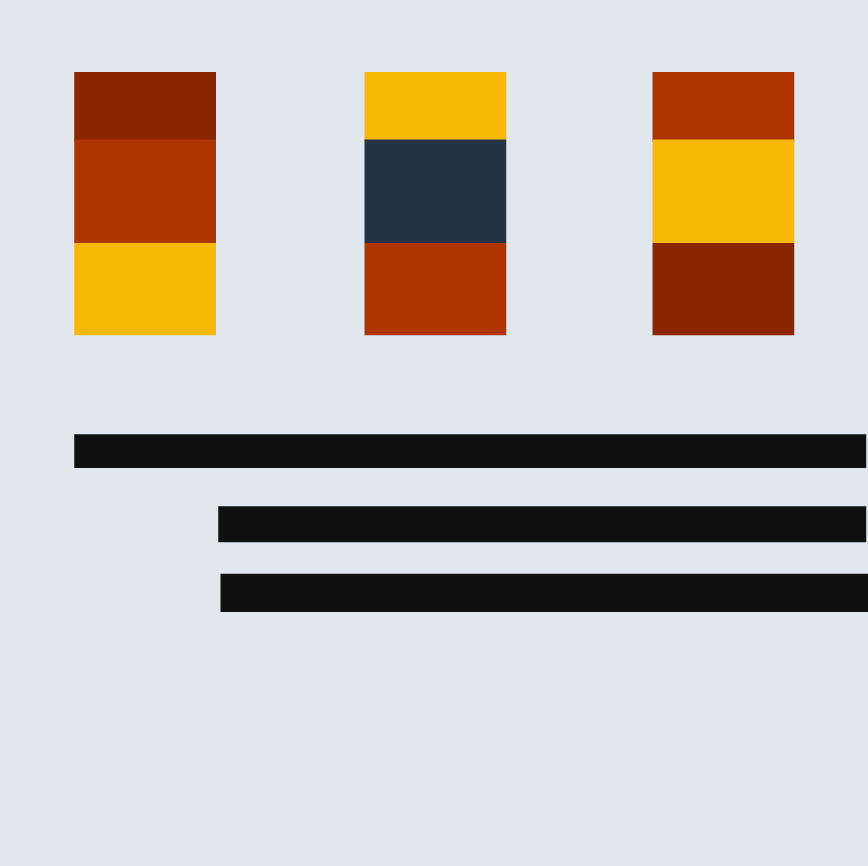
The first thing I saw, were the three stripes on the side of the bus and the windows on the side with the 3 sections.

Bus_Palette_13Feb_Design1

So to get started I open up Quilt Canvas (tool by Threadbias, I use this for all my designs). I only use a 12 x 12″ design palette – typically I find this big enough to get my ideas down and then I can expand them to real size, if I make them.

Step 1: Based on these design elements this is my first step, laying down the components I see with initial colors. I know now that with a saturated color palette I typically use a neutral for the background for balance, in this case the gray from today’s palette.
QDAD_13FEB2015(3)

Step 2: I was surprised at how much I liked the palette today and the balance of the colors. I realized to maintain the balance, my 3 stripes from the bus side, needed to be smaller (width) and closer together. This gives the black less prominence and balances those lines with the addition of the negative space at the bottom.QDAD_13FEB2015(2)

Step 3: While I like the 3 windows, I didn’t quite like all the color placement and I had that other red, I could use from the color palette. This landed up being the final design.
QDAD_13FEB2015

Step 4: Just to be sure sometimes I check a couple of other colorway options. I was seeing if I kept the yellow bus feel with the yellow background (switching with the grey)….but decided I liked it best as in Step 3.
QDAD_13FEB2015(1)

Process Overview:

mosaic25fec95f89e3d85d805c83348219aa374ecf7cbd

Design 2

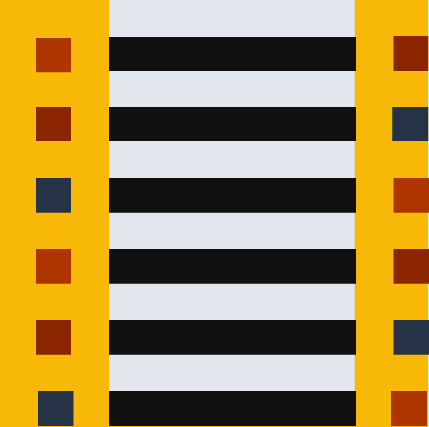
For this design, I saw the geometric options with the grate (grill) of the bus.
Bus_Palette_13Feb_Design2

Step 1: I liked the lines with the squares at the ends. So, I laid those down with an even spacing over the 12 x 12″ design area. I used the yellow and black as in the picture for the center, longer lines. You may notice that I started off with the lines and square rows being a little off-center. I try not to start centered.QDAD_13FEB2015_Grill(2)

Step 2: I did not like the all yellow and black center, so I thought maybe to break it up a little I could use a stripe of grey as well.
QDAD_13FEB2015_Grill(1)

Step 3: Still not really happy with the balance I thought, what if I move the grey  stripe off centered, having the yellow and grey more 50/50 in the background?
QDAD_13FEB2015_Grill(3)

Step 4: I still was not happy with the balance, still thinking it was the background stripes, I decided to move and narrow the grey stripe. Now the stripe splits the left squares background in 1/2 and the black stripe background in 1/2. At the same time I realized I didn’t like the squares in the various colors in the left with this extra (grey stripe) detail. I made them all black except for the first, leaving the lighter red.
QDAD_13FEB2015_Grill

Step 5: I thought I was done at step 4, but I actually came back a little later (about 20 mins after posting) and decided I need less lines in the design. I made one more change to simplify it and give a little more space. I deleted the last line. This is the final design.
QDAD_13FEB2015_Grill(4)

Process Overview:
mosaice7f3e2d08b8275986eca4f208b74b94ca1b685bc

So what about you, grab a pen/colored pencils, or your pick of computer program…what do you see in the bus inspiration and how do you use the color palette. If you do the exercise, come over and post it on the QDAD site or do your own blog post about your process.

I will do another post on my design process tomorrow, a different one.  I hope this inspires at least one person to give it a go. I promise it gets easier the more you do it…and there are definitely days or designs I do not like but that’s part of the learning process. So go on, give it a go 🙂

Please Note: If you would like to make or use one of my designs, please email me (ml_wilkie(at)hotmail(dot)com) or leave a comment below. I am happy to talk with you on options and provide the relevant measurements etc. or have you test out a pattern. Also, if you use one of my designs, please use the following text to credit me the design: “Designed by Michelle Wilkie @ Factotum of Arts”.