I am a little late on this post, what can I say, I was caught up binge watch a TV series on Netflix (while being a little under the weather). It was totally worth it!!
Anyway, as mentioned in my earlier post on the Yellow Bus designs, I am going to share another design and show you how I got to my final design. This one is a little different, in that it was more playing around with the color palette choices than the overall design. Remember, I am very much about finding the geometric shapes and I like minimalistic design.
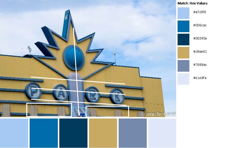
Today’s image and color palette is bought to you by Jennifer Em Lanak, published on the QDAD facebook group.

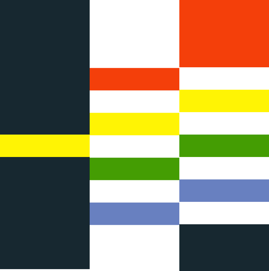
Step 1: My design was based on the horizontal lines, the bar in the middle and the concrete bars at the bottom.

Step 2: In Quilt Canvas, I quickly came up with this design. I knew this design would work. I initially went with a neutral background of white thinking the blues and the gold would pop.

Step 3: The only thing, about the overall design, I did not like was the bottom to top feel. So, I rotated it 90 degrees.

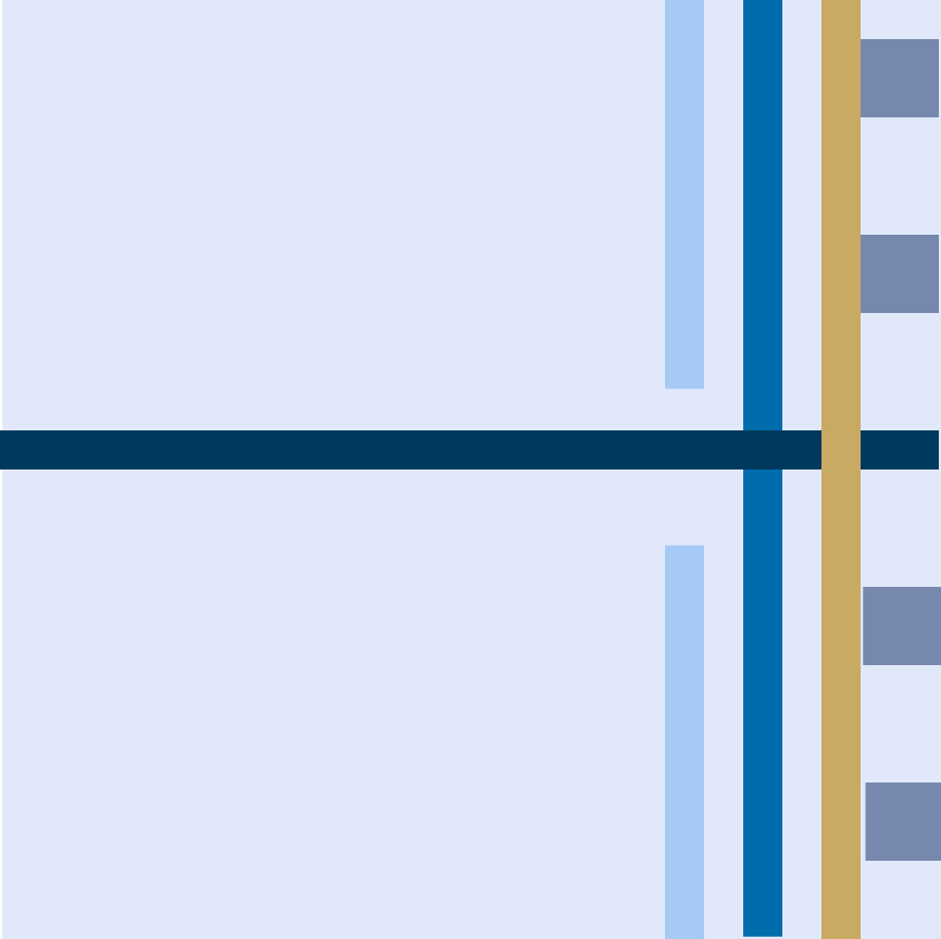
Step 4: I really liked the rotation, but the white, now, was just too white. I needed to play with the color palette some more. What about using the lightest blue instead of white?

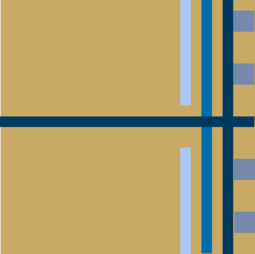
Step 5: I wasn’t happy with this either it was still the wrong balance for me. I decided to use the color that was the most different in the palette, the gold as background. 
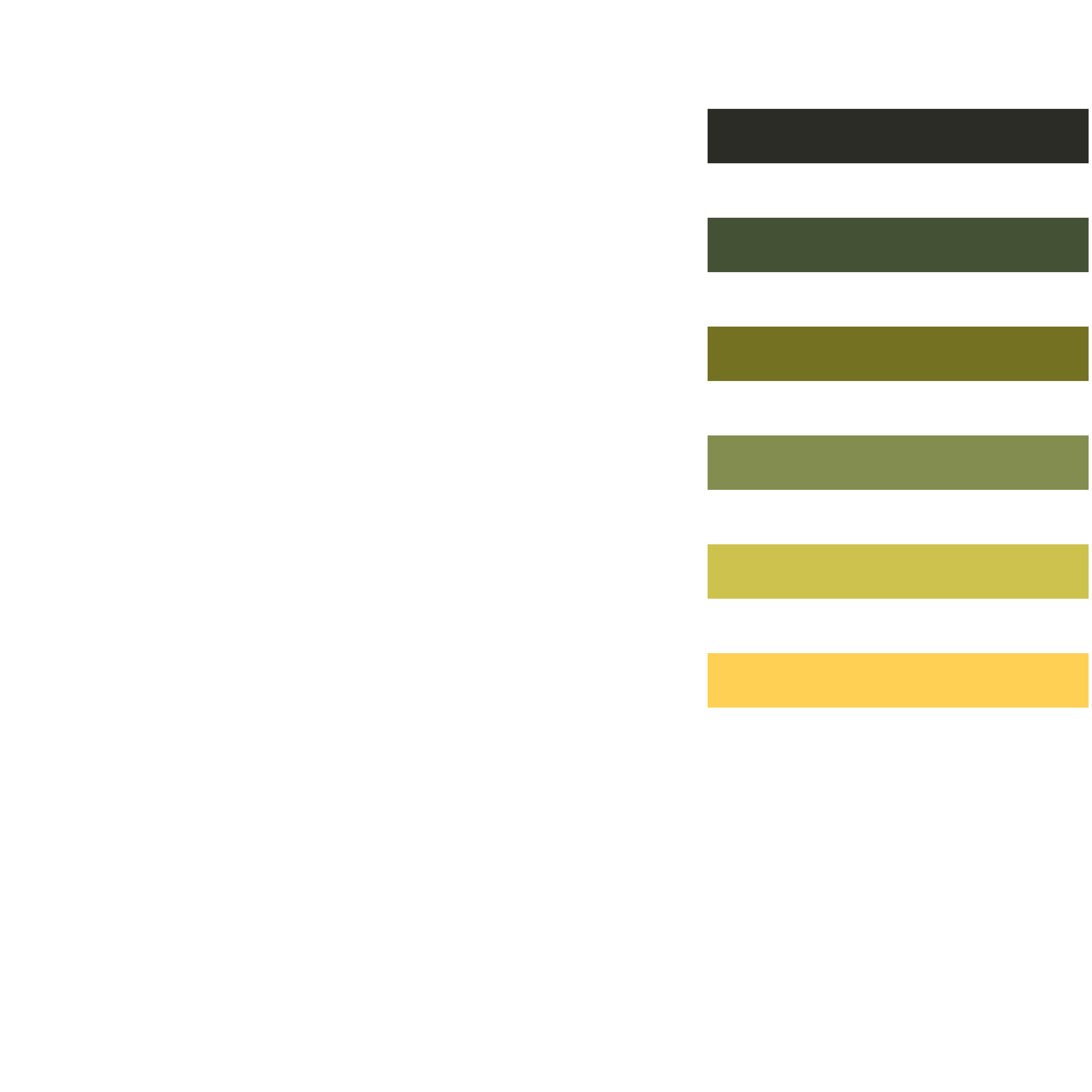
Step 6: While I liked this, I thought the background still needed to be a little darker, and I played a little with the lines adding the lighter blue back in, thinking about the light and dark balance.

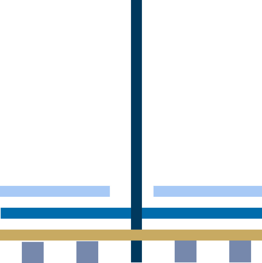
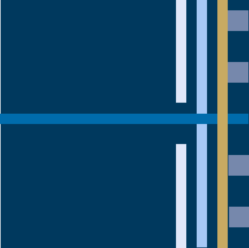
Step 7: I definitely liked the darker background, but I didn’t like the lightest blue color in the lines. In addition, the vertical bar and the intersection of the gold was wrong as the flow seemed broken. I changed the vertical bar to gold for a better flow and changed the blues to be just the two darker “light” blues. This was my final design.

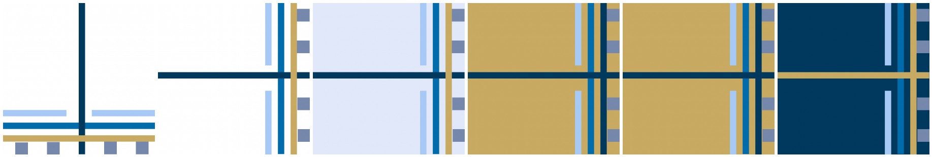
Process Overview:

So, what do you think? Do you think you can give it a go? It doesn’t need to be on a computer program…paper and pencils are just as much fun and a great tool. Anyway, you know where to find us….QDAD Facebook page.
Please Note: If you would like to make or use one of my designs, please email me (ml_wilkie(at)hotmail(dot)com) or leave a comment below. I am happy to talk with you on options and provide the relevant measurements etc. or have you test out a pattern. Also, if you use one of my designs, please use the following text to credit me the design: “Designed by Michelle Wilkie @ Factotum of Arts”.