First timer to Sewtopia

Last week, was Sewtopia Atlanta and I attended. What can I say, it was so awesome. My best retreat ever!! Will I attend again? Absolutely, if my commitments allow I would like to attend everyone from now on!!
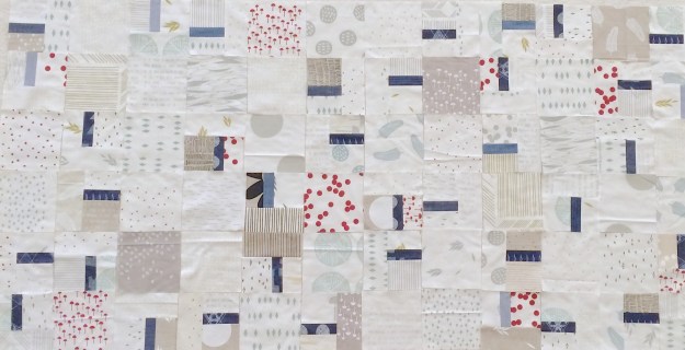
IMG_6069
[Personal Project: WiP: Maze & Vale + AGF Denim]

For those that don’t know, Sewtopia is a sewing retreat which happens twice a year. The first event of the year tends to be structured as  partly class, partly open sew. The second event tends to be only open sew.

It was the first time I have every roomed with a stranger. Corrinna was the best room-mate ever, and totally alleviated my concerns of maybe not knowing anyone. She was not the only new friend I made, it was such a great event for making new or building on existing connections.

IMG_6047

The weekend kicked-off with me scrambling to finish hand sewing my binding on my Michael Miller Challenge item, before the 3pm Cotton + Studio Tour. I did finish it just in time. The studio tour was amazing. All the ladies from C+S were there and answered our questions, we saw their new line and their studio/work space is just amazing!!

IMG_6065[Denyse Schmidt: My Single Girl Block: Blue Scraps+Lizzie House Print]

The classes were Denyse Schmidt’s Free Wheeling Single Girl and Elizabeth Hartman’s Frances Firefly. Both instructors were amazing and so friendly. I managed to contain my fan-girl moments :-), as they spend a lot of time with each student.  The classes were well structured, and since both were block based you could decide what kind of project you would make. Look, I got to practice curves which I just recently learned in Melanie Tuazon’s curve class.
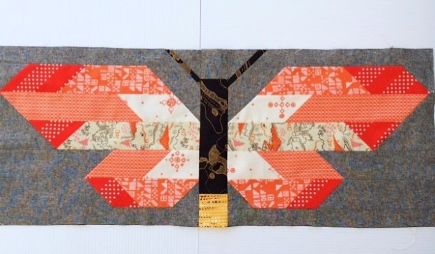
IMG_6067[Elizabeth Hartman: Frances Firefly: Cotton and Steel + Carolyn Friedlander Carkai + Katarina Roccella Avant Garde + Essex Linen]

Other than the special events, the other things that made this the best retreat I have ever gone to:

  • The wonderful and friendly staff
  • The great balance between activities and open sew
  • The stress-free, friendly environment
  • The optional challenge and swap activities is greatly appreciated
  • I enjoyed the catered lunches

I can’t wait to my next Sewtopia retreat (here’s hoping for a spot at Austin, if not I will see you all at Denver)!!

Have a great weekend, all. I am hoping to get some quilting time in.
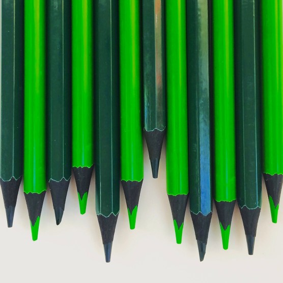
 

Green: A Colour Blog Series

IMG_6079

Green is an interesting color for me. When I thought about it, I thought my projects would be similar to how I use blue. My fabric stash definitely has it as one of my main colors. However, I actually realized that I do not use it as frequently or in the same way.

I think I find green, while very appealing, a lot of the time very symbolic  or representative of well-known brands, which to me is a little off-putting:

  • Irish/St Patrick’s Day,
  • Christmas
  • trees/plants, four leaf clover
  • Starbucks, Barnes and Nobles, BP
  • Springboks (South African Ruby team), Wallabies (Australian Rugby team)….that’s why I might have an issue being a kiwi (All Black – NZ Rugby team) supporter 😉

When I do use green, in a very limited way. Here are examples.

Green + Neutrals

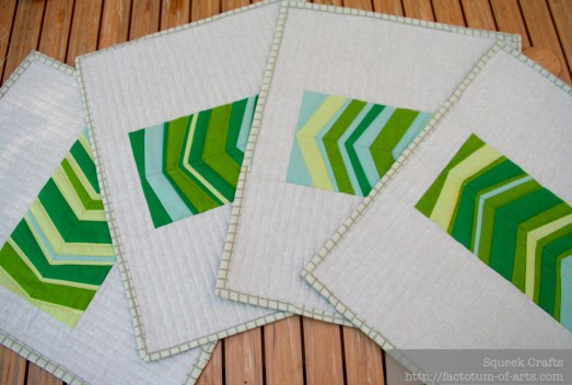
As there are so many various greens represented in fabric, I really do like a monochromatic color palette with various neutrals.  These place mats using shot cottons and linen are a great example.

PlaceMats_WH_complete

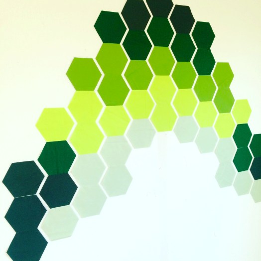
Another project I have underway, is a quilt design that is inspired on a tree-lined street. These hexagons use various greens to represent the light casts and the darkness of the leaves of the trees. The background fabric will be Kona White to make those greens pop.

IMG_6049

Green + Multi-color

I think I like the balance green brings to a bright and multi-colored palette. I use it a lot in this manner and I know when selecting fabrics, I always add the green back in.

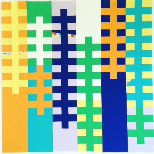
In my recent project, Treehouse Ladders (more to come on this project), green was definitely used to add balance to this very pop art inspired palette. It needed to be this very bright green, but not to yellow as both orange and yellow were used. It was also important it was not to blue since the palette also had blue and aqua.

IMG_6040

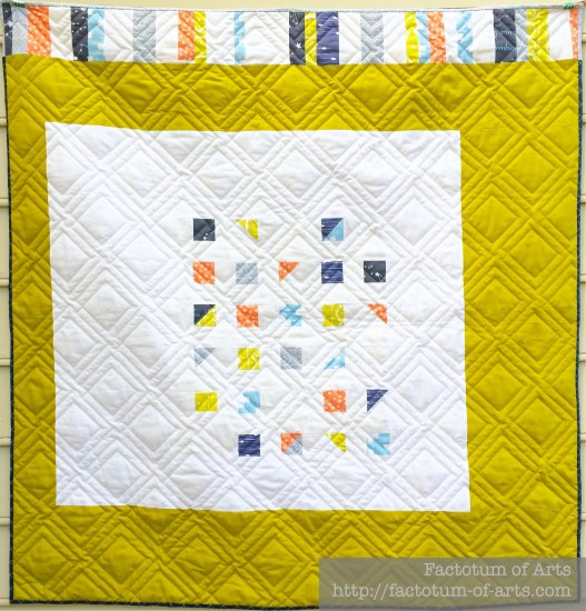
In this multicolored quilt, Natural Corridors,  Kona Pickle (a yellow based green) was used as the focus fabric for the negative space. I decided to use this color as it pulled the citron print out a little but worked well with the blues and coral prints. The pickle area, is not too over bearing in this design and it highlights the offset centered block well.

Natural_Corridors_Quilt_Top

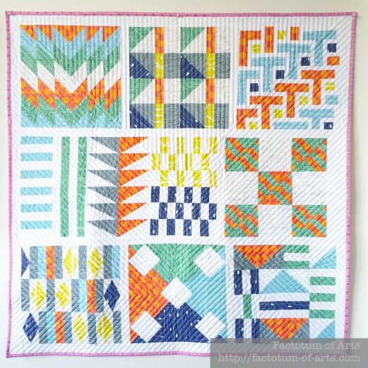
The Spoonflower Sampler Quilt, also required both the mid green print and the citron print to balance the colors.

Spoonflower Sampler Quilt

Lastly, my Phased Circles quilts, using Carolyn Friedlander’s Botanics and Architexture lines, includes green. This was obviously driven from the 6 main color ways included in her fabric lines. This example of green though does show the color variations available in green prints, and the availability of high and low volume green based prints.

PhasedCirclesComplete

I was asked before starting this series about how I decide on the thread color for quilting. That is a great question especially when creating multi-colored quilts with such a difference in color. So above my thread choices are as follows:

  • Treehouse Ladders: Invisible Thread (clear). I used Premium Silky Invisible thread.
  • Natural Corridors: Light Grey
  • Spoonflower Sampler Quilt: Off White
  • Phased Circles: Color Matched the fabric. Blue block: 6738, 2725; Orange Block: 1133; Green Block: 2835, 5015; Pink Block: 1100, 2600; Jade: 2810, 5007; Gold: 5022, 2110

Monthly Tip

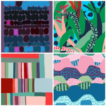
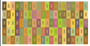
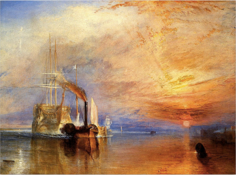
I love learning how other artists in other mediums use their color palettes. Here are a couple of examples.

Ophelia Pang:
mosaicb75cd2cbe7ffb463188be2345c119483e4869be4

Josef Albers: Interaction of Color
Screen Shot 2016-04-13 at 9.57.32 PM

J.M.W Turner
Screen Shot 2016-04-13 at 10.01.51 PM

Monthly Resource

Book: The Secret Language of Color

Give-away

There is no project this month, so this is open to everyone. Just leave one comment below on what you enjoy about these posts and what you would like to see more of or see different.

I will randomly choose a winner on May 1st, who I will announce in my May Colour Blog Series post. The winner will receive:

  • 1/2 yard green bundle of 6 prints curated by me.
  • An exclusive thread box from Fat Quarter Shop.

Last Month’s Winner….

is Katherine Gray who entered a fantastic hexie project she was working on in blue and greys. Katherine, I will direct message you shortly for your details.


Cheri d’Amour: A finish

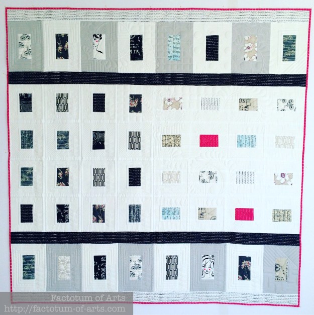
It has been a busy but extremely fun week and now it’s time to catch-up a little. I want to share with you all this finished quilt, Cheri d’Amour. It is a gift for a close friend at work. So excited to be able to finally give it to her.
Cheri DAmour

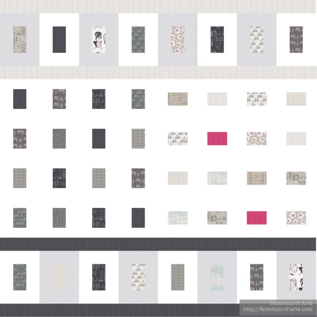
An original design (QDAD), it turned out exactly how I imaged it.  I love this predominantly, black and white fabric line, Cherie by Frances Newcombe for Art Gallery Fabrics.

Cherie_Quilt_Design

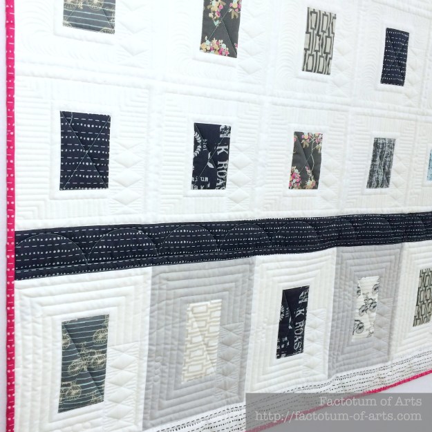
I loved that pop of pink which I also added onto the binding to keep the cohesiveness of the design. Kathleen from Kathleen Quilts did an amazing job implementing my design asks. I really wanted each of the blocks in the center to be framed and have decorative borders (like picture frames).

Cheri dAmour Front

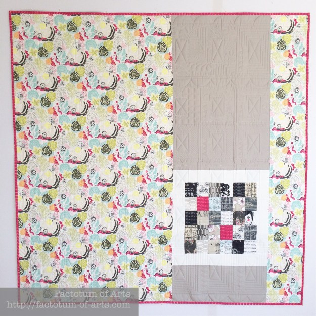
The back uses the brighter flowered print to bring in the color. You can also see more of the amazing quilting texture.

Cheri dAmour Back

I also had some scraps left over and decided that it would make a fantastic patchwork block that will bring an additional level of interest. I really like how the back turned out.

Cheri dAmour Closeup

Details

Name: Cheri d’Amour
Design:
Designed by me
Fabric: Cherie, Frances Newcombe, Art Gallery Fabrics and Kona White
Dimensions: 60″ x 60″
Quilted: by Kathleen Quilts

I hope you stop by again tomorrow, we will be discussing the color Green in the Color Blog Series.