I have been working bit by bit to improve my photo’s for my Instagram feed, to grow interest in my feed. I see such alluring images from others that I wanted to step up my game. I am by no means an expert, here are some of my experiments so far.
Staging photos, adding interest
The first thing was actually work on the staging of my photos. Everyone tells you how important staging is, and it is amazing how it drives a different interest in the photo. For example, I have two photos of the same quilt that are similar, both taken and posted around the same time of day, same day of the week. Both, showing stages in my quilting process of one particular quilt. The response of the photos were completely different.
The first uses no props. it just shows the quilt and the stage it is in. The topic of this photo was that it was time to start burying threads.
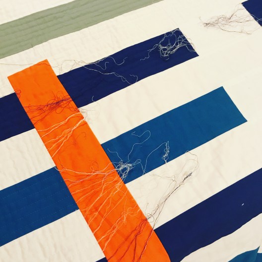
The second, I added the Auriful thread options and the painters tape I was using for the straight line quilting, to the picture as the prop. The topic of this photo was I continue to do 1/2″ straight line quilting.

The response was doubled in the second shot over the first shot.
Photo Quality
I have to admit, I had switched to using my iPhone full-time for taking pictures. This is mainly for convenience, I always have my phone. Also, my phone had higher pixels than my older digital SLR.
I was lucky enough, that my fabulous husband bought me a new Nikon digital SLR camera at Christmas. Oh, what a difference!!! The pictures are clearer, the colors more vibrant. I love it.
I am using these Campbell’s soup can’s as color palette inspiration. I wanted a quick shot and started off with my iPhone (5s). Note, these are photos before any editing. Not bad, but I wasn’t getting those vibrant colors as my eye was seeing. Also, I knew I will need higher resolution photo’s if I wanted to put these in my upcoming book.
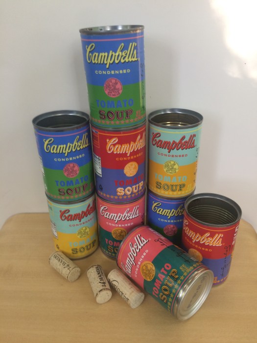
So, I switched to my SLR and was able to control the zoom, the color and crispness was improved. Note, I just point and click and use the camera’s defaults for this image, and again no editing yet.

What has made using my SLR with Instagram so much easier, is my new SLR has a bluetooth feature and downloads from my camera to my phone. There is no need to move the photos from my camera to my laptop to my cloud and then to my phone.
Framing the Photo
I have loved my friend, Nicole @mamalovequilts, Instagram feed for the longest time. I have realized it has a lot to do with her staging and photo quality of her images. It also has to do with how she uses white negative space to frame her photos. I mentioned this to her the other day, and asked how she did this, whether it was with IG or another program. She uses an app PicTapGo ($1.99). I downloaded it yesterday and I love it already!!
I use it mostly for the framing of the picture, but have been playing around with their set of filters too. Let’s just focus on framing a picture, though. I find that framing the picture with more white negative space actually focuses my eye to the image more.
Here is the photo I posted yesterday, a closeup of a pineapple, which I love (border added around the screenshot so you can see the visual space in IG). This one has no negative space around the image.

The second image is what I posted from PicTapGo with a IG Square Floating effect added. This adds negative space around all four sides of the image so its floating.

Another image, of my new media stand. This is the image of what I posted in Instagram. 
However, I like it much better with the floating negative space. To me it gives it a crisper and cleaner look.
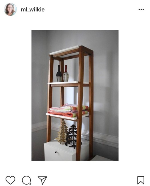
Today’s photo out on Instagram, is using a slightly different border effect. It is the IG Square Full, which adds borders to the long sides of the image but the short sides reach the full length of the space within Instagram.
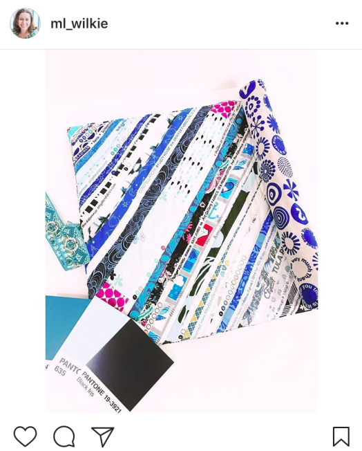
I am definitely no expert, as I mentioned. I still have steps to go to increase interest on my Instagram page. If you are with the MQG, here is a recent article by Christopher @the_tattooed_quilter on social media and photography.
Some of the other Instagram feeds that I find inspiring (not all are quilting related):
Nicole @modernhandcraft
Hillary @entropyalwayswins
Kate @teaandkate
Giuseppe @Giucy_Giuce
Helen @helen_dardik
Nicole @mamalovequilts
Christopher @the_tattooed_quilter
I’ll keep you posted how things go, I am looking into videos next. I would love to hear how or what has worked for you.