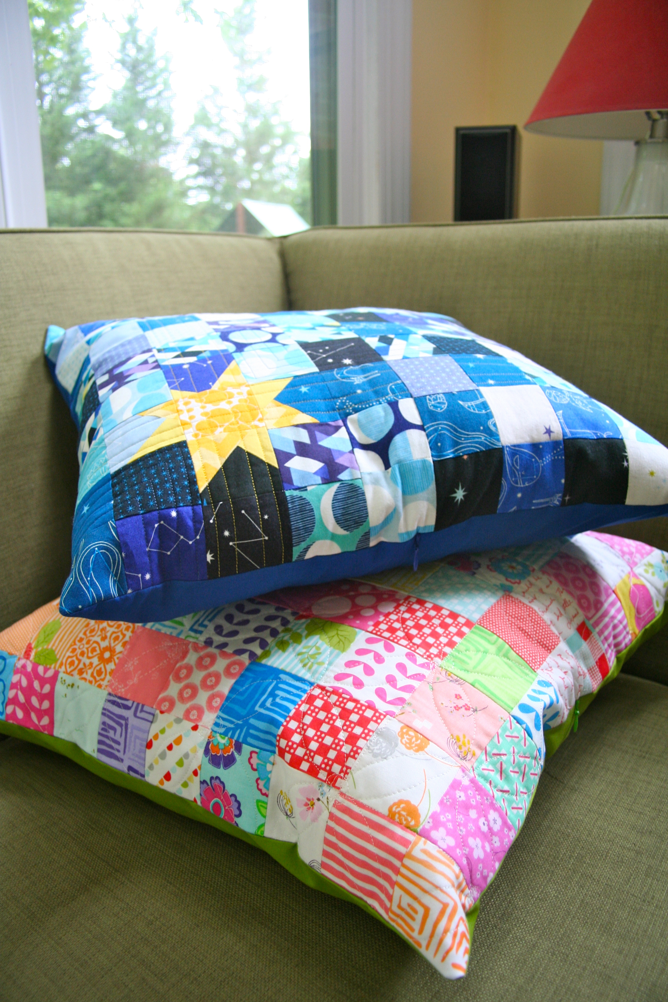
After last week’s cushion top, I received the best compliment, my 5-year-old son asked if I could make him a cushion. I started the strips and posted on Wednesday my start with the “space” themed cushion top using “Constellations” by Lizzie House for Andover.
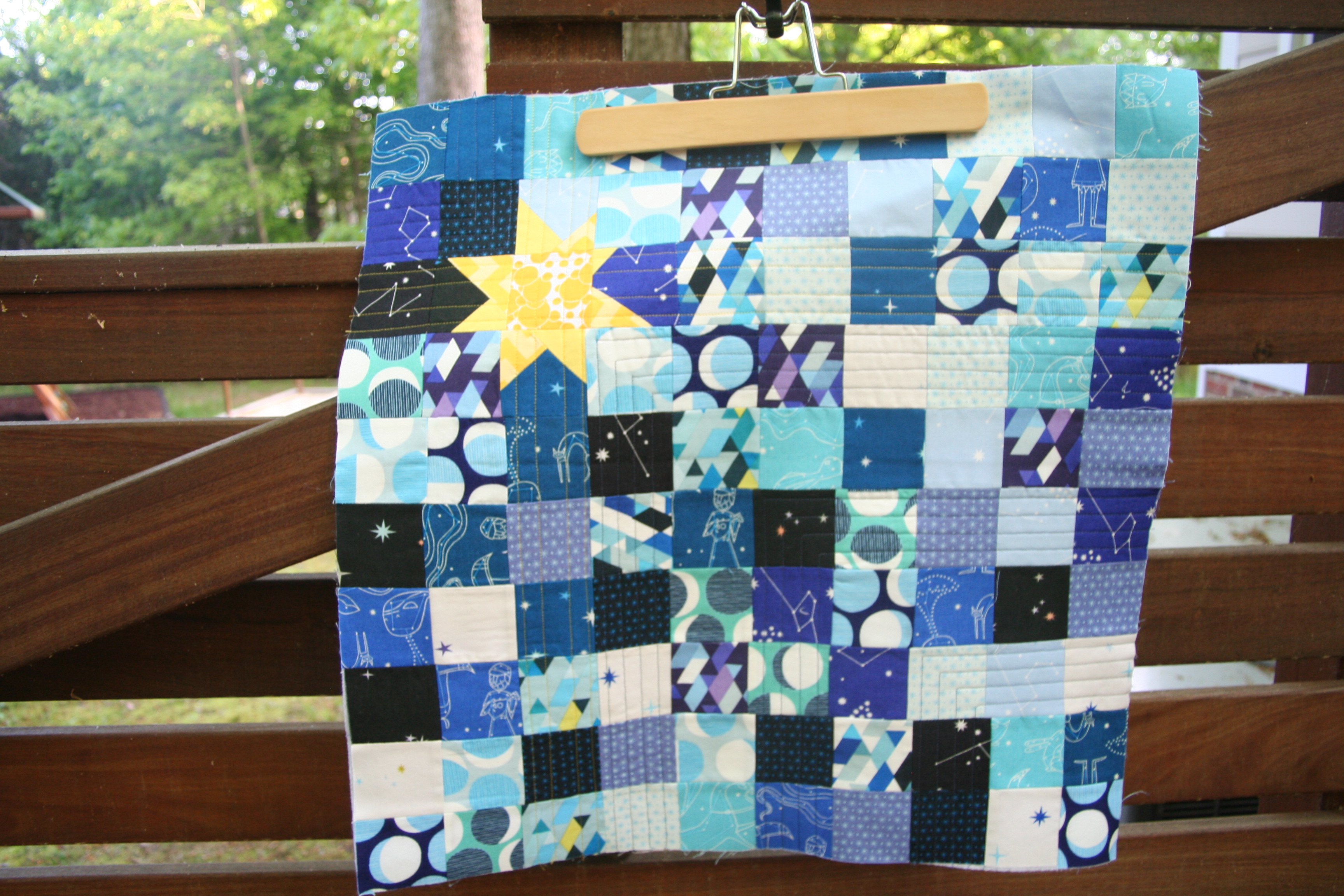
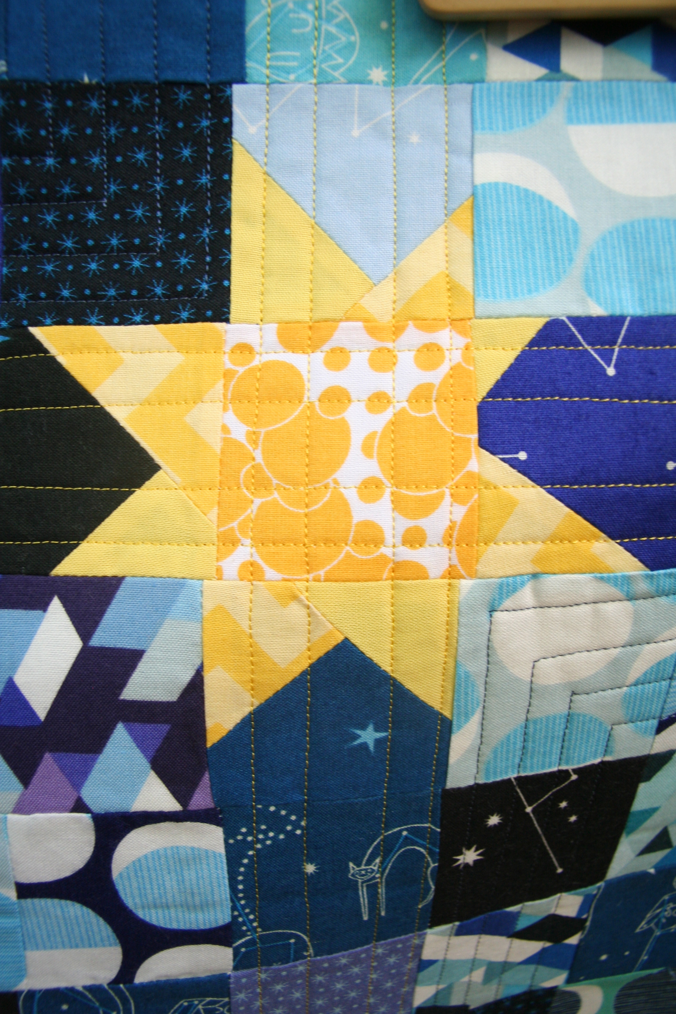
When sewing the strips together, I realized that I can take advantage of my errors purposely inaccurate alignment of the squares (and the wonky star) 😉 and we have a cushion we are calling “The Wonky Universe”.

I can say this about working with postage stamp squares (and probably other squares too)….It doesn’t take much for the strips not to align just slight errors in cutting and probably inaccurate seams makes all the postage square not line up.
The quilting on this one I went with dark blue straight lines radiating from the wonky star, which is our sun, to kind of represent orbits. These lines were alternating to make sure the softness was left in the cushion cover. I also added yellow lines both horizontal and vertical directions through the sun.


When I showed my son this morning his response was “AWESOME!!”. It made my day 🙂
I am linking up with Amanda Jean @ Crazy Mom Quilts for Finish it up Friday.
Quick update: After seeing the amazing cushion from Adrianne @ On The Windy Side, I asked how she gets her squares so aligned….she gave this great advice:
- accurate cutting helps a lot. Personally, I don’t find pre-cut charms or mini charms very accurate, and I find the pinked edges make it difficult to line them up accurately. I would recommend cutting your own squares or cutting down pre-cuts so they have straight edges.
- sewing a consistent 1/4″ seam is a matter of practice. Sewing lots and regularly (like at least an hour most days) will help you get better faster. I’m not sure that my 1/4″ seam is exactly a 1/4″, but after a lot of practice, it is at least consistent. If you’re not already using a 1/4″ foot, it is worth the investment. I can’t sew a consistent seam without one.
- when accuracy is important, I use a LOT of pins. I line up the seams I want to match and pin through the seams. Depending on how big the squares are, I might also put a pin (or 2) between each pinned seam. I also pin in a slightly unusual way (I didn’t realise this until I started sewing with friends!) – I put the pin through the fabric perpendicular to the edge, with the point towards the edge I will sew along. If you put the pins back from the edge a little bit, you can sew along without removing them as you go.
- I don’t usually pre-wash or starch my fabrics, but when I know something might be tricky (like the Essex linen in black I used for these cushions), I do starch just for that extra bit of control.
I hope you go over and check out her blog :-). Have a good weekend all.